Design Without a Designer — Chapter 2: Logo Design Basics
Other Chapters:
Design Without a Designer — Chapter 1: Question Everything
Design Without a Designer — Chapter 2: Logo Design Basics (This one)
Design Without a Designer — Chapter 3: Logo Design Tutorial
You go on Instagram and you see a bunch of really clever logos, then you think to yourself: “My business needs a clever logo like those!” Alright. Let’s see what it takes to create one of those clever logos for your business.

Let’s have a look at the logo above. What do you see? A guitar, a match, and flames. If you were to guess what the company name is, what would you guess? Flame Guitars or Guitar Match or something like that. And you’d be right. The company is called Music Match. The logo is definitely clever and eye-catching, but would this logo be right for your business?
To answer that we need to first establish what makes a good logo.
A good logo needs to accomplish these 4 things:
1: Grab people’s attention
2: Provoke an emotional response
3: Have meaning
4: Be memorable
Let’s break them down.
1: Grab People’s Attention
It’s a busy world out there. If your logo doesn’t grab attention, it’s dead before it has a chance to convey anything.

That’s why the first thing your logo needs to do is grab attention. Who cares how clever it is if no one notices it? So how do you grab attention? Luckily, there are a few tricks that you can use to grab people’s attention.
Evolution
Evolution has thought us to pay attention to very specific things. Colorful shapes with high contrast usually mean ripe fruits and nutrition. Using those in your logo is a sure way of getting attention.

Another thing we are evolved to pay attention to is faces. We can see faces in dimly lit rooms easily and we can even tell someone’s looking at us when they are on the edges of our peripheral vision. Isn’t that crazy? Imagine a logo being able to get your attention even when you’re not looking at it.
We happen to also pay a lot of attention to provocative shapes. Mating is heavily rooted in our brains and noticing certain shapes is almost unavoidable.
Your logo has split seconds to grab attention. If it takes any longer, then it’s not working right. What we’re trying to do here is to trick the deep lizard brain inside people to get their attention. Evolution has taught us a few tricks and that’s the reason it only takes a split second to grab people’s attention.
2: Provoke an Emotional Response
The next thing a logo needs to do is evoke an emotion. Are we friends or foes? Am I going to attack you or befriend you? This takes about a second to decide. This emotional response is also unconscious and happens mostly automatically without any active thinking.

It’s very important to align your corporate identity with the emotional response you are evoking in your audience. If you have a serious corporation that focuses on security and encryption, then use a very aggressive tone. If you are a friendly local farmer’s market, then use a very friendly tone.

Aggressive elements:
- Vertical lines
- Asymmetry
- Sharp edges
- Triangles
Friendly elements:
- Horizontal lines
- Symmetry
- Rounded edges
- Circles
Neutral elements:
- Squares
- Most texts
One example of what not to do: HP decided to do a re-branding a couple of years ago. They are a consumer electronics company and their logo would be something that’s very close to their users. They see it every time they open their laptops. And this is what they landed on:
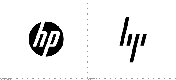
The old logo on the left was in a circle. Very friendly. Had mostly vertical lines, but some horizontal ones too. Balanced. It worked great.
The new HP logo on the right. Removed the circle. Removed all horizontal lines. It is completely asymmetrical. Only made of vertical lines. Has sharp edges. It is literally impossible to create a more aggressive logo than this (except for death metal logos). Unless HP now wants their customers to be scared of their laptops, this re-design is a complete failure. At least in the emotional response step.
3: Have meaning
This one’s a bit difficult. In some cases like MusicMatch, you have words in the title of the company that has physical representations. There are however many other words that do not have any representations like quality, luxury, trust, etc…
Incorporating meaning into the logo could also prove difficult at a later stage because you have to plan for it from the beginning. Otherwise, it would feel forced and out of place.
One thing you can do to help make things easier is to find any icons or symbols that would align with the company’s mission statement or product in any way. From here you can start to mix and match different elements of the icons with each other to see if something comes of it.
If you need help with coming up with ideas and you just can’t wrap your head around combining ideas like that, fear not. There is a book. A magical book. That I often use myself for inspirations. It is called Logo Modernism. To be honest, at this point I don’t even know how I ever did any logos before finding that book. It’s perfect for when you’re having a creative block or if you’re not the creative type at all! I’m not sponsored by anyone to endorse this book. It’s just really amazing! I don’t often recommend products, but this book is definitely one I would recommend. Here’s the Amazon link.
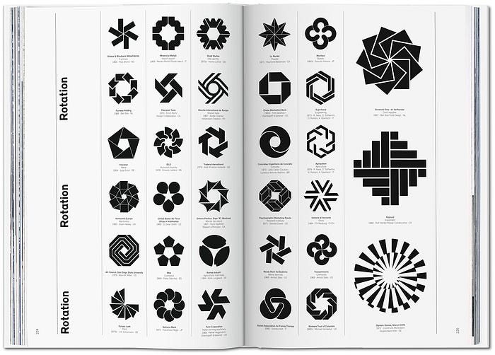
Once you find a logo that somehow represents what you like, either from the book or from your sketches, then you can start working on it in an app like Sketch. Sketch is perfect for creating vector shapes like these, even for beginners. I will create a Sketch tutorial soon for re-creating some of the logos in this book. It’s a lot of fun!
After you nail the general shape, then you have to think of colors. There are a few guides to follow when choosing a color for your logo. It’s about finding the right balance between what color looks good and what color puts the right message out there for your company.
Here is a link to a website that I refer to when I’m stuck thinking about the color of the logo.
4: Be Memorable
The last thing a logo needs to do is to be memorable. All of this would be for nothing if the next time your customer sees your logo they don’t remember you. Lucky for us, there are a few tricks we can use here to make the logo as memorable as possible.
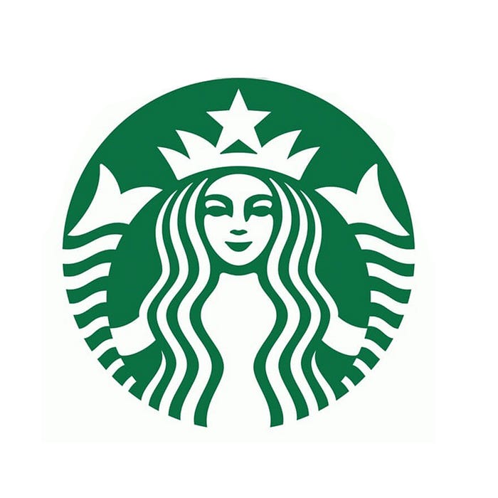
Here’s some bad news. If you are just starting out your business, it might be a good idea to add items to your logo to increase its connection to your company and help with memorability. That might make the logo less appealing to you because it won’t be as simple, but keep in mind it’s just temporary. here is a good example:
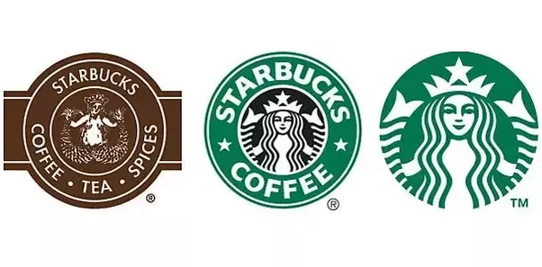
Starbucks has only recently dropped the words “Starbucks” and “Coffee” from its logo. It’s only when a company is at their level of recognition that they can get away with this. If a smaller local coffee shop decides to drop their name from the logo, it would have a severe negative impact because nobody would recognize it anymore. So if there are things that you need to add to your logo to help with recognition, it’s ok. If Starbucks got away with it, you can too.
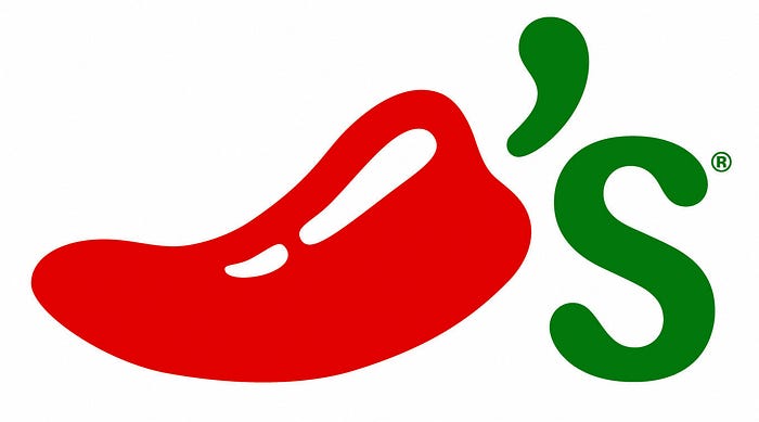
So how can you increase recognition of your logo? You can spell out your name like Starbucks did. Or you can use the initials of your company. If there is an icon that represents a word in your company name, it’s a very good idea to use it in the logo. A good example would be Chili’s.
There is a lot more to talk about here, but I’ll keep it for future chapters. Make sure you hit the clap 👏 button if you enjoyed this article, and if you didn’t then leave a comment down below on what I can improve! ❤️
Follow to get notified about future chapters! I think the next one would be the Sketch 💎 tutorial on creating simple logos.
If you want to read more articles like this make sure to follow me and don’t forget to clap if you enjoyed this piece. ❤️👏❤️
You can also subscribe to weekly newsletter for design news, tips and tricks, and free resources:


