Setup a design system
Build a system that provides a unified set of UX, design rules and patterns.
For the last years I have continued to build and design applications web and mobile, and i have learn how to deal with different departments and utilise their knowledge in order to make better products and build better design systems that scaled better and more efficient.
There are obviously a whole lot more elements you can establish to create a core foundation for your design identity. I will share some of my insights on design systems that scaled and keep all the language consistent across departments and platforms.
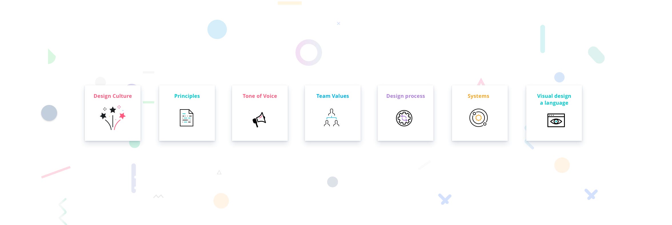
Design language or design systems is more then just ui styles guides is also the way the team works and what are the team values & principles.
…….
The system
“Building products that people love is part of the good design foundations a good design system by creating great experiences for our customer, everyone needs to contribute to creating high-quality products that inspire customers, but to achieve all of this we need to have a strong foundations within the teams across the business, everything is a little piece to the puzzle.”
From typography, layouts and grids, colours, icons, components and coding conventions, to voice and tone, style-guide, documentation, a design system is bringing all of these together in a way that allows your entire team to learn, build, and grow…
The future
Design systems will give us the flexibility we need for working with the unknown devices of the future. It may be a change in process, but it shouldn’t be too much of a difference in thinking. We need to keep experimenting and communicating, particularly in the area of design, as good user experiences are the true sign of whether our products are a success.
When i build design systems i not only look on the library, but in how we work today, tool, design process, documentation, the whole ecosystem, otherwise you just cleaning the dusk and place it under.
Isn’t enough to focus only on visual, we need to align first the foundations, such as documentation, tools we use everyday, our design process, all of this is very important to build a strong design foundation, as well on how to organise your files, how to name them, which tools everyone is using, do an inventory of all of this points and start to clean them up and align everything.

Before starting any work toward your design system, talk to all the major stakeholders who might need to reference or update the system. Ensure you understand what works well today, what challenges could be solved through the system, and how each stakeholder likes to work.
Getting everyone on board at the beginning, and collaborating with them throughout the process is essencial for the success of the language you are designing.
The design team or a “DLS team” might “own” the design system, it’s creation should be a team effort with a collective desire provide both a fantastic user experience while adding efficiency to internal processes through effective documentation and reusable components.
Remember; Building a design system is a long process filled with trial and error, Test, learn, Fail….

Set the foundations right before to move to visual side, this is very important as it will speed up the process on later stage.
First i check:
1 — tools we currently using,
2 —Naming we using on folders, files, layers, even the name system for the symbols in sketch and styles.
3 — Documentation i write down everything all the rules, etc.. so this will be really helpful when you have any doubts just go to the file and double check,
4 — Style guide.
You need to setup your workstation before diving into design, let’s say you are a bartender, before the service you need to setup the bottles, coffee machine, ingredients ready for the cocktails etc.. so this way when you open the bar all is ready and well setup, here it works the same way.
Tools
Doesn’t matter which tools you use, but is very important to standardized those into the process.

When i say tools i mean, everything you use on your design process, from Notes, collaboration to design.
Check the with the team and define the tools you going to use.
Folders & Naming
Is annoying to spend half hour to look for some file, or the most recent version, Organise correctly your folders with names and syntaxes everyone knows.

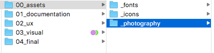
Here is a screen shot of my default folder system, copy paste the “folder system” and rename it to the currently project im working on.
Within one folder i place all the documents for UX and visual designs, so if you looking for wireframes is in 02_ux folder, if looking for the most recent designs is on 01_design.
File naming conventions
Wait, I’m confused. Should I use “NEWEST.sketch” or “LATEST.sketch”? How about “Final_v2.sketch”?
Make sure everyone knows how what to use clearly, without a defined naming convention, files often become named ‘homepage’, ‘homepage v1’, ‘homepage_v2’ and so on.
Example:
name_version_date.sketch
ComponentName_YourName_Date.sketch
Pick an order. Use hyphens or underscores but not both. Never spaces.
I don’t have the formula to format perfect naming, you need to try and stick to the formula.
Choose a Convention and Stick to It
Documentation
Literally documenting the design system was the biggest challenge for me.
Designs should include explanations or examples of functionality. There are many ways to provide elements with specifications that serve as documentation.
Give them a general idea of what it should look like along with functionality in the same place. I started to document everything till now, from folders name, file name, design process, which tools to use while designing and collaborative.
For now, i use Google Docs It’s easily accessible by all team, plus they can comment inline, which is great for feedback.

Design Board

UI Inventory Audit
A UI inventory, or audit, will help you easily identify problems and uncover information you may not know existed. I recently i found over eight variations of one button, each button just a little off from the other. The point is, nobody really knew how many problems there really were until we did the UI inventory. These kinds of problems cause visual disharmony, unneeded markup, and bloated CSS sheets.
“The other two buttons had slightly different font sizes and styles.”
Maybe you could start with an interface inventory and a simple list of the components you’ve found. Focus on the parts that will be used repeatedly or that at least have the potential to be used again.
Some links to learn more:
Before Start the Design
Organise your sh** …..precious time, and you’ll hate yourself if you have to do some maintenance on your design files a few months down the road.
- Sketch Plugins
- Set name conventions for your artboards and layers
- Create pages
- Set up Grid system
- Choose the type scale
Setup your plugins
Setup the plugins you going to use, add them on the resources folder and documented them explain what is for and when you should use it.
Here is the plugins i use for ui kits:
Rename It
Sketch plugin to rename layers like a boss.
Sketch Palettes
A Sketch plugin that lets you save and load colors into the color picker.
Craft by Invision Labs
Once changes are made and synced to the elements within the library this will update all Sketch files that use these elements. Unlike Sketch symbols, elements within Craft library are not bound to the elements within a single Sketch file.
This allowed to create a shared library of assets (hosted on Dropbox or other cloud) that the team can use to drag and drop elements into their designs. If the library is updated, it auto-updates for all team members!
Having a preset library of buttons, inputs, styles, etc. reduces the risk of elements being repeatedly redesigned and saves time.

Create a document and explain how to use them, and where to get it, so when you had new designers you just give them the toolbox and they are ready to go.
Set name conventions for Sketch
Nobody wants to spend hours trying to understand your mess, so name them properly.
Naming layers: Be as descriptive as possible on *every* layer. “Layer 0 copy copy” isn’t gonna cut it.
Icon: icons/interface/normal/instance_name ( using the / when you export the elements they will be automatic add into folders).
Other:Horizontal_divider

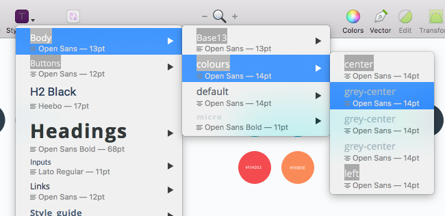
Naming styles & symbols
Do not create random styles or symbols always follow on pattern.
here is some examples how i normally name my ones again is no right formula, just find that works for everybody and stick to it.

“ icons/interface/state/name of instance “
“Primary-Accent/(colourname) “
Symbols:
Buttons/Btn50px/teal/icon-right/hover
Grid System, 8pt Grid

Setting up your grid system will make layout and positioning a very passive act; you won’t even have to think about how far apart things should be spaced because you know your grid system increments grids allow you to design with precision, to make sure that you’re using consistent sizes and positioning no matter if you’re designing for the web, mobile applications, or icons, use a grid.
I like to use 8pt grid system,
The 8pt grid system. Use increments of 8 to size and space out the elements on a page. To me this means that any defined height or width, margin or padding will be an increment of 8.
What are points?
A point (pt) is a measurement of space that is dependent on screen resolution. The simplest explanation is that at a “1x” resolution (or @1x), 1pt = 1px.
At a “2x” resolution (@2x), 1pt = 4px because resolution doubles on both the X and Y axes making it 2px wide by 2px tall.
At a “3x” resolution (@3x), 1pt = 9px (3px x 3px) and so on.
Type scale & Modular scale
Once chosen a beautiful typeface and have worked to make your text easier to read. Now you might be wondering at what sizes to use. Well, a modular scale is the best way to determine your typographic sizes and even the proportions of your whole layout.
You first choose a ratio, then you pick the base size of your text, for example, 16px. After that, you multiply to get the sequential numbers: 16px, 26px, 42px, 68px, 110px.
Typography & Text Styles
Use different type sizes and weights to convey a visual and rhythm.
I like to give myself the widest range possible of text sizes and styles, so my typography sheet looks like this, i do also create a dark version of it.
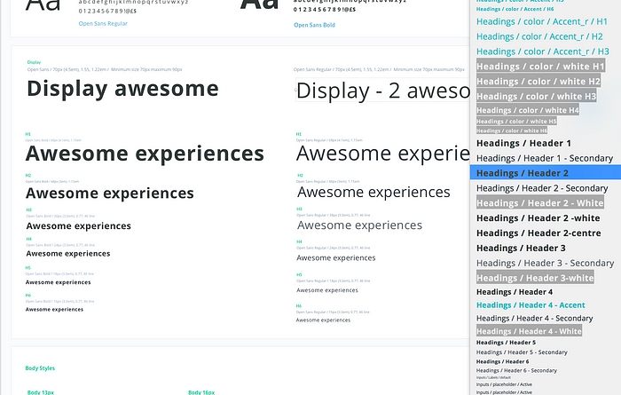
Design is dynamic and adaptability is key. Functions, features, and aesthetics are often likely to change. Defining text formatting as first stage it will help you on the way.
“A modular scale is a sequence of numbers that relate to one another in a meaningful way. Using the golden ratio, for example, we can produce values for a modular scale by multiplying by 1.618 to arrive at the next highest number, or dividing by 1.618 to arrive at the next number down.”
Explorations
The important aspects of design for both parties is to understand the goals of the product you are designing. We tend to jump straight into pixels and quickly flesh out the UI of the project. If it’s a brand new website, or a new feature, be sure to set clear goals of what you want to achieve.
I collect all images to my Inspiration folder. I use mood boards mainly to discuss my thoughts with colleagues and describe some of the visual ideas, before I start with the pixel process, collect much information as possible.

First Draft
Designing is always an ongoing process. You’re going to iterate a lot along your way to a great result. With first draft is also comes gathering of first feedback. You don’t have to come to pixel perfect design in order to start receiving feedback from your teammates, clients or potential users.
I normally work with 2 drafts versions along side, so i mix colours buttons typography styles etc, to build the foundations.

With this draft i have an idea of which direction i want to go, colours and general style.
I’ve always struggled with designing nice headers while I the rest of the canvas was white. While designing I learned to put all the content in place first — just play with the layout and typography. It’s much easier to design nice details and play with the whole concept with the content in place.
Now is all done, i know which colours and typography i have the base foundation for a style guide, At this stage i don’t organise anything i do that after when i know which foundations i will processed.

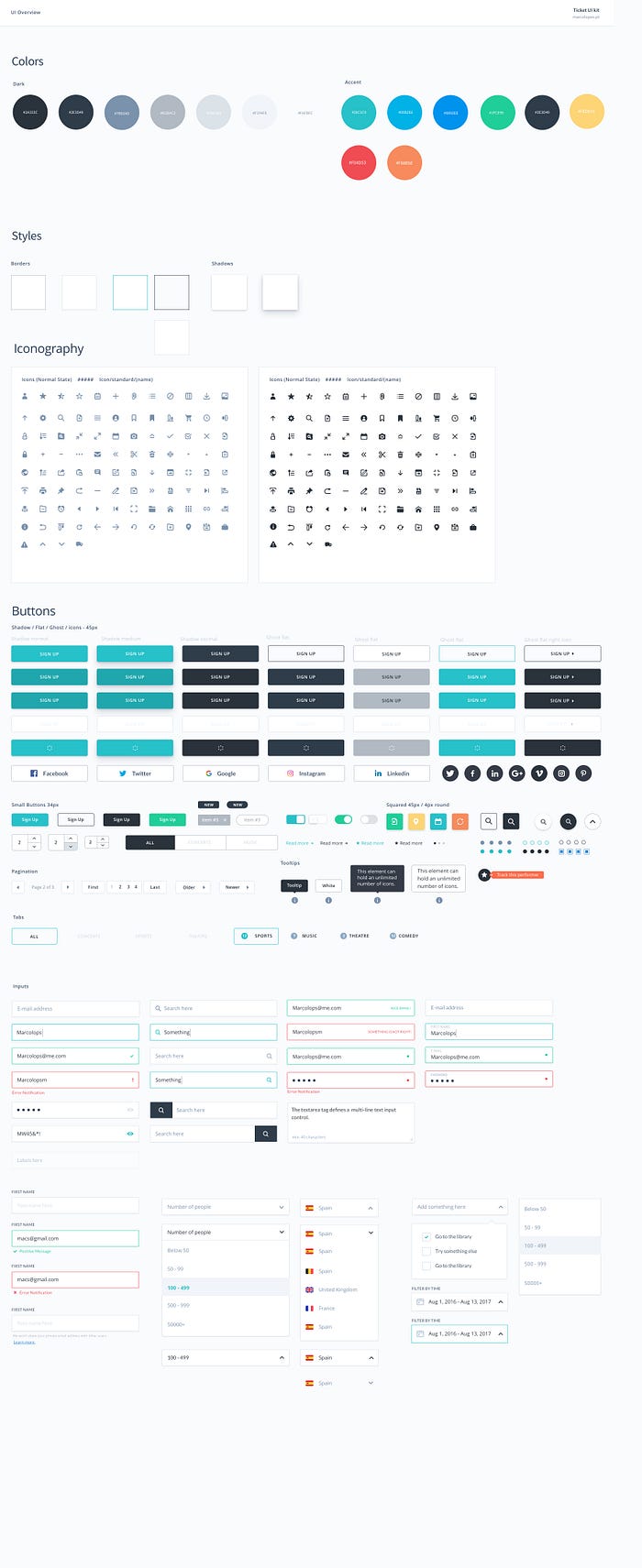
Building a pattern library
The concept of a pattern library is simple: Break down an interface into reusable building blocks, arrange and group them, name them, establish rules between them, generate an overview of all components, and make them available for the entire team to build and design with.
After the exploration, reviews and iterations, you arrive at the style you are happy with, you have define the global style palette.
The task now is to create the suite of patterns and components, accounting for all states and scenarios — essentially creating a comprehensive UI kit.
The visual system is made up of foundational elements like defined text styles for headers and content, a colour palette, inputs, forms, what we call patterns and components.
This includes navigation, cards, tables, empty or loading states, notifications, alerts and modals. Patterns are versatile, can contain components, and be paired together to make up a template.
A pattern library is closely tied with the code base because it is often generated from the code base itself with tools for living style guides.
Approaches to make pattern library usable
…How do we make a pattern library more likely to be used throughout an organization, then? Perhaps by shifting the focus away from the modular methodology and towards a more general big-picture view of components. Here is a few interesting approaches to this issue.
- Atomic Design Theory
Atomic Design is a popular set of principles based on a way of thinking about design systems on the web. It helps web folks think about elements users interact with and how they fit together into a holistic system. It’s based on foundations of web concepts which can apply in the design phase. Coined by Brad Frost, his guide is available online.
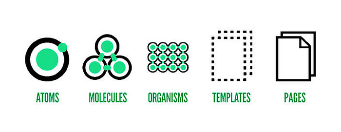
Here is a great article where explains what is the Atomic design:
“Atomic Design using Sketch is the future of product design.”
General Electric’s Predix design system
Is another great example principles and applications.
“ In Practice
The internal launch of the Predix Design System included design patterns created and documented by the Predix platform design team, as well as patterns contributed by teams building products on top of Predix. Launching with contributions from multiple teams allowed us to fill the entire hierarchy of the design system with content. The Platform team, as the stewards of the design system, provided most of the foundational design patterns for Principles, Basics, Components, and Templates. The product team on the other hand, provided design patterns from the more applied levels of the design system.
The inclusion of design patterns created by multiple product teams not only helped fill out the design system hierarchy — but it has demonstrated how we can achieve our goals of sharing and reuse. Teams are now drawing upon design patterns which have been used in other products, and are eager to share and show off their designs to the rest of the community. Based upon the reactions in the months since the launch, the Predix community within GE is eager both to learn and share new design patterns.“

Between those and others you need to find the best will fit your organisation, and a way that everyone will understand it.
Don’t forget UI Motion visual Pattern
Normally we referred to in the design community as ‘brands,’ employ a visual language which is in alignment with, and an expression of their core values. Consideration is given to everything from layout, color, typography, photography, do’s and don’ts, and much more. These brand recommendations are an expression of the brand and in alignment with our expectations of the brand promise using the fundamentals and symbology of the visual design medium. Certain fonts are chosen over others because of their meaning. And the meaning of the selected font supports the values of the brand. You could say there is a continuity of experience across the design spectrum with relationship to brand.
Likewise, motion in user experiences can be thought of as a visual language itself, containing elements like timing, velocity, and a number of properties that change over time including but not limited to transparency, scale, rotation, position, shape, overlay, anchor point, masks & mattes, material performance, etc. Each of these elements or properties, just like the fundamentals of design, carry with them their own meaning.
Some useful resources:
Final
Thats the most points i approach when building design systems the inclusion of design patterns created by multiple product teams not only helped fill out the design system hierarchy — but it has demonstrated how can achieve goals by sharing and reuse and organising tools.
Creating and maintaining a design system is a significant amount of work but if we do that well since the beginning will be much easier and faster to build features and products.
What i’m saying in this article is the setup of workflow before the actual work is very important.
Thank you for reading, if you have anything to add please send a response or add a note!
_
Join us at prototypr for more design news and prototyping tool updates.

