Design of everyday things: the Japanese way (English version)
Maybe if Donald Norman were born and raised in Japan, he wouldn’t had written his manifesto-book.
Maybe I’m exaggerating, anyway in 17 days spent travelling across Japan I’ve never had a doubt about how to open a door or a tap, despite the linguistic barrier and the strong minimalism of the everyday use objects.
During the journey I often took photos of products and services I noted for their smart solutions of common design issues. So this is a short catalogue of good examples — plus a couple of bad — , of everyday things design.
Accessibility, usability, service and anticipatory design principles probably are at the base of these solutions, but in their simplicity they result almost spontaneus; an invisible design that silently makes his duty.
Accessibility
User-centricity is translated into the design of inclusive services, objects and spaces that area accessible to all target users, especially by the weaker ones like kids, elderly and people with disabilities.
For example, the majority of public accessible buildings (museums, public offices, stations etc) installed double height handrails: for adults and kids.


In some cases, the extreme politeness of Japanese culture gives origin to a functions duplication: in some elevators the pushbuttons are doubled, one at standard height and a lower one, easier to access to a disabled person (and kids). My idea is that they do not put just one button low not to constraint adult people to stoop.


Last, a little example of attention to user mixed with gender equality: this public restroom guide points out the availability of a changing table both in women and in men’s sector.

Predictability
Another keyword of good design: the form of an object should let people understand its function and how to use it. But predictability also means to anticipate (anticipatory design), user needs and/or induce their behaviour.
In Japan almost everything is predicted and anticipated; sometimes you wonder if their is space for uncertainity and improvisation in Japan. Here are some of counteless examples.
Free or busy? Another map of public toilets. This one, at the entrance of a restroom in Tokyo Station, besides giving information about the type of services, indicates which toilets are free. This avoids embarassing tentatives to open locked doors or waiting in vain.

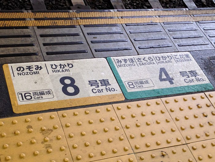
Where should I get on, where get off? Another inexistent doubt. If you have to take a Shinkansen highspeed train, which has dedicated tracks, the number of the car is literally written in the stone: it’s a plate on the track floor. You don’t have to wait that it appears last minute on the displays, causing a congestion of people moving in opposite directions.
Taking the wrong exit in the Tokyo Underground could mean getting out several hundred metres far from your destination. This is why exits are very well indicated and in some underground cars their position — relatively to the coach your on — is signaled on the same display that announces the next stop, so you know in advance if turn righ, left or go straight when you leave the train to reach your exit — and it saves a lot of time and congestion during crowded rush hour.
You could need… Hotel rooms are a mine of examples of customer needs anticipations. You travel from abroad and you could need to recharge your electronic devices which have a different socket. So on the the desk you can find an adapter with iOs and Android cables or — my favourite option — an USB port is incorporated in the bed header.

Why there’s a flashlight hooked beneath the desk? Because it’s at reach in the most common place where you could find yourself if an earthquake surprises you while in the room.
Easiness
Traveling in Japan is really easy. When you arrive or go back you are loaded with luggage, and on Narita Express trains you will find many large cases for your big suitcases, with locks and a stop bar to avoid them to wander across the aisle at the first turn. Easy, useful, done.

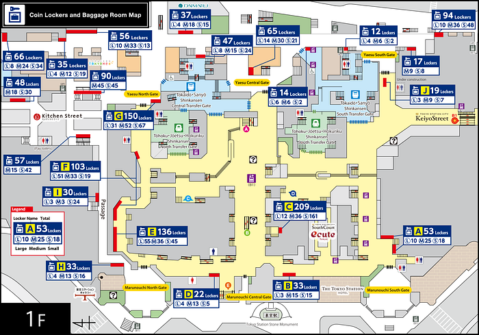
Anyway, since you take the first Shinkansen, you won’t find anymore dedicated space for your luggage (excluded for hand luggage). That’s because in Japan you can send your suitcases to your next tour stage, and you will find them straight in your hotel room. A service offered also by family run ryokans. Moreover, using coin lockers, you can go around also without your hand baggage. Weightless, priceless.
Last but least about easiness of traveling in Japan: Suica and Pasmo prepaid cards for public transportation. You can use them to get on local trains, buses, undergroud trains in Tokyo, Kyoto, Hiroshima and many other cities.
The travel fare is charged at each use and if the fare is superior to the credit on the card, you can recharge it at machines before turnstiles. And on buses a machine reads the card, shows the import to add, changes notes into coins and accepts coins.
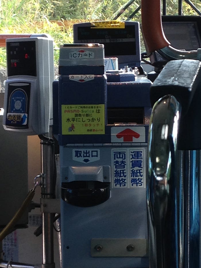
Suica and Pasmo cards can also be used to pay at vending machines, in convenience stores, parking and coin lockers.
One experience, one device. And all the complexity is absorbed by the system. Easy, isn’t it?
The banality of good ideas
“Ingenious!”, “it should be the same in Italy”, “why didn’t we think of it?”, “I want one of this!” are some of the thoughts that accompanied the following shoots.
The standing chopping board. A simple bar that rotates on itself acts as a support for the chopping board when you put it to dry after washing.

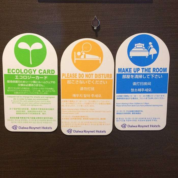
- The magnetic “do not disturb” sign. Besides its practicality, the ecological option is to appreciate.
- The umbrella dispenser. It cannot miss in the country where everything can be bought at vending machines.

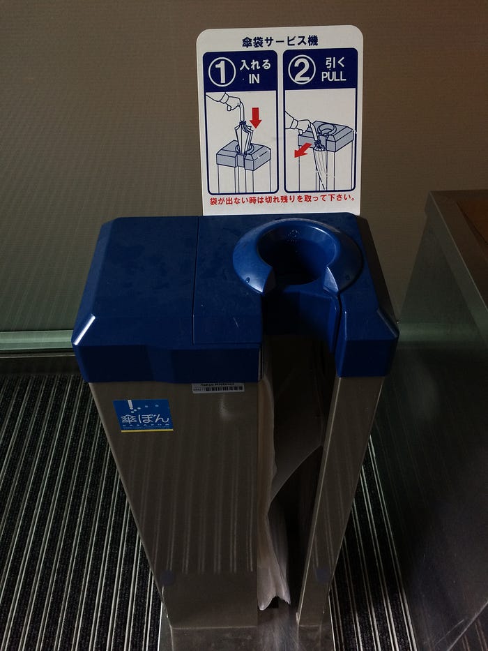
- The umbrella packer. Raise your hand if you have never got hands and clothes wet trying to pack a dripping umbrella in the plastic sleeves you find at shops entrance. In Japan they know how a bother it is, so they invented this smart tool.
The umbrella locker . You can find it at the entrance of restaurants or department stores. Besides its usefulness, it’s surprising the presence of keys to block the umbrella, in a country known for the fact that if you forget your pocket on a train, someone will bring it back to you at home.
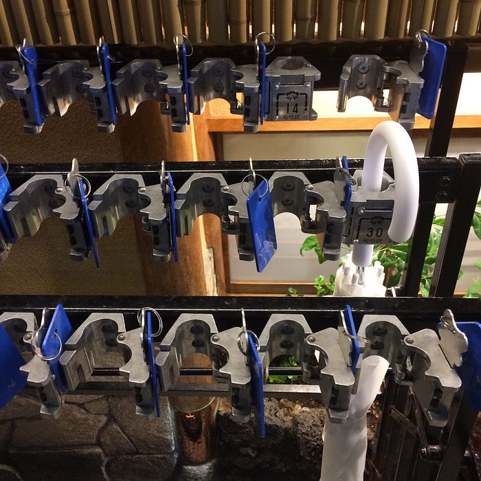
So why put under lock an item of low value? My personal explanation is that many people have the same kind of umbrella (che white one in the photo) so putting it away in a numbered locker means to be sure to get back theirs: the key helps to remember the number and works as a constraint not to forget the umbrella or not to leave back the key itself.
Even the best ones can go wrong
The combo ketchup and mustard blister. Practical at first sight but actually it presents some usability defects. The blister opens folding and squeezing the edges, in order to break the sachet with the sauces, which explodes under pression. But it literally explodes, so if you didn’t position the blister right towards the food, you will end up with dressings all around the table and your clothes.
Secondly, you can only pour them together, so who doesn’t like one, couldn’t open only the other one.

Lost in translation
It couldn’t miss a paragraph dedicated to him, the full optional water closet, better known as Washlet.
You meet it as you arrive (at the airport restroom), love it or hate it, but anyway it’s the only true moment of “lost in translation” for western people, maybe more than the strict etiquette about shoes and chopsticks. Mostly, it’s a it’s a story about being lost in functions: buttons, cryptic icons and sometimes additional signs to show the right way.

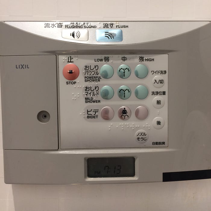
The most common type is quite intelligible for a foreigner: simple icons, and an understandable hierarchy of functions suggested by position and size of the buttons — the main ones on the big ones, while the optional functions are smaller and located contextually to the control they adjust. Last, the setting ones are the smallest and located in a difficult to reach position.
Moreover, the primary action (the flush) is a lever or another button separate from the set of accessory functions. This actually happens not because of good design, but because these models are additional seats applied to traditional water closets.
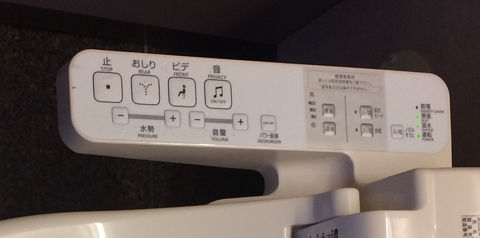
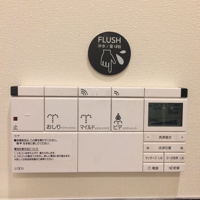
Even ignoringn the labels in English, this model is approved for its usability.
Here instead problems start (and at the same time help signs explaining how to flush appear).
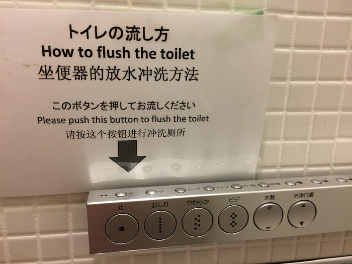
Duplicate icons with labels only in ideograms, wrong hierarchy and location of buttons (the flush one is on a secondary bar and five time smaller than the others), decontextualized options. Definitely not usable, even though this is a more advanced model than the previous one.
Slightly better situation here: size and location are rational, but the washing options matrix is puzzling: a mild shower high will be stronger or softner than a powerful shower low? Japanese subtleties.
The next one leaves speachless. Better, the only question that arises on a designer mind is: why? Why 15 buttons? Why the primary action is in a almost invisible position and deserves only a small unlabeled button? Why all these bad choices, only to put then an awful plastic sheet pinned with tape to explain people what to do?
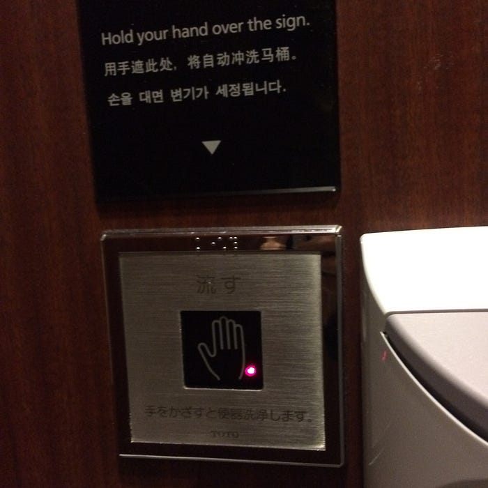
Special mention to the contactless flush: anyway also in this case instructions are necessary.
Anyway the real special mention goes to the presence of braille characters labels on (almost) each functions bar we examined: so we close the circle going back to the accessibility of daily use services and objects.
Owari
This brief article has been written to make sense of hundreds of photos taken across my journey in Japan, and give order to thoughts about design of everyday things that came to mind while taking them. Anyway I wrote this note quickly so comments, corrections and integrations by designers and or Japan experts more skilled than me are welcome! Arigatou gozaimasu.

