The toggle switch button we use in the UI design indicates a physical switch that allows users to turn functions ON or OFF. It’s a really good metaphor if the designers use it properly. This component is usually used in Settings.

Let’s see how does Google, Windows and Apple define this UI pattern first.
Google Material Design
On/off switches toggle the state of a single settings option. The option that the switch controls, as well as the state it’s in, should be made clear from the corresponding inline label. Switches take on the same visual properties of the radio button. The on/off slide toggle with the text “on” and “off” included within the asset is deprecated.

Windows
Toggle Switch controls to present users with exactly two mutually exclusive options (like on/off), where choosing an option results in an immediate action. Use a toggle switch for binary operations that take effect right after the user flips the toggle switch. For example, use a toggle switch to turn services or hardware components on or off, such as WiFi.

iOS Human Interface Guidelines
A switch is a visual toggle between two mutually exclusive states — on and off. Avoid adding labels to describe the values of a switch. Switches are either on or off. Providing labels that describe these states is redundant and clutters the interface.

In short, from these guidelines, the basic rules for using toggle switch component are quite clear:
- If the function has two mutually exclusive options, especially ON and OFF;
- The feedback/result should taking effect immediately after flipping the toggle switch; (think about the physical light switch in your room)
- The visual state should be clear and could help users make decision easily.
- As above, the text label next to the switch should help users understand the state and correspond to the flipping operation. Otherwise it will become redundant if you already use the visual clues as the affordance.
Now let’s see a failed UI design example on Linkedin “Privacy & Settings” page.

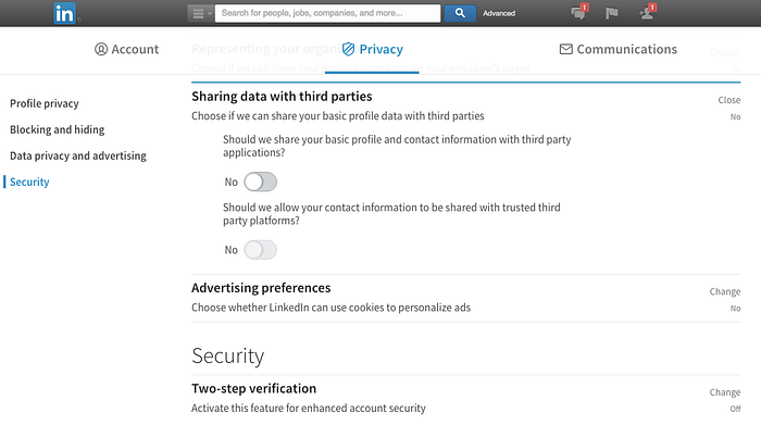
First of all, these toggle switches in the Settings page are not exactly related to the metaphor ON/OFF options, that’s why they need to put a lot of words to describe what kind of function you’re gonna operate and what’s the result you’re gonna get. A good UX design should simplify these readings and help users to make decision easily and quickly.
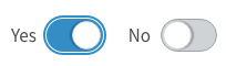
Secondly, if you notice carefully, these functions are neither related to ON/OFF(they use YES/NO instead) nor affecting the results immediately. They’re more like preference settings, not switch functions. I would suggest rewrite function wordings, make it short, easy to understand and use a stand-alone checkbox instead.
Thirdly, the text label next to the switch button is placed on the left side, it’s kind of bothering and redundant for me. Taking action right away is the most important thing in these small sessions, if the visual affordance is clear (which is not in here because of the above two issues), I think the text could be removed or just moved to the right side of the toggle switch.
The last but not least, the design is lack of some delightful interactions. :) Most of designers will think the Settings UI design is not as interesting as other charming functions. A lot of words, function settings and users won’t spend a lot of in here. But from a product design perspective, a good designer should consider every single, tiny part of the whole product. For example:
- Though toggle switch is more suitable for touch-based UI (the slider look implies the radio button could be moved), it would be a nice-to-have for providing this sliding interaction on web-based UI too.
The redesigned Linkedin UI apparently take Flat Design as the new design language, but it looks not so consistent the visual designer used shades and shadows on the radio button. The visual doesn’t look clean and sharp as other pages. Keep in mind, even the project is a team work, the design might be divided to small pieces for many designers to collaborate, but make it as a WHOLE is still important and professional.
I always think Settings page is a good design challenge for designers, it’s easy to make it just functional, but adding some seasonings would make the design more interesting! LinkedIn is a wonderful networking platform for professionals, as a designer and user, pointing out these design observation issues is not only I’m hoping it could improve these design issues but also I’m taking this chance to remind myself, not to make the same design mistakes.:)

