Member-only story
Design Guide: Top App Bar
Best Practices of Designing a Top Navigation Bar for Mobile
As per Material Design, top app bars “display information and actions relating to the current screen”. With these components usually on every page of an app, it is paramount they are designed effectively 💪.
TLDR
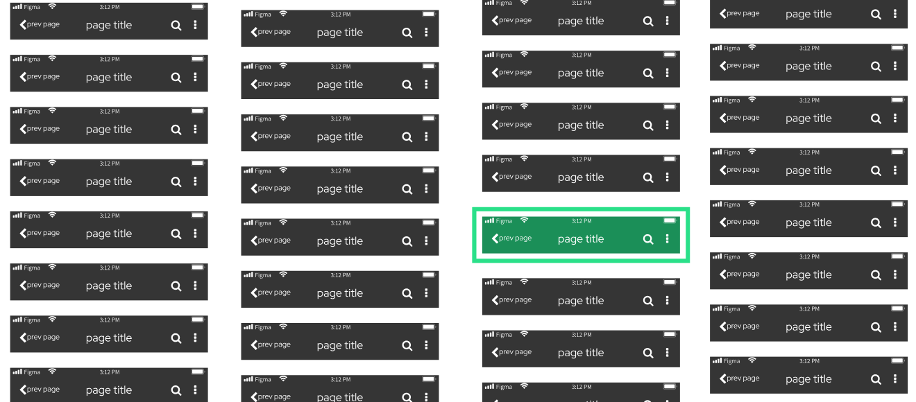
You can choose to just trust me on this and duplicate my file on Figma (referenced in the diagram below):
Or…you can read the WHY in the next section 💪
Explanation
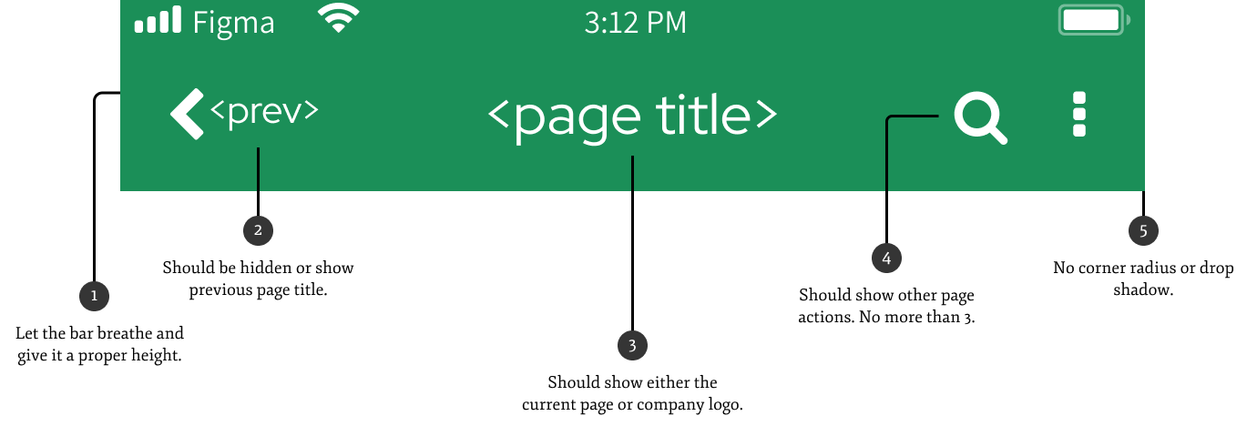
1. Let the bar breathe
The top bar contains a lot of important info and will be a mainstay throughout the user’s experience. Cluttering this area can make the whole app feel overwhelming. Therefore, give it a suitable height so that things do not look squished. In my example, the bar is 70px (the ubiquitous phone details area is 14px, so the amount of room we can play with is really 56px).

One other aspect to consider is the ease of selection at the top of mobile phones. Unless you have an iPhone 3, the top fourth of your screen is hard to reach, thus touch accuracy will be negatively affected. If the top bar is crowded, it further compounds the difficulty level 😤.

2. Back button should show previous page name
This is definitely a “nice-to-have”, but should not be too hard to implement. Plus, it’s like breadcrumbs, without the breadcrumbs, which I think is super cool 😎.


