Member-only story
Design Guide: Classifying items
How to properly design static and dynamic classification components
Labels, Tags, or Badges are all types of classification component that help to categorize, organize, and label elements. In this article, we will explore how best to use these UI components, with guiding examples from different design systems — from Shopify’s Polaris, to Google’s Material Design.
Component Terminology
Classification components go by many names, depending on who you talk to.
Label
I’d say the most generic term for a classification component would be ‘Label’, which Semantic defines as any classification content.
Badges
As seen in Shopify’s Design System, although Badges can be more specifically defined as components holding a numeric attribute, such as Apple’s app notification count:
Tags
Another term is a Tag, which is notably known as something users can uniquely add to items for SEO purposes. However, the United States Web Design System uses Tags to call attention to new or updated content.

Chips
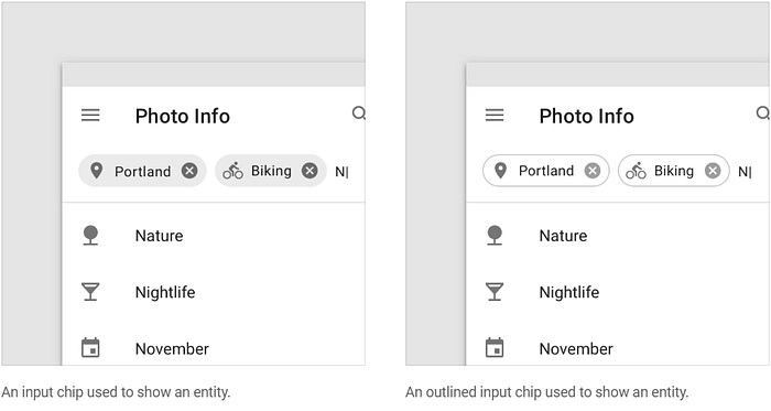
Chips were made famous by Material Design, although their Chips can also be used for selecting, filtering and inputting.

Honorable mentions
Pills, Lozenges, and Tokens. These are more defined by their shape, rather than their functionality.
Definition
For the sake of this article, I will use the term Label and will define it as:
A component that further classifies an item / element, e.g. the status of an item.

