Design for the feedback you want
A great design critique will leave you feeling motivated and focused. A less valuable one can leave you feeling frustrated and stuck. There could be many reasons why you aren’t finding your design critiques helpful. If you consistently find yourself in this scenario, maybe it’s time to rethink how you’re presenting your work.
I often see designers presenting high fidelity mockups in design critiques. The problem with this approach is people tend to get caught up in the details. Details like colour, copy, and spacing are obvious and easy to point out. If that’s what you want to discuss, then high fidelity mockups work well. But if you’re looking for feedback on the less obvious parts of your design (e.g., how it functions or how a user interacts with it) it might get overlooked.
Sharing work throughout your design process helps keep feedback focused on the most relevant problem at each stage. It also allows you to move onto the next stage confident that the foundation you’re starting from is a solid one. It takes a lot of time to work out all the details in high fidelity mock ups. I completely understand why designers would rather show off a more finished design. After all, that’s the fun part! But if you’ve spent hours pushing pixels only to get feedback that the flow doesn’t make sense, not only was that time wasted, but you might be more reluctant to change your design after all of the time you invested.
Getting feedback on: the concept, workflow, and technology
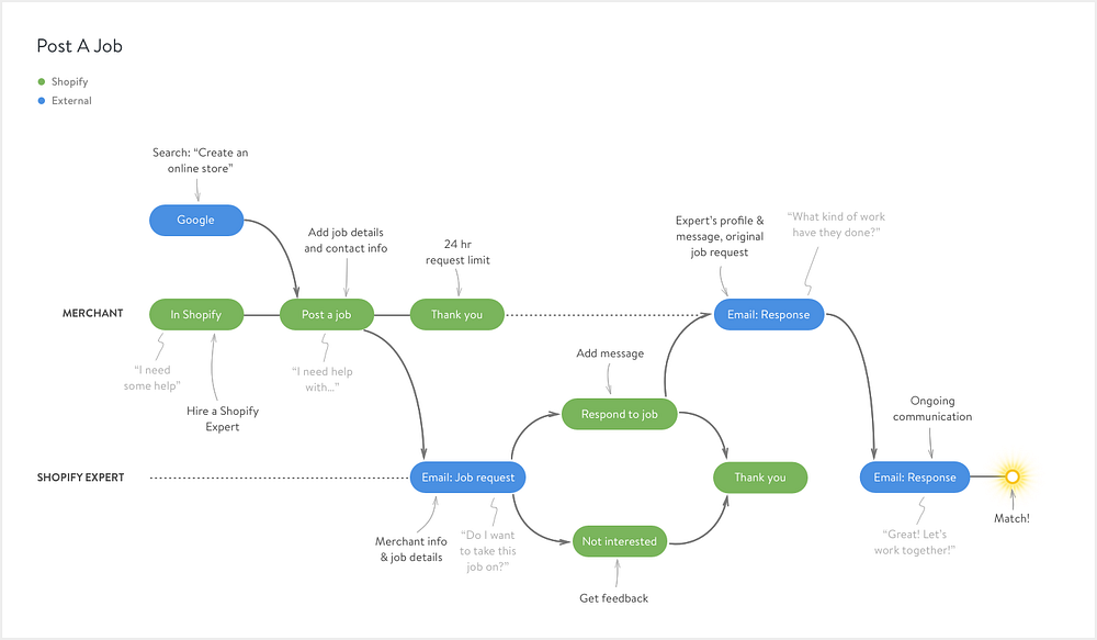
Journey maps and user stories are an important tool during the initial design stages. They’re useful for visualizing workflows, user research and the concept as a whole. Sharing this type of work with your team is a perfect way to get feedback on these points specifically.

Points for discussion:
- Does the flow make sense?
- Is it a natural progression?
- Is it possible from a technical standpoint?
- Are we missing anything?
- Can we simplify?
This type of visualization is a means to an end. You may have many working user stories, and that’s okay. Get feedback from stakeholders, engineers, data analysts, as well as other designers. They each have a unique perspective to offer on how the project can be built. Maybe there’s an easier path that you haven’t considered? Maybe the technology you’re counting on isn’t in place yet? The more feedback you can get at this stage (especially from other disciplines), the more you can be sure what you’re building makes sense.
Getting feedback on: layout, content, hierarchy, interactions, copy
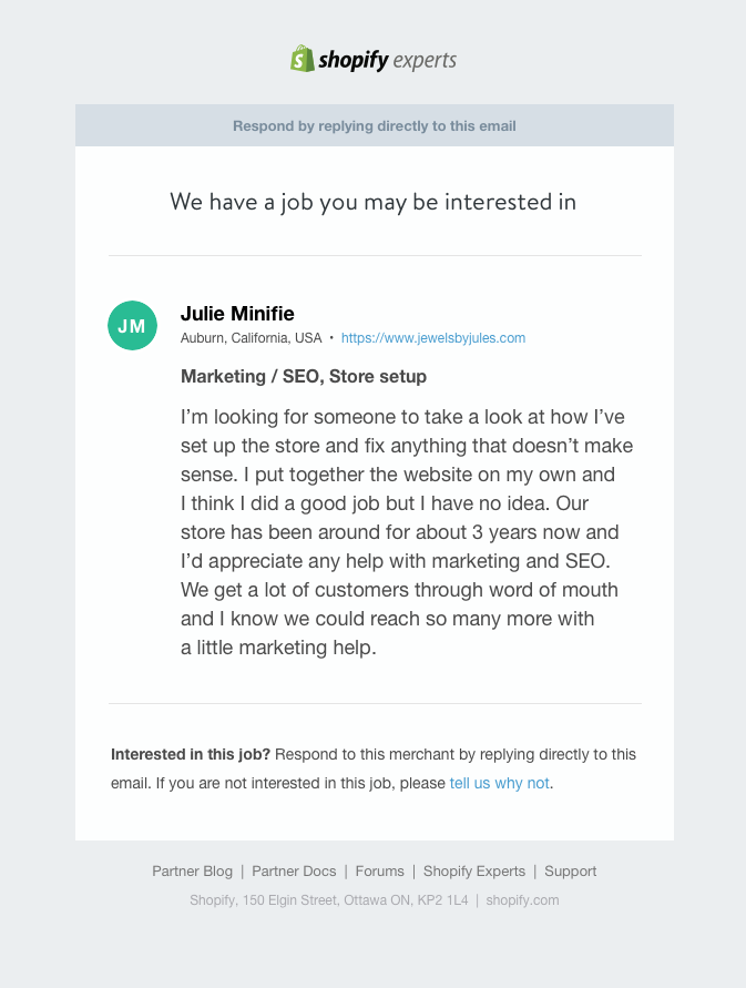
Low fidelity mockups or wireframes are useful tools to get this type of feedback. At this stage, focus on exploring the kind of content that should exist and how it should be displayed.
Keep the focus on the content and where it’s placed by designing wireframes in black and white (or grey). I prefer to get a lot of feedback on the copy at this stage and replace any images with plain shapes to size. Balsamiq, whiteboarding, and thumbnail sketches are all great wireframing tools. Try to keep it as simple as possible so there can’t be debates around things like colour and typography.
If you need to work within the constraints of a design system, then it might be easier to use your own wireframe solution. I find it helpful to use a greyscale version of the Shopify style guide when designing features. For example, I know buttons are always going to be 36px high and have a padding of 15px. This is a constant I can take advantage of because I can be sure of how much space I have to work with in my wireframes. You don’t need to worry about spacing at this stage, but by taking advantage of the constraints you do know now, you can make things easier in the next stage.

Points for discussion:
- What type of content do you need?
- Where does it belong on the page?
- How important is it in relation to other content on the page?
- Does the mechanism that users interact with make sense (eg. dropdown or a list, modal or a card, etc.)?
Getting feedback on: colour, spacing, typography, visual details, *copy
This is where details matter and high fidelity mockups are the perfect tool to enable these discussions. I’ve added “copy” again here because it’s something that will be scrutinized as soon as it can be read.

Points for discussion:
- Are elements aligned with each other?
- Is there enough space between elements? Is there too much space?
- What part of the page is the eye drawn to? Is that important?
- Is there enough contrast between colours?
- Is it readable and accessible?
This process isn’t foolproof. It doesn’t mean you won’t get feedback on usability when you’re presenting a high fidelity mockup. But it can be a guideline that helps keep feedback laser focused on the parts that matter throughout your design process.
Priorities for presenting
Keep in mind, it’s still up to you to present your work in a way that’s easy to understand. You need to work with your audience to get what you need out of them. Your top priorities when presenting work is to:
- Set context. Briefly describe the problem you’re solving (I try to do this in 1 or 2 sentences).
- Guide focus. Keep feedback on track for what you want to discuss.
- Listen (and take notes).
Without context, people aren’t going to know what they’re looking at or how it fits into the big picture. Unless you keep the discussion on point, they aren’t going to know what you need help with and how they can help. Keep it short and simple. Don’t be afraid to point out exactly what you want their opinion on. It’s easy to debate small details, but it’s up to you to keep the conversation on track for what you’re interested in.
Having said that, it’s harder to guide focus when you’re communicating asynchronously with a tool like Invision. Conversations there aren’t organic. Writing out comments is time-consuming and feedback tends to be short. Generally, if I need clarification on a comment, I’ll follow up with that person elsewhere. Since Invision screens can be shared with anyone, others can be brought into the conversation with even less context. So, how can you keep these priorities in mind with a tool like Invision? Again, design for the feedback you want.
Getting feedback on Invision
If I’m not in-person to give context or guide focus, I add these points to the mock-ups:

At the top of the design I add the project name, the problem I’m solving and the goal. This is where I set context. I’m not sure why Invision doesn’t offer a description field for screens like they do for Boards, but it might help. After all, every screen has a purpose, and if someone is dropped into the middle of a complex flow, the purpose won’t always be clear.
On the right, I list relevant notes; functionality or decisions the team has made along the way. Finally, I list questions I have. These are things I might ask in a design critique but could also be reminders to do something I haven’t yet explored. I still ping individuals on the design but setting up my screens this way gives everyone a big picture of where I’m at and what I’m thinking. With more feedback, I move answered questions into notes and keep evolving the screen as I go. Everything is fair game here. Feedback on how it functions and the problem is just as relevant as the design itself. This is how I guide focus.
Presenting work can be similar to the process of designing products. The design is a product (even unfinished) that is being tested. The people reviewing it are your users. They’re going to scrutinize your product, use it (if they can), and try to understand how it works. Try to set them up in a way that makes that as easy as possible. Presenting your work in a way that can be easily understood can be just as important as the design itself. The advertising industry does this very well. The quality of the pitch is just as important as the product.
I used to work at an ad agency where we would frequently pitch project ideas to clients. Whenever we left a pitch, the CEO would turn to me and ask, “Well, how did it go?”. Since he was there with me, he knew exactly how it had gone. What he was looking for was feedback on the presentation itself. What worked? What fell flat? What do we need to refine and perfect? How did the audience react? Those mini retros got me thinking about the process of presenting work. And the responsibility we have as designers to get what we need out of those conversations.
Keep working at your pitch. Refine your process, look for the parts that break in your presentation. What points aren’t hitting home? Why aren’t they? What can you change to get the feedback you need? Do you need to educate the audience? Is it your communication style? Is it the tool you’re using? Keep digging and reworking.
These are some basic tips I’ve learned over time that’s helped me get quality feedback. What are some tips you’ve learned? How do you present your designs? Is there anything you’ve found that works well?

