Design for Programmers
Original article is posted on loveux.co.
Design is not as elusive as people think it is. It is a learnable skill. Design has rules that anyone can apply to their work. If you are an engineer working on an application or a business guy putting together a slide deck, there are a few tricks you can learn. I will show how to apply three base principles of design: grids, typography and color theory.

Design Primer
There are three components to designing anything:
- Esthetics
- Empathy
- Means of production
Disclaimer: I am a product designer, so I will use product design as a reference point, but you can use the same principles for anything else.
Esthetics is fueled by traditional principles of visual design. The core components of the visual design are grid systems, typography, color theory, and motion. Esthetics is not just “making things pop”, but a visual language. It is a skill to communicate through visuals.
Empathy is understanding of who you are designing for. In product design, it’s called User Research or UXD. It doesn’t matter how well you are communicating if you don’t know who you are talking to or what they want to talk about. Design is never in a vacuum. It has a purpose and problem at the core.
Finally, you need to know design tools to design. Design tools span from doodling on a napkin to Processing and D3.js. I can imagine the first thing that comes to your mind is Photoshop, maybe Illustrator. Code also can be a design tool. In fact, many product designers switch to code or use hybrid, GUI/code, tools like Framer.js.
Example
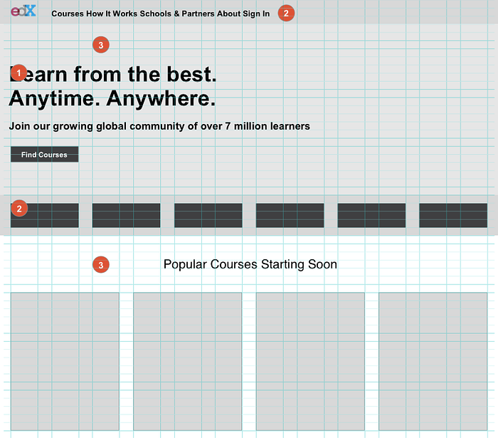
I will take a real product and apply the rules of design throughout this article. I have chosen an educational website (because I like education) that offers online courses. I will not make any structural changes, because it is outside the scope of this post.
I will apply three base principles of design to the example project: grids, typography and color theory.
My first critique is that the page looks too busy; your eyes don’t know where to look. So first, I will completely strip it off all the style and leave just the content.


Rule 1. Grids
Everything needs to be aligned. The first thing that would drastically change how you design is alignment. It means that all elements on your website, application, or slide deck sit on a grid, vertical and horizontal.
Typographic Grid
The traditional typographic grid consists of columns, gutter, modules, negative space, margins, and baseline. Some common print layouts are a manuscript, columns and blocks. The typographic grid can be as simple or as advanced as you want it to be because there is very little technical limitations.
Web Grid
Web grid tries to be just as good as typographic but is limited by the web browser capabilities. It is inspired by print but is much less sophisticated.
The choice of a grid will highly depend on the type of a project you are working on. For most projects you will need a grid system that has a bounding container for the columns. That means that the total width is a fixed number, like 960px or 68em. Using a bounding container ensures that your text is still readable on large screens. Anything from 45 to 75 characters per line is ideal for readability.
You can easily drop in a CSS grid into your project. It’s hard to think of an example where you would want to code a grid system from scratch. There is an abundance of grid frameworks out there (960, Bootstrap, Foundation). Any grid framework will provide you with a column system. The most common systems are 12, 16, or 24 columns in a container. My personal favorite is Neat.io, because it provides solid defaults, but is also easily customizable.
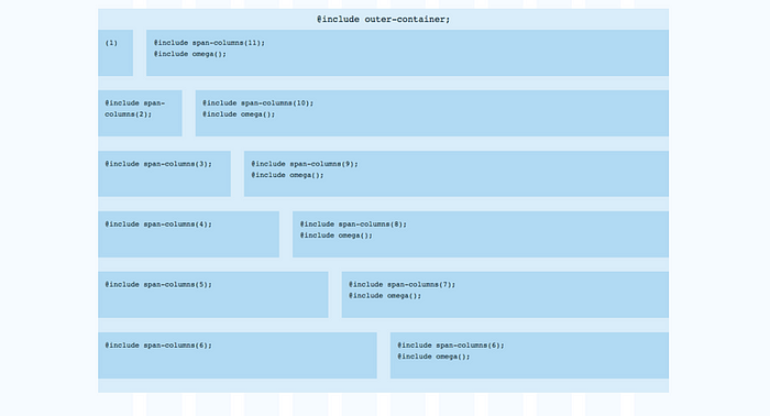
When working on web applications, you probably should consider a grid system that utilizes the entire width of the window and provides modularity. For building apps, you would want a grid system that is built for the idea of different modules that neatly take up the entire screen. Zurb Foundation for Apps is a framework built specifically for that.

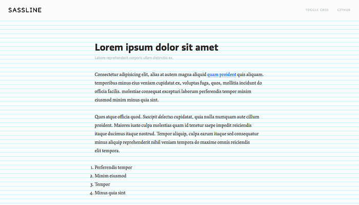
Vertical Rhythm
Now the tricky part, vertical rhythm. Vertical rhythm or baseline grid is a horizontal grid of your layout. There is no easy way to implement a baseline grid on the web. I like implementing it with a simple Sass map and then checking it with Basehold.it.
One way to achieve visual consistency in web design is to use a vertical rhythm. For a website, this would mean that no matter what font-size any text element is, its line-height is always an even multiple of a consistent unit of rhythm.
Using Sass to Build a Custom Type Scale with Vertical Rhythm
— James Steinbach
Hierarchy
Hierarchy conveys what is the most important on the page, and the flow of content. Headers are usually bigger than the paragraph text, and it draws people’s attention to headers first, and also allows them to skim the content.
Another way of drawing attention to an element, apart from blowing it up, is using negative space. Negative or white space is the padding around the element that gives it more weight.
Example
The first thing I’ve done was applying a grid to the page. Some elements like the school logos and course cards were misaligned.
- I’ve applied the baseline grid and aligned all the text to it.
- Containers like navigation and school logo section are now also aligned to the baseline grid. Also, I’ve aligned the school logos, which take two columns each.
- White or negative space around the headers gives them a higher value in the hierarchy, which makes them more noticeable.

Rule 2. Typography
Watch out for the design gang to critique your use of typography. The art of typography is more than 5 centuries old and has hundreds of books dedicated to it. Here are a few tips to avoid smirks from the creative department.
Choosing a Quality Typeface
- Styles. Look for a typeface that has versatile styles, a few weights of bold and italic. For example, Sura font doesn’t have italics, which might turn out problematic.
- Kerning (spacing between characters). You cannot really fix bad kerning with CSS, so look for fonts that have neat, proportional kerning. See how some letters almost touch each other on Ecgar. This could decrease readability on smaller font-sizes.
- Glyphs. Check that the font has all the special characters. You probably don’t need anything too exotic, but definitely see that the font has a full set of typographic symbols.
- Not too gimmicky. This is more of a feel than a hard rule, but try to stay away from typefaces that have too much character until you feel comfortable with your design choices.Case in point.
- Steal. You don’t want to be too original with your typography. Look for inspiration from renowned bloggers and designers. Typewolf posts great examples and recommendation.
Pairing Fonts
- You don’t have to have two fonts. You can use different styles of just one, high-quality font. You can also stay within the same font family, like Alegreya and Alegreya Sans SC. Definitely don’t have more than two fonts in one design, unless you are 10000% sure about what you are doing.
- Don’t pair two fonts that are not distinct enough. Like Open Sans and Helvetica. Users won’t be able to tell them apart, but the overall design will feel off. When pairing fonts look for similar skeleton (e.g. x-height), but distinct features.
Example
I have chosen a modern, edgy sans-serif font Titillium paired with subtle Work Sans. Both fonts are sans-serifs. Titillium definitely has more character, which makes it a good heading font. Work Sans is a high-quality sans serif with a wide variety of styles.


Rule 3. Color
The first thing I want to say about color is that it is highly subjective. There are definitely rules behind color schemes, but our perception of color highly depends on our cultural background and experiences. You can apply the rules of color scheme creation, but don’t expect it to have 100% success rate. I will first show you some trends in colors and then we will switch to a color wheel, and I’ll show you how it works.
Like any creative field, color schemes are affected my trends. Just like in fashion. Often color trends migrate from art to graphic and industrial design and then to web design. Here are a few dominant color trends.
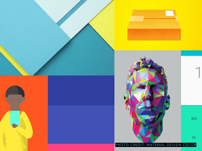
- Material Design
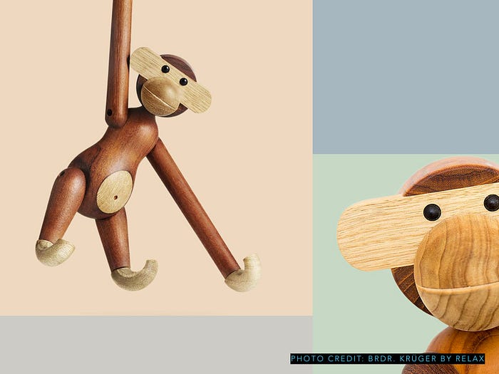
- Pastels with crisp photography
- Greyscale with one accent color
When in doubt always use a grey scale with an accent color. Purple is definitely on the rise.
Color Inspiration
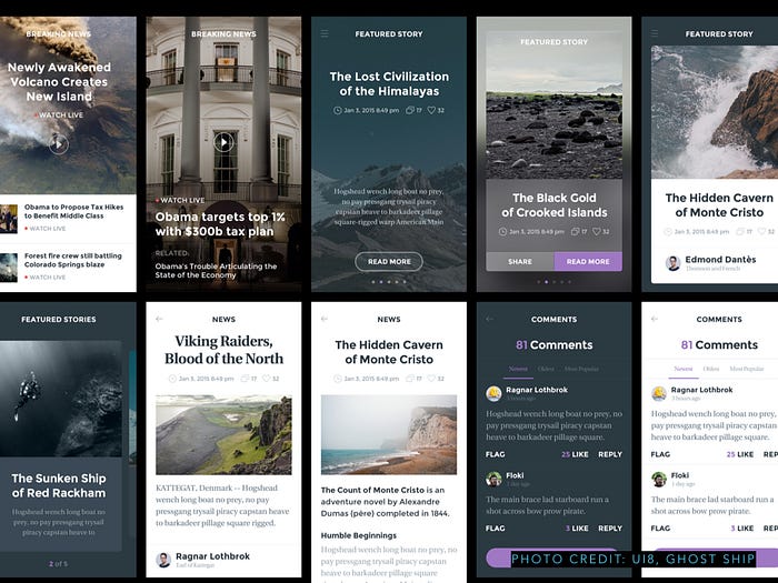
Unlike traditional graphic design, colors used on the web and mobile products are usually more reserved. You want to keep usability in mind, and choose high contrast schemes and use colors as part of the visual language. For example, you will probably have one or more accent colors that mean that an element is actionable. You don’t want to confuse the user by using the same color on actionable (e.g. buttons) and static (e.g. text) elements.
- Check out Awwwards for some distilled color inspiration for UI (keep project orientation in mind)
- Pantone color of the year, color books, Pantone nerd blogs
- Take photos of cool stuff, especially industrial design, and analyze with Adobe Color
Color Schemes
Shades / Monochromatic. To create a monochromatic scheme you need to pick one hue and create 4 or 5 swatches of different brightness (B in HSB).
Monochromatic schemes are great for base colors for text and supportive elements like borders, backgrounds, shadows, etc.
- You would want to have the lightest color have the brightness of ~95% and the darkest ~20%.
- You never want to have your text be an absolute black or #000. 20% dark grey on a white background is much easier on the eyes, thus easier to read.
- Try adding a slight blue hue to your greys to achieve a more modern, cold grey colors.
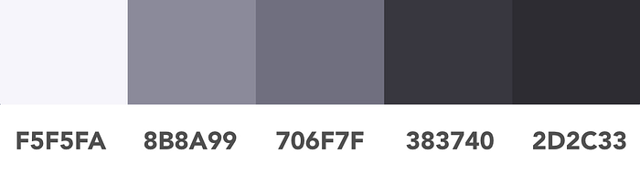
$grey-colors: (
  x-light   : #F5F5FA, //HSB 244,2,98
  light     : #B9B8CC, //HSB 244,2,80
  medium    : #706F7F, //HSB 244,2,50
  dark      : #383740, //HSB 244,2,25
  x-dark    : #2D2C33  //HSB 244,2,20
);
Analogous schemes are the most popular in product design today. To create an analogous scheme, you want to take two colors of a similar hue, and use them with not necessarily contrasting, but noticeably different brightness.
To create this Mint Navy scheme, I’m using the hue of 161 and 209 and brightness of 88 and 50. So not too far apart, but still noticeably different. Then I am complimenting the scheme with two grey colors that use the same hue as the navy color.
You can try the same formula on other colors.
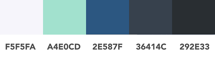
$analogous-scheme: (
  primary   : #51E0B3, //HSB 161,64,88
  secondary : #2E587F, //HSB 209,64,50
  light     : #F5F5FA, //HSB 240,2,98
  dark      : #36414C, //HSB 209,30,30
  x-dark    : #292E33  //HSB 209,20,20
);
Complementary schemes use two colors on the opposite sides of the spectrum (think IKEA). As you can imagine, complementary schemes in their pure forms look outdated and aren’t as popular anymore.
You can try creating a complementary scheme with an interesting twist like the one in Slack design. You are still going to take two colors that are opposites in their hue, but then also make them contrasting in saturation and brightness. You can see that Slack is using a deep, muted aubergine color with bright green.
I’ve created a bit milder theme, where the green is not so bright.
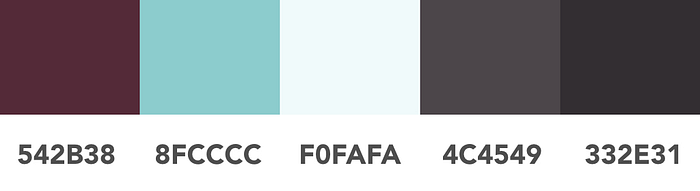
$complementary-scheme: (
  primary   : #8FCCCC, //HSB 180,30,80
  secondary : #542B38, //HSB 341,49,33
  light     : #F0FAFA, //HSB 180,4,98
  dark      : #4C4549, //HSB 327,10,30
  x-dark    : #332E31  //HSB 327,10,20
);
Triad schemes are tricky to create because they use three different color hues. Just as with complimentary schemes, to create a modern-looking triad scheme alternate saturation and brightness.
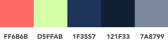
$triad-scheme: (
  primary   : #1F3557, //HSB 216,64,34
  secondary : #D5FFAB, //HSB 90,33,100
  terciary  : #FF6B6B, //HSB 360,58,100
  medium    : #7A8799, //HSB 216,20,60
  dark      : #121F33  //HSB 216,64,20
);
Gradients
Gradients are very popular in modern design. Gradients were re-introduced in its new, “flat” version at the release of iOS7. There are two major trends in creating gradients.
Subtle gradients use two or three very similar colors. Subtle gradients are based on analogues color schemes. When creating a subtle gradient, pick colors that are almost identical in saturation and brightness and are also very close in hue. The difference in hue should be as little as 10 or 15. You can also try adding a slight angle to the gradient.
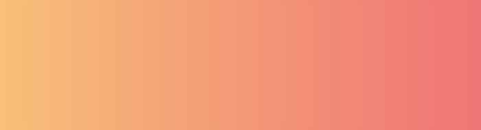
.subtle-gradient {
    background: #FF5F6D; /* fallback for old browsers */
    background: -webkit-linear-gradient(to left, #FF5F6D , #FFC371); /* Chrome 10-25, Safari 5.1-6 */
    background: linear-gradient(to left, #FF5F6D , #FFC371); /* W3C, IE 10+/ Edge, Firefox 16+, Chrome 26+, Opera 12+, Safari 7+ */
}
Accent gradients are the new kid on the block. Accent gradients are based on triad or complementary patterns. There is still no solid opinion on whether the use of such dramatic gradients is genius or kitsch. So use with caution. I would highly recommend using these gradients just for small accents (hence the name), and not on any big elements.

.accent-gradient {
    background: #FF5F6D; /* fallback for old browsers */
    background: -webkit-linear-gradient(to left, #FF5F6D , #FFC371); /* Chrome 10-25, Safari 5.1-6 */
    background: linear-gradient(to left, #FF5F6D , #FFC371); /* W3C, IE 10+/ Edge, Firefox 16+, Chrome 26+, Opera 12+, Safari 7+ */
}
UIGradients is a great resource for gradient inspiration.
Example
- Color scheme. I’ve picked an analogous scheme using purple as a base color. In my process, I first picked one primary color (purple) and explored the color wheel for the matching colors. I will be using purple as the primary action color for all main links and buttons. The two shades of blue complement the overall design, and I am using them on non-actionable elements like headings and overlays.
- Accent Gradient. I am adding a bright gradient that I will be using as an accent item.


$example-scheme: (
  primary   : #71069E, //HSB 216,64,34
  secondary : #3B52B8, //HSB 90,33,100
  terciary  : #00A2D4, //HSB 360,58,100
  light     : #DDE0F0, //HSB 216,20,60
  dark      : #5D5F63  //HSB 216,64,20
);
Final Thoughts
Here are the final design and my process.
- Overall, I reduced noise on the page. The primary point of attention needs to be on the Hero section with the tagline and the call-to-action. The cacophony of colors distracted from the important elements on the page. The navigation bar is now defined by a simple white line (10% opacity). School logos are in grey color, and take the secondary place in the visual hierarchy.
- I have added a bright gradient accent that can be used throughout the design as part of the branding.
- I have switched out the main photo background to an image of the night sky. In my head, it symbolizes ambition and search. Mostly, I’ve done it because the original image was too obviously a stock photo. People are very sensitive to facial expressions and can tell a fake in a split of a second.


