Design Exercise — Plume Fitness App
Project Plume — Product Design + Market Plan (timeline)
Overview
If you have ever tried losing weight, building muscle, or improving that blood work of yours, you know how frustrating and tiring it can be. You seem to be doing everything while not able to see any results at all.
Plume will help you get to the path of fitness one step at a time. Plume is a free app that will provide you with a progression based upon your set targets.
This app will use geolocation and GPS capabilities on your phone to track your metabolic activity. It would be best if you kept your phone with you at all times for it to work.
Target Users
- Who?: Office-goers, aged 22–50, live in Tier-1/2 cities, and lead a busy lifestyle while not finding time for exercise.
- What?: This app will allow users to change small parameters of their daily schedule to move the needle and get fitter without significantly changing their life priorities.
- When?: Folks who want to cultivate healthy lifestyle habits will use this app.
- How?: Mobile App.
Hypothesis
This app is largely targeted at the new generation of tech junkies who enjoy a workaholic lifestyle, leading to poor food choices. These people want to be fit and healthy but need some motivation to go to the gym.
A majority of Indians are on one or the other Android mobile; hence, this study will build this app.
Persona
I wanted to collect some data before forming a persona for this app, so I interviewed 5 people who have previously tried to get fit or are in the pursuit to do so. Based on that, the provisional persona came out something like this:
Behaviors
- Works 10–6 pm. Occasionally have to work during the weekend
- Goes for short walks 3–4 times a week
- Sleeps 5–6hrs
- Cares about his social/body image
Needs & Goals
- Want to lead a healthier life
- Doesn’t want to do strenuous exercises or lift weights
- Want to lose weight (5–10kg)
- Want to sleep longer
- Want to find a common social network to workout with
- Want to understand more about how to eat healthier
Demographics
- Age: 27
- Location: New Delhi
Focusing on a specific user helps keep his/her needs in mind and not get distracted whenever an idea for a new feature or demand pops up.
Coaches’ Interview
To understand how this app can be designed to bring about a positive change in users’ life, I interviewed 3 coaches from different CrossFit gyms. I wanted to understand what their experience with clients on a day-to-day basis is like. Also, what are the things that clients (M/F) are scared of in general and work very well?
Workout
- Working out is the easiest part. Sticking to a schedule is tough
- Female people mostly look at weight training negatively
- Most people are motivated for a month or two in the beginning
- Having a friend to workout with or daily reminder helps them to train more often
Eating / Diet
- Not binging during social gathering is tough
- Cutting down sugar when at home is quite impossible. Specially if you have kids around
- People keep on track with their diet habits for weekdays and start binging on weekends
- People often forget to drink enough water for the day. Also, most of them never got into a habit of recording / calculating it daily
Calorie Counting (using an app like MyFitnessPal)
- Recording food took too much of people’s time
- Daily macro goals were hard to reach
- Most people don’t understand the role of protein, fats and carbohydrates in diet
- People forget what to report since they didn’t record it immediately or while they were eating it
- People didn’t know how to measure food by eyeballing it
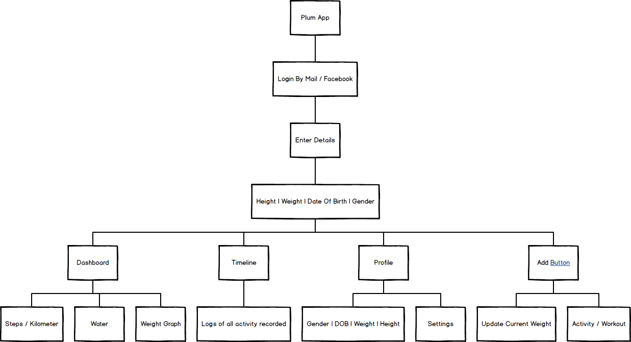
User Flowchart (IA)
Mapping the app's basic flow made me realize how a user would go through the app inside each flow. I treated this as a sitemap to finally start sketching all the screens of the app.
Wireframes/Sketches
Based on the user flow on top, I outlined the app and imagined it visually. The visual guide represented the skeletal framework of the app.
The app is basically broken down into three main parts,
- Dashboard — This page helps the user keep track of weekly progress. The cards here are divided into three main categories — Move. Hydrate. Eat.
- Move — Steps, Video Workout Cards
- Hydrate — Graph of water consumed
- Eat — Checklist of things to eat every day.
- Timeline — This page behaves like a long list of things that get logged by the user manually or automatically through the device
- Profile — This shows the user’s general data (like height, weight, DOB) and targets weight to reach. If anything changes here, everything in the app changes with it.

Main User Journey
The app's main usage will be the daily tracking of steps taken, water consumed, and food is eaten. Those main trackers will, in turn, move the needle in the weight category.
Every time the user comes onto the app, he/she is greeted with a calories progress dial.
Accompanied below, there would be a summary of a step taken, water consumed and distance walked.
The dashboard takes a feed role, which also introduces new movements like pushups, squats, and single-under. Once the user learns these, they are then presented in the form of a 5–10min workout that the user can perform in their spare time.
User Interface
The UI has a simplistic monotone nature, with relevant stats and pictures/videos taking higher focus.
The use of a 3-tab structure decreases the complexity and enables the addition of new features easily into the product.
The main HEX code that the app uses is #385BE0. Everything else is muted towards grey.

Why choose Plume?
After having interviews with gym coaches as well as actual users who were aiming to get fit, one thing was clear: eating and hydrating enough were the main pain points. I knew if I could solve these, 80% of what we call general fitness can be achieved. I broke down the card in my dashboard panel into three parts:

Move | Hydrate | Eat
Move
- It was important to get the heart rate up, but it was more important to make the users get up from their seats and move
- 10K steps are the starting target to be achieved. But as the weight drops, this won’t be enough to see any rapid changes
- Steps will get changed to jump rope & then to Squats & so on…
- The move module changes its workout to jump-start users’ metabolic rate further and further.
Hydrate
- Users will be sent a push notification to drink a glass of water or more every hour.
- The more they drink, the more they have to urinate, and the more they have to walk.
- In turn, the hydrate module supports the move module in increasing the number of steps walked by the user.
Eat
- Eating / Dieting is an important part of achieving any fitness goals, and from the research, it was the most important part of them all. Most apps ask users to log the foods consumed for the day after they have consumed them. This becomes a pitfall for the user.
- Plume allows users to select foods that are available in his/her region and, based on that, calculates the food quantities and macros that should be consumed by them. For example, maybe cottage cheese (paneer) and not blue cheese are more readily available in your region. There is no point in giving users a diet full of things that aren’t even available in their region.
The initial list of foods to select from can be populated by crawling a local grocery website on the web. This will make a list very relevant for the user (the location should be turned ON for this to work).
Once a user selects all the food available, a 7-day raw items + recipe chart is shared. The recipes are shuffled every few weeks to keep things interesting but keeping the raw ingredients the same.
Logic Highlights
- New users can easily get deterred by either seeing slow progress or too many things to care for. Hence, everything should be a progression.
Move — Increase workout complexity as weeks go by and weight/fat starts dropping.
Hydrate — Divide bodyweight in KGs by 3 to get the target water intake in MLS. Increase this target by 350ml based upon steps taken.
- Give users a different workout after a few weeks of following the same thing. Keep things intense and interesting on their end.
- Hydration should fuel more walking. Not the other way around. The app’s move+hydrate module is built around this hack.
- Don’t manipulate the user’s surroundings to fit a diet. Fit the diet to a user’s surroundings.
Market Timeline Plan
Phase 1:
Scoping and Requirements (platform, screen sizes, features)
2–3 Weeks
Phase 2:
Design (branding, font, wireframes, UI, interaction, visuals)
6–7 Weeks
Phase 3:
Development & Testing (android app, backend, tech architecture, integration, manual testing, user testing)
Recruit Alpha Testers: 1 week
+14–15 Weeks
Phase 4:
Beta Testing & Deployment (more hidden bugs)
Recruit Alpha Testers: 1 week
2 Week
— — —
Total
26–27 Weeks (6–7 months)
Give me a shout!
Thank you for reading this far! 😁 Let me know if you have any questions or comments on my design — or — If you’d like to have a chat about anything design-related, I’d love to hear from you!
Before you go…
👨🏻💻 Connect with me on LinkedIn, Twitter, and YouTube (Subscribe).
💭 Comment your thoughts, feedback, anything!
👋 Alternatively, you can also book a design mentorship session by sending a request on Calendly. If you want to learn more about design, check out my short 2–3 minute design education videos on AntWak.