Design a pleasant user experience inside the VR

In a previous topic I’ve talked about the experiences and the technology behind virtual reality. How the user interactions differ from the “traditional” way. In this article, I wish to go deeper into the matrix, so the goal is to leave the physical body behind and focus on what’s inside.
In the traditional way when designing for flat surfaces, UX designers had to visualize a canvas in front of them. Now with VR in the picture, the traditional UI elements won’t work the same way the used to. In other words, you need to re-adjust to the ever changing world of UX.
This article will show you:
- how to design using curves
- how to manipulate the field
- how can you use the depth and sounds to your advantage
- how to deal with a moving interface
Let’s begin.
Design for curves:
Rectangles, flat surfaces the blessing of simplicity. Now from inside the virtual world, this all seems to be a luxury. If you try to force this type of design on a world of spheres where the user is in the center, you will fail to provide a pleasant and convenient user experience. Imagine a laptop in front of you. You have a clean view overall since it’s in your focus.
Now, what happens when you expand this into the virtual world?

In one way or another, the edges of flat surfaces will fall out of the user’s field of view, resulting in something blurry and overall hard to see. Since the distance is out of the “comfort zone”, designers have to solve this problem somehow. The first step is to re-imagine flat designs as a sphere.
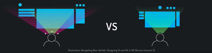
Take a look at this simple yet effective curved design concept for the Samsung Gear VR.
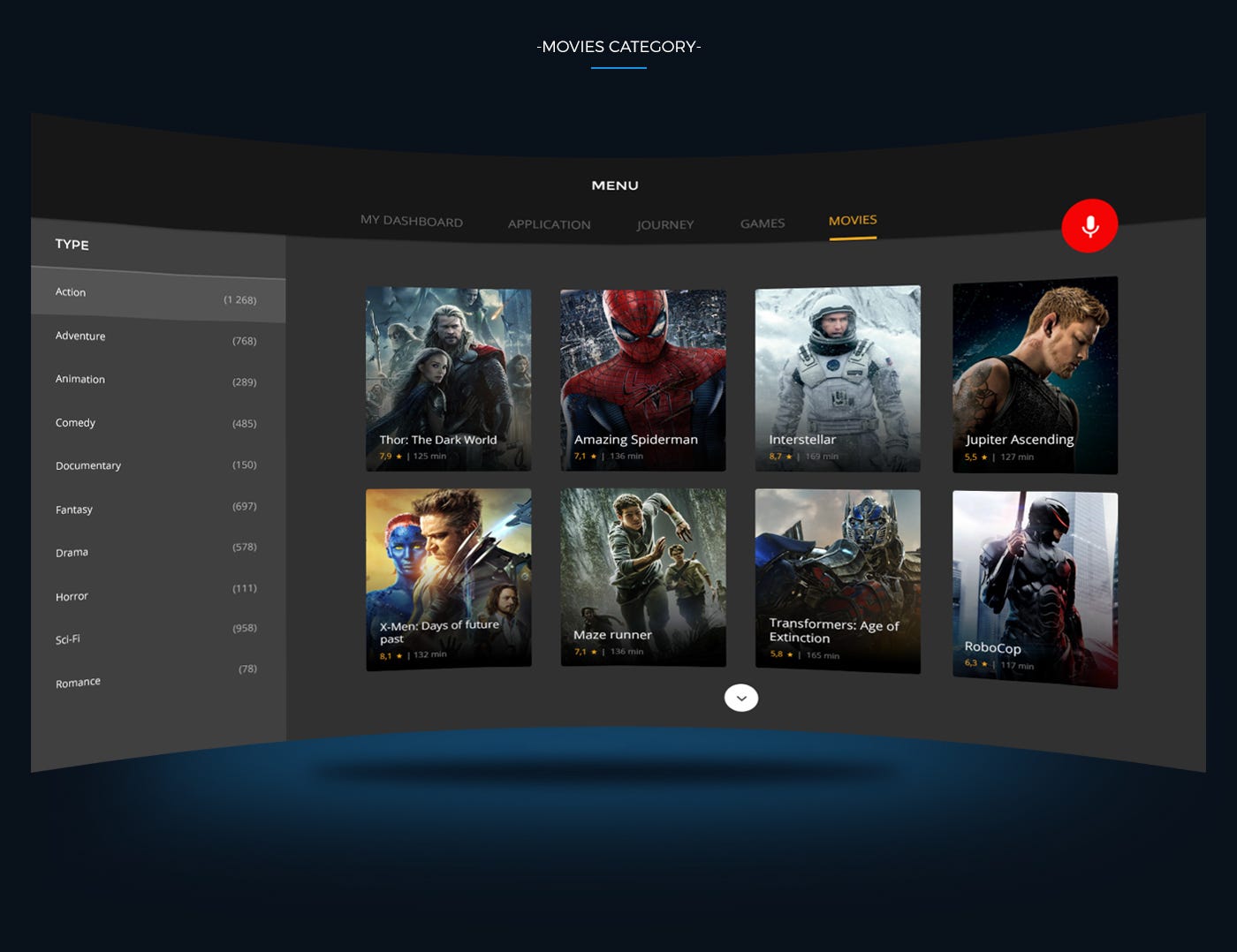
Another possible solution
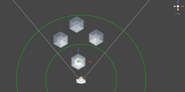
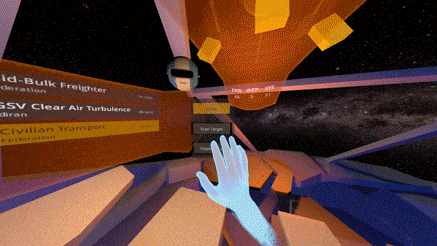
No need to overthink this. First, go and decide what are the core elements of the UI that are essential for the user experience. Then make sure that the user has a clean access to them. In other words, simply avoid placing important UI elements in the periphery field of view. Take a look at the image below

If the product would be a first person shooter game for an example, this would mean that key elements such as health, stamina ammunition indicators should be within 30° in front of the user. Secondary elements like radar or map could be somewhere in the mid-peripheral field of view between 30°-60°.
Let’s face it we are used to canvases and rectangle shapes when designing for the web or mobile devices, but just like, in reality, this would eventually force the user to tilt too much.
Care for proximity
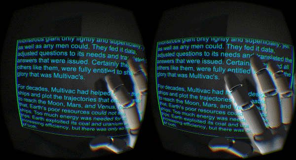
Even people with eagle eyes see images blurry when they’re out of the optimal focus range. Just hold up an object or simply your hand and move it towards your face. After a certain distance, it will be so blurry that you’ll instinctively try to compensate this by leaning back. Now this works in real life but in VR you have nowhere to backup if a poorly placed fix UI element is too close to your eyes. Sure you can adjust the lenses but that’s not so convenient when you can see other elements just fine.
Now moving objects too far away would do the same. So once again just like with the peripheral view, designers face the challenge. When designing core UI elements it is advised to place those in close proximity since the users can feel the distance better between objects that are closer.
Proper usage of Anchor objects
In my previous article, I’ve mentioned the success of virtual nose implementation in the battle versus motion sickness. However, that’s not all that you can do. Why don’t you get motion sick when you sit on the bus for an example? The whole environment is moving around you.
BUT, you have anchor objects around you such as the seats in front of you, the frame of the bus. Or when driving you have the dash.
Navigation assistance through Sound
The goal of VR technology is not simply just putting the user in a chair with a visor on the head.
I think of it like emerging people in a pool of awesomeness.
Sound plays a significant role in this by creating a perfect ambiance, that supports the user fitting in. Like when you drop a coin into a deep well. You can’t see the bottom but have a clue how deep can it be. But not only that. It also helps to determine the zone of influence. Take a look at the example video below.
Even if you’d close your eyes you could tell if you’re on target or not because of the auditory feedback. For example, it can help if you try to set a scale on the UI or just browse through content.
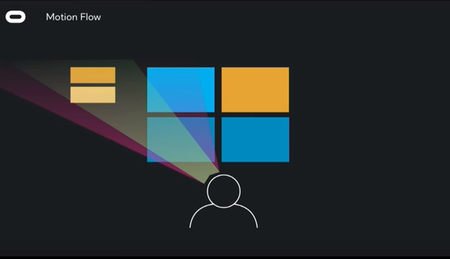
Motion flow and moving UI
Let’s say you want to guide the user through a training process but not intend to disturb the experience of discovery. Well, this is why the practice of motion flow exists in the first place. Make things happen with a press of the button or looking at a certain UI element for enough time, giving the user a feeling that something is going to happen soon that will require a slight adjustment in the viewing angle or require some motion.
Just remember never to force users into inconvenient movement, because in one way or another that will lead to motion sickness.
With a moving interface, you can do the same trick just as good. The main difference is that it’s basically the opposite of motion flow. In the case of “less important” mechanics, elements it is a better practice to just move them in front of the user when they’re needed and get rid of them when they’re not.
“If the user will not go to the mountain, the mountain must come to the user.”
Conclusion:
VR is a multi-sense experience that is affected both by the external and the internal world at the same time. It’s just as important to focus on what’s happening inside and making it convenient and safe as possible as in the “outside world”. Designers have to re-think the way they look at practices since this playground is not just about canvases and rectangles. So be prepared to design for spheres and curves! Caring for proximity and using anchor objects will make the overall experience much more natural. Ambient sound can really help emerging and also function as guidance. Sometimes it’s better to move the interface towards the user when motion flow is not necessary, but when it’s needed to be sure not to force the user on any sudden or inconvenient movement.
Please write a comment, your feedback means a lot to me! Also sharing and recommending is a big motivation. I appreciate every help! ❤