
Introduction
Introduction
Note: I want to express my gratitude to the Depop team for creating such an incredible product. All of this work has been done only from my desire to improve my design skills by improving the product I’m in love with.
(And sorry for my English, It’s not my native language, yet).
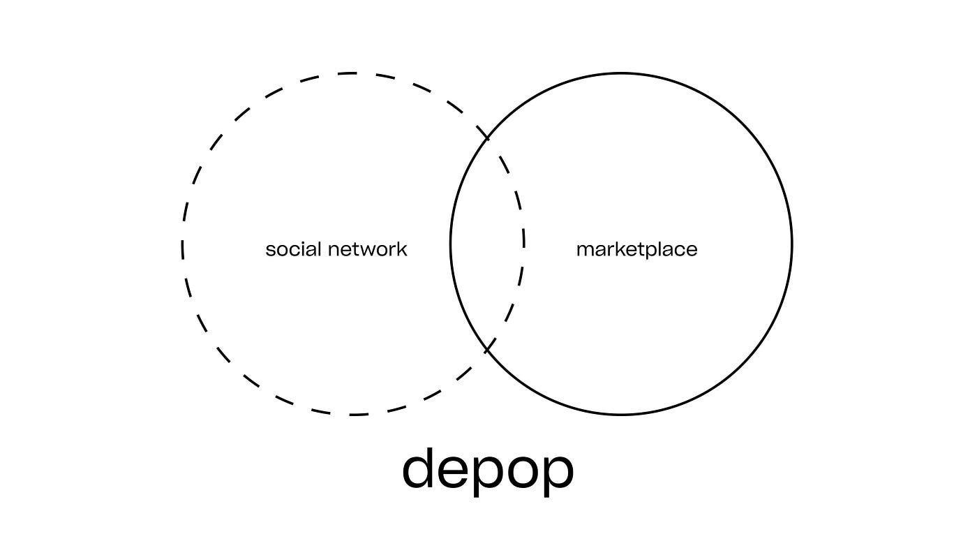
Depop is unique. Mostly because it is trying to rethink the usual way of marketplaces by focusing not only on the items but on the communication between people. People come here not only to buy great clothes but to become part of something bigger than they are.
The Challenge
To identify the main points I have to improve, I analyzed the current IOS app from the position of its regular user. Then I talked to many my friends, who frequently use it too. Then I briefly described main scenarios across the app:

Eventually, I found out that good search flow is crucial. The more and faster desired items buyers will be able to find, the more deals will sellers make, so everyone will be satisfied. Besides, the Depop doesn’t work as a typical marketplace, most items are unique, that’s why it needs to rethink search mechanics to let people find them.
Thus my challenge was to:
Rethink search flow to allow users find tones of high-relevant content and fast navigate on it
Suggested solutions
1. Tab Bar Improvement
There's no need in the app to create a custom account for sellers. Depop supporting the idea, that everybody can sell. The new “add” button clarifies this for users and not confusing them, suggesting “to take a shot”.

2. Selling section

Currently, one-page-form-fill has a number of weaknesses:
1)It’s tricky for the seller to keep in mind all the different aspects of items;
2)Even if he decides to make a detailed description, It’s time-consuming to write the same words like ‘size’, ‘brand’, etc. over and over.
solution:


- Step-by-step form filling
It allows sellers to stay more focused and to create quite comprehensive items cards without wasting a bunch of time. - Category first
I discovered sizes go hand in hand with a category in which the clothes belong. Therefore it’s possible to simplify picking-size-process for sellers by letting them pick a category first. - Several sizes and sizes systems
Allow sellers to pick several sizes because clothes don’t always match with one certain size.
showcase
3. Items cards

theory:
Item card Architecture For creating perfect cards solution,
I decided to make a little research first and find out what information is the most important for users while they making the decision of buying:

solutions:
- Main information first
Putting the ‘1st level info’ first is allowing buyers to skim the card and make a fast assessment of products - Folded description
People usually read a description only if they feel good with the main info, in all other cases— there is no reason to scroll it. Folded description a is a perfect solution for this case, it saves people time and speeds up searching flow. - Tell the shipping price.
- Simplify buttons
People usually use ‘Comment’ and ‘Message’ for the same goal — to ask more questions. However, if the seller constantly getting the same question, he would answer on it in the description.
showcase


4. Likes concept

solution
- Join Likes and Favourites
Let’s be honest, these two tools do almost the same job. Therefore, I decided to combine them in order not to overload the user with an abundance of options.
Now, in likes section users can create thematic collections, secret board, wish-lists and share them.
Solving search problem
As I said, searching— is the most crucial moment in the app, in my view:
The more and faster desired items buyers will be able to find, the more deals will sellers make, so everyone will be satisfied.
5. ‘Getting started’
Everything starts here, It’s the first place, where the app can learn people’s preferences.
showcase
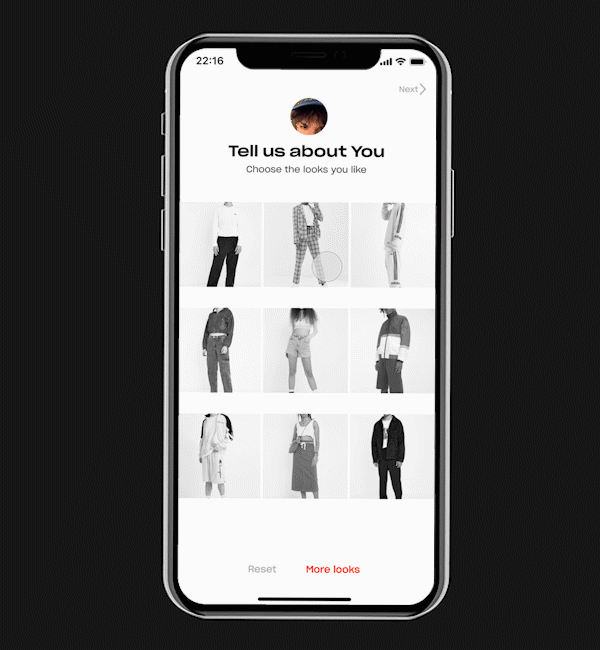
solutions:
- Use ‘taggs’
People easily identify by photos, whether they like those styles or no. Each photo contains several ‘taggs’. - Set up a search section at once.
As a result, all selected ‘taggs’ will immediately appear in the ‘Made for you’ search section. - Remember user size
6. Search section
solutions:
- Top Shops
Now the likes tool works equally good for sellers and buyers and the most liked shops will appear at the top of the search section. - Everything about the user
The new Search screen is divided on certain user preferences selected in ‘getting started’ screen or based on recent activity - Don’t show sold things
It is disappointing when you find a thing you like and find out later that it’s sold.
7. Direct search

Imagine the situation, you exactly know, what clothes you want to buy, and you are just making a request for it:

- ‘Taggs’ everywhere
Most frequently used ‘taggs’ with your request will instantly appear right above the founded clothes to help you navigate on it - Summation
You can sum two or more these ‘taggs’ to clarify your request
8. JTBD Search

And now, imagine the another situation: You probably like the clothes you found with a direct search, but…you’re not really sure. Then, you decides to go with a ‘Suggested by taggs’ tool. Making the taggs summation by key features, you going with a new request, but you still searching what you want.


And that’s where the miracle happens, You found what you exactly needed!
explanation:
The idea of this search based on the Jobs-to-be-done framework and the idea of direct/indirect/second competitors
the Depop doesn’t work as a typical marketplace, the most items are unique, that’s why it needs to rethink search mechanics to let people find them.

For example, I’m looking for something to keep my body warm in the autumn. In this case Tommy sherpa jacket would be as good as the fleece jacket. However, what if I’m looking for something to just look nice? In this case, the bucket hat could be a competitor to a fleece jacket.
9. Passive Search
But what if the desired item has not yet appeared in the app?

For example, you look for a certain thing in a certain period of time, however the desired thing has not yet appeared in the app, and you wish to catch it as soon it happens. In this case, you act in the following way:
After refreshing search screen, you will see updates by your recent searches, selecting the certain one,


And the miracle again! You can follow ‘taggs’ combinations you like and new items by them will appear in your home section.

or, if you’re too busy to check the home screen each time, you can turn on push-notifications. And Depop will immediately notify you when there will appear interested things.
Video
Conclusion
All of the UX-improvements are based on my personal experience of using the product and on communicating with a lot of people who also use it. Of course, all of the improvements should be tested in the real-world with real people and It will refine and validate suggested solutions.
Thank you very much for reading! I’m open to any feedbacks ;) write your thoughts in comments or connect with me blaggaragh@gmail.com and LinkedIn

