Defining a Modular Type Scale for Web UI
Creating a type scale for web applications is as much of an art as it is a science. While choosing scales can be daunting, breaking down the each step into a systematic process eliminates guesswork and defines the scale in a harmonious way.

Type scales can work together so that they look and feel coordinated. The term Modular Scale refers to a series of harmonious type values that are both pleasing for users and scalable for feature development.
In this case study, I talk about:
- What is a harmonious scale?
- Ems, rems, pixels?! Variable fonts and dps?!
- Types of scales
- Branding and type explorations
- UI style guide for the type scale
- Lay out the base scale
- Adding type treatments
1. What is a harmonious scale?
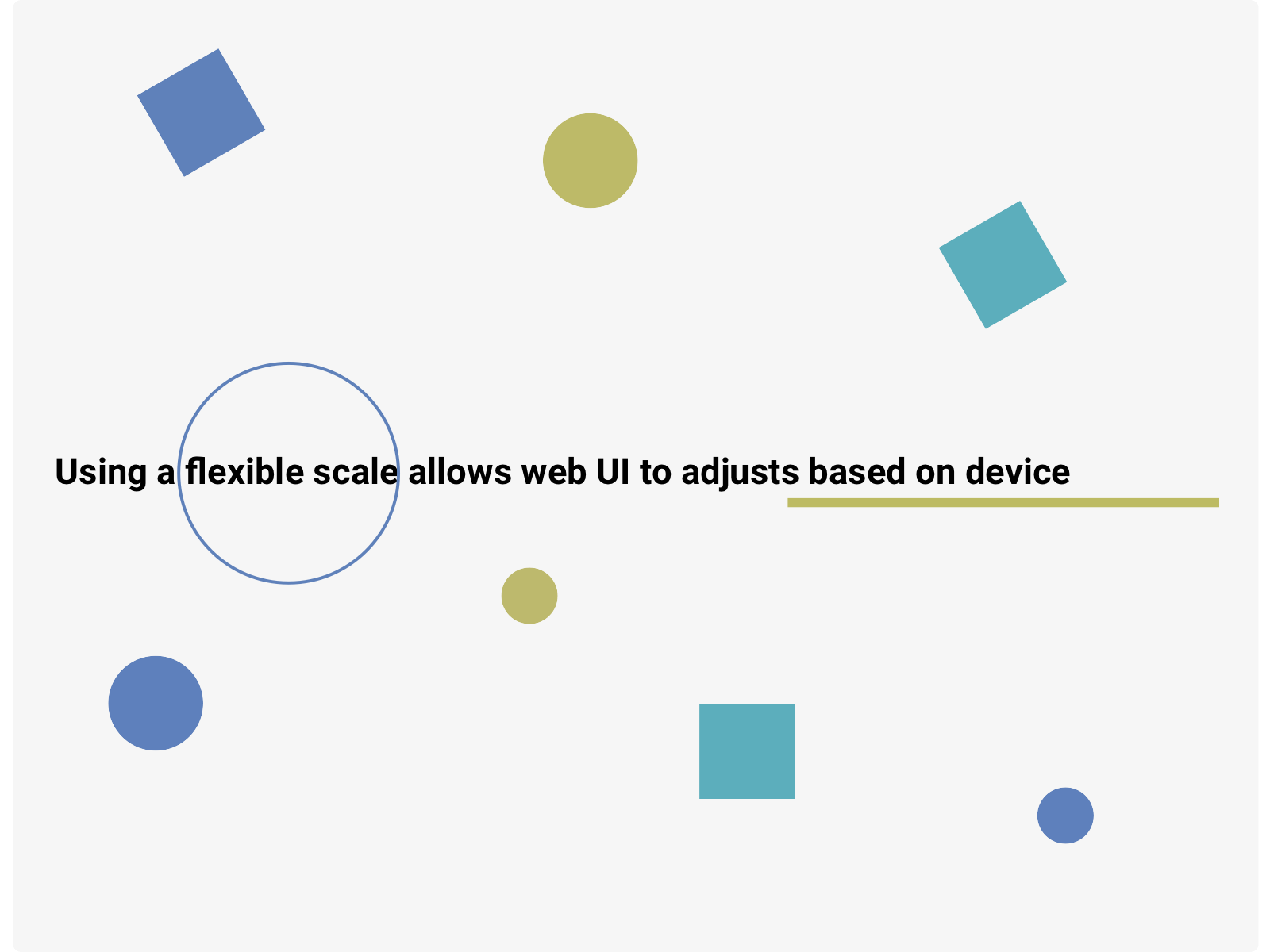
Rather than choosing a type scale based on feel or perceived hierarchy, using a scale tool can create type that works together. So what is a typographic scale? It’s a set of fixed type sizes (10px, 24px, 45px…). Any list of variable type sizes can be a scale, but a flexible scale not only fits within a design language but is responsive across device sizes.
By sticking to a scale, Designers can limit the overabundance of choice (so many typefaces and sizes!) and avoid errors when applying a size to a typeface.
(Note: try out Google Material’s Figma theme builder)
2. Ems, rems, pixels?! Variable fonts and dps?
When designing web UI, proportions or “unitless” measurements are the best approach so that the scale is flexible for different device viewports. EMs or REMs are proportion scales using for type sizing and spacing on the web. The <h1> to <h6> tags are used to define HTML headings and tell the browser the importance of each tag.
- Pixels are for designers, don’t use them to define a web app type scale.
- A REM is a unit of typography equal to the root font-size. This means
1remis always equal to the font-size defined in the<html>. Therefore, creating a scale based on a baserem(I will explain more later) will define the entire harmonious scale for the web UI. - Variable fonts are a new type treatment which launched in 2016. Designers have control over defining the rules for weight, width, style, optical size. Type blocks can adaptive to different screen sizes or compensate for dark mode implementations.
- Dps (pronounced “dips”) or densisty independent pixel is equal to one physical pixel on a screen. Dps are primarily used to defind Android pixel density.
- Sp or scalable pixels are similar to dp, but are used for fonts. Sp and dp have the same default values.
- What is the difference between sp and dp? The primary difference between an sp and a dp is that sp preserves a user’s font settings.
- What about points (pts)? The focus of this case study is web, but points are a unit of measurement for typically for iOS. One pt equals to one pixel on a standard-resolution (non-retina) screen and 2x2 pixels on a retina device. To make things easier on yourself, design at 1x so that you don’t have to scale everything.
So, for example, we take a base 1 rem = 16px we can use that as the starting point for the entire scale.
h1 { font-size: 3.5rem } /* 1rem = 16px */
h2 { font-size: 2rem } /* 1rem = 16px */
p  { font-size: 16px } /* this is the base REM */
By adjusting the base rem we can shift up or down the entire scale without having to make changes to every step.
h1 { font-size: 3.5rem } /* 1rem = 18px */
h2 { font-size: 2rem } /* 1rem = 18px */
p { font-size: 18px } /* this is the base REM */- An EM is a unit of typography, equal to the currently specified point-size. This can get messy when defining multiple type scale values since
1emcan include different values depending on where you are in the code.
h1 { font-size: 56px } /* 1em = 56px */
h2 { font-size: 46px } /* 1em = 46px */
p { font-size: 14px } /* 1em = 16px */
This isn’t very helpful for defining a flexible scale, so it’s best to stick with rem when possible.
To calculate a dp:
dp = (width in pixels*160) / screen den
h2 { font-size: 46px } /* 1em = 46px */
p { font-size: 14px } /* 1em = 16px */
3. Types of scales
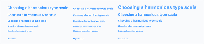
There are several that work well for web UI because of the flow between type levels. The Major Third, Major Second or Perfect Fourth scales can be a good place to start since the difference between the <h1> down the <h6> isn’t as drastic (unless that is the intent for the project). For larger, bold headlines, Golden Ratio or Perfect Fifth could be good options since there is more visual separation between the largest step down to the smallest.
(Note: Google Material uses the Major Second scale)
Scales to get started:
4. Branding and type explorations
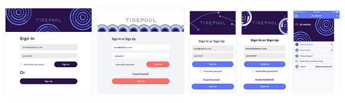
Now that we have chosen a scale, we can apply it to our project. When starting a new project, it’s helpful to lay out and test different use cases. Oftentimes, the feel of the type in use is just as important as a harmonious scale, so it is best to strike a balance. While sticking to the scale is important, it’s best not to sacrifice the design in order to adhere to a type layout.
Testing the type and scale in context within the app can provide more details on how the type will perform within the web app. Sometimes a scale can feel too heavy with the palette, so scaling down the base rem or weight will make the scale feel harmonious.
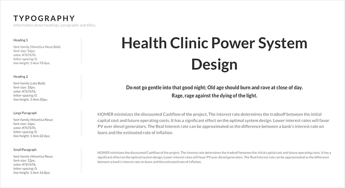
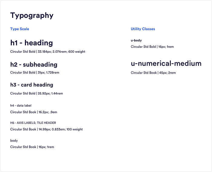
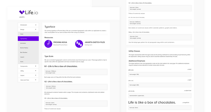
5. UI style guide for the type scale
Typically styleguides should contain the information for the design scale (pixels), rem values and weight. For example:
h1 heading33.184px; 2.074rem; 600 weight
Here, I’ve provided the type scale in both rems and pixels including the type scale and utility classes. The body is 1rem which can be adjusted to shift the scale if the headline takes up too much visual real estate, for example.
6. Lay out the base scale
Choose your base scale
Choosing the base body type defines the entire scale structure. The size depends on the weight and structure of the typeface. Typically, between 14px to 18px works well for web apps. While 14px can feel on the small side, it can improve the readability of weightier typefaces.
Creating a scale that can be flexible
This is hard because you may not know how the web UI will expand. Will there be a need to a different input or graph treatment? With the assumption that the type will change, it’s important to build flexibility into the scale.
Assign values to the scale (h1 — h6)
h1: Typically used for headings on main screens
h2: Subheadings, such as for container headers
h3: Supplementary content such as numerical values or callouts
h4: Axis labels, supporting content
h5: Supporting content, such as card containers
h6: Supporting content, such as labels
p: Body copy
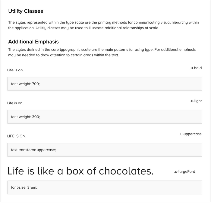
Defining utility classes
If there are additional sections that require emphasis outside of the scale, a utility class can be used in order to draw attention. Utility classes can be used for larger numerical values that don’t fit within the type scale. It’s best to use these sparingly because several areas of emphasis can be distracting for users. Keeping the type treatments within the base scale is ideal, but adding utility classes can add balance to a layout.
7. Adding type treatments
Type treatments can balance out an interface that has a varied informational hierarchy. Diverse content such as graphs, metrics and supporting copy can feel overwhelming unless it’s broken out by visual distinct type elements.
Type weights and accents
- Case: Depending on the brand, it can be impactful to use uppercase treatments for subheading or utility classes. For example, axis labels or card container headings can benefit from additional emphasis.
- Color: I’ve found that color should be use sparingly in type scales, but can have an impact with lower scale selections or utility classes. Typically the brand color works well here, but other accessible colors in the palette can add a significant brand association.
- Type accents: Accents such as a callout, underline or box can draw attention especially in graph or text-heavy interfaces. It’s again best to use sparingly.
8. Next steps
While balancing feel with a harmonious scale can help define the web UI, it also might be beneficial to gather user feedback early on. I’ve previously written about rapid usability testing using remote tools, which is a quick and easy method to gather qualitative feedback about a design.
As always, I love to hear feedback and comments. You can sign up for my newsletter: AI as a Design Partner. Please reach out with questions! Email me hello@kellydern.com or see my website www.kellydern.com

