Dear Apple: Notes text styling sucks.
Redesigning Apple’s Notes styling experience.

Hello World,
One of the tools I use frequently in my day to day life is the native Notes application. This handy app allows me to quickly write a note and then access it on any device I have synced with my Apple Account. I use this app for everything under the sun. Grocery lists, creative ideas, long rants, love notes.
If someone were to read through my Notes, they would be peeking right into my brain.
Although this magical app is one of my favourites, one aspect that has always bothered me is how difficult it is to style your notes. Mac users are usually creative visual learners, so you would think that Apple would make the styling tools more easily accessible.
I’m going to run through all the ways in which Apple creates a bad user experience for someone wanting to beautify their notes
Take a look at the image below. Here you can see multiple notes I’ve created.
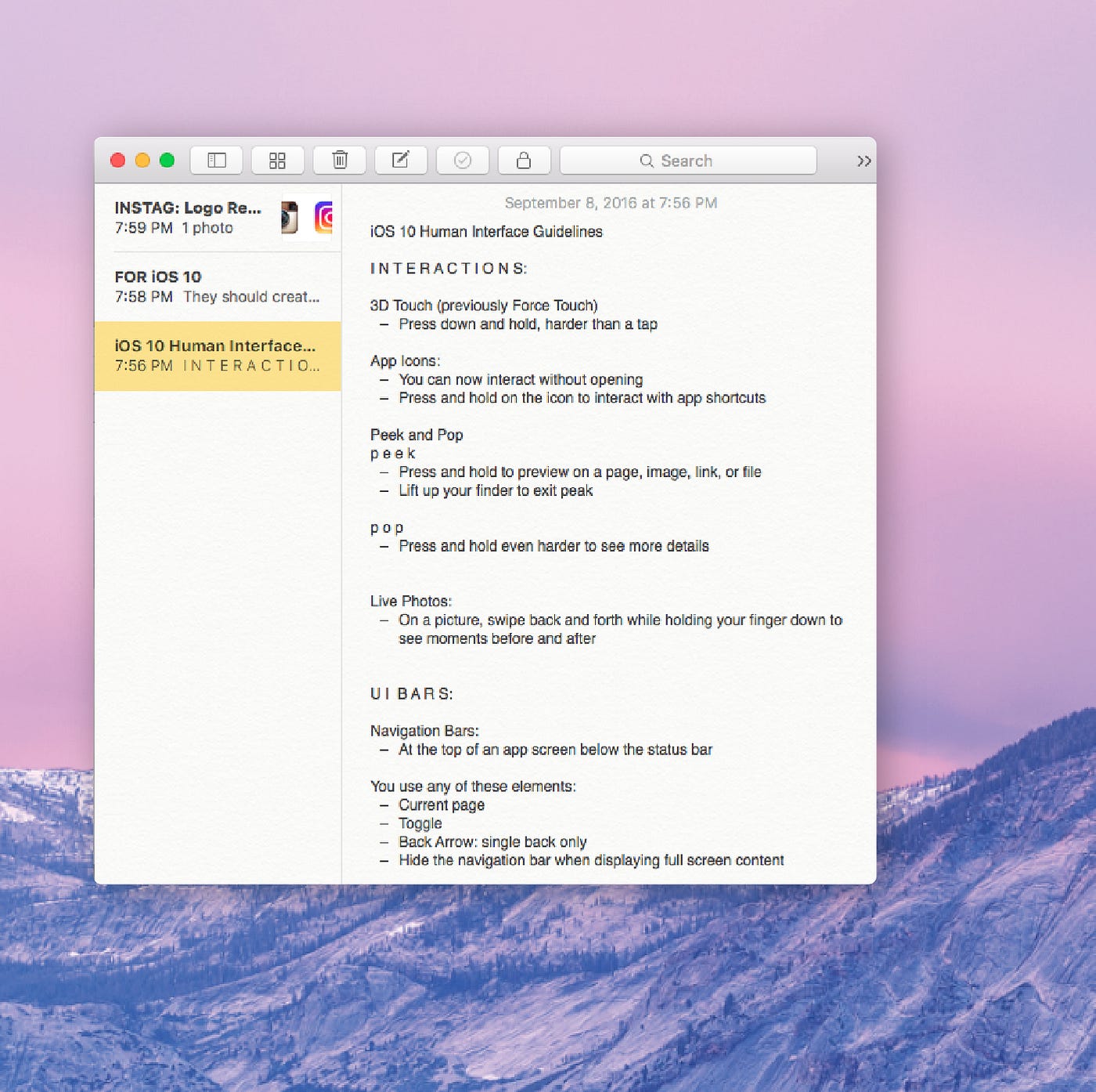
The one currently open is about the iOS 10 Human Interface Guidelines. As you can see this note has not yet been styled. I will take you through a few scenarios I often encounter and find troublesome.
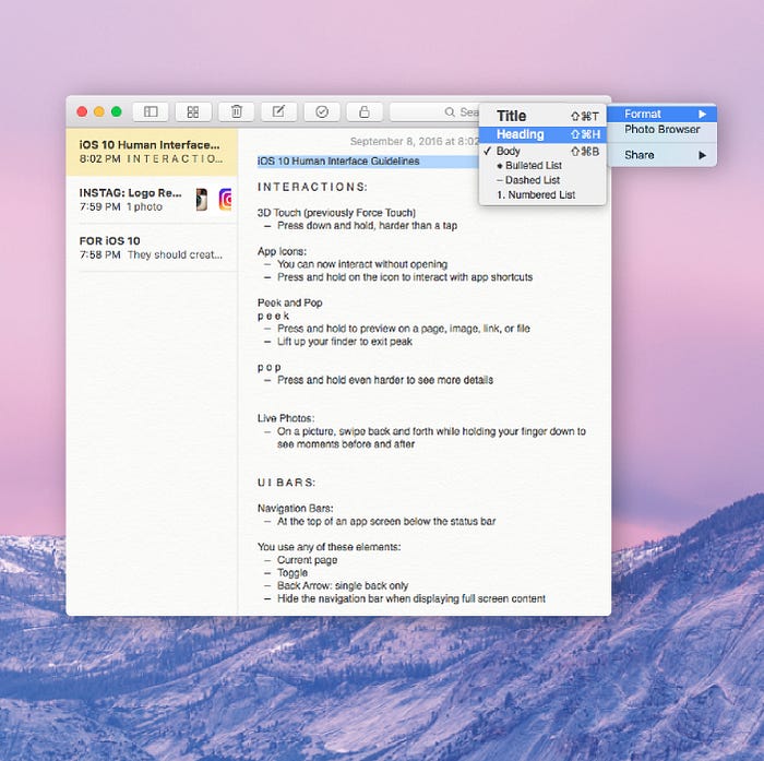
Scenario 1: Top Toolbar Styling
User Story:
I want to style Titles, Headings, Body, Dashed and Numbered Lists quickly and easily.
Problem:
Every time a user wants to style highlighted text to be either a Title, Heading, Body, or List, they have to:
- Drag curser to the top of the screen
- Click on Styling Button
- Select a style from a dropdown
This is a lot of steps… especially since its location is at the top of the screen away from where you were just clicking.

Scenario 2: Styling with a Small Window
User Story:
I like using notes as a small window so it fits beside other windows. I would like to style my Note while in a small window.
Problem:
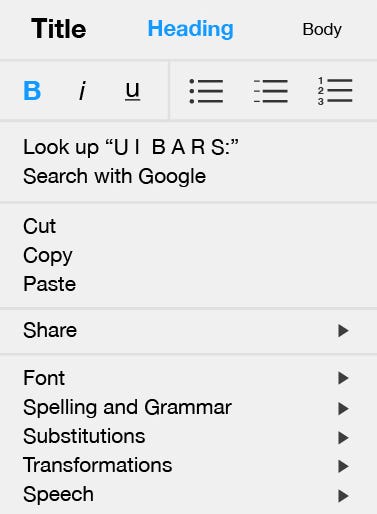
The Styling Button disappears when the Notes window is too small.
In order to style highlighted text a user would have to:
- Click the More Arrow ( >> ) on the far right end of the toolbar
- Click Format. *(In the latest version of notes, this says Style)
- Select a style
Having to click through more than one dropdown option to get when I want seems like a lot of wasted effort.
I was really hoping and almost expecting the styling options to be in the dropdown menu. But instead I found a list of options I rarely ever find useful.
🤷 Why is this Bad UX?
Both these scenarios take 3 steps to do one style!
This is an extraordinarily long time considering to style 3 lines of text it would take me a total of 11 clicks.
1 Title (3 Clicks) + 2 Headings (9 Clicks)
= 3 Styles (11 clicks)
Thats not even counting the 7 Dashed Lists (21 Clicks) if a user weren’t to use commands.
🤦Why Apple. Just why?
I was really hoping and almost expecting the styling options to be in the right click dropdown menu. But instead I found a list of options I rarely ever find useful.

✨Better UX: Styling Dropdown
I have created a dropdown menu that allows users to style highlighted text simply by right clicking. This removes one click from the current user flow and doest take the user away from where they currently are.

Some additional edits I have made
- This menu also allows you to do Bold, Italics and Underlines so all styling options can be found in one central location
- I found using the checkmark as the selected state made it look cluttered. Here I have changed the selected styles to be blue.
- Removed “Add to iTunes as a Spoken Track”. I feel as this should have been a tool in the located in the top toolbar. But this could just be my personal option.
Don’t feel bad Apple. Bad UX is everywhere.
I still love you.
Caitlin O’Bunny


