Dashboard design: 6 things every UX designer should know.

01 Show insights not just data
Designers often confuse data with insights. A user is not just concerned about reviewing his data in a beautiful way, they want to see what they can do with this data. For example, If I am creating a section of a dashboard for a recruitment firm, where the CEO is reviewing the number of people hired, A simple approach could show ‘Total applications’, ‘People hired’, ‘Application in process’ and the ‘Applications rejected’. But showing only the data would probably not help the user and the insight that would really help is to show that there has been an increase/decrease in the number of people hired as compared to the last month, along with the following scenario (if possible):
- Why did this happen?
- How can it impact the user?

02 Understand the user and the psychology
Most designers do the required research to understand the user in terms of Demographics, Competitive analysis, User personas, and all the other stuff but one of the main things to consider while designing dashboards is the user psychology.

Dashboards aren’t meant to show everything at hand upfront. Too much information can lead to something known as Analysis paralysis, a state of over-analyzing (or over-thinking) a situation so that a decision or action is never taken, in effect paralyzing the outcome. Dashboards are meant to be gateways to further information. Disclose information progressively. Show a snippet of the most important data point upfront and allow the user to drill down further if he wishes to.
Key takeaways:
- Use more icons instead of labels and headings.
- Keep the unnecessary things hidden (Use Drop-downs, Accordions, Pop-ups, Light Boxes etc).
- Do not try to guide the user too much.
03 Follow design principles — principles of interpretation.
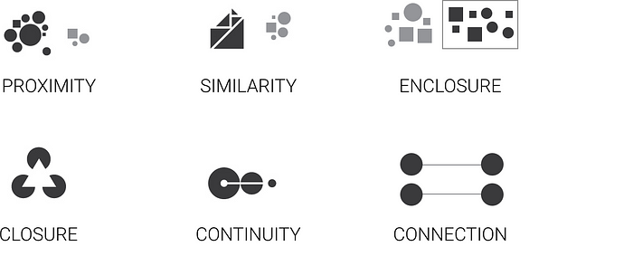
In the 1900s, the Gestalt School of Psychology studied human perception through a series of experiments. It found six principles for easy interpretation of information:
1. Proximity: Our brains can group multiple elements or forms together that are located near one another.
2. Similarity: When objects are similar in shape, size, color or orientation, our brains will correlate them even when they aren’t grouped together.
3. Enclosure: We perceive that objects are a part of a group if they’re surrounded by a border.
4. Closure: When a figure is incomplete, our brains will create regions and fill in the missing elements.
5. Continuity: We perceive aligned objects to be a continuous body or series.
6. Connection: Objects or forms connected by a line will be seen as a pair or group.
Key takeaways :
These age-old principles have been tried and tested and they surely work, hence you should try and use these principles in everything you design.
04 Visualize data the right way
Content on the dashboard has to be organized in a way that it is most accessible and useful for the users. It’s always better to go ahead with some logic or a principle that industry leaders have been following, which will increase the chances of making a better design.
A similar principle is followed by the world of journalism, popularly known as the Inverted Triangle or bottom line up front (BLUF). As per this principle, the news content is divided into 3 segments on the order of diminishing significance. The most important information on the top, an overview in the middle and background information which allow a user to deep dive, at the bottom. (like a headline, subheading, and body of a news story)
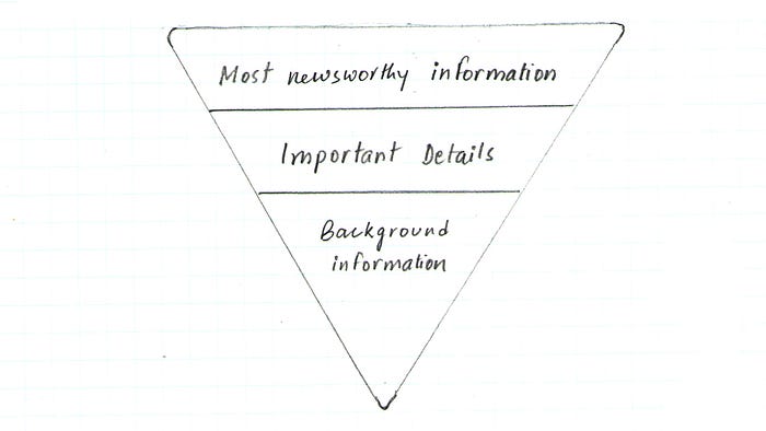
Dashboards should follow the same logic where the most significant and high-level insights are on top, followed by the trends about these insights and the finer details that only a few users would want to explore, at last.
05 Don’t measure everything on the same scale
While going through some dashboard for a recent project realized that some people just put similar graphs together in order to make the design more appealing and symmetric, while not every data point in meant to be shown in a graph. Multiple visualizations should not be used just because you can. Think about scalability, understand whether the data in the graph will remain the same or if there will be more respondents/dates/figures in the future.
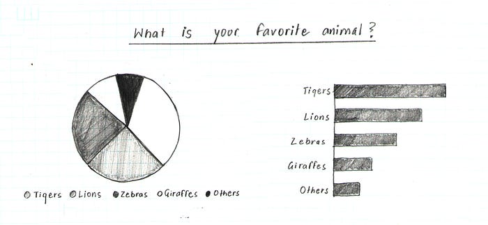
Looking at the pie chart above, it’s not obvious how the different slices stack up in terms of size. Are Tigers more popular than Lions? How much more popular are Zebras than Giraffes? A better option for visualizing the parts-to-whole relations of a data set is the bar chart. This is because it lets us compare the different objects by their length, which is one dimensional. Comparing objects along one dimension is a lot easier than along two, which makes comparing the length of bars a lot easier than the areas of pie slices.
Choosing the right graph for your content is the most important but could be the trickiest part. Considering these scenarios might help:
- Number + Secondary Stat — To display a single measure.
- Bar Charts — Showing data over a related series of data points. Bar graphs are used to compare things between different groups or to track changes over time.
- Line Charts — Showing the relationship of data in the same series of data points. When smaller changes exist, line graphs are better to use than bar graphs.
- Sparklines — To display a trend for a single data point.
- Bullet Graphs — To display multiple data points in a small space
- Pie Charts — Only when the sum of the parts is equal to 100% and the data doesn't have to be compared with each pointer but to compare parts of a whole.
06 Have high Data-Ink Ratio.
One of the most interesting principles in the field of data visualization is Data-Ink Ratio, introduced by Edward R. Tufte in his book, The Visual Display of Quantitative Information, which must be read by every designer. In this publication, he states that there are two different types of ink (or in our case, pixels) in any chart, as follows:
- Data-ink: This includes all the nonerasable portions of graphic that are used to represent the actual data. These pixels are at the core of the visualization and cannot be removed without losing some of its content.
- Non-data-ink: This includes any element that is not directly related to the data or doesn’t convey anything meaningful to the reader.
Based on these concepts, he defined the Data-Ink Ratio as the proportion of the graphic’s ink that is devoted to the non-redundant display of data information: Data-Ink Ratio = Data-Ink / Total Ink
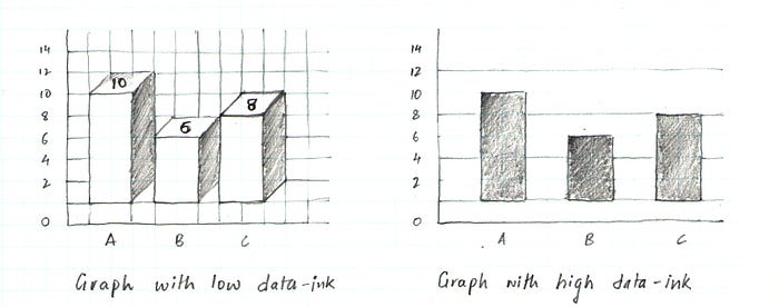
As you can imagine, our goal is to maximize this number by decreasing the non-data-ink used in our dashboards. For example, the chart to the left has a low data-ink ratio due to the usage of 3D effects, shadows, backgrounds, and multiple grid lines. On the contrary, the chart to the right presents a higher ratio as most of the pixels are data-related.
Thanks for your time :)
References:
