Dangerous Drop-Downs? ️Bad UI Design Caused ⚠️Hawaii’s False Missile Alert
And how it could have been avoided
We’re all aware of the false alarm people in Hawaii saw on Saturday the 13th of January:

But how could such an alarming message be triggered in the first place? Bad design was the main reason — a drop-down menu to be more precise. Here’s our roundup of design reactions to the Hawaii false alarm. We include some suggestions of how this could have been avoided, and end with some notable stories on the subject.
One Click Terrorizes the Entire State?
Just after reports of this being a false alarm, we saw famous designer and author, Don Norman, tweet how it was down to incompetent design:
Norman suggested it was down to just one click. And according to many sources, that one click itself was down to the inappropriate use of a dropdown menu in the UI. Here it is in the Washington Post:

Update [17/01/2018]:
Today we saw that the interface may not have been a drop-down menu after all — there haven’t been any confirmations that this was the true UI. Per Axbom explains how it could merely have been anecdotal:
In his write up, he shows how quick we’ve all been to speculate what the user interface includes, and everyone has an opinion. For instance, it could have looked like this:
[17/01/2018] Designlab have an updated story:
According to their sources, this could have been the real option:

Here’s a great update from Jared M. Spool:
The rest of this article can be looked at as a timeline of speculation, starting with the drop-down menu. We’ll keep updating with more:
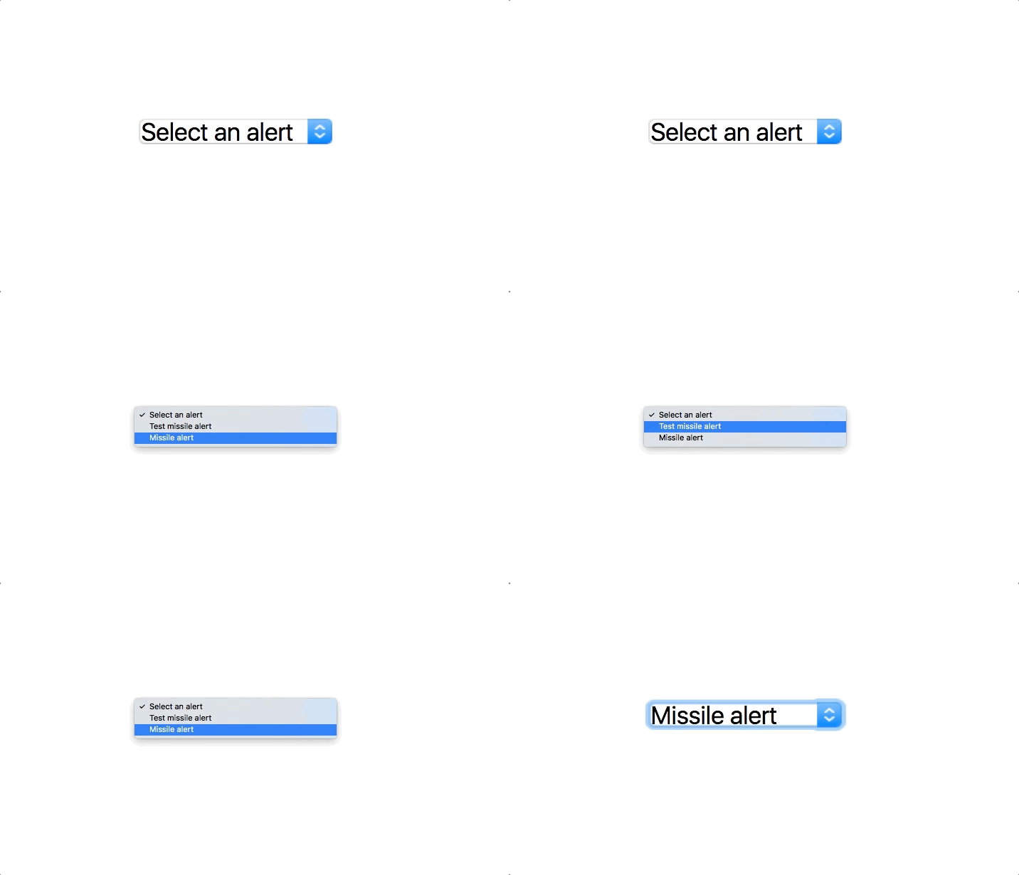
Dangerous Drop-downs
Whilst we don’t have an screenshot of the exact software the employee was using, a few representations have emerged. A notable one was from Owen Williams, who suggests this incident will be in UX design textbooks for years to come:
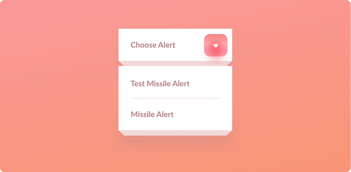
Quartz gave us their version, highlighting how very easy it is to choose the wrong option:

We get the idea, but here’s another:

The Problem Is in the Software
With this being probably one of the most dangerous dropdown you’ll ever see, Brian Schatz, US Senator from Hawaii confirmed Hawaii are looking into some best practices for notifications and warnings to prevent similar mishaps:
A drop-down clearly isn’t suitable as the two choices aren’t in any way equal. It’s too easy to do something drastic. The NextWeb stated that buttons for testing and actual deployment should never be put next to each other.
Quartz go on to highlight that use of ‘interface friction’ could prevent users choosing options that can have great impact. This design concept would be a great place to start, so let’s look at how it works:
When Friction in Design is Good for UX
Think about the steps it takes to delete a Facebook account, or unsubscribe from monthly subscriptions — you sometimes have to work a little harder to activate/deactivate an option, and you might be prompted to confirm what you’re about to do:

It can even take 12 steps to delete your Amazon account, and still requires authorization from an Amazon staff member:
Let’s look at some more resources for designing for friction that show why it’s good, and how it could have effectively prevented the Hawaii blunder:
Designing for Friction Resources
Designing Friction For A Better User Experience By Zoltan Kollin.
In this article, Zoltan tells us how ‘error prevention’ is a basic usability principle, and friction helps implement it. Essentially, it makes it hard for people to do something by mistake. An example used to demonstrate error prevention is the macOS delete confirmation:

He goes on to show examples beyond confirmations, such as giving the user chance to backtrack on actions:

Imagine if the UI of the software used by the Hawaii emergency employee gave them the chance to undo what was about to happen:

Well we’d probably have a different outcome. Read the rest of Zoltan’s post on Smashing Magazine for more tips:
When Friction In Design Is Good For UX by Nick Babich
Nick provides another explanation of why friction can prevent users from making bad decisions in his shorter article on the subject. He states that whilst friction can have a bad reputation, it’s not always negative:
Here’s a few more resources (by Dina Chaiffetz, Steve Selzer, Sadhana Balaji, and Robyn Collinge):
Notable Stories
Here on Medium:

- Sean Dexter gives us a similar overview, sharing why he thinks design was the major cause of this situation, not human error:
- Ron Goldin, Product Designer at Google, mocks up what he thinks the UI of the current system may have looked like. He then examines the pitfalls, followed by putting together an alternative UI flow:
- saribrooke gives us her view, with a mockup of a dialogue to cause the employee to confirm the choice made:
- [17/01/18 update] Per Axbom suggests there’s been a lot of speculation about what the real UI the Hawaii employee was faced with:
From the News:
Finally, here’s some news coverage of the topic:
Feel free to drop your thoughts in the comments, and join us for more in the future. If you’ve got any prototypes of your solution, send them through!

