Daily UI Challenge 006 — User Profile
I recently decided to take part in the Daily UI Challenges to learn and improve my skills in Adobe XD, Illustrator, Photoshop, Sketch, and InVision.
Challenge 006: User Profile
For this challenge, I decided to redesign the user profile screen on the Airbnb app (see Image 1). Airbnb is a popular platform for people to easily book accomodations through, so I expected the app to provide a seamless experience for users. To my surprise, the experience browsing through the ‘Profile’ tab was tremendously mediocre.

Here is my process for creating a more fitting interface for the Airbnb User Profile tab:
1. Identify the problem

The ‘Profile’ tab in the Airbnb app doesn’t provide a rich user experience and the interface is bland, with room to be revamped to better represent the superior experience that Airbnb offers. The long list of menu items in the current Profile tab are daunting to look at and contain repetitive information (i.e. Notifications is mentioned in the list and in the Settings).
There is also an unnecessary step. When you click the Profile tab, you’re taken to a screen that has a preview of your profile, with other menu items in a long list below (see Image 1).
2. Research and Brainstorm
Airbnb is often put on the same spectrum of services such as Uber, Facebook, and Amazon, so users expect seamless service on both the web and mobile platforms. Though these are not examples of competitors within the same industry, they heavily influence user expectations in regards to the full experience using the technology. With this in mind, I began researching examples of clean designs for user profiles.
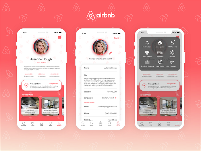
Many of the designs that stood out had a good balance of colour and white space. In the current Airbnb profile, there was little no inclusion of the pink brand colour. Good designs also had a proper usage of the horizontal space on a page, versus long lists that require the user to scroll more than once — a mistake that the current Airbnb profile tab made in the worst of ways (see Image 2).

3. Wire-Frames
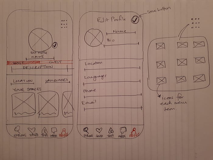
I originally intended to have two tabs in the Profile section: one for Host; one for Guest. Each tab would have the basic user information like name, description, location, etc., but both the Host and Guest tabs would house information about the users listings, and the users visits, respectively (see Image 4). However, since there is already a Trips tab and Saved tab, the visits and other guest information didn’t need to be presented in the Profile tab again.

4. Feedback
One of the most important pieces of feedback I received was to change up the cards on the Edit Profile screen (see Image 5). The feedback was that the cards seemed outdated, and took up a lot of space on the screen, making the screen daunting to look at.

5. Final Product
I took the suggestion to swap out the cards for a line separator, which would be lighter and provide more white space on the screen. Line separators are also easier for the user to look at when inputting information, so it feels less like a chore, resulting in greater engagement and less fields left empty.
The final product is a Profile tab that is clean, crisp, and aligned with the level of service offered by Airbnb. I swapped out the list of menu items and presented them in a 3x3 box menu format so that users can see all the options in less than half the screen. I didn’t feel that all those options needed to be presented in the first view since they are supporting operations, so I made them into a menu format.
Main takeway: In a profile screen, a user should not have to scroll more than two times. If they do, it means you’re presenting too much information on one screen, which can be daunting and seem like a big time and energy commitment to the user, making them less likely to browse through it, much less fill out any forms. I noticed this first hand in the current Airbnb profile tab, and it was reiterated in the feedback I got for the Edit Profile screen. Less is more.