Theming With CSS Variables
Hello, today I want to share my experience on how to theme a website with CSS variables.
There was a use case — to build a scalable design system with an easy customize method for the Whitelabel option when a client wants to have their own colors and typography, styles.
- The easiest way is to use CSS variables — manage hundreds of places where you implemented different styles much better with a small list of variables.
- And much more comfortable is just add one new CSS file instead of menage variables with preprocessors or JS. Also, because initial design-tokens in our project always should be the same and updated with our latest default styles. I consider a new CSS file with new variables that will override current variables like a web-manifest file.
- Also, we have deeply nested components, one library import another and another import a new one. It means that we can’t override SASS variables or properties that are stored in the imported libraries, where we can override only styles.
Therefore, the best solution here will be to have union variables which we can override no matter if they nested it another library or no.
We all know how to use variables in preprocessors, and unlike preprocessor variables, CSS variables dynamic — it means that you can change them on the fly, instead of recompiling all.
This is a very convenient way because to change the color you don’t need to operate with JS, you can override a ton of the same properties by only several variables.

I won’t say anything like — relax man and just use it, but in my opinion, support has good coverage.
Fun Facts About CSS Variables
CSS custom properties or CSS variables?
Both names are correct — it’s the same.
Why I should use CSS variables instead of preprocessor variables?
They are native, they have wide support, they more flexible.
Can I use Scope — global and local variables?
Yes, you can.
You can write fallback values
For instance if var-a was not found you can use a fallback value

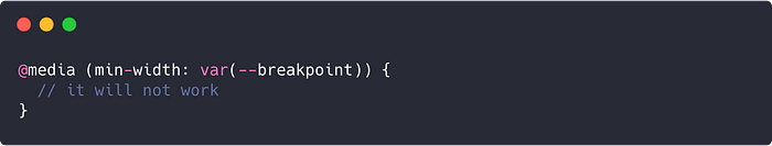
You can’t use CSS variables in media-queries, but…
Unfortunately, but if you will write something like on the example below — it will not work.
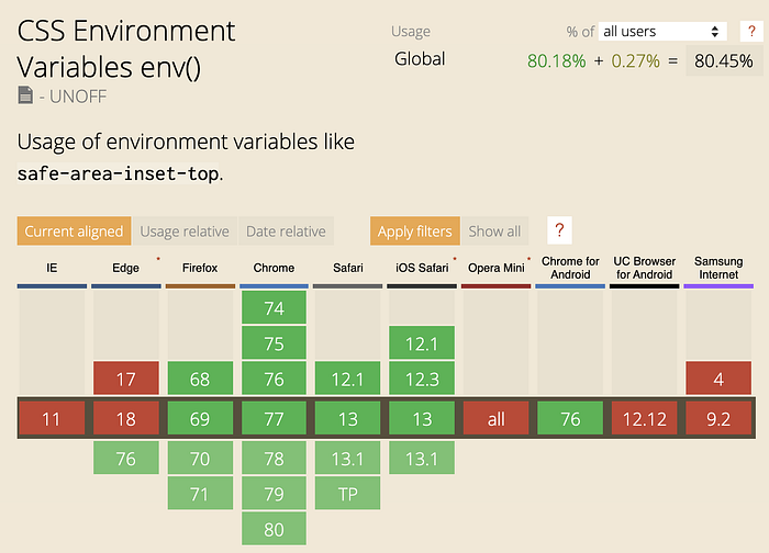
But there is a solution (in the future)— CSS Environment Variables. It has not so wide coverage like CSS variables, but it’s a matter of time.
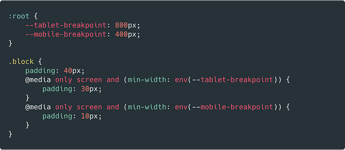
There is a difference, unlike CSS variables, with env() we can use:
- The
env()function is global env()variables can be used everywhere- You can’t change them. Consider them as CONSTANTS
So, far it doesn’t work as we want but in the future, I hope we will be able to use env() vars like this:
Here is a nice article about env() variables btw👇
On Practice
From theory, I want to move this article to the practice side. Here is a link to the Figma project, I will use it as an example for this article.
Organize Design Tokens
Our first artboard in the project — Design Tokens— the foundation.
Variables combinations. How to use Design tokens.
So, if your product should be flexible in terms of different themes where you will have a deal with colors, typography, grids, and spacers — we can call this design tokens — foundation in our great wall. In this case, I suggest you separate design tokens into 2 pieces — native and preprocessor's variables or hot and cold variables.

As we already know — we can’t use CSS variables for media-queries, so, we will make variables for Grids as cold (SASS) variables.
Also, we will make Spacers as cold variables as well, because there is no case when you will change them globally, like to change spacer M with8px value to16px, it will break all our designs.
SCSS (cold) variables:
- Grids
- Spacers
CSS (hot) variables:
- Colors
- Typography
- Border-Radii
Adding Cold Variables
Let’s add SCSS (cold) variables first — Grids and Spacers.
To make this part shorter, let's just add media-queries rules to the “layout” component, where we will place other components like buttons and inputs. Also, we will use Spacers here to build margins and paddings.


Open codesandbox.io and create a react app. Then in src add two folders components and design-tokens . In design-tokens we will store all files with design-tokens scss and css variables. In thecomponents folder we will store all our components including layout.
Here is a link to the current project state: https://codesandbox.io/embed/holy-glade-131ii
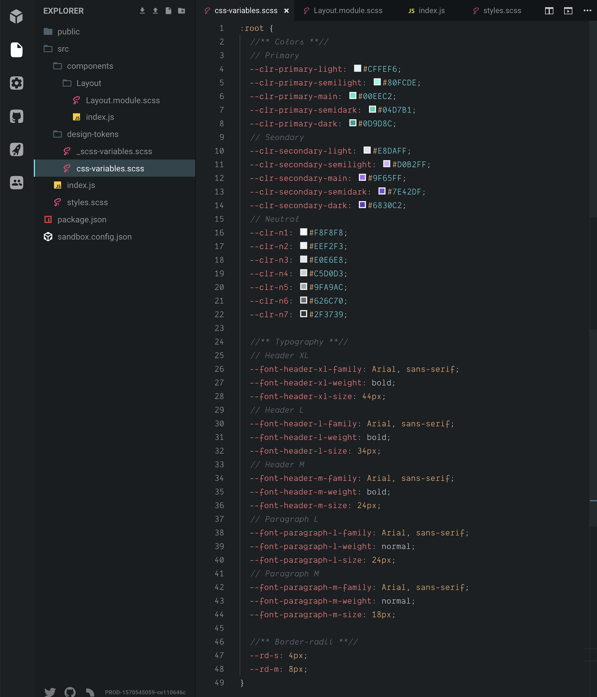
So, _scss-variables.scss consists of two groups — spacers and breakpoints .

and you can import them as usual SASS variables

Now we need to add media-queries


As I mentioned before — we don’t need to change spacers and breakpoint for different themes, so we can leave them as it is as cold SASS variables.
Next, we need to add CSS Variables.
Adding Hot Variables
In my previous article, I described how you can import tokens automatically from Figma, but because I’ll do it just once here, I’ll do it manually
We will break CSS variables into groups and subgroups.
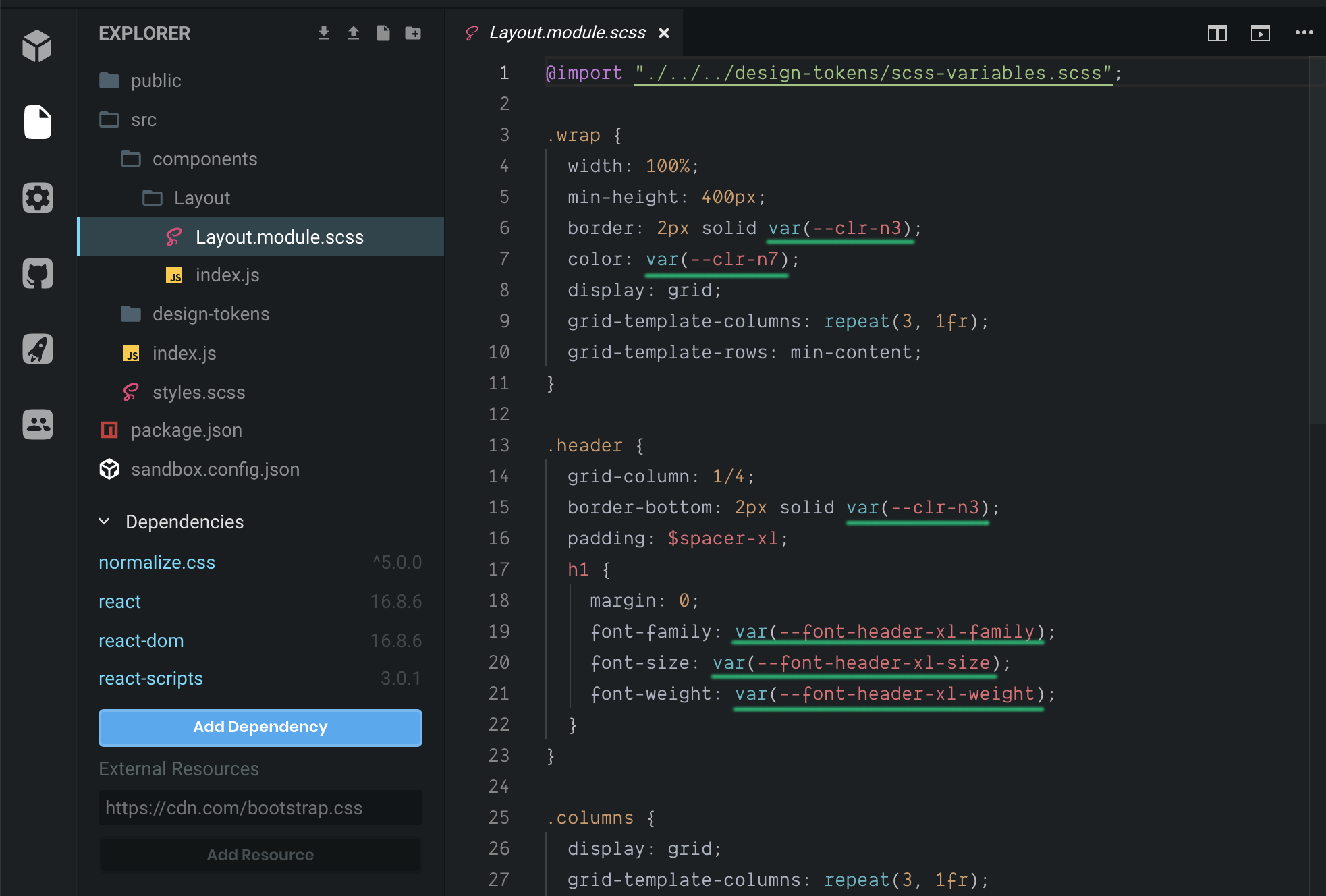
Now, when we wrote all our CSS variables we can import them. Because we import variables in the :root we can import them just once in our common stylesheet style.scss.

And then we can use these variables without import in other files that will be imported among common styles.
Note:
To declare varriable it should be under an element like
:root,bodyor.my-class.Declare it like
--my-awesome-varUse it like
var(--my-awesome-var)
Making a component with isolated variables
We already used Sass and CSS variables in the Layout component, but here is a different case where we will use “nested variables” it means that we will add CSS variables inside components classes, not in the :root because we want to isolate and protect the component’s variables.
The Case.
To change only certain variables, if we need to change only border-radius of a certain components or if we need to change several properties using only one variable. I will demonstrate it on our components.
I’ll skip all parts like how to make states in our components, the most important to show how to use CSS variables.
Button component
Here is our design — we have 2 basic types of the button primary and secondary, and we also have an icon on the right side.

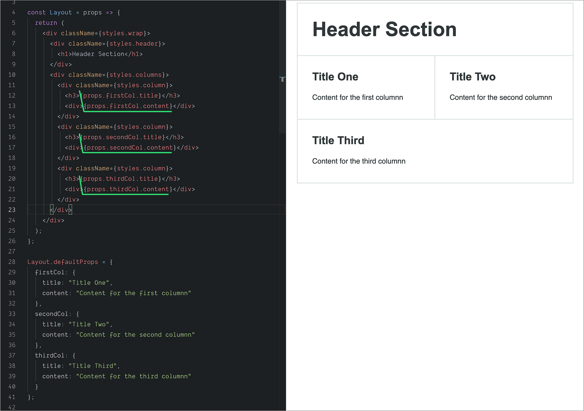
To pass the future Button component into Layout we will add additional props to the Layout component like title and content:
I’ll skip a detailed breakdown of the Button component in JS all the more important for us is how to work with CSS variables, so, I’ll show it on the image.
Index.js

0. Import CSS module
1. Add icons object, where we will store paths for SVG icons. We will use it in the future to add an icon to the button. I added only one SVG path here but you can make this as a separate file and add as many as you needed.
2. Then we will use a function changeType() where we will check if secondary property is true and if is true we will switch Button styles from the styles.primary to the styles.secondary .
3. And default props for the component.
4. The fourth point is where we will pass the already existing property className into this component because with this property we will override privite variables. Also, this property can be useful if you want to add additional styles to the component like bottom-margin or adjust it somehow on your page.
Button.module.scss

Here we will add two similar (in case of structure) classes — promary and secondary , it’s not the ideal case (there is a way to make it shorter)
- Add
privitevariable--btn-text-clr. This variable will cover not only the text color but, also, the icon fill as well because the icon and the text always will have the same color. And this is the big advantage of CSS variables that we can actually override several properties only by one variable. - Here we just set background button color using our global color variable.
- There are two props where we will pass
--btn-text-clr:colorfor the button text andfillfor the icon. - Use a darker variable for background color.
- Custom property
--btn-brfor the button radius which is using globalborder-radiusvariable.
Input component

I’ll skip the JS part explanation because for the Input component I didn’t do any hook functions, just simple HTML structure. So, let’s look at the CSS file

- Like in the
Buttoncomponent will add--input-brvariable. We will use a globalborder-radiusvariable in it if we will decide that we need to override all radii in one go. But if we decide that all radii should be0pxbut buttons should have8pxwe can just remove this global variable and replace it with another value. - For all colors, we use our CSS variable palette.
Toggle component

We will make the Toggle component based on checkbox. It’s a simple component but with a nuance—State hook. We need to add it to handle toggle animation.
Index.js

0. Import useState hook
- Declare two
consts—isOnto use andsetIsOnto changeisOnvalue. As a default value, we usedefaultProps.checkedvalue. tooglefunction is the place where we will changeisOnvalue using inverted boolean!isOnisOnfor thecheckedattribute. We will change this value withtogglefunction.- Html
inputsrequireonChangefunction, instead of usualonClick
5. Here we define default props like id , className , style and of course checked attribute.
Toggle.module.scss

Here we will use the same approach that we used on our previous components.
- We use global color variables and wouldn’t make any private variables here, because colors of this component should obey to the global palette.
- Here we create two additional variables for radii to protect this component from global changes.
You can check out the live version here:
Theming
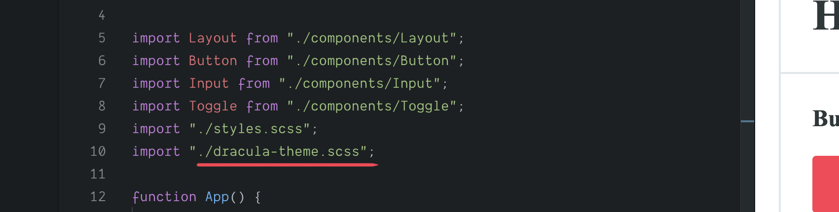
We need to create a new stylesheet and override inside the root all variables that we want to change and import this file in the index.js. Like that

but there is a problem — we also need to change the text and the icon color to more contrast — from black to white.
To do so, we need to create a new modifiers group consists of classes that we will add to elements with privite variables.
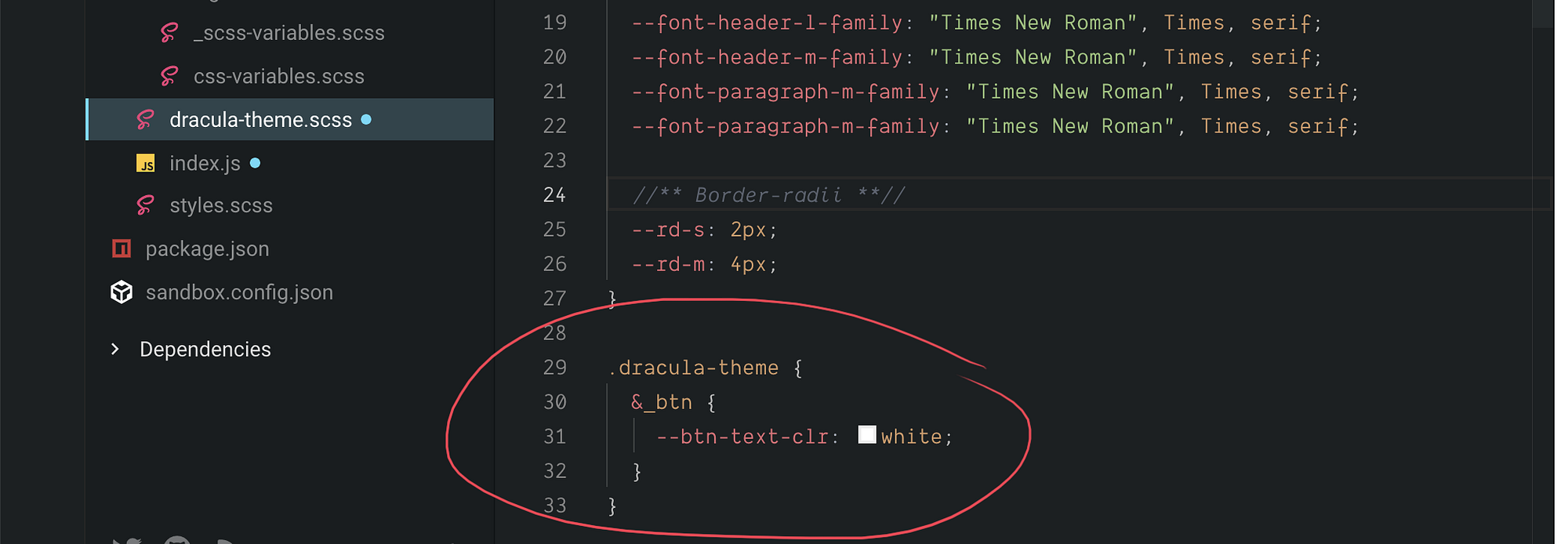
then add this class .dracula-theme_btn to the element, you want to change.

So, by one shot we changed two properties color and fill. Using this approach we can change any privite variable.
There is another way — you can store privite variables for certain components in the root it depends. But here I prefer to add an additional class to change.
Here is the live version:
We of course, also, can implement a dark theme by adding additional CSS variables:
At long last
I find the way where you can mix different types of variables SASS and CSS very fascinating, and each type can solve different problems.
In this article, I tried to show how we can theme a website with CSS variables without JS, combine CSSand SASS variables, override several CSS props only by one variable.
Like I mentioned before we have nested libraries and components that we can’t change, so we can’t add hooks in certain components, only change their CSS. But still if you are doing everything from the scratch there are good articles about CSS variables + JS:
Here are a few good articles about CSS variables 👇


