The Metro design UI brought by Microsoft with Windows 8 may not have been largely received with a positive response (mostly because of the major UI overhaul from Windows 7), but it opened the doors to a new era of User Interface. Other than introducing a beautiful implementation of flat design, thin typography and expansive images, it brought what I believe was lacking in the traditional Skeuomorph design: colorfulness.
iOS and Android then updated their design standards with iOS 7 and Material design respectively. Both iOS and Material designs also went for flat designs and thin typography: Helvetica Neue (later San Francisco) and Roboto respectively. And both, in their design overhauls, introduced colors and gradients like they were unheard of.
So now that we’ve established that vibrant colors play a major role in all modern designs today, let’s check out a different implementation to the traditional use of CSS background gradients.
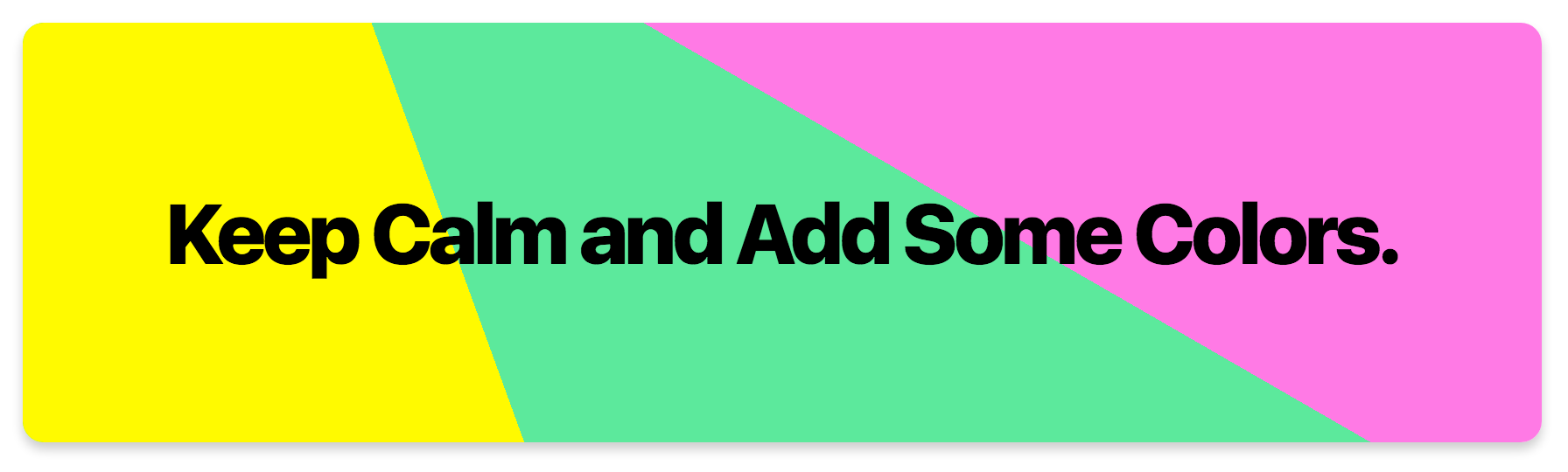
In this implementation, we rely on the color-stops parameter in the linear-gradient() (or radial-gradient) property. These stops decide where you want to start a particular color. The boilerplate for the property we’ll be using is:
background: linear-gradient(<angle>, color1 color1-stop-at, color2 color2-start-at);The simple logic here is that we stop the first color at an x% and start the second color at x% or <x%. This removes the gradient from the linear-gradient and defines a clear edge between both colors giving the background a multi-colored-material effect.
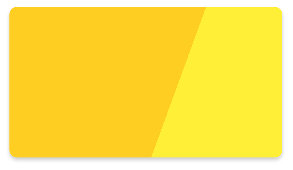
background: linear-gradient(110deg, #fdcd3b 60%, #ffed4b 60%);For simplicity, I used just the generic background CSS property. You can refer to the CodePen for browser specific property syntax.
Looks beautiful, doesn’t it? Add some text on it and it looks like a nice highlighted element. The above example has some extra CSS style thrown in (like border-radius and box-shadow).
Essentially, the background property can hold two contents one over the other: 2 gradients, 2 images or you can mix-and-match any of those.
To use more than 2 colors (because why not), put the powerful rgba() to use and use 2 gradient parameters.
Here’s an example with the background property holding an image and masking some portion of the image with a gradient of orange and transparent.
Use a dominant color from the image or a completely contrast color for the rich look.

Sample code for such a banner would be:
background: linear-gradient(-70deg, #fa7c30 30%, rgba(0, 0, 0, 0) 30%), url('planets.jpg');Here’s a codepen with some examples (including the use of radial-gradient).


