CSS Animations for Non-Developers Part 2 — SVGs
This is the second article in a two-part guide intended to give non-developers the tools to create their own CSS animations. In part 1, we created a button and learned the fundamentals of transitions, easing, and the :hover selector. If you haven’t read part 1 yet, you can find it here.

Getting started
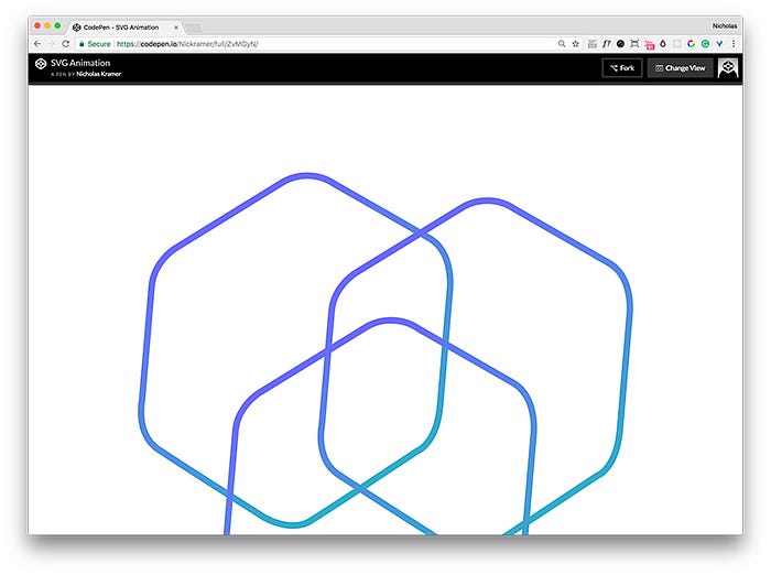
In this article, we’re going to take the basic concepts from part 1 and pair them with the keyframes and transform properties to create precise, multi-step animations. To demonstrate this, we’re going to create an SVG animation that will execute on hover. We will also discuss the proper technique to prepare, export, and upload an SVG file to a text editor. You can follow the examples below with the corresponding CodePen here.

Preparing Your SVG
Before we jump into coding, we first need to prepare our SVG file for development. To do so, start by opening up your vector illustration in Adobe Illustrator. Note: You can save SVGs out in most vector based programs but Adobe Illustrator affords more precision than the alternatives.

Sizing Your Artboard
First, we need to make sure that our artboard is fit to the size of the illustration. This will prevent clipping and also ensure that the SVG is appropriately sized when exported.
The easiest way to do this is to highlight all of the elements in the illustration and then go to file > artboards > fit to selected art. You’ll notice that the artboard now snaps to the exact dimensions of your illustration, no matter the size.

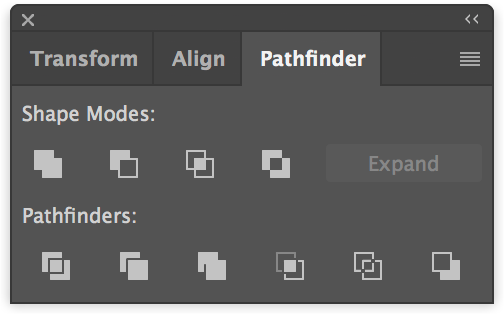
Optimizing your Paths
The illustration should be as simple as possible. As a general rule of thumb, try to use few anchor points when creating your shapes and if any paths overlap, combine them using the Pathfinder tool.
Line illustrations should also retain their strokes — this makes it easier to call and manipulate paths later in the code.
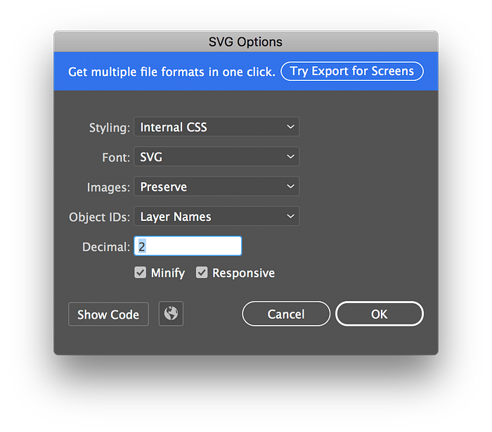
Exporting
At this point, our file is prepared and ready for export. Go to file > export as click SVG, and then click save to finish exporting. This outputs an SVG that reads our illustration as a series of numbers and coordinates rather than pixels like a raster image does.
From here, you can import your SVG file into a text editor to begin development.
Understanding SVG Code
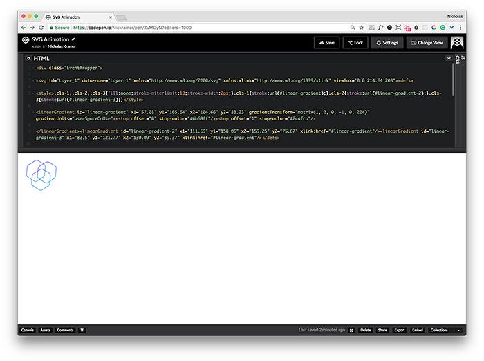
After opening the text editor, you’ll notice that the SVG code will output something similar to this:
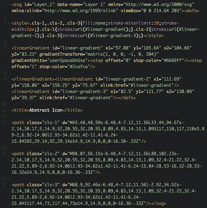
You may not recognize some of the HTML attributes and elements from the code generated, but if we go through it bit by bit, you’ll notice that it is not as intimidating as it may first seem:
<svg id="Layer_1" data-name="Layer 1" xmlns=”http://www.w3.org/2000/svg" xmlns:xlink=”http://www.w3.org/1999/xlink" viewBox=”0 0 214.64 203">- This first section defines the SVG’s id, name, and other identifying information. The
xmlnsandxmlns:xlinkattributes are unnecessary and could be removed. (They’re considered ‘namespaces’ and are not needed when using SVGs embedded in HTML). ViewBoxsets the container size of the SVG—think of it as an artboard. Its corresponding numbers can be edited to increase or decrease the container size as well as change the SVGs position within the container. You can play with an interactive demo demonstrating how this attribute works here.
<defs>
   <style>.cls-1,.cls-2,.cls-3{fill:none;stroke-miterlimit:10;stroke-width:2px;}.cls-1{stroke:url(#linear-gradient);}.cls-2{stroke:url(#linear-gradient-2);}.cls-3{stroke:url(#linear-gradient-3);}
   </style>
   <linearGradient id=”linear-gradient” x1=”57.08" y1=”165.64" x2=”104.66" y2=”83.23" gradientTransform=”matrix(1, 0, 0, -1, 0, 204)” gradientUnits=”userSpaceOnUse”><stop offset=”0" stop-color=”#6b69ff”/><stop offset=”1" stop-color=”#2cafca”/>
</defs>- Elements inside
<def>define styles or gradients applied to elements.
<path class="cls-1" d="M43.48,48.59s-6.48,4-7.12,11.56L33.44,94.67s-2.14,10.17,5,14.9,32,20.55,32,20.55,8.09,4.83,14.13,1.09S117,110,117,110s5.89-2,6.92-14.06l2.93-34.62s1.42-11.41-6.24-15.84S92,29.14,92,29.14a14.9,14.9,0,0,0-16.38-.33Z"/>- The
<path>elements are the vectors that an SVG is comprised of. If you were to use the rectangle or circle tool to create your SVG, you might notice that these elements read<rect>or<circle>respectively. They behave relatively similar to<path>. - The numbers inside the
dattribute determine the size, shape, and position of the path.
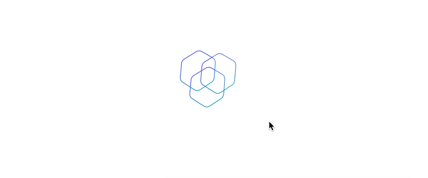
When we look at the visual output of this code, you’ll see our illustration. You may notice that the illustration is rendering as the full width of the browser — we can fix this with some minor styling updates.
Styling the SVG
Currently, our illustration looks large because there is no width applied to it. To fix this, we’re going to wrap a <div> around the SVG and add a max-width to it.
.EventWrapper{
   max-width: 150px;
   position: relative;
}
We are also going to set the position of the wrapper as relative. This will ensure the paths contain within the wrapper when we animate them.
.cls-1{
 position: absolute;
}
Finally, we will be giving each <path> an absolute position. This will allow us to move them independently without interfering with other elements on the page.
Keyframes
Unlike a button animation where there is a linear path from the beginning to the end (think of a red button turning black on hover), SVG animations tend to have more complex, multi-step paths.
In our case, when hovering on the SVG, we want the rings to move out slightly then quickly move to the center. The transition property automatically defines intermediate states of an animation and, as a result, does not accommodate for multi-step animations. Because of this, we must use the keyframes property instead.
Keyframes give us the ability to define different moments of an animation by noting changes in properties at different times. These changes measure on a scale from 0% to 100%.
If we were to change the color of a path from red to blue to green on hover, our keyframe may look something like this:
@keyframes ColorChange{
  0% {
    background-color: red;
  }
  50% {
   background-color: blue;
  }
  100% {
   background-color: green;
  }
}
Let’s dissect this code to see what exactly is going on: ColorChange is the name of our keyframe animation (important for when we call this keyframe animation later on). The percentages dictate at what point the background color will change colors. We can see that it will take the same time to change from red to blue as it does to change from blue to green because the percent change is exactly the same (50%).
If we wanted our animation to quickly change from red to blue and then slowly change from blue to green, our code may look something like this instead:
@keyframes ColorChange{
  0% {
    background-color: red;
  }
  10% {
   background-color: blue;
  }
  100% {
   background-color: green;
  }
}
Like transitions, keyframes can animate almost all CSS properties. To move the position of individual SVG paths we’re going to have to use a property that we haven’t discussed before: transform.
Transform
The transform property modifies a number of different “coordinate spaces” that an element encompasses. This includes scale, skew, rotate, and translate as well as a number of other different modifiers that can be read about in further detail here.
If we were to move one of the rings of our SVG to the left 15 pixels and down 15 pixels on hover, it would look like this:
.cls-1:hover{
  transform: translate(-15px, 15px);
  transition-timing-function: ease-in;
  transition-duration: 1s;
}
As discussed previously, this will only allow us to move the SVG in one direction. We have to make use of keyframes to get the multi-directional look we’re going for. When we put it all together it looks like this:
@keyframes Ring1AnimationIn {
  0% {
    transform: translate(0px, 0px);
    animation-timing-function: ease-in;
  }
  70% {
    transform: translate(-15px, -15px);
    animation-timing-function: linear;
  }
  100% {
    transform: translate(30px, 22px);
    animation-timing-function: ease-out;
  }
}
Remember, animation-timing-function makes use of one of six different easing options to provide for a smoother animation feel.
Now that our keyframe animation is set up, we need to be able to call it on hover using the animation property.
Putting It All Together
The animation property calls the specific keyframe animation to be used on an HTML element and defines the amount of time that the animation will take to finish. Using forwards, we allow the animation to stay in the last frame before hovering off—this prevents any choppy or abrupt animations. If we were to see this in practice it would look like this:
.EventWrapper:hover .cls-1{
  animation: Ring1AnimationIn 0.35s forwards;
}
Notice how we’re applying this hover to the SVG wrapper. This is to ensure that while hovering over the entire SVG, the animation will play. If :hover were just isolated to a specific path, it would be difficult for the user to trigger the animation because they would have to hover over that very thin line for the animation to execute.
On Mouse Out
Now that our animation works on hover, we need to play it in reverse when moving our mouse off the SVG. To do so, we need to create another keyframe animation but have the values input in reverse like so:
@keyframes Ring1AnimationOut {
 0% {
   transform: translate(30px, 22px);
   webkit-animation-timing-function: ease-out;
 }
 70% {
   transform: translate(-15px, -15px);
   webkit-animation-timing-function: linear;
 }
 100% {
   transform: translate(0px, 0px);
   webkit-animation-timing-function: ease-in;
 }
}
You can see how it is the same exact animation as Ring1AnimationIn but simply in reverse. To call this animation, make sure that you are calling it on the desired path. (Note that this is the only way to trigger a reverse animation on when moving your mouse off of the SVG without writing any custom JavaScript.) Your path’s CSS will then look like the following:
.cls-1{
  position: absolute;
  transform: translate(0px, 0px);
  animation: Ring1AnimationOut 0.35s forwards;
}
We included the transform property of (0px, 0px) here to ensure that our path resets to its default state when the animation is finished.
If you look at our animation on hover, it works just as intended. Now with a little finessing, we will apply the same concepts to the other two rings to have a fully resolved animation.
Final Thoughts
More often than not, the initial preparation of files and the illustration dictate how complicated the development process will be. As long as your illustration is simple and your paths are optimized, you should have no problem jumping in and creating your own animations.
Have fun experimenting and developing your own SVG animations and check out some great examples for inspiration here and here.

