Create a pie chart/donut chart in Figma
Step-by-step guide to creating a pie or donut chart in Figma
Mandatory introduction about how useful charts are, how great Figma is, and if you don’t have Figma you should totally sign up for it, it is free.
With the introduction out of the way, let’s get to it:
First, create a frame, any size, but for the sake of this tutorial make it 200x200.

Inside the frame, create a 160x160 rectangle, center it, and give it a fill color. This fill color will be one of the colors in your pie/donut.

Drag two guidelines so that they meet in the center of your rectangle. This will help you draw the rest of the elements in your chart.

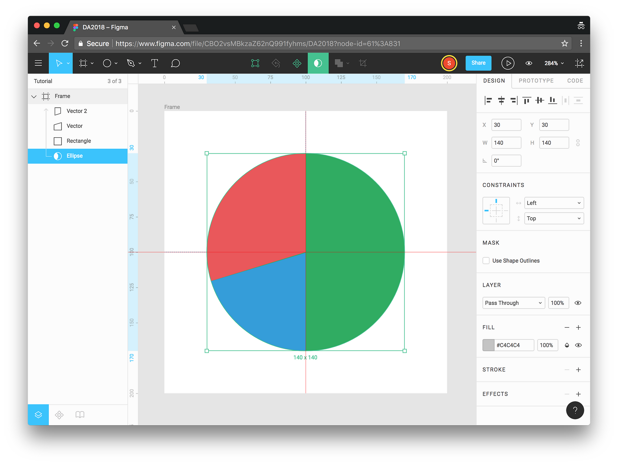
Let’s say you’re creating a chart with the following distribution: 50%, 20%, 30%. We will use green for the 50%, blue for the 20% and red for the remaining 30%.
If you want to be precise about your pie slices, you will probably have to calculate pixels and figure out exactly where to put the pen tool, but for now we will just eyeball it.
We now need to create a 20% pie slice, the blue one. We will do that using the pen tool.

Put the pen tool where you want the green portion of your pie to end, and draw a polygon that matches 20% of your final pie, like this:

Zooming in will help you draw the polygon. When you’re happy with it, remove the stroke, and give it the fill color you desire for your second slice.

Create the final polygon to cover the remaining 30% of your pie (in this case we can actually create a rectangle covering 50% of the green rectangle, and put it between our vector and the original rectangle, that will save us some time if we only have 3 slices in the pie).

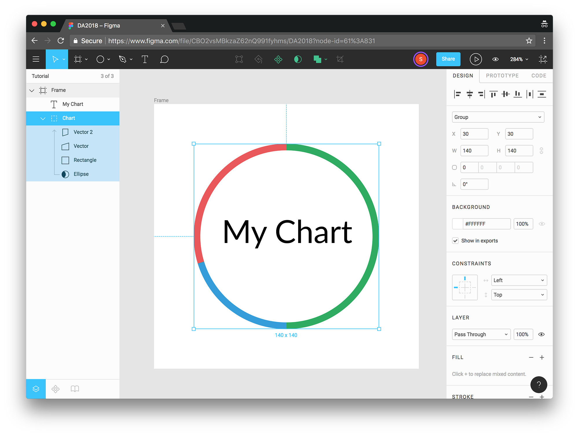
We have the individual segments, but we need to make it look like a pie. To do that, we will draw a circle, and apply a mask.
Draw a circle and center it over your rectangle.
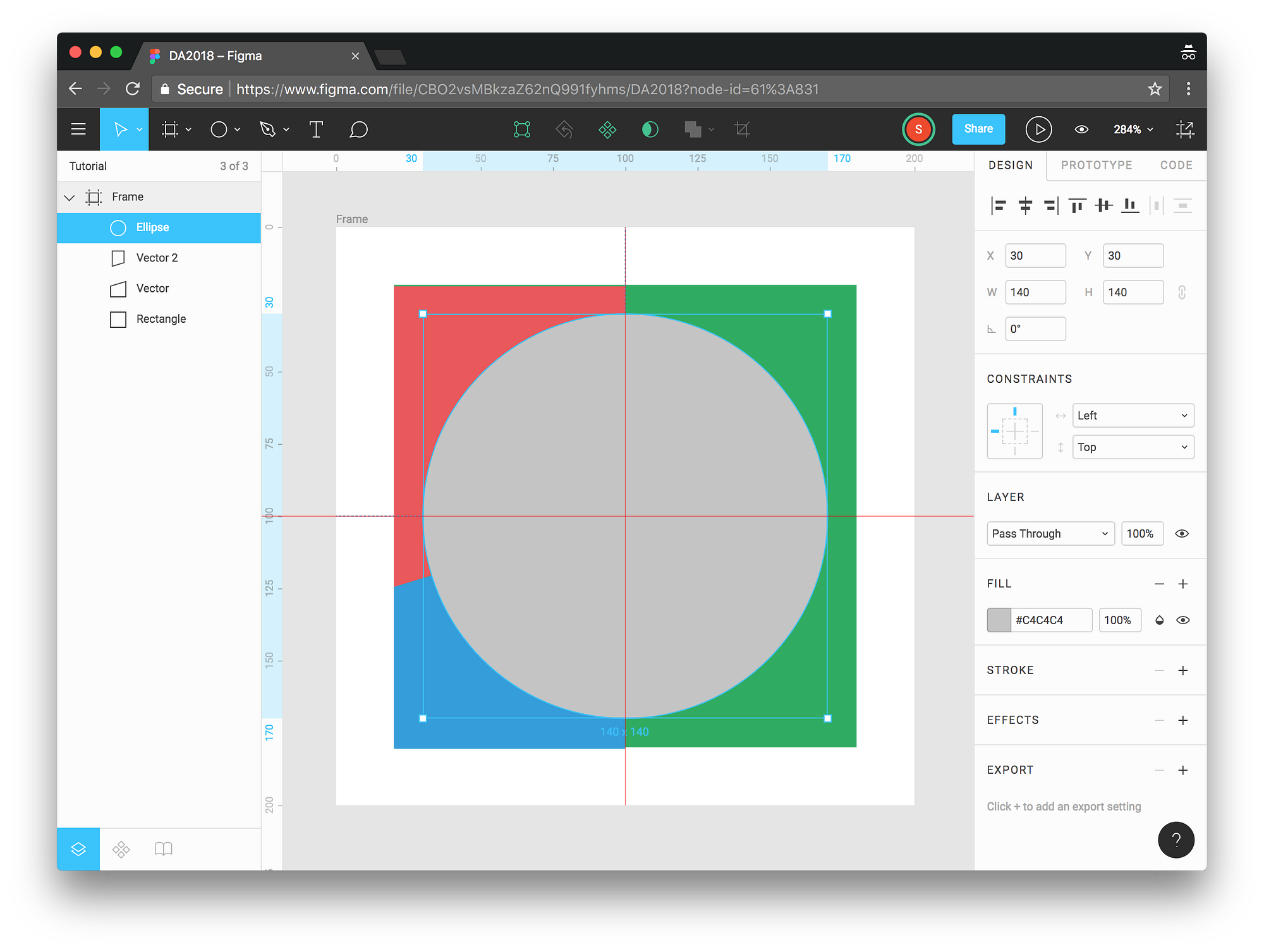
In the layers panel for the frame, move the circle to the bottom, so that it sits behind all of the other shapes.
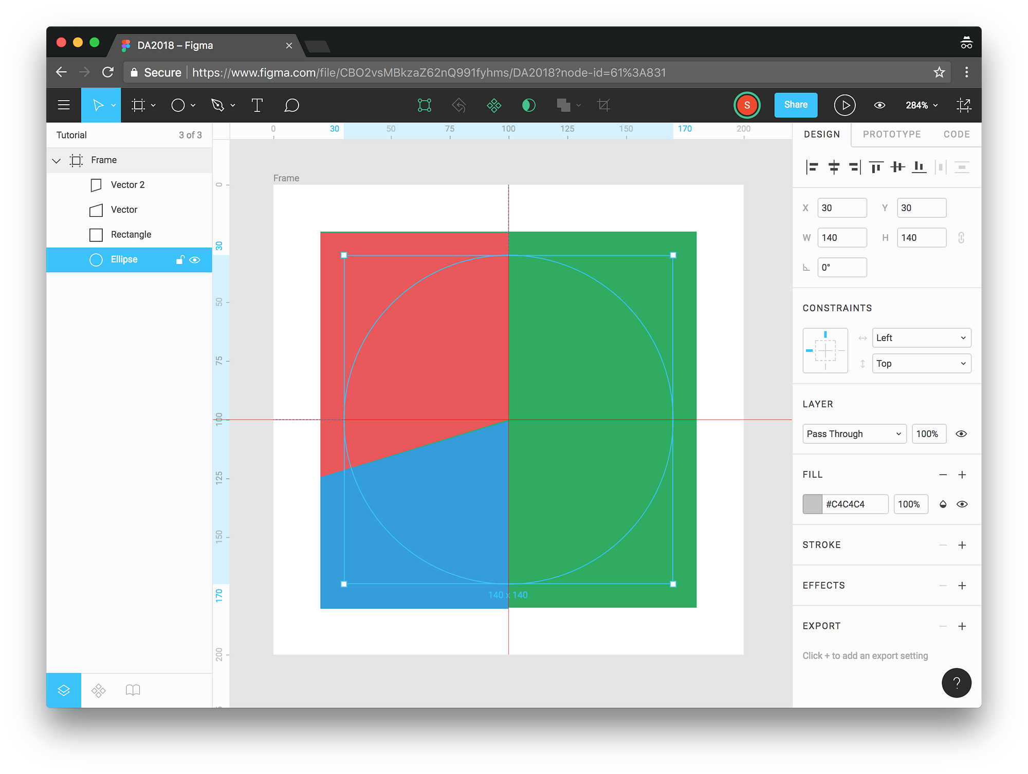
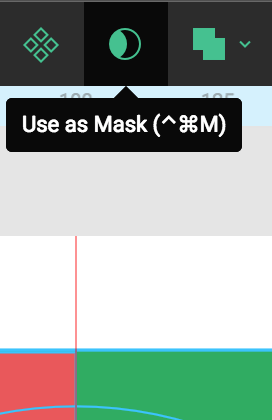
Now, select all of the shapes, and hit the mask button at the top. Do not select the Frame itself, only the shapes within the frame.
Select like this:

And then hit the mask button:
It should look like this:

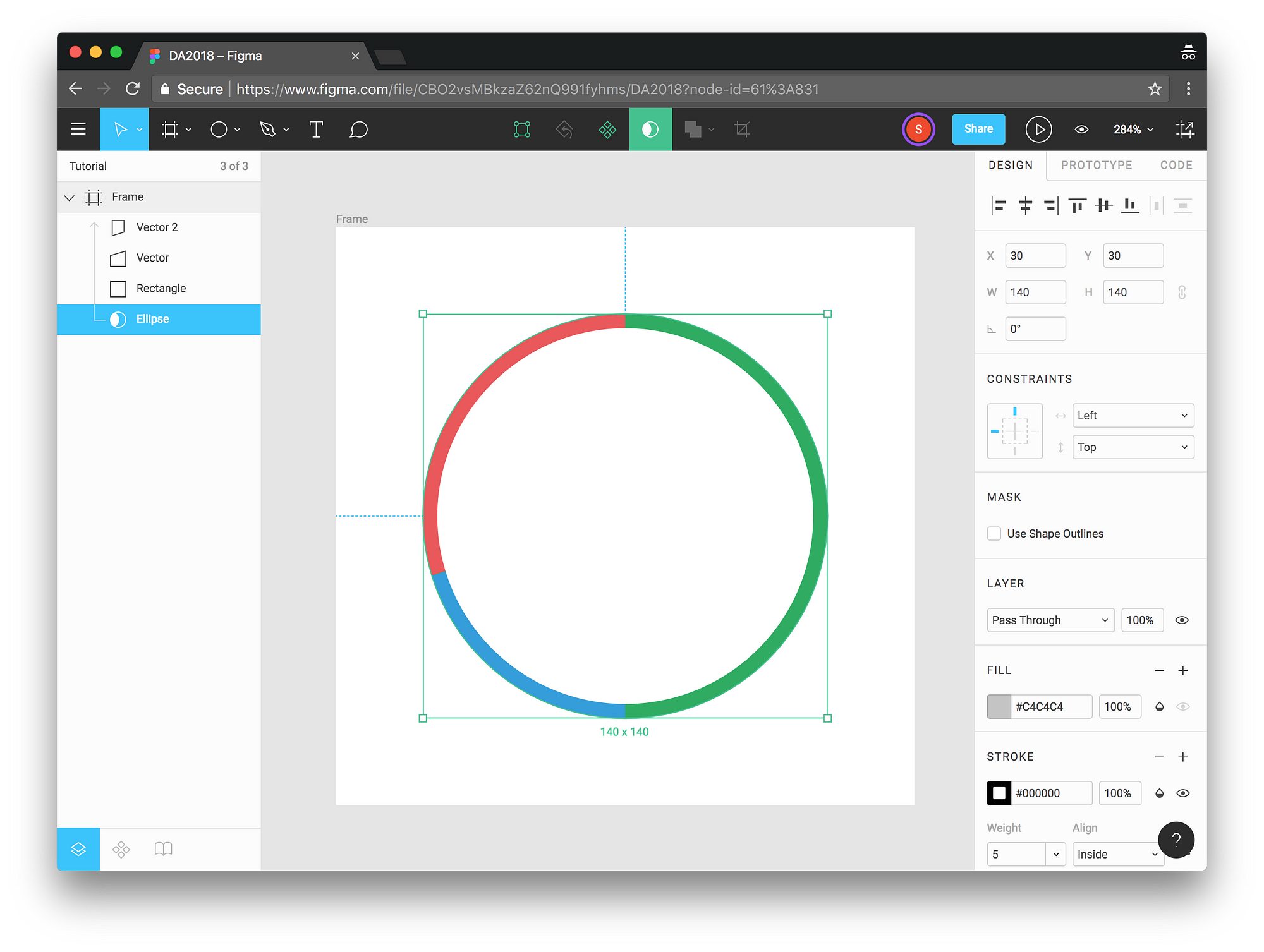
Once you hit the mask button: Voila! You have a pie!
To make a donut, you will simply apply stroke, instead of fill, to your chart. So turn off the fill, and hit the plus button in the stroke panel to apply a stroke.

Here I’ve hidden the fill, but I can also remove it, the result is the same. I’ve added a stroke. The color of the stroke doesn’t matter, the mask will use the color of the shapes.
You can change the weight of the stroke to create a thicker donut, here I’ve used a weight of 5.
And there we have it. A scrumptious pie, or donut, that you can turn into a component and reuse across your design.
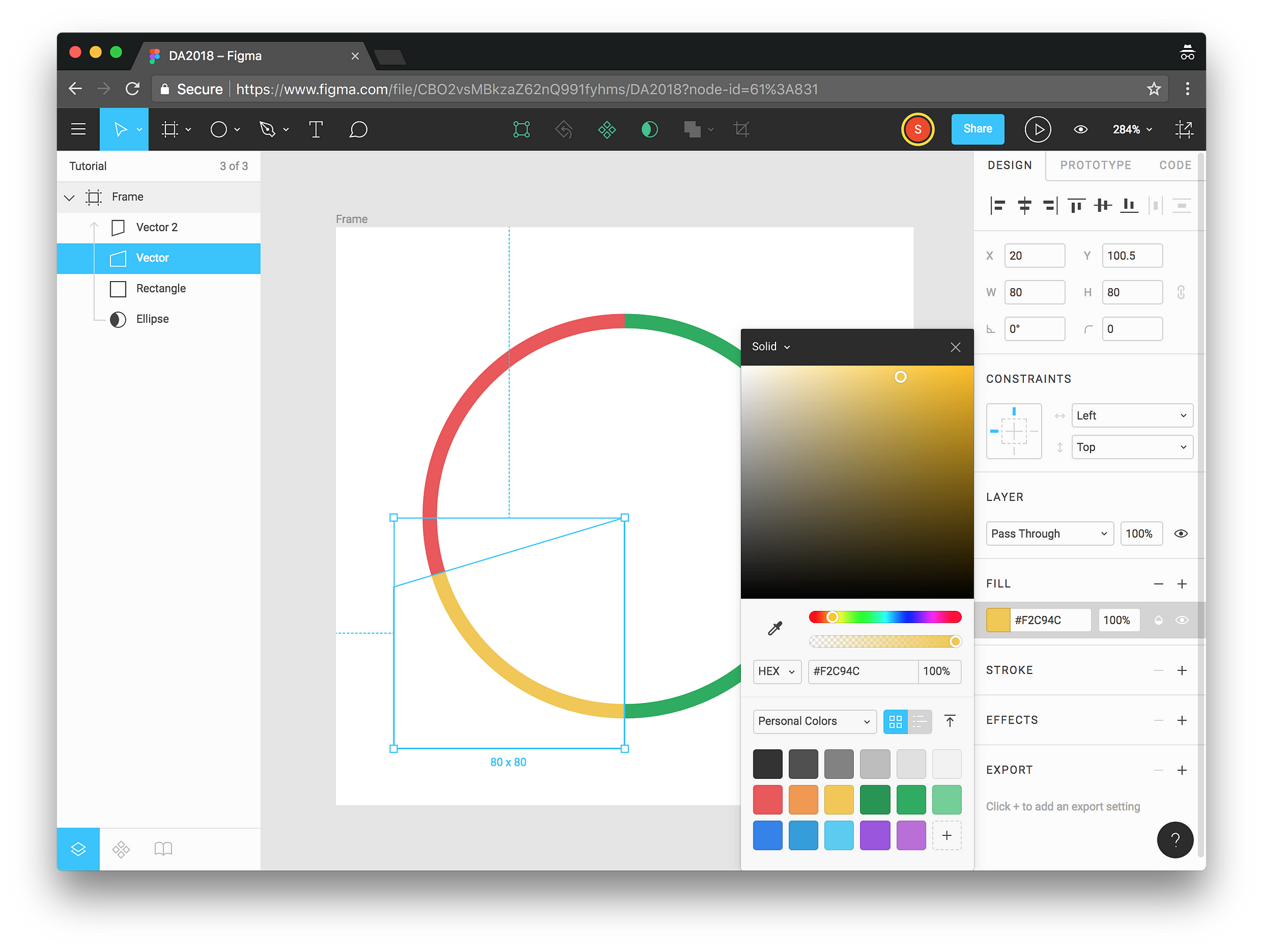
To change the colors, simply change the fill color of the individual vectors. Here I’ve selected the 20% one and changed it from blue to yellow.
If you wish to add text to this design, you should group the elements that belong to the chart so that your text doesn’t get affected by the mask.