Common Accessibility Problems: Good and Bad Examples in Modern Websites
Accessibility awareness is growing, and with one in eight workers will be disabled for five years or more during their working careers, today’s developers must not leave out issues regarding accessibility when developing and designing our modern interfaces.
Our users may have a variety of disabilities and our complex web pages are filled with richer multimedia and HTML content. An accessible site may not only allow users (potential customers) with motor, visual/audio disabilities to use your site, but may be as important as whether a disabled person is able to do her job.
Below are some common examples of why your site is inaccessible.
Note: The guidelines listed are simplified versions of the WCAG guidelines. Click on the links for the full descriptions of the guidelines.
Insufficient color contrast

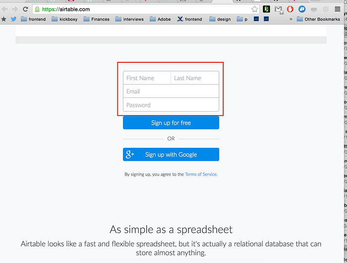
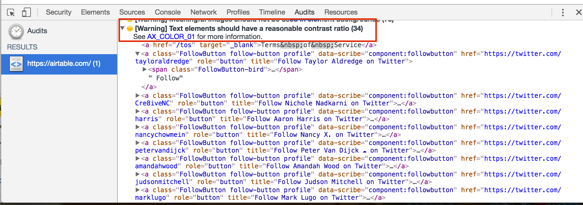
Bad. The gray color used for the font and border of this login interface fails the contrast ratio guideline
Affects: users with vision impairments (low vision, color blindness, etc.), and even users with good vision in brightly lit situations or low-contrast displays
Guideline: The visual presentation of text and images of text has a contrast ratio of at least 4.5:1 — WCAG 1.4.3 Contrast
Tools: I use the Google developer tools to determine if the color contrast on my current page follows . Under “Audits”, you can check “Accessibility” to run an audit your current webpage.


Another resource is the WebAim color contrast checker to determine the current color contrast and whether it passes the minimum contrast ratio requirement
Not Keyboard Accessible & Keyboard Traps

Good: being able to access all your links/buttons with the keyboard. You should be able to focus and activate all of these elements as well.
Affects: Website users who rely on a keyboard only — or assistive technology which uses the same level of functionality as a keyboard to use and navigate sites.
Guidelines:
- Make all functionality available from a keyboard. — Guideline 2.1 Keyboard accessible
- Don’t let your users get “stuck” on an element. If keyboard focus can tabbed to an element, then the focus should be able to be moved away from that component using only a keyboard — 2.1.2 No Keyboard Trap
Tools: Go mouse-less. Everything you can do with a mouse should be possible with the keyboard.
No Visible Focus & Tab order is not logical

Bad. We are seeing illogical tab order in this example, and the menu link “Categories” is skipped — never receives focus!

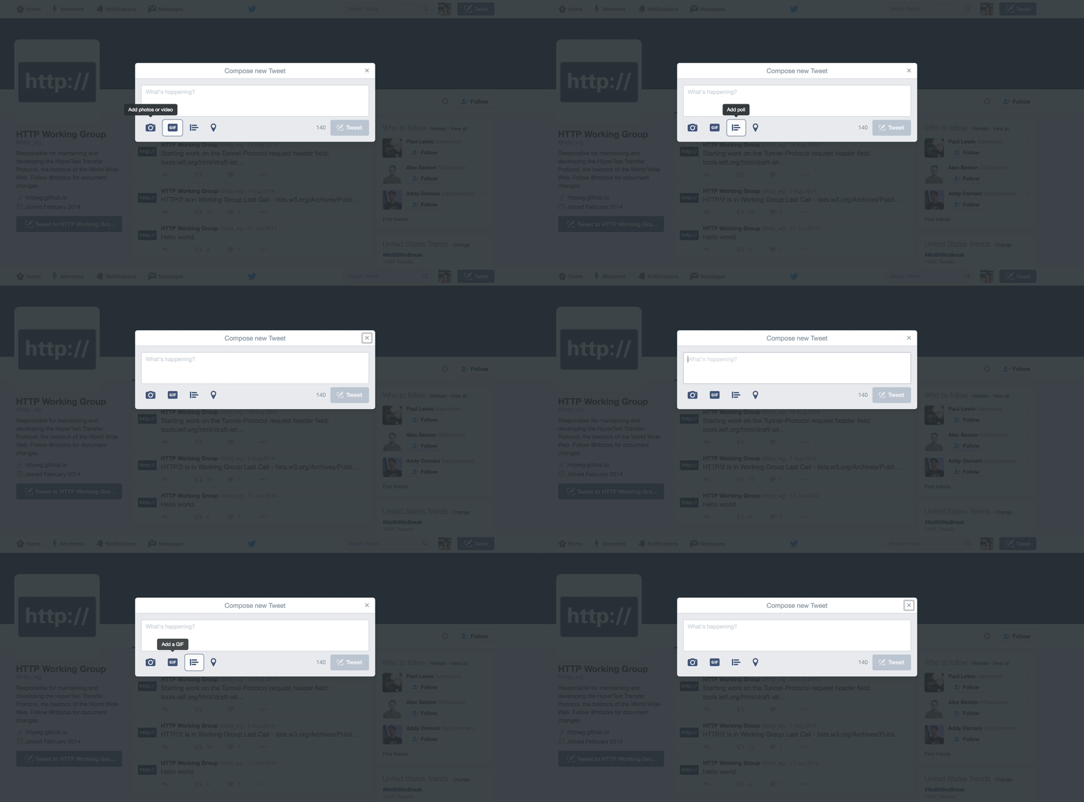
Good. Notice that when a tweet dialog is shown, the focus never leaves the dialog itself. As long as the dialog is open, focus should limited to the elements of the dialog.
Note: When the dialog is dismissed — either by the “x” in the dialog or the keypress “escape” , focus returns to the button or the element that triggered this dialog (in this case, the “Tweet” button”)
Affects: Keyboard users trying to navigate content of your site. Don’t mess up their mental model of your page content! Browsers need to show users visibly which element of the site currently has focus
Guidelines:
- Any keyboard operable user interface has a mode of operation where the keyboard focus indicator is visible — 2.4.7 Focus Visible
- Focusable components should receive focus in an order that preserves meaning and operability. — 2.4.3 Focus Order
No alternative text for non-text content


Good. Ebay is using an image to direct people to their Nikon Cameras sale. In the HTML markup, we see alternative text describing what this image’s content (Nikon Cameras 40% off) and function (Shop now)
Affects:
- People with visual or certain cognitive disabilities: Screen readers will aloud text content in place of images
- Anybody — if the image file is not loaded or when the user has chosen not to view images
Side note: It provides a description to images which can be read by search engines or to determine meaning from this alt-text alone.
Guideline: Provide text alternatives for any non-text content so that it can be changed into other forms people need— Guideline 1.1
Note: If you want to use a clickable image instead of text, consider adding an aria-label aria-label=”My label” to the item; an aria-label takes the literal (localizable) string and translates it to ensure the screen reader reads the right thing. (this overrides the alt attribute)
More about guidelines:
The most widely accepted standards for accessibility are the Web Content Accessibility Guidelines (WCAG), developed by W3C. It is internationally recognized and provides a set of testable criteria we can measure against. To even be able to claim that your application is following basic conformance, all criteria in level A’s guidelines must be met.
There are 3 levels of conformance: A, AA, AAA (AA is widely accepted)

