Come for the URL, stay for the message — abovethefold.fyi
A novelty side project exploring the myth of the fold. Is it really a myth? Scroll to find out…
Concept
My idea was pretty simple. A novelty one page site, demonstrating and informing why ‘above the fold’ is a saying from the past, with a bunch of great reference articles.
Definition
above (or below) the fold
2. positioned in the upper (or lower) half of a web page and so visible (or not visible) without scrolling down the page — Oxford Dictionary
Problem
With responsive design, the fold cannot be measured by an exact amount of pixels anymore. So how do you represent the fold when there are so many different devices, resolutions and viewports? Where actually is the fold?
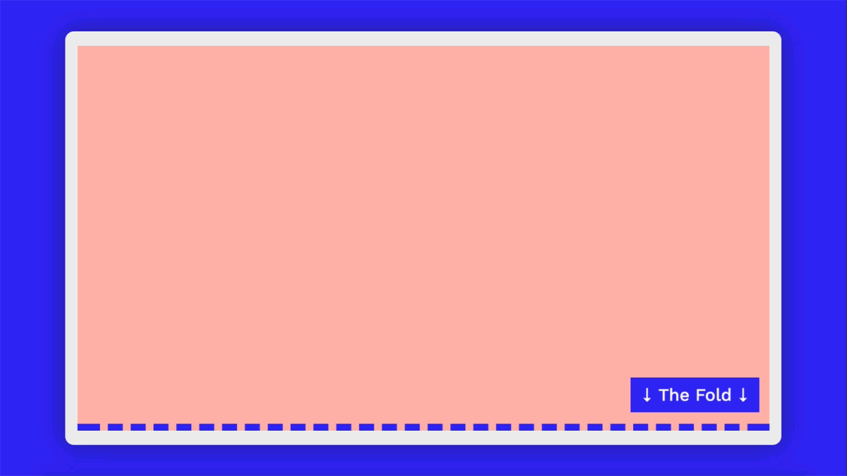
Solution
To represent the fold on every viewport and resolution, I decided to use fix positioning, and a 10px blue dotted line. I added an animated visual cue to further highlight the position of the fold.
hr.thefold {
    border-top: 10px dashed #2b00f7;
    position: fixed;
    bottom: 0;
}
To ensure that the key message was initially hidden, and only visible when the user started scrolling, I used viewport units. Viewport height (vh) and viewport width (vw) represent a percentage of the current browser viewport. I set the top margin at 100vh, which would always position the content after 100% of the viewport height — essentially ‘below the fold’.
.content {
    margin-top:100vh;
}
Feedback
The response has been great. There has been a lot of positive and negative comments. A few people said that they thought the website was broken and that the content was taking too long to load. Others embraced the concept, and like most people nowadays, they scrolled.
Positive
Huge were kind enough to tweet about it, which was awesome. It was also picked up on Sidebar.io, CCS Tricks, Designer News and featured on Brutalist Websites and One Page Love, to name a few.
There was also this user on Reddit who emphasised their point in CAPITAL letters…
THE FOLD DOESN’T EXIST. NO ONE GIVES A F**K ABOUT SCROLLING.
Negative
Some people disliked it and took it a little too seriously…(one of my favourites from Reddit)
This is rubbish. “Above the fold” is being wasted away by clueless hipster website “designers” who put a full screen height and width image on the landing page to make it look pretty on their iBook so consumers have no choice but to scroll. Such “designers” have no knowledge of actually how to sell. The clients have no knowledge either. Those who know the ‘score’ will keep on using above the fold.
Conclusion
It’s a difficult task to ensure specific content appears above the fold on every device. Using viewport units (vh and vw) can be a nice solution. There is still a lot of value in content that appears higher up the page. But ultimately, it’s not the only place to have valuable content.
Remember there is not a ‘one size fits all’ answer for this. Every project is different. Every end user is different. Every goal is different. Every device is different. Use your common sense, and apply basic design principles. Remember to create engaging content and make sure to prioritise your CTAs appropriately. Design an experience that is right for the end user, and it will be a basis for creating a successful product.
Business above the fold, party below the fold
Those of you that like to right click and inspect, make sure to note my finest bit of code. Thanks for reading. Let me know your thoughts about the site.
Visit abovethefold.fyi
<!--
  Business above the fold
  //
  //
  //
  //
  //-THE FOLD-//
  //
  //
  //
  //
  Party below the fold
-->
By Rob Lafratta – a clueless hipster website “designer”

