Member-only story
Creating Your Design System from scratch is never done overnight. You already prepared for building your UI Library by reading how others do it, seeing some samples & picking the right tool? Now you are ready to open Figma or Sketch and start to play… with Colors!
This is the series of articles helping you to create your own Design System UI Library, previous parts:
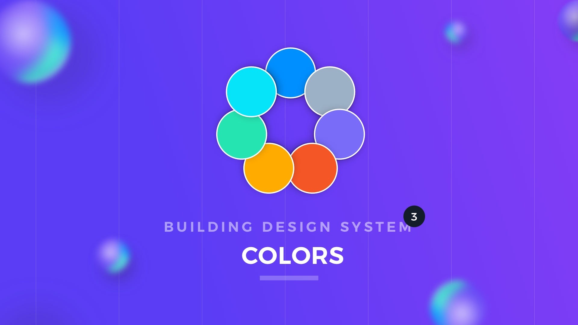
Colors are the most important (next to Typography), when it comes to creating a Design System. Your Graphical User Interface may not have icons, panels, pictures, but it surely contains some colors & text. That’s why picking the right set of tones is very important.
Naming Convention
Picking the right naming convention is the first thing you should do. It should be done before defining colors and the number of tones. Why? Here is the explanation.
Color names in the Design System should reflect their purpose. That is why your colors have to be named like: Primary, Secondary or Tertiary instead of Red, Purple, Blue. This will give you more flexibility, and even if your project goes through rebranding, the color names will stay the same in the UI Library. Prepare the following names:
- Primary — usually the main brand color
- Secondary — may be optional)
- Tertiary — may be optional)
- Success — for the accomplished goals and other successful operations
- Warning — use it when you have to warn a user
- Error — as the name suggests, elements displaying Error should use this color
- Neutral — for all kinds of grayish elements
- White & Black– white & black are always these pure colors that never changes.
Ok, so you have your base colors. But to ensure good flexibility and accessibility, your colors have to include more than one tone. You have to create tints & shades.


