Clover is going to optimize your shopping — UX / UI Case Study
Crafting an innovative experience with a shopping app
I recently completed a training in User Interface/User Experience design with Ironhack Paris. For my final project, I worked on the UI/UX of a personal project that I wanted to develop until one year. Thanks to this project, I win the one minute pitch Ironhack Hackshow of which the goal is to present our final project. The public had to vote for their favorite one.

Context
“Your are not your user” but some personal experience can gather a community of concerned people. We were in the middle of the afternoon, there are a lot of people in the main street of shopping in Toulouse. I had no time and I had a precise idea of the article I needed but “ Where could I find it … ? ” “I don’t see the articles in stores, there are too many people … 😤” Maybe, there is a real problem in this experience… .
Business
This experience regroups 3 values : efficiency, exclusiveness, precision. The main mission is to create a UX / UI solution to simplify the Out-Store In-Store shopping experience, namely to quickly indicate the store in which there is a desired type of article.
Challenge UX / UI
- Analysis of competitors and existing
- Conduct user research: surveys, questionnaires
formalize the personaes that result. - Define the user path and functional responses
to problems. - Creation of the information architecture and the user flow(s)
- Realization of wireframes and prototyping interfaces
- Implementation of user tests (Desirability test, etc …)
Data market
After defining my main mission and precising the foundations of the business, it was important to lean on data market and maybe to see the first pain point. According to INSEE, the ready-to-wear represents 28 billions of dollars in 2017 in France.
2018 is the 9th year of recul for sales of clothing in France (physical stores) : -34% of frequency until 2014.
The sales of ready-to-wear on the Internet explode and pass from 6% to 17% in France. According to Eurominotor International, personalization will remain a key trend in the fashion industry for years to come.
I have noticed that there was a real problem with the experience in physical stores.
Competitors analysis
At first, I have analysed some competitors which give the possibility to find an article in a shop of the same brand or another brand as Bershka, Screenshop and Selectionnist apps. However, when I have interviewed users (in the next step), their needs were more focused on the personal shoper and not only the fact to find the good article in the good store.
So, I have reanalysed the competitors in order to define my new strategy, based on a unexistant concept which users need.

User Research
To define the user persona, I have sent a survey : 88 persons have answered it and 82% of them weren’t really satisfied. 72 % are women between 26–35 and shop regularly in store once by month, the week end. Women shop alone, until 3 stores before finding the article they need. Globally, they buy 1 to 5 articles in one experience shopping.
Interview results
Then, I have discussed with 5 fashionistas and 2 professional relookers.
“ — I know what I don’t want”
“ — I hate overcrowding of shops”
“ — I know the colors that don’t suit me”
“ — I want some originality that stays in my style ”
- 5/5 say they receive bad advice from sellers (or not professionals)
- 4/5 find articles on the internet before going to the store, check the quality and try in the store.
- 4/5 shop with a specific idea and want to complete their outfit easily
- 3/5 do not easily find the article they want.
At this step, I decided to focus on the purchase of an individual article and that will complement what the user already has in his dressing room (because the persona is careful about the budget and has a habit of comparing the prices of items) Some competitors are access to the complete look, recommended but not on the immediacy. Competitors propose looks “Box” or so offer the user to create his own looks, or to appeal to a stylist. My personal shop will take into account the style of the user upstream to be able to propose new articles that match with his style and what already exists in her wardrobe.
Build the persona
After a better overview about the strategy business and the users’ needs, I created one persona that embodies the traits of the target audience.
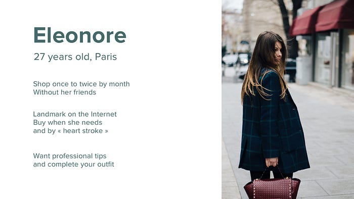
Persona Journey
To understand where Eleonore meets problems, I have built a journey map. Here is the resume of her out-store and in-store experience :

Stories
With some of the pain points uncovered earlier, I created two stories for the features that will addressed with the first release of the app.
- As a shopper, I want to find the article that suits me but stands out.
- As an ethical consumer, I do not buy an item if I do not need it.
- As a person who does not have the habit to match with the outfits and the colors, I like to have professional advice.
- As a working girl, I hate over-crowding in the shops.
Pain points
The pain points uncovered are as follows:
- The persona is not a stylist.
- Eleonore doesn’t know in what shop to head.
Define the Problem
How might we help Eleonore find an article that corresponds to her style every time she wants novelty?
Ideation & Brainstorming
Around a table with an incredible team of ux designers, we have proposed 24 different ideas. After that, it was difficult to select the best idea that’s why I have regrouped these ideas by categories and have selected three ideas. Thanks to the Round Robin user experience method, with another team of 3 persons we have develop these three ideas. Each idea has been deepen by each member of the team.
At this step, I decided to retain one idea that perfectly met the needs of the user :
— Personal shopper : look builder based on the user’s style. Thanks to algorithms based on relookers’ work, the app generate 3 articles matching with one of a photographed basic that the user doesn’t know how to associate it in a complete look.
User flow
I used the Cart Sorting method to create the information architecture. This method allows me to define three steps of the flow :
- Onboarding : Eleonore informs about her, her best brands, her morphology, colors that she hates.
- Look builder : system in which she can add one of her basics. The app proposes her three articles which match with it. She can change range colors at this step.
3. Adress store : list of stores where she can find the articles.
Eleonore will create her account by filling in her name, her first name, her e-mail and the brands she usually buys. She indicates her references “style” and the color she does not like, a maximum budget of 80 euros.
She wants to find one nice item that combines with her pullover, she changes price by 50 euros and the color range. She validates the proposed articles and inquires on the address of the shop.
Design Explorations
My goal was to provide design solutions for the pain points uncovered in the initial research. The paper prototype testing generated mistakes which let me to deepen or remove some parts of the app.
Paper testing
Instead of crafting all the design, I have created the low-fidelity prototype in order to verify the flow and the set up of features. Some issues have been mentioned and here the solutions I have set up.
Usability issue 1
Participants asked me what morphology, shapes corresponding to their body.
Solution : Use artificial intelligence to define the shape of the body. The user will be use camera of his phone.
Usability issue 2
Most of users love the concept but say that it will be more interesting to offer a global look. Participants found that the landscape navigation is a bit embarrassing but it is held if there is 3 proposed articles.
Solution : Create an app which proposes a complete look with no one but three items.
Usability issue 3
Participants thought that it will be interesting to add a distance range at the begining.
Solution : Add the distance range before the user reachs the screen of the look builder.
Usability issue 4
Users don’t understand that you have to put the phone in portrait mode.
Solution : The flow will be continued in landscape mode. The following screens will be redesigned accordingly.
Wireframe
I have crafted the mid-fidelity screens taking into account the feebacks of the test. Since most users want to find items which match with their style, first screens ask to the user to create his profile, describe his style, his cuts, favorite brands.

According to relookers’ interviews, eyes’ color and hair’s color influence what we are wearing. It was necessary to define those caracteritiscs before the look builder. As users are not friends with some colors, they can indicate what color they don’t like at all.
Every time the user wants to go shopping, the app will ask him what style he is looking for and what distance he wants to buy items. As stated previously, the app warns the user that he has to turn his phone for finding articles. I’m aware that datas in user experience indicate that landscape mode is weakly used that’s why at the end of this part the last screen accompanies the user.


Then, the user adds his basic, the app generates the global look. The user can regenerate as many clothes as he wants ; he can change the color by product. The algorithm goes back the number of available articles. Distance and price are alterable.

After validating the look, we have access to adresses of the stores where we can find the articles. These screens present the list of the item and the corresponding shops. After 2 or 3 hours, the user receives a push : “ Hey, have you bought your global look ? Come on notify it !”

Design reviews
After a second test with users, I have noticed that the icon “wheel” which change colors are not really clear for the user. Moreover, technically it was too difficult ; I have decided to review this part. The user was lost, too many features were represented.
Visual design
Branding
I decided to name this app “Clover” because this concept symbolizes the clever purchase and scarcity. There is a play of words between “Clover” and Clever” and a responsible dimension with the green color. The dark leaf recalls the basic item and the other leafs describe the three proposed articles by the look builder.
Moodboard

I have choosen minimalist elements :
- Proxima Nova font : in uppercase letters, it is very strong and engaged. In small letters, it is elegant and suits the world of fashion.
- Coral color : Coral symobizes change and transformation.
- Light green color : because it translated the personalization.
- Light icons : their design express elegance
Prototypes
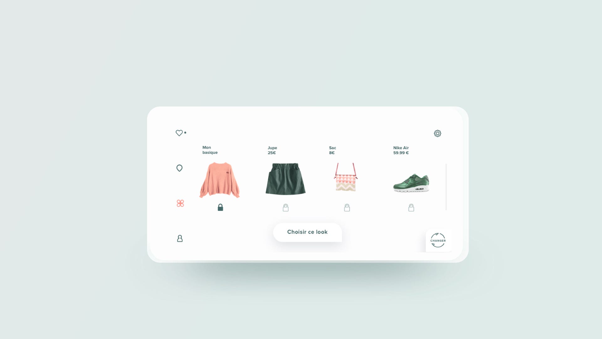
I have replaced wheels by padlocks because if a user love one cloth, it can lock it. Distance and price have been moved in a modal view (“wheel icon”).

Desirability Test
The design was appreciated by 100% of people. They define the design around 4 points :
- Trendy
- Modern
- Convenient
- Clean
All users were interested to use this concept : it was a success (at the end 😄)
“ — Stores are now all mine ! “ Eleonore.
Key Learnings
- Simplicity = efficiency : when we add too many features for giving more freedom, user isn’t free but lost.
- Test the app with paper prototype and retest with mid-fidelity wireframe allowed me to avoid making this app unusable on this mean feature (look builder)
- “You are not your user” : one year ago, before following the Ironhack course, I wanted to create an app using augmented reality for finding only the item we need. Thanks to this ux research, I understood that it was not the real problem, the users’ needs.
What’s next ?
- Micro-interactions (artificial intelligence of morphology, etc…)🚀
- The user will publish photo of your worn look on his instagram account and find photos or video of worn clothes on Instagram. 📸
- Find a developer-associate to realize this project 🤝
Before you go
- Give me your feedbacks, what you think about it 🙌
- Visit my website alor.design if you want to know about me 🤹🏻♀️
- Contact me at allo@alor.design if you are webdevelopper and if you are interested in this project. ✊
- Clap the article to motivate me to write more and more about my work 👏
Thanks to Agathe, Camille, My-Lan and my team of designers Tahina, Louise, Southi, Hana, Laura, for their collaboration and Ironhack Paris for giving me the means to craft this project. Thanks to my users who participated in the survey, interviews and tests.


