Chatting about UX failures — Facebook Messenger
You often hear “less is more” in design, which originated in Architecture but is equally important in UI/UX design. For me pairing back a design to it’s absolute minimal elements and making sure the interface is clean, easy to understand and quick to use IS the definition of good UX.
It’s crucial to remember your user’s primary goals and to prioritise accordingly to achieve the best experience possible.
It seems Facebook Messenger is trying to take the “less is more” approach to their app but some of the UX failures are too good not to point out. So let me take you on a journey with me.
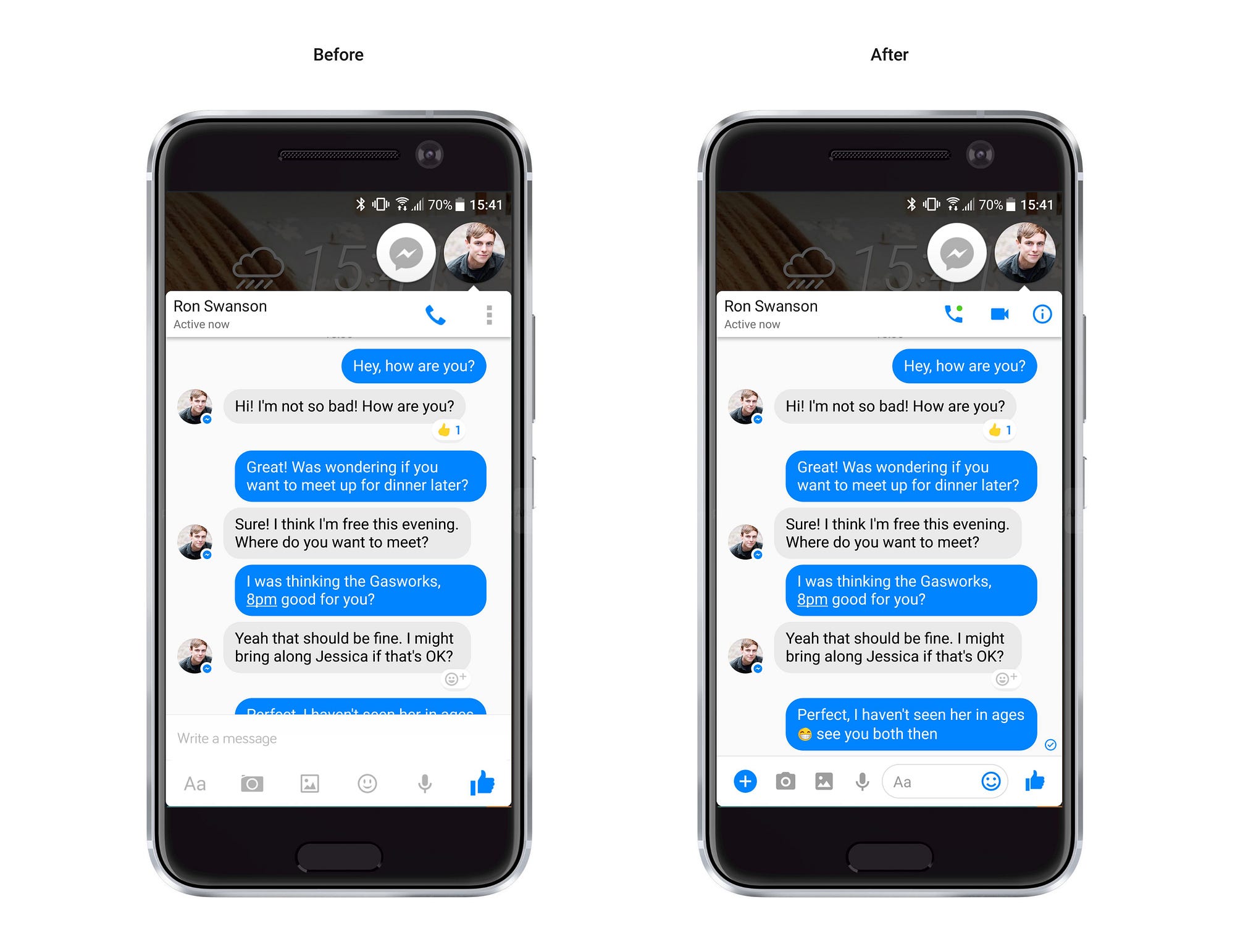
I recently opened Facebook Messenger after an update to find that they’ve changed the layout slightly. As I entered the latest version of the app not only was I bombarded with “helpful” tips on how to use it, but all of a sudden I was completely lost and couldn’t find the chat text field. The helpful tips kept getting in my way for the task I was trying to achieve — if you need to explain to me how to use your app, you’ve already failed.
This app’s primary function is to chat to people and now when you load it the bottom of the screen no longer automatically has the chat function ready to go. You’re forced to open the text field to start chatting — so Facebook have added an extra step to get to the primary function.
Did we really need to save those 80 pixels where the text field was before? Have you enhanced my experience by pairing back the design? No.
Less may be more, but only if you prioritise the functionality appropriately and keep key functions easy to use.
Ok so the initial frustration is over now that I can see where I have to click to chat to someone. Away I go chatting… but wait, what’s this handy little arrow here? 👀 Is it pointing to my message that I’m typing, or does it… do something?

Oh, no… it’s a back button to the full menu with a forward facing arrow 👉 how confusing. Remember before, when I could type a message and use the other features at the same time — yeah that was nice, those were the days.
I’m a huge fan of emojis — why say it with words when you can say it with an cute illustrations instead 🤖👏. So I head on over to the little smiley face (the undisputed international symbol for “show me them emojis”) only to find myself on the Stickers page 😫👎
Well it’s not too bad because I can see my emojis in a tab nearby, but I would rather this smiley face goes directly to what I expect — namely smiley faces 😀

Great, I can see my emojis now and maybe I will even use a sticker — who knows I might even go crazy and add a GIF! Yeah, let’s do it, let’s rock this conversation with a GIF….who doesn’t love a moving image?


I have so many questions 🤔
Why are the GIFs above the tabs instead of below? Usually when I click on a tab content appears below, not just on this app but the web in general. It’s how I expect tabs to behave.
Where did my text field and the other functions go? They’ve been replaced with a search bar. I like having a search function but not at the expense of finding my way back to where I was.
Is that X button to clear the search or to go back? Not so long ago I was using a forward arrow to go back to the menu so why is this icon different here.
For me Jim’s face (on the right) says it all here…
At the end of the day it’s a product and I understand that there are constant changes and improvements going on in the background, so let’s give the Facebook Messenger team a break. But as a UX designer, I just couldn’t help myself but to point out these UX flaws.
Read more on Strata3 Blog

