Case Study: Student Portal
Introduction
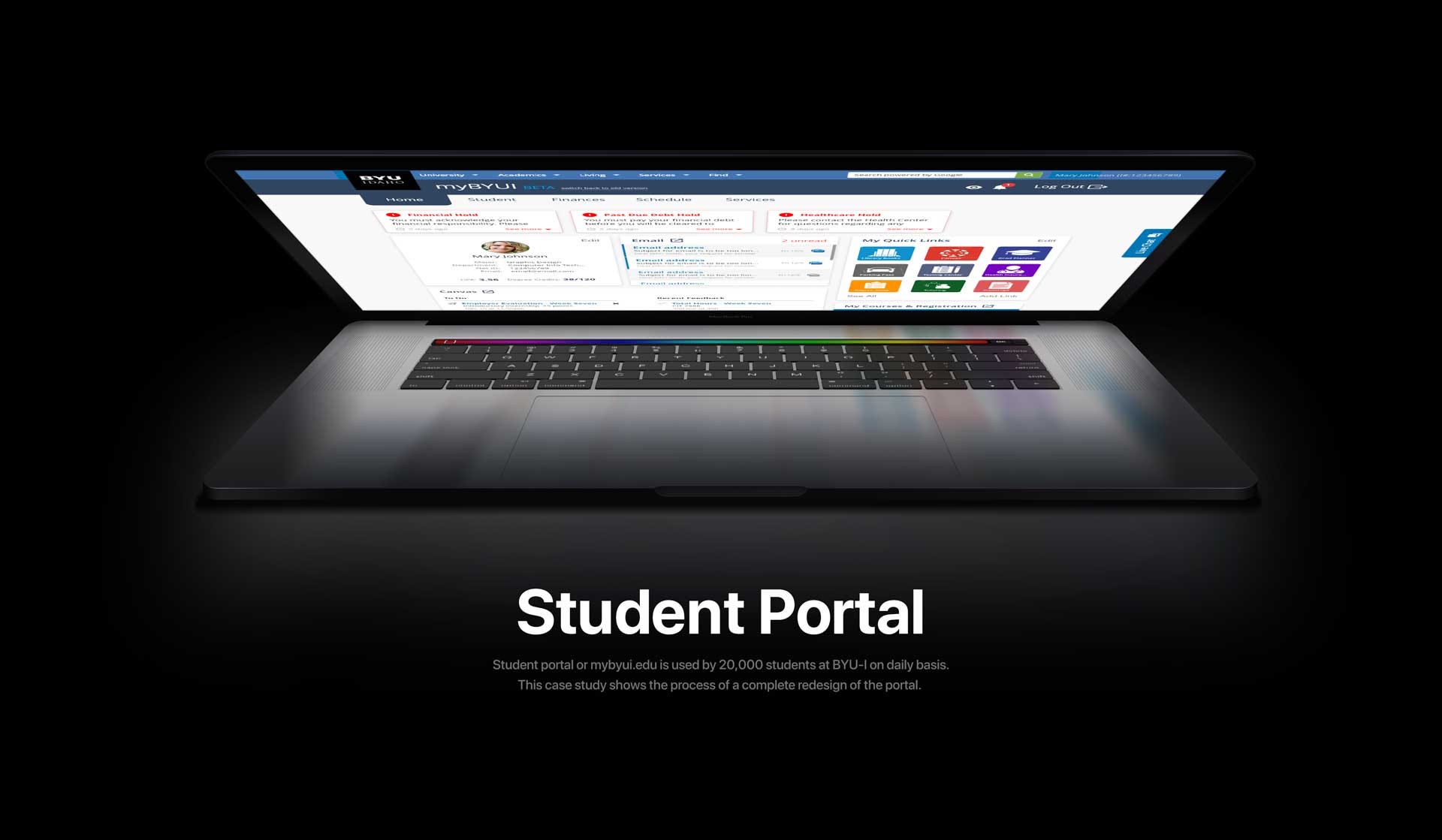
Student Portal my.byui.edu is one of the most used tools at BYU-Idaho. It’s used to access all vital resources to help students go through college and earn a degree. It’s used by 20,000+ students on daily basis and receives 2+ million visits per month.
My Role
I was a lead UX designer on this project, but couldn’t have done it without my team. Jake helped us jump start this project in ideation and sketching process and Nate helped me throughout the project to design, test, and iterate.

Project Goals
To identify project goals, I’ve conducted interviews with university stakeholders and users. Being a day to day user of this portal, I’ve had a few goals of my own that I wanted this tool to accomplish.
- Create a portal that would serve as a hub to all vital resources that users need on a day to day basis.
- Implement a tool that could be used by university to communicate to the users important information and overall vision.
- Tailor content to specific user groups.
Problem
Current myBYUI student portal does not provide students with relevant resources and information. As a result, students have difficulty accessing the services the school provides and completing important tasks.

Solution
By providing the students with relevant information at hand, we have made this portal more accessible and informative. By providing a notifications center we have also given a school another communication tool.

Below is a comprehensive Case Study research process
User Research
Assumptions
I found that it’s a good habit to start a project with a brainstorming session to identify what we’re trying to achieve in the project and how we will do it.
- Users never use anything below the top navigation.
- Users don’t use the side navigation.
- Most vital links are bookmarked by the users.

Key findings
Our team conducted 30+ user interviews to understand how the users are using the current student portal and to see what features they would prefer to see in the new student portal.
- Tabs are being used to get to somewhere else.
- Students disregard current information below the top navigation.
- Lack of alerts for holds and important news.

Quantitative Analysis
To better understand the main problems of the current student portal, I’ve requested our Student support and Analytics teams to provide us with data on the portal for the last quarter of 2018.
Main complaints:
- Current portal is missing the “Log out” button
- Some resources on the portal are not working or very hard to find
- Students want to have a place with the most used services links
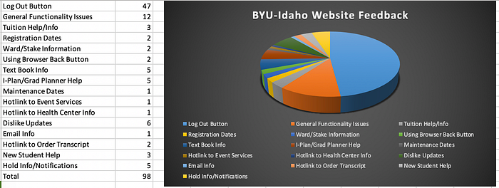
Most used services:
Our analytics team has provided us with the most used services at BYU-Idaho.


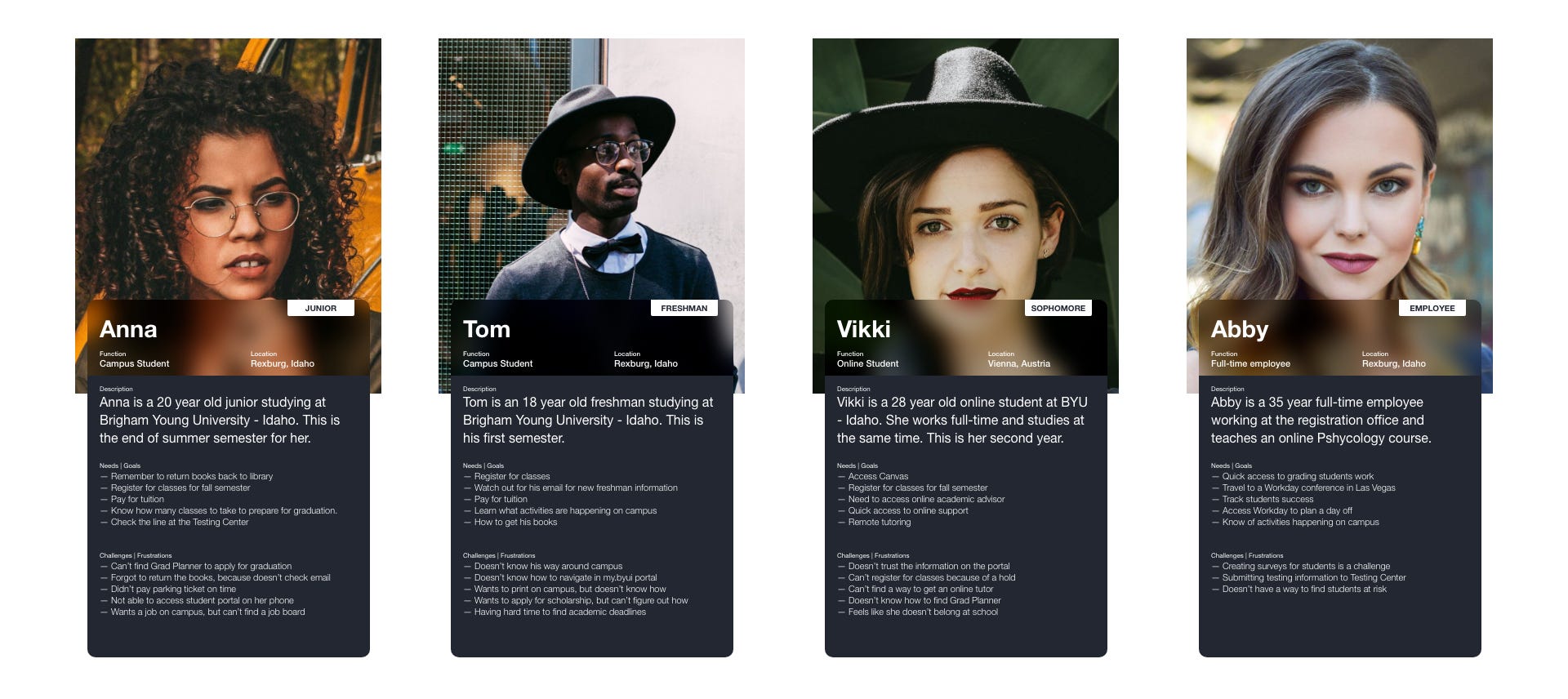
Proto Personas
These 4 personas were created to help our team focus on the main target audience and user groups of myBYUI portal.
Mind Mapping
Trying to understand the users is the key to success with this portal, so I decided to go through some mind mapping exercise. I have mostly been using Lean UX book during this process.


After going through this exercise our team was able to prioritize the features that should be on the student portal.
Card Sorting
We realized that there were very many services and items that currently exist on the portal and to make sure that users would know where to find them, Jake and I conducted 10 card sorting activities where users had to organize items into 3-4 groups and then name those groups.
Top Navigation Menu Proposal:
- Academics
- Finances
- Resources


Competitor Research
It was important to learn a little bit about what other schools are doing and what portals they are using. I have found a couple different portals and dashboard variations, but these were the closest to our needs.


Design Process
Sketching
After we have discovered the main problems, identified most important services and user groups, our team moved on to the design process. We gathered together and sketched out a few variations of the portal keeping in mind our research.


Wireframing and Paperprototyping
After our team has solidified a few ideas, we have taken this to the next step and created a few wireframes. These wireframes were our top 4 ideas out of more than 10 that we’ve created and tested on 4 different user groups with overall 20 tests.

Testing outcomes:
- Users really liked the overview of most used services
- Users were big fans of the holds and registration sections
- Users wanted to have most used services in the quick links section.
Lo-fi Mockups
After testing wireframes, we have built approximately 8 different variations of low fidelity mockups and tested them to receive user feedback. Mockup below tested the best out of all.

Testing outcomes:
- Users liked the layout and were immediately drawn to the content below the navigation menu
- It felt like users were a little bit overwhelmed with the amount of information presented upfront
- Nobody noticed the notifications/alerts section
Hi-fi Mockups
Testing outcomes of our lo-fi mockup pointed out a need to restructure the way the information was presented to make it easier to comprehend. After a few iteration and about 15 tests, I was able to come up with an idea that tested the best.

⚠️ Lessons Learned:
I’ve learned the importance of working in a scrum environment, because other stakeholders have vital information that we as a design team are not aware of.
⚠️What I would have done differently:
While we have gathered a lot of information about how users interact with the student portal and what their needs are, we haven’t considered each user group and their behavior at different times in their schooling experience. We could have enhanced their experience even more if we would have implemented that feedback in the new design of the portal.
