Building a system for email design & deployment

I’ve always had this love/hate relationship with email design. Over the years, I’ve grown to love them, learning to accommodate their finicky nature. There’s something so satisfying about seeing an email design come to life — fully responsive, and not broken across (most) email clients. At the same time, recognizing the lack of progression in email design and development can be incredibly frustrating — while other areas in design are pushing the boundaries with stuff like augmented reality and VR, email feels like it’s stuck in the 90’s, unable to escape the treachery of table-based HTML.
This discrepancy strikes me as a little odd — despite being one of the key channels used by many companies to drive revenue and engagement, emails don’t get much love. How can designers and marketers build a scalable, functional, and progressive system for creating emails?
Applying design systems thinking to emails
Being one of the hottest topics in the industry at the moment, it’s hard not to think of design systems when working on any type of design, even emails. At their core, design systems are meant to establish consistency and efficiency across the mediums that a brand manifests itself through. Emails, like mobile apps, websites, and any other elements that need design, deserve the same level of care to ensure that a brand’s voice is coming through effectively, and that the design work itself is able to scale.
At both of the companies I’ve worked at, I’ve worked closely with marketers to create template systems that work for them and other designers — along the way, making a bunch of mistakes and learning new methods for the next time I try again. In my most recent attempt, I tried adopting a design systems approach which has helped me better understand and adapt to our changing email needs while maintaining consistency amongst communications. The strategies I’m about to share might be helpful to you as well if:
- You’re working on highly-customized emails (lots of text/copy)
- You need responsive design
- You’re comfortable with maintaining a database of HTML snippets
There are other options for building systems with MailChimp or Campaign Monitor pre-made templates if this doesn’t sound like you. If this does sound interesting, I hope these strategies will be helpful to you in some way!
Building the foundation
Like with any design system, building a toolkit of design components that are tied to pieces of code helps to establish the foundation of the system. A simple email design system can consist of two key elements: design templates and a code repository.
Design templates are exactly what they sound like — fully mocked-up components or designs in Photoshop or Sketch, with replaceable areas for content (usually smart objects or symbols). The code repo is the HTML and CSS that brings these designs to life. Every element that you include in your design templates should have corresponding HTML/CSS living within the code repo. When those design templates get updated, the code repo should as well.
Understand stakeholder needs
Before you start designing, it’s key to evaluate the different types of content that is typically communicated through emails your organization sends. Working directly with marketing at this point in the process ensures that you’re satisfying the stakeholders’ needs. If the templates don’t meet the requirements that they set forth, they’ll fail to create value and won’t be used as you intended, no matter how beautifully designed they may be.
Once general content types are defined and stakeholder requirements have been established, this is when to start designing the templates.
Module-based design
I’ve adopted a module-based design approach to emails — designing small components that represent pieces of content that might be included in an email. At their most basic level, modules are predefined layouts combining text, images, and CTAs. Create modules by using different image sizes, text layouts, and button placements to establish a library of commonly used components.
When designing these modules, it’s also essential to remember to design how they’ll translate between desktop and mobile clients. Responsive email design is a key element in driving engagement for users and also ensuring they have the best experience to consume the information you present.
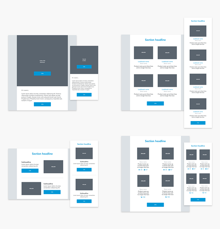
Modules can be designed using any design program of your choice. I’ve typically used Photoshop to create Smart Objects that will allow other designers to replace images and text to my exact template specifications without altering the overall layout. Similarly, Sketch can be used with its Symbol functionality to allow other designers to quickly replace images and text to customize each email. In any sense, it’s important to design these elements in a way that others can easily understand the exact specifications needed to replicate the module on their own. This helps to make the system more scalable and usable for all parties, instead of relying on a single point of contact to make emails work.
Applying modules to email content
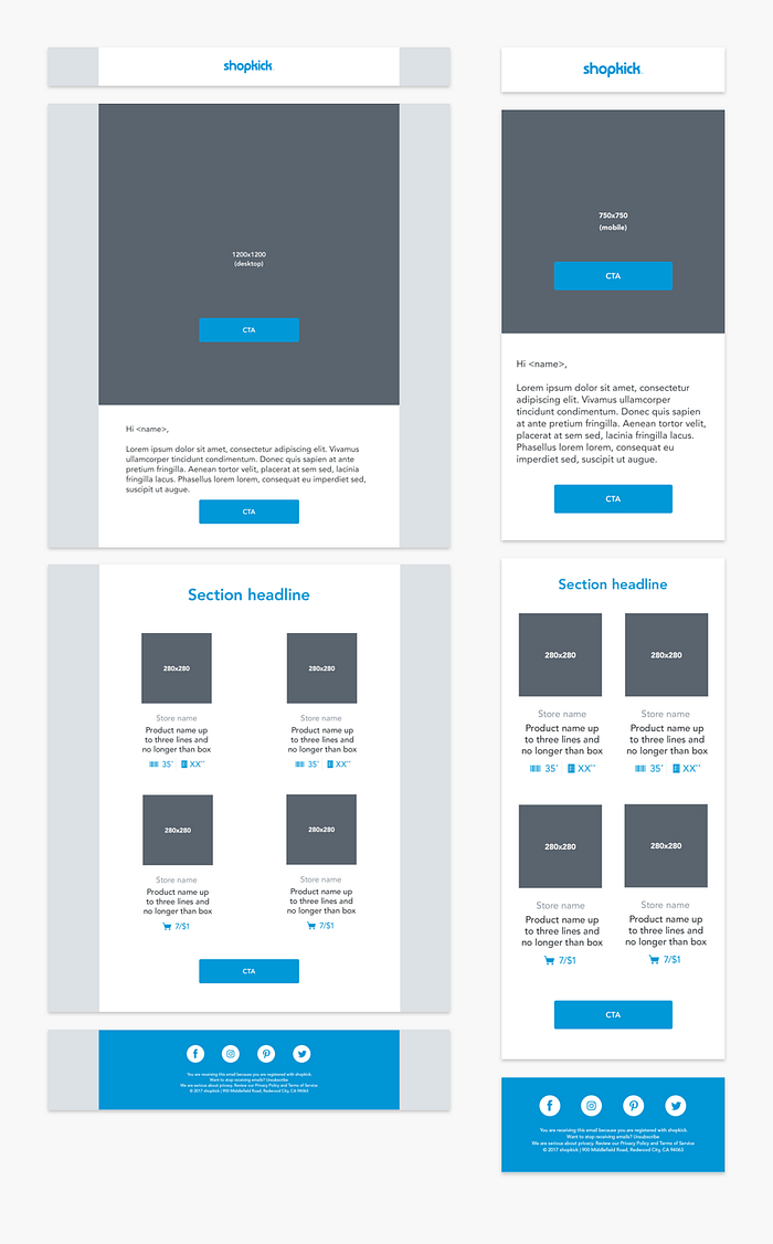
At Shopkick, every stage of email design and deployment is worked on closely by both marketing and design. Marketers typically propose content they envision will communicate a strong value proposition to users, and designers take these proposals and create email designs using the modules that will best communicate this content. The process is entirely collaborative — with marketing helping to influence design, and designers helping to influence strategy and copy.
Here’s a simple example of how an email can come together — say your marketing team wants to send a weekly email that showcases different items or products around a seasonal theme. There will be different numbers of products featured week over week, and each product listing needs to include the following:
- An image
- The product’s name
- Where to shop for it
- The price
Since I started with a module-based approach, it’s easy to mix and match different content layouts to fit the needs of this communication. For something like this, I’d include a simple header graphic and description module to allow the marketers to write a brief introduction, and apply any relevant graphics to tie the email to the rest of the campaign, a module with product “tiles” and listings, and our normal branded header and footer
modules.
For many organizations, certain emails that are sent on a regular basis like newsletters, weekly digests, or the like. In these cases, it’s great to expand your foundational elements to include fully-built design and code templates, that are super easy to swap out on a weekly (or daily) basis. Observe the combinations of modules that you most frequently use, and dedicate specific design and code templates to these, so you don’t have to manually pull these modules together every time. Take this step after your modules have already been designed to ensure you’re applying the same foundational components to maintain consistency.
Create the code repo
Now that the modules and a few consistently used layouts have been designed, it’s time to start building the code repo. As a designer who’s well-versed in HTML, I typically work with a PSD to HTML service, like Email Monks or MailBakery. I send them a PSD file with the designs I need, leave notes with specs, and they’ll return a package with images and the HTML needed to implement the designs. If you work with automation services like MailChimp, Campaign Monitor, or Marketo, they’ll even help provide code with the necessary integration snippets to help with making them easily editable by your marketing team. Even better, both MailBakery and Email Monks provide testing via Litmus for different clients, which makes understanding what to expect from your code easier from the get-go.
You can have both individual modules and full templates coded by them to build your repo from the ground up. Then, when you’re ready to deploy an email, you can copy/paste code snippets together, or use the full template that they’ve already built to create the design in HTML. Depending on how your marketing team functions, they can either upload the HTML templates into their email automation system of choice with designers providing new image cuts for each email, or designers can hand off fully-packaged HTML + images for each email that they work on.
This system does require a bit of knowledge of HTML to change out image source links and text, but getting the integrations built in to the templates really helps to simplify the legwork that goes into getting emails designed and implemented.
Working in the details
In the first template system that I worked on at Axcient, one of the main goals that I’d set was to establish consistency across email design. Emails were frequently created using different type sizes, graphics, and treatments, making them feel like they were coming from different brands, not a unified voice that represented our company.
As I was designing the templates, I wanted to keep the design as simple as possible while requiring marketing stakeholders to need as little help from design as possible when setting up emails. After all, we were a two-person design team, and we didn’t always have the bandwidth to create graphics for a last-minute email send.
Since our primary use of the new email templates would be to market new thought leadership materials, collateral, and events, I’d decided to create a library of interchangeable icons that could be easily swapped out depending on the type of content we were marketing. Additionally, I assigned colors to each email type, in hopes of creating recognition amongst readers of different types of content.
Although my templates looked beautiful, I quickly learned that they weren’t functional and flexible enough for the purpose that they served. The fact that I’d defined specific graphics and background colors for each of the different types of emails we sent were too limiting, making it difficult for recipients to distinguish email messages from each other. I relied so much on the idea that consistency would create recognition that users began to recognize elements and disregard our messages completely because they thought they were repeats.
Layer flexibility over foundational elements
I learned the hard way that flexibility is king in creating an email template system. Although there are certain content types and modules that are frequently used, designers should understand that requirements are constantly changing based on company goals and industry trends, requiring there to be some level of customization to building any email design. Additionally, the volume of emails that most people receive makes it essential for each email to have its own unique flavor, allowing it to stand out from the herds of emails that a person typically receives.
Having created the foundational elements of your system (the designs and code repo), using design templates with replaceable content areas makes it easy to customize emails to feel very different across messages. These graphic areas can easily be customized with typography, illustration, or lifestyle photos that help each email establish their own sense of personality through the visual representations that are used. At Shopkick, most of our email templates include a large header area to place any sort of graphic — whether it’s lifestyle photography, illustrated, or even an animated GIF. These graphics contain text baked-in, as well as CTA buttons to indicate that a user can engage with the content. In the case that browsers don’t show images on load, we supplement with a body paragraph of live text immediately under the graphic to ensure that users will be able to understand the message even without all of the pieces. Using elements like this can help each email message stand out from each other, and catch the reader’s eye.

It won’t be perfect
That’s all it takes! Building an email design system isn’t as hard as it might seem, as long as you put the time in to front-load the work, it’ll save you time and create consistency in the long run.
Don’t worry if everything isn’t exactly as you’d planned it — emails can be tough to cooperate at times, even amongst the best of us. One of my cardinal rules of email design is that all clients will render emails differently. It’s impossible to understand exactly what an email will look like on every possible client, and even worse, the differences between some widespread clients can be so large that you begin to wonder if you’re even looking at the same email. I’ve slowly realized that fretting over a few imperfections isn’t usually the best use of time and energy in the larger scheme of things, and that even the biggest companies out there make mistakes with their emails.
I usually do my best to understand the clients that my target audience uses, and make sure that emails are in tip-top shape for those customers. Then, our team evaluates the volume of users who are on clients that the design looks less favorable on, and makes a call on whether we’re willing to sacrifice the experience for that small percentage of users.
For example, at Shopkick, we know our B2C audience primarily opens our emails through Gmail and Yahoo Mail. We occasionally have email designs that we notice don’t look perfect on clients like Outlook 2011–13, but since a very small percentage of our users open emails on these clients, the amount of time and effort we save trying to debug these issues outweighs the benefits of a conversion amongst this audience. On the other hand, at Axcient, where our primary user base was a B2B audience, I’d pay much closer attention to Outlook and desktop email clients, knowing that the enterprise audience uses these tools more frequently than a consumer-facing audience. Understanding where your time and effort is best spent and realizing that it’s okay if your email doesn’t look perfect for a small percentage of your audience will help alleviate the impact of last minute email issues.
In the end, emails can be a fun, engaging way to push your brand boundaries and recognize real revenue. Give them some love, and they can become one of your most relied on tools. Good luck!
Special thanks to Eze Jaime and the team at Shopkick who have helped to make this system successful and usable!

