
Browsing with a Community: A SoundCloud Case Study
As the 70,000+ minutes I spent streaming music in 2018 suggests, I love listening to and discovering new music. SoundCloud is arguably the best app for this; since it allows users to upload their own non-commercial tracks, it has music unavailable on any other music streaming platform. However, like many of my friends, I’ve always preferred the more mainstream platforms such as Spotify. I originally hypothesized that this was because SoundCloud has poor content organization due to the amount of content, and it’s thus frustrating to navigate through the app. For example:

Since this massive content base is also what differentiates SoundCloud from its competitors, I set out to find a way in which this content could be better arranged.
Understanding User Perspectives
After my own hypothesizing, I interviewed 15 users to understand their experiences and determine their frustrations as they discover new music.

So what’s the problem?
After better understanding why and how others interacted with SoundCloud’s app, I realized the issue pertained more to difficulties with browsing as opposed to just the content organization. I was able to shift my original hypothesis to a universal user frustration.
When I am browsing for music on SoundCloud, I want to easily navigate content and find new recommendations. I can’t do that well because
A. the current model of music suggestions largely contains music already listened to by the user, and
B. SoundCloud has an overwhelming amount of content so it is difficult to both search and find what I’m looking for.
Existing Solutions
SoundCloud currently guides the user browsing process both through its recommended playlists on the Home page, and through the Stream page which lists tracks and playlists reposted by those a user follows.
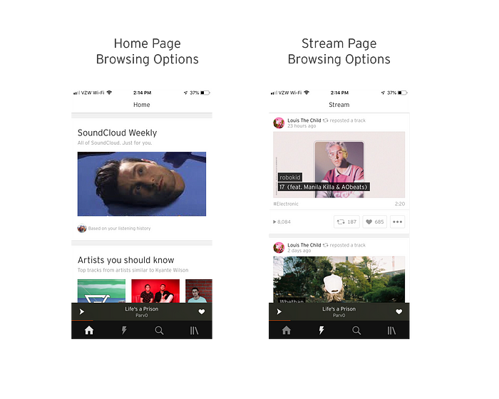
According to my research, users tend to visit the Home page or a friend’s profile to browse, and not the Stream page.
So how can users find music they haven’t already listened to, and receive entire playlist recommendations?
Brainstorming
I recruited 2 active SoundCloud users, ages 17 and 20, to help me brainstorm solution spaces within which this problem could be reconciled. We identified a few potential solution areas.
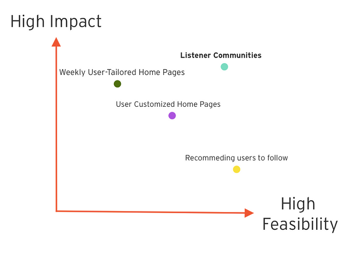
Since it would be difficult to tailor home page recommendations to a user’s diverse music tastes on a weekly basis, less impactful to simply recommend other users to follow, and not as impactful or feasible to allow users to customize their own home page content, I decided to further develop listener communities. These would be pages similar to subreddits, containing a library of similar playlists based on the community’s specified genre or mood.
These communities would address the people problem through both …
impact: communities would allow users to find pages of the specific type of music they’re looking for within all of SoundCloud’s content
AND
feasibility: communities are a user-driven solution and require little extra engineering, as users would navigate the content themselves by first creating the communities and then adding content
Market Research
Before beginning my own flows and prototypes, I gauged existing examples of community-style features currently on the market.

Both solutions allow people to join these communities, and then receive information pertaining to that community as a member. The challenge for me would be to adapt this community-style solution to a music-based app instead of an information-based one.
Envisioning Listener Communities
Before beginning any medium or high fidelity designs, I started with some paper prototypes on how these SoundCloud communities might look.
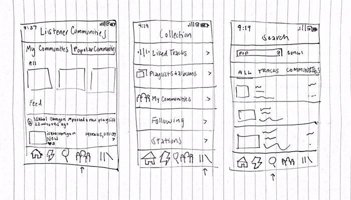
The Entry Point
I started determining where the community feature entry point would be by jotting down a few ideas about how a user might enter the communities feature on SoundCloud. I ultimately decided this would be a significant enough feature to warrant a navigation bar icon for entry.
I based this decision on the fact that I planned for the feature to contain a user’s communities, trending communities, and all functionality to create, browse, and listen to community playlists. User feedback led me to understand that all of these functions would be difficult to contain and lead a user through on an already existing page.
This is what I envisioned SoundCloud’s navigation bar with communities to look like:

Community Landing Page
I next designed a few iterations of what the Community feature’s landing page might look like:

Since Option A left users confused about where they could access the communities they followed and Option C seemed to be a bit too similar to SoundCloud’s already existing Home page, I decided to go with Option B.
Individual Community Page
After this, I explored how I would design the page for an individual community:

With all pros and cons in mind, I chose Option A for the simplest user experience.
Complete High Fidelity User Flow
I decided users would be able to create a community within the 3 dots icon at the top right of the Community landing page. Clicking this would result in a slide up drawer containing a button to create a community, as this is consistent with the methods SoundCloud already uses to hide additional information.
I lastly designed the Create a Community page consistently with SoundCloud’s existing model for creating a playlist.

I now had fully developed high fidelity flows for three sets of user interactions with the Community feature: creating a community, navigating through the landing pages, and navigating through an individual community.


Prototyping
I finally prototyped the user interactions through this SoundCloud Community feature flow using inVision.
Extra Considerations
- Would users add playlists to a community also using the 3 dots icon?
- Would users want to share their communities or community playlists to other social media platforms? Where would that functionality live?
- Would there need to be a user-driven solution, such as a dislike button, to remove playlists not conforming to a community’s standards?
Lessons Learned
Since this was my first design case study, I learned quite a bit about the entire design process. By interviewing other users I learned that the actual people problem you center your design around may instead be a variation, or underlying cause, of your original hypothesis. Creating multiple designs for a screen taught me that the more iterations you perform, the more likely you are to find a better alternative. Asking for user feedback on my designs helped me understand that elements you may assume to be intuitive may not actually be so for the user. Most importantly, I learned not become attached to a particular solution; at almost every stage of this case study, I reworked what I had previously thought was the solution.
Though I’ve largely discussed the technical benefits a user would receive from SoundCloud Communities, equally as important are the social benefits. The solution space I identified is predicated upon user frustration from navigating SoundCloud’s expansive content space alone. A SoundCloud Communities feature eases this frustration by de-individualizing the user browsing process. These communities enable users to search together, create together, compile together, and listen and share in the love of the same music together.
One of the only constants within our incredibly diverse world is that music has the power to bring different people together; I hope my solution allows SoundCloud to do just that.

