Bringing Design System Components from Production into Framer X
At Datadog, the speed at which we design and build components into our React-based design system has been increasing. And with greater speed comes the challenge of representing those components consistently in our design tools.
Our team received invites for Framer X beta and we’ve spent a few days testing its capabilities. The power of Framer X lies in its ability to allow designers to design on the canvas and with code interchangeably.
Code from Framer X is not meant to be production code, but it does have the same capabilities as a regular React project. So we set out to explore the possibility of a workflow to bring our production components into Framer X.
We wrote this article as part guide, part documentation. It follows the process we went through to get our production components into Framer X.

Getting started
This guide assumes you have a basic development environment setup with Node, Yarn and Git, as well as basic Javascript and React knowledge. Let’s start by cloning the build system repository:
git clone https://github.com/shiftsave/framerx-build-system.gitNext, install the dependencies:
cd framerx-build-system && yarn installBundling the codebase
First of all, we needed to bundle our production codebase into a format that Framer X could interpret. That means plain ES6 and CSS. We used Webpack to bundle our production codebase into a dependency-free library (referred to as “lib” in code).
The entry point of the library is the index.ts file, which imports the relevant assets and components from the production codebase. This includes anything from JSX, TSX, LESS, Sass or even SVG images.
One of the biggest hurdles was to have all the production component dependencies resolve correctly in the library that we are exporting. For example, a dropdown component that is dependent on classnames.

To use this build system with your production codebase, point the Webpack entry to your codebase. We recommend creating a symlink to your production codebase to avoid duplication.
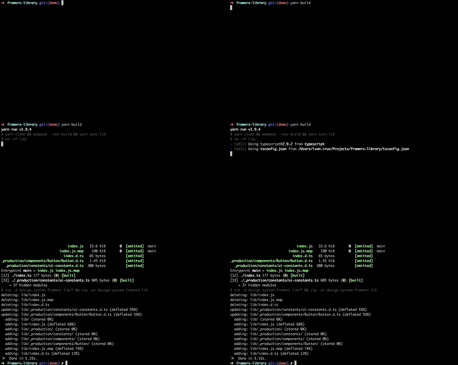
Whether you decide to follow along with our example or use your own, all you have to do is run yarn build. This will bundle the code inside _production and copy the bundled library into design-system.framerx.
Working with bundled components
Before we get started, we need to dissipate some haze about the way Framer X works. A .framerx file is a zipped folder bundled as a binary.
When opened, Framer X unzips the file inside macOS’s AutoSave Information folder. On file close, Framer X zips the contents back into the file.

Adding components
We are going to take our production component from lib, and wrap it in a new component as a bridge between our production code and Framer X. We need this wrapper to expose Property Controls (We’ll touch on these soon)
The build system we put together includes a sample Button component. We will use this component in this section.
Open design-system.framerx and create a new Code Component called Button. Framer X will open Button.tsx in Visual Studio Code.

Let’s remove the boilerplate code and add back what we need piece by piece.
We’ll start with the import declarations. We recommend alias import declarations { Button as _Button } this allows us to use the original component name as the name of the Framer X Code Component.
import * as React from "react";
import { Button as _Button } from "../lib"; // <- This is the bundled production code we inserted with yarn build.
Next, let’s define the component and its props. The props in the example below match the props defined in the component from the production folder we bundled with Webpack. Props change the content and visual style of the component, in this case size, type and title.
import * as React from "react";
import { Button as _Button } from "../lib";enum SIZE_OPTIONS {
  EXTRA_SMALL = "xs",
  SMALL = "sm",
  MEDIUM = "md",
  LARGE = "lg"
}// Define type of property
interface Props {
  buttonType?:
    | "default"
    | "primary"
    | "success"
    | "warning"
    | "danger"
    | "toggle";
  size: SIZE_OPTIONS;
  title: string;// Width and height of the component when loaded in the canvas
  width: number;
  height: number;
}export class Button extends React.Component<Props> {
  render() {
    return <_Button {...this.props}>{this.props.title}</_Button>;
  }
}
Now the component is in Framer X, but you’ll notice it renders a bit off. This is because we haven’t initialized any defaultProps. Let’s initialize some props to have a better default view of the component.
import * as React from "react";
import { PropertyControls, ControlType } from "framer";
import { Button as _Button } from "../lib";enum SIZE_OPTIONS {
  EXTRA_SMALL = "xs",
  SMALL = "sm",
  MEDIUM = "md",
  LARGE = "lg"
}// Define type of property
interface Props {
  buttonType?:
    | "default"
    | "primary"
    | "success"
    | "warning"
    | "danger"
    | "toggle";
  size: SIZE_OPTIONS;
  title: string;// Width and height of the component when loaded in the canvas
  width: number;
  height: number;
}export class Button extends React.Component<Props> {
  // Set default properties
  static defaultProps = {
    title: "Button",
    size: "md",
    buttonType: "default",
    width: 68,
    height: 28
  };render() {
    return <_Button {...this.props}>{this.props.title}</_Button>;
  }
}
Voila! the production component is in Framer X! 🎉🎊

Exposing controls
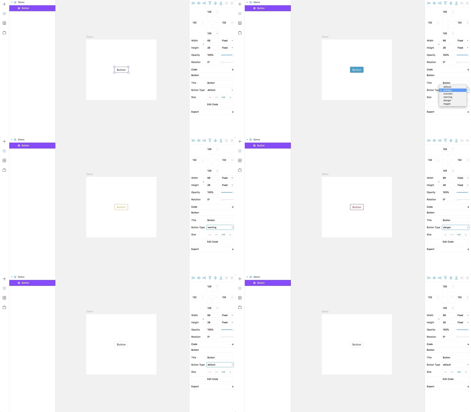
Next, let’s add some Property Controls. Property Controls are one of the most powerful features of Framer X; they allow you to expose controls to interact with the props of your component. See Framer X docs for details.
import * as React from "react";
import { PropertyControls, ControlType } from "framer";
import { Button as _Button } from "../lib";enum SIZE_OPTIONS {
  EXTRA_SMALL = "xs",
  SMALL = "sm",
  MEDIUM = "md",
  LARGE = "lg"
}// Define type of property
interface Props {
  buttonType?:
    | "default"
    | "primary"
    | "success"
    | "warning"
    | "danger"
    | "toggle";
  size: SIZE_OPTIONS;
  title: string;// Width and height of the component when loaded in the canvas
  width: number;
  height: number;
}export class Button extends React.Component<Props> {
  // Set default properties
  static defaultProps = {
    title: "Button",
    size: "md",
    buttonType: "default",
    width: 68,
    height: 28
  };// Items shown in property panel
  static propertyControls: PropertyControls = {
    title: { type: ControlType.String, title: "Title" },
    buttonType: {
      type: ControlType.Enum,
      options: ["default", "primary", "success", "warning", "danger", "toggle"],
      title: "Button Type"
    },
    size: {
      type: ControlType.SegmentedEnum,
      options: ["xs", "sm", "md", "lg"],
      title: "Size"
    }
  };render() {
    return <_Button {...this.props}>{this.props.title}</_Button>;
  }
}
Collaboration and versioning
One of the biggest hurdles we had to overcome during this process was collaboration, and tracking changes in GitHub. This meant extracting the components from the Framer X file into the main repository.
We wrote three scripts inside package.json that allow us to sync the Framer file with the contents of src and vice versa. This allowed us to have full versioning capabilities for Design and Code components with minimal impact to the workflow. This works well for now until Framer X has a better way to handle versioning in the future.
The scrips we implemented for managing the build system are:
yarn build
Bundles the production codebase into ES6 and copies it into the lib inside Framer X contents.
yarn sync:lib
Replaces lib inside Framer X contents with the latest version of the build.
yarn sync:src
Replaces the contents of src with the content of the Framer X file.
yarn sync:framerx
Builds a new Framer X file in case of conflicts or file corruption with the contents of lib and src.
Conclusion
This workflow is still in its early stages — but the benefits are real:
- Allows cross-functional teams to have a centralized source for approved components. Yes, a single source of truth.
- Simplifies collaboration between design and engineering . We can easily list out the components and specs needed for new features.
- Empowers designers with development experience to build components that are nearly ready for production.
- Allows designers to build prototypes with real interactions faster.
At Datadog, we’re designing products that give engineers visibility into their Cloud Infrastructure. Our design system is complex with lots of moving parts, so we’re excited to test out Framer X’s ability to help us bridge the gap between design and engineering.
If you’re interested in working on challenges like these and want to help us shape design at Datadog, we’d love to hear from you!
I would like to thank Jenil Gogari, David Plakon and Derek Howles for co-writing this article with me.


