Better together: Displaying Japanese and English text on the web

If you’ve ever made an English-language website that contains a bit of Japanese (or other non-Roman) text, you might have run into difficulties getting the text to display beautifully across browsers and platforms. Below, I’ll share a few tips for working with English and Japanese type together on the web.
The tl;dr is: Always declare <meta charset="utf-8" /> right after the opening <head> tag in your HTML document, set site-wide and element-level lang attributes, and use a rich, cross-platform font stack that will not mix serif, sans-serif, and monospace typography when English and Japanese appear together. (Spoilers: Google has an interesting solution in the works.)
OK now, on with the show…
Specifying character encoding
The W3C recommends adding a charset declaration to all websites immediately after the opening <head> tag for security and to ensure proper character display:
<!doctype HTML>
    <head>
        <meta charset="utf-8" />...
You might not notice any difference on fully-English pages, but this line is necessary for displaying Japanese text properly. Otherwise, the browser will do a series of checks to guess the encoding type, and it will most likely make the wrong guess, causing a simple paragraph text block like <p>sans-serif ひらがな、カタカナ、漢字</p> to render like this:

Adding <meta charset="utf-8" /> enables the proper display of all Unicode characters, including those in Chinese-Japanese-Korean (CJK) scripts. (Note: You should also be sure that the HTML file you created is saved with UTF-8 encoding. This is usually the default for web development IDEs, but you can check your IDE settings to confirm. If you have access to it, you can also check encoding settings on the web server.)
Setting document and element lang attributes
Setting <meta charset="utf-8" /> allows the browser to properly render Japanese characters because it's setting the character set to basically all Unicode characters. But there's nothing here that would actually tell the browser which languages are displayed. You can—and should—do this by setting a lang attribute on the entire page (html) and, optionally, on specific elements. For example:
<!doctype HTML>
<html lang="ja-jp" />
    <head>
        <meta charset="utf-8" />
    </head>
    <body>
        <h1>日本語</h1>...
or
<!doctype HTML>
<html lang="en-us" />
    <head>
        <meta charset="utf-8" />
    </head>
    <body>
        <h1 lang="ja-jp">日本語</h1>...
The lang declaration is made up of two parts: the language (ja for Japanese) and the region (jp for Japan). Regions are more meaningful for languages that differ across geographic regions, such as American English (en-us) and Australian English (en-au). Note that you can't string together multiple languages in a single lang declaration.
If Japanese characters are encoded properly without it, why bother including the lang attribute at all?
Firstly, depending on the user’s browsers, OS, and settings, the value of lang may trigger the browser to offer better translation and search functionality. For example, declaring an html lang may prompt users' browsers to initiate convenient translation options on page load.
Also, for mixed-language pages, you may want to offer different CSS rules for different character sets. You can set lang styles in CSS that apply to any element with a matching lang value. For example, a <h1 lang="ja-jp"> could be styled by CSS like this: :lang(ja-jp) { font-family: Arial, sans-serif; line-height: 1.5rem; } This is a more syntactically-pleasant solution than, say, creating a CSS class and marking up the header as <h1 class="japaneseText">.
For Japanese in particular, some browsers are a little confused by Unicode characters that appear both in Japanese and Chinese. As a result, the default font the browser uses for rendering Japanese text can change mid-sentence (or even mid-word)! As it turns out, this is reeeeally distracting. I’ll talk about a bit more later.
Once again, the W3C has detailed guidelines and best practices for a variety of situations as well as a great CSS-specific guide to languages that covers advanced features like style inheritance for languages, style settings specific to Asian languages, and more.
So we’re in agreement that lang attributes are good! But, for an English website with some Japanese text, do you really need element-level rules? After all, setting <html lang="ja-jp" \> will render Roman and Japanese character sets quite nicely, and it's less code!
While it works, I wouldn’t recommend it. If you’re designing an English-language website with some Japanese text, you should use <html lang="en-us" />. html lang is best used to identify the site's native overall language: the language used for links, navigational aids, copyright notices, profile, contact information, etc. Element-level lang attributes and styles should be used for the Japanese content. I'll explain the benefits of doing it this way with a quick example.
I maintain the website for FEMICOM Museum, an archive of old video games and software. Many of the games described on the website are Japanese, so I have a need to display some Japanese language content on my site. I’ve also conducted interviews with Japanese game developers, and I’ve made these interviews available in both English and Japanese.
Even though it would be less work to just set <html lang="ja-jp" /> and get the benefit of proper Japanese text rendering throughout the site, there would be significant drawbacks. First of all, my website would show up for Japanese users as being a "Japanese-language website," and thus the browser would likely not automatically offer them English-to-Japanese translation for navigating the site. Browser functionality for English-language users might be limited, too. Finally, setting <html lang="ja-jp" /> may limit my website's discoverability in English-language web searches. So, it's best if I set html lang to en-us and then mark specific blocks of text such as interviews with Japanese-language styling via the element-level lang attribute.
As W3C notes, what browsers actually do with lang data varies. It is seen as an area of growth, meaning browsers may offer more features and support around lang attributes in the future.
Styling Japanese text across browsers and platforms
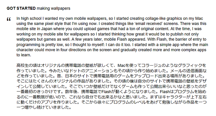
Even if you don’t fancy yourself much of a typography nerd, it’s worth your while to give some thought to text styling in websites that have both Roman and Japanese characters. I learned this the hard way when I zoomed in on some Japanese text in Chrome and noticed something aesthetically… distressing. Here’s a portion of the Japanese interview text shown above as viewed in Chrome on a PC. The orange underlines are added for emphasis.

Do you see how the majority of the characters have a consistently thick stroke width (as if written with a felt-tip marker) but then a few don’t? See how the underlined characters have varying stroke width (thin horizontals and thicker verticals) and a calligraphy look? Or are those… serifs?!
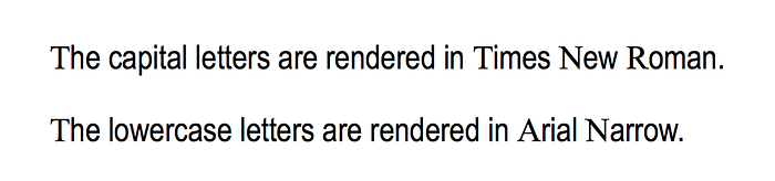
After a bit of research, it seems like this is due to a bug in Chrome (for PC) that has been around for over 5 years. If Japanese isn’t specified as the document’s language, and if you haven’t applied specific styling for a block of Japanese text, Chrome will interpret Japanese kanji (characters borrowed from Chinese) as Chinese-language text, which is by default rendered in a serif font. And this disconcerting result will occur.
If you aren’t familiar with Japanese text, the image might not seem so weird. So, I’ve made an analogous version in Roman text, showing the eye-bleedingness of text that has capital letters in a serif font and lowercase letters in a sans-serif font.
So, let this example remind you to think about Japanese text when you’re CSSing! :)
Just like the Roman letters used in English, Japanese text can be assigned font-family stacks. Most named fonts and font families that we're familiar with for Western languages do not also have an associated Japanese character set. Instead, if you assign a specific font in CSS, the browser will try to be smart and choose a matching default serif, sans-serif, or monospace font to render the Japanese characters. However, it might not make the right choice. So, it's best to specify a serif, sans-serif, or monospace fallback. Here is some markup showing different generic font families and how they look in the Chrome, Safari, and Edge.
<style>
    h1, h1:lang(ja-jp) {
        font-family: serif;
        font-size: 24px;
        font-weight: normal;
    }
    h2, h2:lang(ja-jp) {
        font-family: sans-serif;
        font-size: 24px;
        font-weight: normal;
    }
    h3, h3:lang(ja-jp) {
        font-family: cursive;
        font-size: 24px;
        font-weight: normal;
    }
</style>

Interestingly, the cursive fallback for Japanese text differs depending on whether the user is on a PC or a Mac. For PCs, cursive falls back to Comic Sans, which is a sans-serif font. Thus, the Japanese text is also sans-serif. On a Mac, cursive falls back to Apple Chancery, which is a calligraphic font that more closely matches the generic Japanese serif font.
There are two other font fallback categories: monospace and fantasy. monospace will give us a monospace Japanese font, while fantasy may give us serif, sans-serif, or monospace, depending on the browser and platform. (Another font category called system-ui is a draft spec as of current writing.)
In the end, unfortunately, we only get three Japanese fonts to play with: system-default serif, system-default sans-serif, and system-default monospace. However, we can bring in more interesting typography with a little extra effort.
With a little experimentation, you can add other Japanese system fonts to existing web-safe CSS font stacks. PCs and Macs have their own sets of Japanese fonts that can be named in a font-family list. Because user distribution of these fonts isn't going to be incredibly high, these fonts should be incorporated with plenty of fallbacks. On a Mac, the Hiragino Kaku family meshes well with the Arials, while Microsoft's Yu Gothic fits right in with Segoe. If you go this route, CSS Font Stack could be a useful resource.
Google Fonts offers an interesting alternative. It includes several Japanese fonts as part of a new early access web font program. Some of these are third-party Japanese fonts. However, more notable is Google’s Noto project: an effort to create an all-in-one font for all major character sets at multiple weights, including the CJK languages. As Google puts it, “Noto fonts are intended to be visually harmonious across multiple languages, with compatible heights and stroke thicknesses.” Noto has both serif and sans-serif options for Japanese text, and they’re both quite pleasant. At the present time, the Noto project’s GitHub repository shows CJK and emoji as the only unreleased web fonts, but again, you can grab them in early access. Personally, I am really looking forward to trying this out. Here’s Noto Serif (CJK) in 900-weight:

Well, I hope this has been helpful to you! There’s a lot more to know about displaying Japanese text. Setting up vertical type, <ruby> tags for furigana... the list goes on! But hopefully this is a good start. If you have any other best practices or tips for working with CJK + English text on the web, feel free to leave 'em in the comments. Happy HTMLing! じゃあね。
Originally published at nobadmemories.com.