Bauhaus 93 : A type family with strong influence from Architecture
Having a background in Architecture prior to pursuing typography, I was really excited to find out that most of the history for type design is drawn from architecture, product design and Industrial design.
When Ksenya Samarskaya our course instructor at Harbour.Space University gave us a project on designing a type specimen and to find a type that resonated with me, my first instinct was to research around the Bauhaus movement.
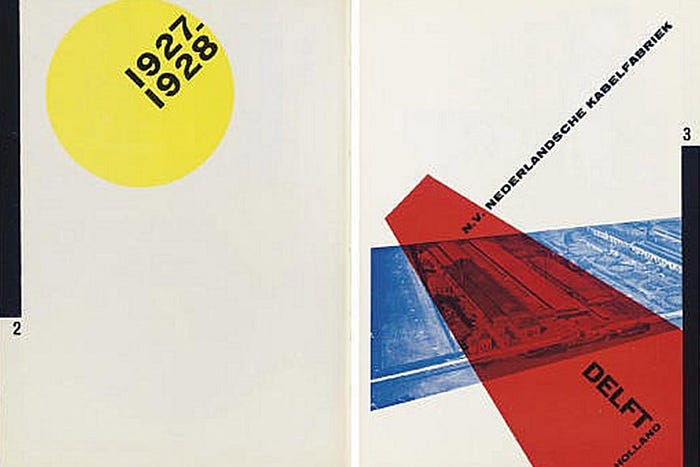
Bauhaus was a school whose approach to design proved to be a major influence on the development of graphic design as well as much of 20th century modern art. Founded by Walter Gropius in Weimar, Germany in 1919. They made a significant contribution not only in the field of Architecture but also Typography. It belonged to the school of thought where students were encouraged to work on multiple art mediums like sculpture,fine art graphic design which allowed each discipline to inform the other.
This often led me to think that, it could be the design discussions across these different disciplines that could have lead to the typography designers to borrow elements of Architecture principles to create type.Herbert Bayer is the pioneer to create Bauhaus as a type face. He had a strong background in Architecture which could have had the influence on shaping the typeface itself.
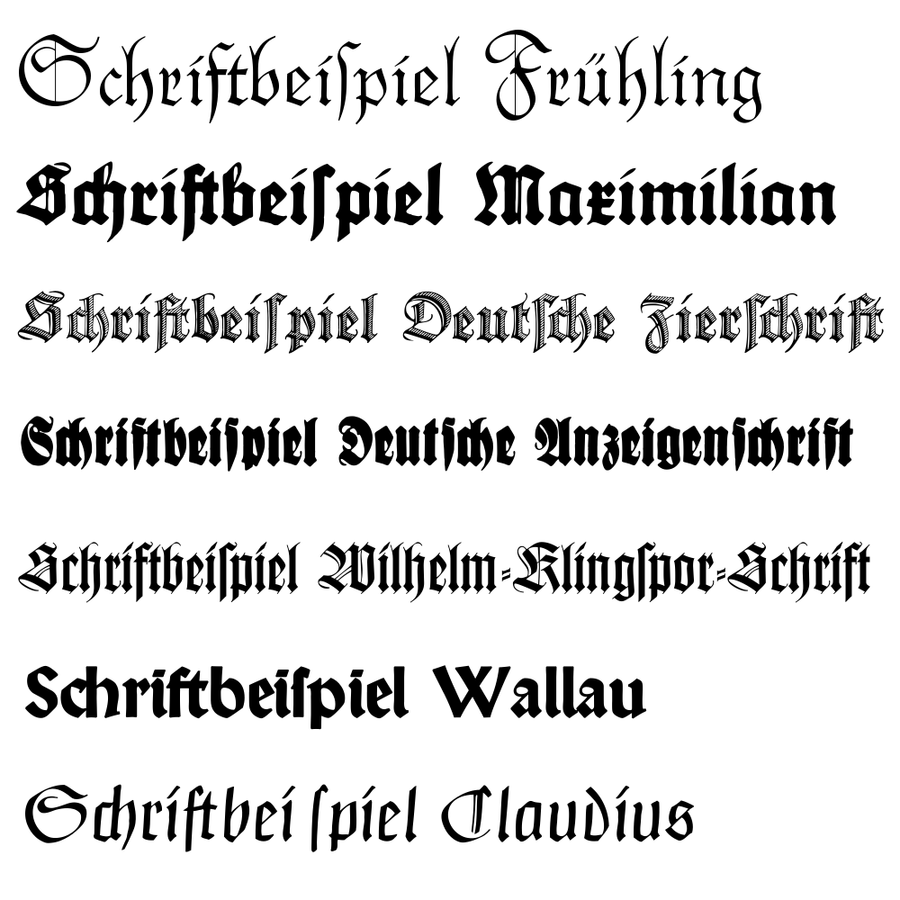
Bauhaus followed the design principle of “ Form follows function”. The philosophy of this group was influenced by technology, machines and changes in the lifestyle of people due to Industrial revolution. This clearly justifies why the ornate German blackletter did not appeal to this school of thought.
Integrate industrial methods with design for mass production.
“ Bau “ meant construction and the desire to provide methodologies for mass production. The era around which the Bauhaus type face was conceptualized was during the 20th Century Machine culture. It was the era when Mies Van der Rohe introduced the idea of : “Less is More” . Hence the Bauhaus style of typography was focused on conveying this message through their design.
But I feel there is a disconnect to the above principle and the way the font Bauhaus type family is shaped. The use of this type family was mainly for posters, magazine covers and advertisements.This Typeface though introduced as the functional font, I believe that it cannot be used for the purpose of body text or a business presentation.
There is a limitation to the usage of this type family as “Staged Typography”.
The font is bold and has a character and voice of its own hence can hardly be used as an invisible font. It has a balanced layout,a structured and geometric shape with sans-serif letters in upper case or lower case fonts which claims to be simple.
I would argue that in contrast it has a strong identity. It has the flexibility of not only being used horizontally and vertically but also works well when angled or wrapped around objects.
It is key to note that the use of Bauhaus type face can grasp the readers attention hence it is definitely not a faceless type .Though it does not have a decorative quality it does have a strong opinion which influences the texture of the content.The type specimen acts as an Influencer to draw attention of the reader.
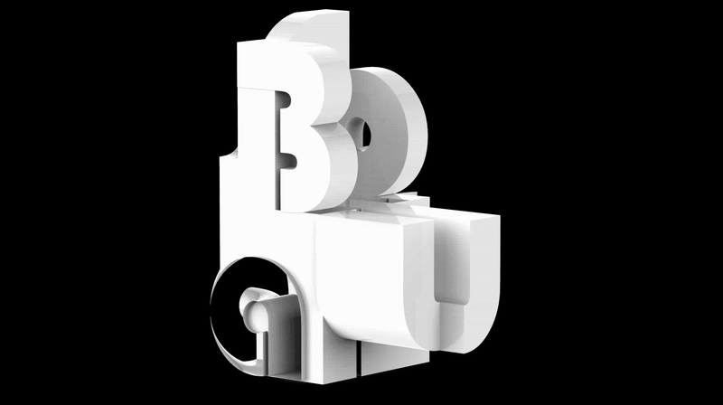
Evolution of the Bauhaus Font :
A study exploring how the font evolved to form Bauhaus 93 or Bauhaus ITC.
Piet Zwart was one of the contributors to the type specimen. In the book Shaping text, it was mentioned that he believed that less interesting the type it is more typographically usable. Which is an ideology that resonated with mass production and Industrial revoultion.
He wanted to create more “ business like letters” termed as jobbing type that can be re-used for presentations and documents. He mainly advocated functional typography over staged typography.
It was surprising to note that these fonts that belonged to the same Bauhaus family had a different goal and design mindset as opposed to the Bauhaus ITC or Bauhaus 93.
I dug further to understand the transition of the style to a more bold typeface that had more of a spatial quality as opposed to the mechanical geometric lines as created by Piet Zwart.

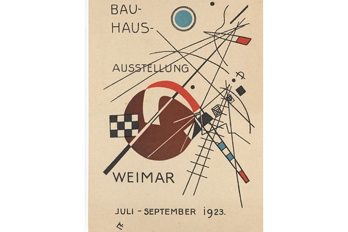
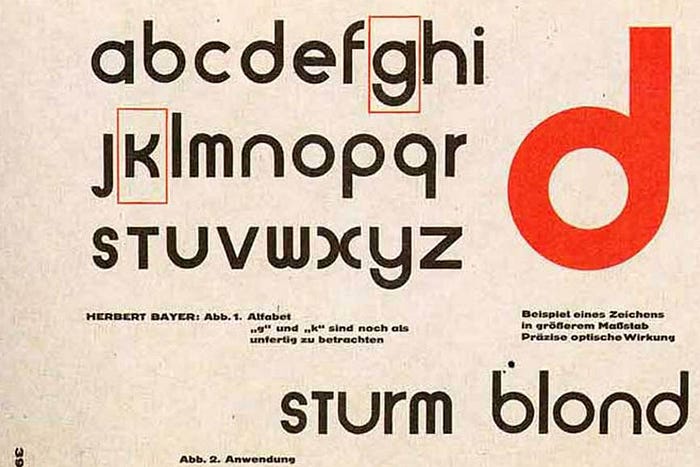
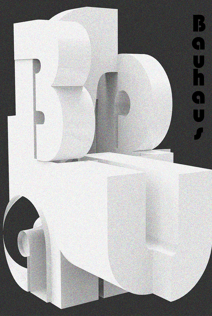
The above poster designed by Joost Schmidt in 1923 has elements of an Architectural plan around which the type is wrapped. The more I look at the graphic elements (and not the type) the more it reminds me of Bauhaus 93.
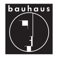
The logo designed for Bauhaus has a strong influence of solids and voids. There seem to be a back and forth movement of dialogue within the type family whether the architectural quality has to do with space and volume or have a feel of a mechanical or structural plan. The Universal Alphabet font created by Herbert Bayer seems to be the font that has elemental quality that derives from both the dialogues. It could be the starting point which influenced the thought process of typography artists when designing fonts for the Bauhaus family in the future.
Who made Bauhaus 93?
Universal Alphabet was definitely a reference point for creating the Bauhaus 93 which was used in Microsoft word. It was originally owned by font foundry, URW, which stood for Unternehmensberatung Rubow Weber. It was released in 1993 hence the name Bauhaus 93. It is now owned by URW++, the successor of the original company. Microsoft bundled Bauhaus 39 a variant of the original Bauhaus to make it accessible to the public. Bauhaus 93 is available only as a Regular font it was never completed.
Modular techniques adopted in font construction
It is evident that Bauhaus philosophy encouraged mass production. Mass production meant modular techniques in construction. The theory of Modular Design, which allowed the system to be subdivided in smaller modules which then can be replicated and mass produced resonated with the initial Bauhaus principles of “ Form follows function”.
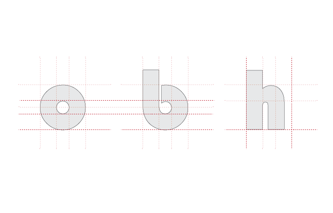
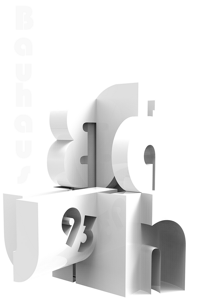
Analysis of Bauhaus 93 : Re-using modules to form two different letters
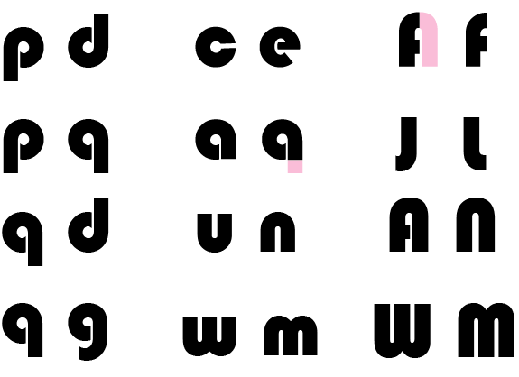
It is very evident from the above image that the type face follows the principles of modularity. I can easily categorize Bauhaus 93 into smaller modules which in combination created the character set.
I conducted a further research on where was this type commonly used. I wanted to investigate if it was a commercial type specimen and if it really stayed true to the family it belonged to.
The Bauhaus 93 type specimen was used by Nintendo and Disney. It served the purpose of a distinct logo that defined brands that represented playfulness and fun.


The commercial usage of Bauhaus 93 for products that are targeted to children and teenagers creates a world view around the font to be bubbly cheerful and joyful as opposed to the rich history that supports the structure and construction of the font. I personally feel that the font has a more serious out look and identity as opposed to the flimsy use of the font for children products.
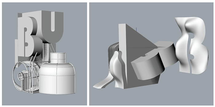
The construction of Bauhaus 93
While researching more on how type artists take inspiration from Architecture, I fell upon this gallery called : Balman Gallery which featured Peter Defty’s photograph which had an interesting composition of negative spaces to create letters.
These photographs and techniques channelized my thought process to dig deeper into Architectural elements to draw parallels to this specific type specimen.
I started the analysis by making a technical drawing. I tried to find patterns within the construction of the type to understand the thought process behind each of the lines,curves and angles.
The above image clearly indicates that the font was not created without a technique. It almost feels like a construction drawing of a staircase or an architectural blue print. There is consistency and mathematics involved in the methodology used to construct the curvature and the angles.
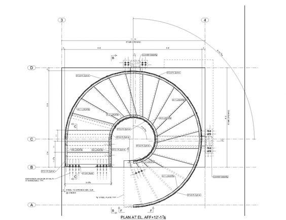
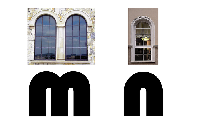

The architectural drawing of a staircase design resonates with the letter “P” or “q” of the Bauhaus 93 type face. The designers of this time believe in the purist concept of the relationship of form to space (Poling, 1986) hence it wasn't surprising to see parallels in staircase construction drawing and the construction of the type face. Comparing staircase plans, windows and arches to the font design further confirmed my assumption of architectural elements influencing the type face.
Hence I firmly believe that the font has been underestimated in the possibility of using it for products or ideas that are more serious, structural or maybe concept that has a sense of movement.
Movement !! yes the type definitely reminded me of a winding road or a hairpin bend along the mountains.
“It is a font that flows “

The shape of the letters guide your eyes towards the goal. There is definitely an opportunity to play with the shape of the alphabets to instill movement or rhythm.
This thought process suddenly made me realize that I had seen a similar treatment of shapes to direct and channelize water to a collection area.
As an architect I was extremely interested in rain water harvesting channels and step wells. When I went through my collection of these water systems I was astonished to see many references that resonated with the common module that was used to create the type family.
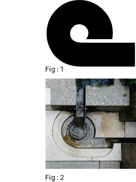
This image established why I was drawn to this font and why I could see the potential of it being used to communicate mobility, journey or progression.
Material exploration in type
Pushing this notion of architectural principles adopted to type design, I extended my research on the material that was used to define the “Less is more” era.
Bauhaus asked ‘Why can’t we design cheap stuff that’s nice too?‘.
Most of the materials used were concrete,steel,stones etc. These were typical construction materials that required limited factory processes. It was utilitarian and could be easily afforded by the masses.There was no pointless decoration and simple line prevailed the Bauhaus aesthetics.
Objects were dissected into their raw and true geometry, as they considered this as the most efficient way to design any structure.
With the above principles and theories in mind, I created a poster that was dedicated to what Bauhaus stood for —
Strength | Functional | Modular
Experiments with material, space and type
Poster 1
I considered the properties of concrete and metal plates while designing the poster. The treatment of the poster is to indicate that the font has a history and a time factor which plays an important role in how you view it or use it today.
Poster 2
Play of light and shadow to enhance the lines of the letters.
I played with only shadows to translate the above idea. The play of light translates the heaviness of concrete and the lightness of thin metal sheets.
It is not just a poster it is a piece of sculpture !
The design is still under progress. Would love your feedback so do write to me at juneza.niyazi@gmail.com or follow more of my work at http://junezaniyazi.com/