Another post about colours for data visualisation. Part 3 — DIY Palettes
This post is part 3 of a 3 part series, catch up on the first two posts here
Part 1 — Data Types
Part 2 — Colour schemes

Apologies on dragging my heels on the last part…
I guess that’s the writer’s block kicking in — Just call me JK Rowling. (Jks Jks)
When it came to choosing colour for our visualisations, I found that my go-to colour inspiration sites (listed at the bottom of the post) didn’t directly apply. They were not great in terms of practicality & definitely not very colour blind friendly. But then, on the other hand, the pre-made ones didn’t quite work for me either.
If you find yourself needing to create a custom set of palettes with brand colour considerations — then read on.
Challenges with using existing tools
The graphs that we were proposing to show contained categorical data
(qualitative & quantitative discreet) which required the use of categorical palettes, you know, the difficult rainbow mashup of colours. I also needed to incorporate the primary brand and interface colours into said palettes. 🙃
The problem I had with the popular tool Color Brewer was that all of their palettes seemed more suited to showing data on a map. I.e., it nailed sequential & diverging, qualitative(categorical)- not so much. What’s more, when colour blind compatibility was turned on, only one of the categorical palettes met the requirements :(

I didn’t have any luck with another favourite in the copypasta lists either -Colorpicker for data. This is a great tool made by Tristen Brown referencing Gregor Aisch’s work and built using Chroma.js. But again, I found it better suited to creating gradients. Also either I couldn’t drive it properly, or it just naturally produced palettes that looked a little muddy?… they just didn’t POP Y’know?* After all, I’m a designer, not a data scientist. I want things to not only be useful but to look nice as well.
*Please kill me; I said the dirty words.

Most of the other off the shelf solutions for categorical/qualitative palettes contained reds, oranges or pinks. Colours that I wanted to avoid or use sparingly on the dashboard because of their learned psychological perception of red = error/bad/danger. (Red is used to convey error and destructive actions in our UI)
So I guess I would be creating my own palettes after all…
DIY colour palettes
FINALLY THE FUN PART! (They said)
Considerations
- 4–6 colours
The data sets I would be working with were relatively simple and would rarely require more than four colours (Plan for seven) - All values are of equal importance
Maintain visual consistency in saturation so that no values appear more important than others. - Incorporate brand colours
Cornflower and teal blue were existing brand colours of the platform and needed to be considered in the palettes. - Consider multiple graphs
Multiple graphs would be shown on the dash at once, so the palettes needed to be harmonious. - Avoid reds and oranges
Avoid colours like red and orange which usually indicated errors or destructive actions in our UI. - Create a set of palettes
Although we would only require categorical palettes at first, I would also need to create a set of sequential and diverging palettes for future use.
With these considerations in mind, I set about finding my base colours from which I could build out my palettes.
Helpful refresher — Colour theory applied to data vis
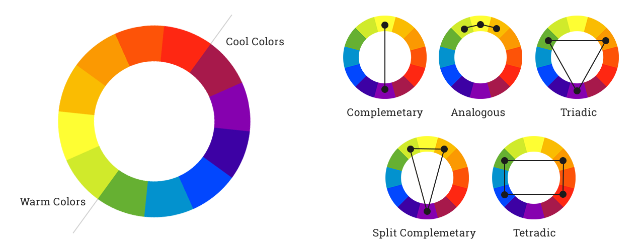
Monochromatic
Shades of a single hue, ideal for sequential data.
Analogous colours
Colours that sit beside each other on the colour wheel. Multi-Hue gradients actually work better for sequential data visualisation as they are easier to distinguish yet still remain harmonious.
Complementary colours
From opposite sides of the colour wheel. When paired with a neutral (e.g. white or grey) these palettes are perfect for diverging data. Complimentary also works if you only require two hues in a qualitative palette.
Triadic colours
Three colours equally spaced around the wheel, which are a good starting point for a qualitative palette.
Tetradic colours
Two sets of complementary colours. A good starting point for a qualitative palette.
Basic colour theory applied to data vis — borrowed from here:
Choosing colors for your data visualization — Cambridge Intelligence
Finding your base colours
Paletton is an excellent tool where you can specify a starting value and adjust the sliders to obtain a set of colours based on different colour theory rules.
I used the results as a starting point to build out the rest of my palettes.
Tip: Vary the brightness in the monochromatic mode for sequential schemes, and vary the hue in quadratic or freestyle mode for categorical palettes
In the below examples, I ended up using freestyle mode as I needed to incorporate two colours — Blue and Teal.

Paletton also and has an inbuilt feature that simulates the different types of colour blind deficiencies.

Making sure they work
Once I had my base colours (I’m sticking with the 4), I headed over to Viz Palette, another great tool that lets you see your colours in action, test for colour blindness and check similarity with names.
Tip: Swatches often look different to the eye than say when the colour is applied to large areas, lines or dots.
I mentioned Viz Palette in an earlier post — I do recommend having a skim of this article from one of the creators here.

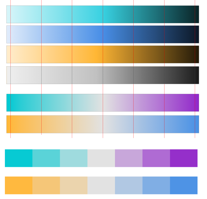
Creating diverging and sequential palettes
To create the Sequential and Diverging scales, I used the base colours obtained from Paletton.
I wanted to make sure the base colours would be in the end palettes so I opted for seven stops (but this would also work with five or nine)
For the sequential scales, I set up gradients beginning at white and ending in black with the base colour in the middle. I marked seven equal stops along the gradient then colour picked from the centre of each mark to get seven values.
For the diverging scales, I repeated a similar process where the base colours were at either end of the gradient, and a light grey was a neutral centre point.
This simplified method was borrowed from an idea from this post by Samantha Zhang
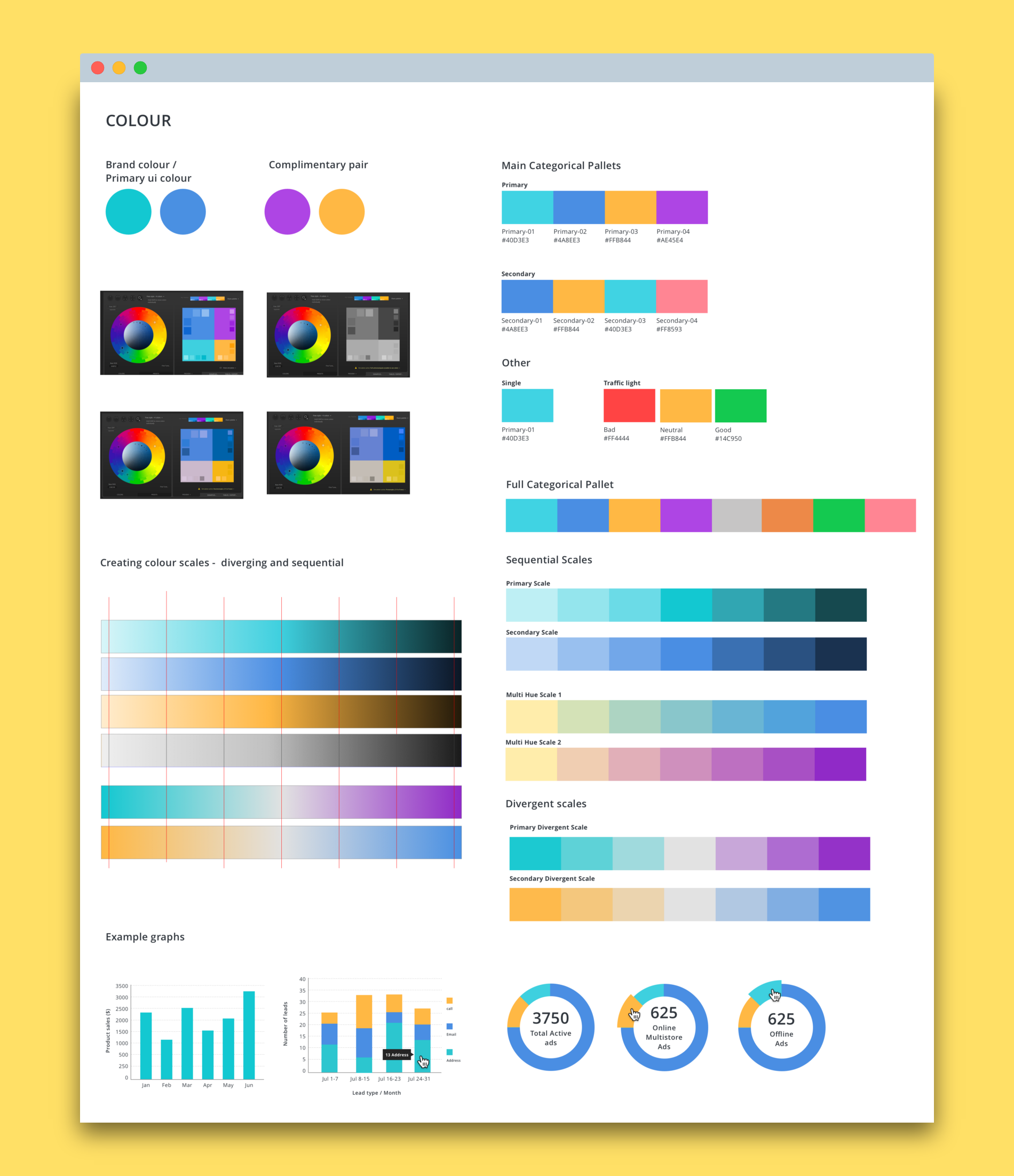
The final palette and graph examples.
Summary
Was it overkill to go into so much depth for something when the data and graphs we would be showing were simple and had a maximum of 4 values? Maybe… But, it is far better to show something meaningful and useful for the user even if it’s small, and I learnt a bunch of things along the way too. Though, I still feel I have no idea about colour. 😅
Phew! You got to the end of my colour essay. Hopefully, this post was useful to you or your work. Leave me a clap, comment or feedback below 😊
Worth reading
- Why Color is Key in Data Visualization and How to Use It
- Finding the Right Color Palettes for Data Visualizations
- What to consider when choosing colour for data Visualisation
- Mastering multi-hued colour scales with Chorma.js
- How we designed the new palettes in Tableau 10
- The viridis colour paletts
- Choosing colors for your data visualization — Cambridge Intelligence
Useful tools for DIY palettes
- Paletton — Create different palette types starting from a base colour. Adjust hue, & simulate colour blindness in the browser. A great starting point for creating palettes that require a brand colour.
- Chroma.js — Master multi-hued, multi-stops colour scales using Chroma.js
- Viz Palette — Test your colour palette for conflicting names, visually similar colours & colour blindness.
- RGB Color Gradient Maker Create multi-step, multi-hue / single-hue colour gradients.
Off the shelf
- GeoDataViz Toolkit — Set of resources that will help you communicate your data effectively through the design of compelling visuals.
- ColorBrewer — Colour advice for maps.
- I want HUE — Colors for data scientists. Generate and refine palettes of optimally distinct colours.
- Tableau public — Crowed voted palettes
Other fun colour resources
Not directly applicable to data visualisation, but some of my go to faves.
- Khroma — The AI color tool for designers. ❤ this tool.
- Wes Anderson palettes — Palettes created from colours used in his films.
- Swiss Style Color Picker — International style colour scheme palette
- Color claim — Simple two colour pairing examples
- Coolors — Easily generate, save, & explore thousands of palettes.
- Colordot — A colour picker for humans