Another Post About Colours for Data Visualisation. Part 2 — Colour Schemes
This is part 2 of a 3 part series,
Catch up on the first post here about data types & graphs
Once I had an idea of the types of data and graphs that I would be working with, I turned to the internet of experts to find out what the best practice was for choosing colour.

The three main colour schemes for data visualisation
1. Sequential colour schemes
2. Diverging colour schemes
3. Qualitative/categorical colour schemes

Lets take a closer look at those shall we?
Sequential colour schemes
What do they look like: Single or multi hue gradients.
When to use them: When you have data with a single numeric variable where one end of the range is low or neutral and the other is high. The aim is to show progression. (quantitative continuous data)
Examples: Temperature variation, population density, Github contribution..
Github uses a sequential colour scale (which ranges from a very light grey to a dark green) to show the number of commits a user made on a particular day where grey = none, dark green = more.
Some things to note: Make sure theres enough variation in the steps (visual equidistance)Think about the brains perceived use of colour. Lighter = less, Darker = dense / more. Where appropriate, a multi hue gradient is a better option contrast wise than a single hue, as long as it remains light to dark.

Diverging colour schemes
What do they look like: Two gradients sharing a common lighter middle colour.
When to use them: When you have quantitative data with two extremes that share a mid point.
Examples: Mainly seen this used in political election results or data which show two extremes that differ from the average/norm.
Some things to note: Diverging palettes are like two sequential ones which share an equal low or neutral point. Make sure the two colours on either end have contrasting hues with equal brightness/saturation.
Qualitative / categorical colour schemes
What do they look like: Contrasting multi hue palettes.
When to use them: When you have data with distinct categories.
(qualitative or quantitative discreet)
Examples: Types of products sold during a given week, suburb racial stereotypes..
Some things to note: Remembering how the brain interprets colour
(light = Low, Dark = High) Keeping a perceived constant brightness & saturation helps distinguish the colours from each other without emphasising any particular one. As tempting as it is to use a pretty palette with adjacent hues, a palette with at least 20–30 degree hue change between each colour is much more affective at showing contrast even if it does appear clashing, thats kind of the point. You want users to be able to tell the distinct categories apart.
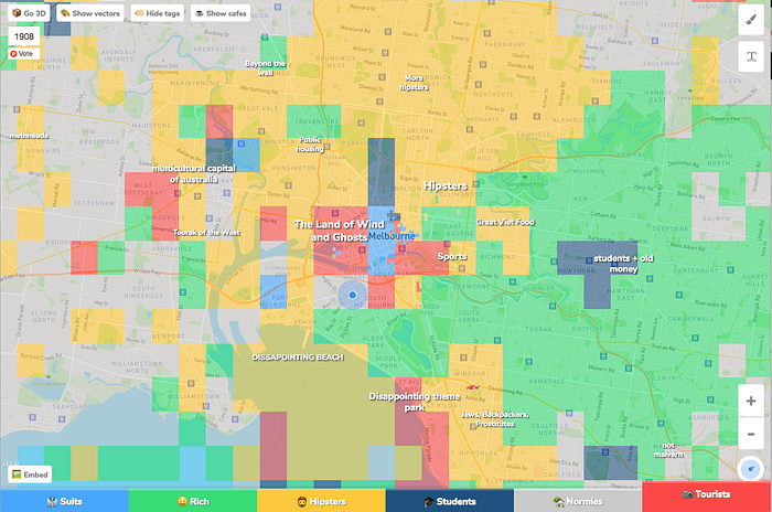
https://hoodmaps.com/
That’s all for this post, thanks for reading, and I hope this was helpful. 🤗
Let me know your thoughts in the comments below or leave some love to help others discover this post.
Reading & Tools
- Color scheme types — ColorBrewer
- How to Pick the Perfect Color Combination for Your Data Visualization
- Your friendly guide to colours in data visualisation
Coming soon
Another post about colours for data visualisation - Part 3