Anatomy of a great Landing Page

If you know your customers well enough and you have a good product to serve them then building your website with the right structure is the key to a great impression. It’s managing that impression of your product that get’s the visitors into the next step of your funnel.
Keep in mind this article will only teach you how to get that structure in place, if you want to know that previous steps that lead to this, there will be a free course at the end explaining you my own process.
Why structure is your ultimate tool
If you separate your website into sections than it’s easier to focus on the goal of each section and you tweak each one to obtain the best result. Here are some other reasons structure helps you a lot.
- Easier to change: if you have a style defined for the website it’s easy to change the copy, images, explanations, features covered and so on…
- Easier to test: you can more easily think of different version of small portions of the website instead of the whole thing and it’s faster to tweak.
- Easier to optimise: you can isolate variables to find out what’s holding the website back from better CR’s.
- Easier to understand: by having proper structure you are basically breaking down you message into easier to understand pieces that you can change and test so you can answers your visitors objections as they navigate and make the website sale your product for you!
1. Header
The header is your opportunity to create a good first impression so make sure you can explain briefly what you product can do, it’s very important to create curiosity as a lot of people leave the website in a blink of an eye.
Pro tip: An effective header is not one where you try to cram everything the product can do in a single section, the key here is to make every section introduce the next one so the visitor becomes more and more interest and understands more and more the value you can provide at the same time.
Clear headline
Introduce the problem or solution you are solving in the headline.
Clear supporting test
Explain briefly to solution of you have for it.
Clear CTA
Make sure the CTA is visible and stands out otherwise people will miss it and you can’t expect them to convert regardless of your efforts elsewhere
Pro tip #1: Use this color pallet generator to help you with selecting colors with good contrast just select your brand colors and you are done, easy!
Pro tip #2: Use the button text to manage the expectations for the next step, a little caption below might help depending on the complexity of your offer.
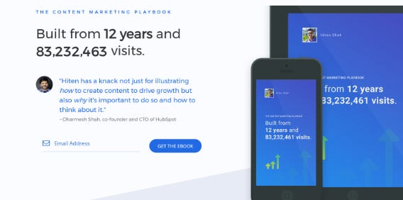
Good Examples


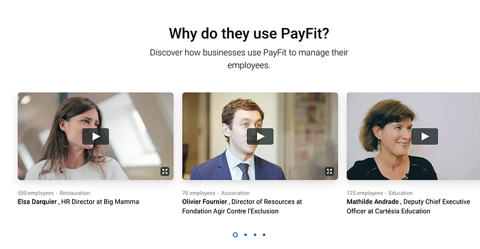
2. Establish “quick authority”
What I call “quick authority” are some details throughout the website that create trust in your solution, if you focus a lot of the social proof in one place you will have two huge problems, a lot of people won’t get to see that (as they will leave) and it makes it seem your are trying to hard to sell them in some cases. Some examples that fit this category could be press coverage, some foreword from press, a small testimonial, a great mention on twitter, well known companies using your product and so on…
Pro-tip #1: Through in some number when possible to contextualise the problem or the solution better, also acts as a some social proof.
Pro-tip #2: Use high number in the social proof as anchors combined with the last tip for even better results.
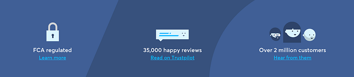
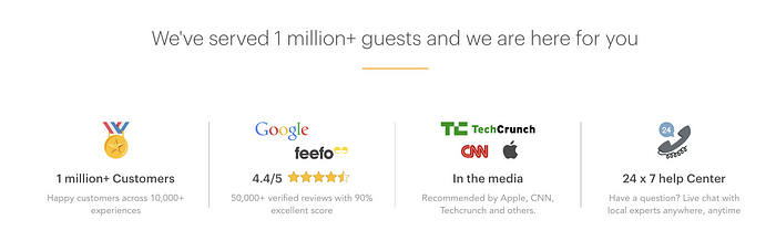
Good examples:
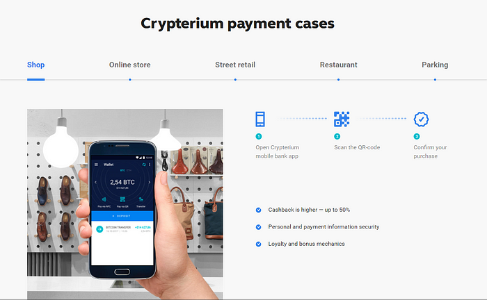
3. How it works
More like “How it can get you results”… if you think about it this way it’s easier to focus on benefits instead of a list of what look like “nice to have” features, a “nice to have” business doesn’t grow and worst, doesn’t last!
Images that relate to the content
90% of people will scan through your website that’s the sad truth but if you have good screenshots, gif’s, explainer videos to complement the rest of your message you can grab there attention and make sure they see something that will impress them about the product and think of it as the solution.
Break it down
Think about it, do you learn better when you are overwhelmed with information? I assume your answer is no, so help your visitors learn about your product and break it down for them, it’s that easy.
Benefits, not features
People don’t want to buy features from you, they want to buy their time back, eliminate their stress, simplify things, increase productivity, the list could be endless. This triggers the investment mindset where they want your product to get results, if you don’t trigger this you will ended up with price conscious customers and once a cheaper, good enough alternative comes up they will leave you asap, sad stuff…
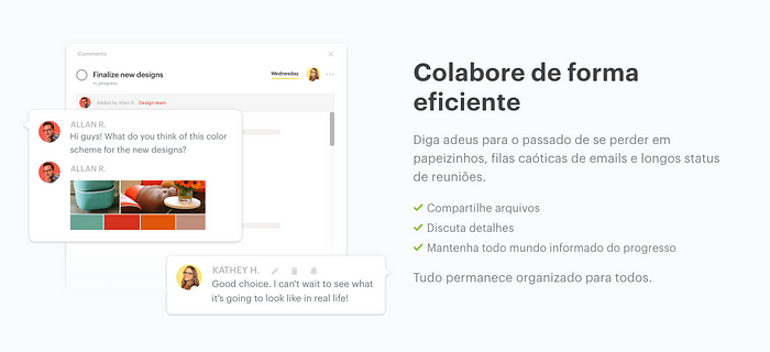
Good examples

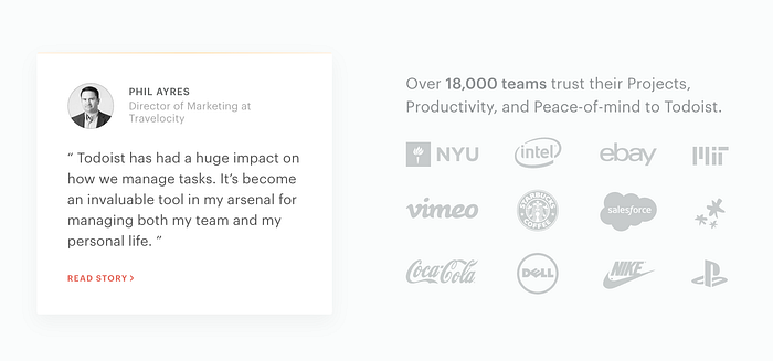
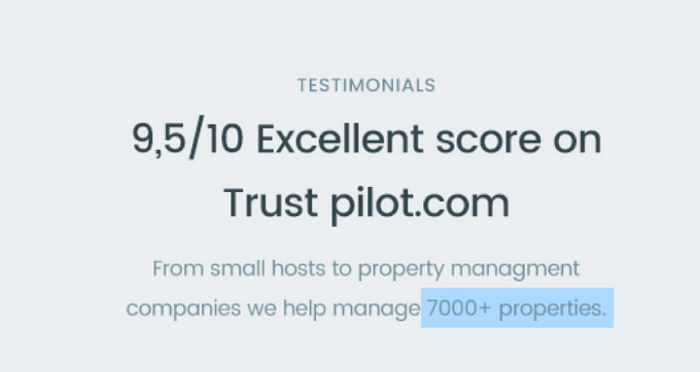
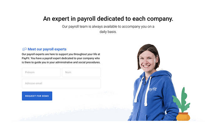
4. Social proof
The real purpose of this section is to communicate: “Look there’s already a lot of people getting results”. Triggering some FOMO while creating a lot of faith in your product as a solution for their problem.
Pro tip #1: To make this as effective as possible make sure your testimonials are result focused.
Pro tip #2: To ask for results focused testimonials simply come up with 2–3 examples of how the testimonial could sound like so when people give you the answer it uncousinly follows what you needed (without it being fake).
Good examples
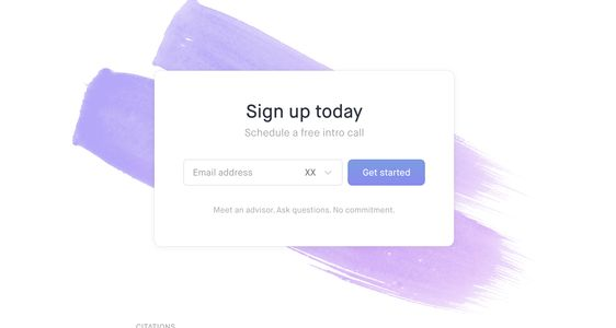
5. Final CTA
You have been nailing their impression about your product with the previous steps so make sure you grab them as they ready to convert to the next step.
Pro tip: Remember, it’s not the CTA that makes people convert it’s the work you did before to make them want to sign up, get a free trial, buy or schedule a demo. “The website is the decoy and CTA is the fishnet”
Good examples:

Final thoughts
The whole point of doing this is creating the right process for you to keep learning about your audience and therefore be able to pivot the product or the message to improve results, you don’t need a designer or a developer to make this happen now a days, this is a mindset and a process! If you wan’t to learn more make sure to checkout my 3 step process from my free email course ;)
▶️ [Free Video Breakdown]
Breaking down the Funnel I use to help SaaS Startups Turn Their Visitors into Customers

📨 Need help Generating Revenue with Your Website?
Would love to discuss your problems so feel free to tell me about your current situation, needs or goals in the comments 👇 or …
Want to chat? Schedule free consultation here
Email: pedro@cortes.design
Further Reading about SaaS Landing Pages
You can find weekly articles on optimizing websites for SaaS on my blog.

