Member-only story
All Caps on UI: Good or Bad?

Using All Caps on the user interface does not sound like a good practice. There are many other ways to emphasize your point when you are putting textual information for your user.
All caps text is difficult to read and human mind takes time to absorb it.
To provide a good user experience, it is recommended to avoid all caps text.
The examples below will provide you with a clear picture that why All caps text can create problems for a design.
All caps are difficult to read and scan
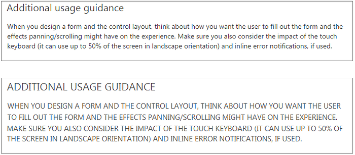
The example below displays a list of Styles from MS Word. You can easily judge both images and tell which one is looking better.

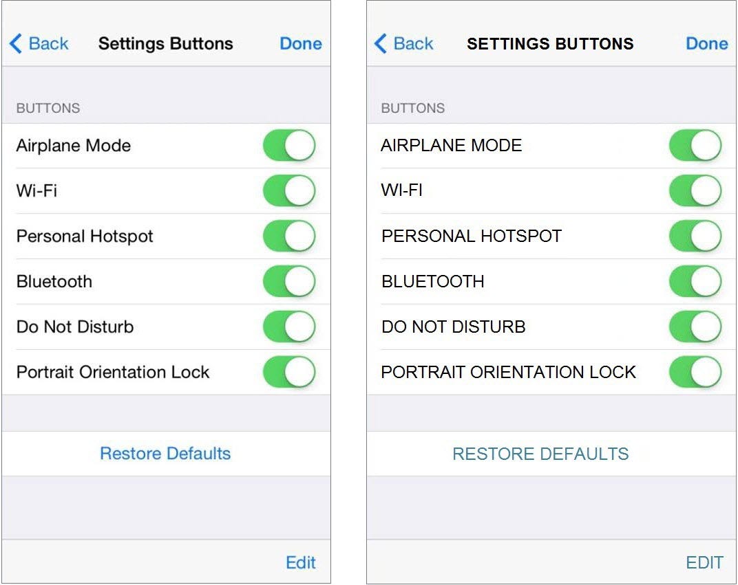
A similar list view is displayed below from iOS. While looking at both images one after another, you can feel the difference in stress levels that your eyes and mind have experienced.
It seems like SHOUTING on the user
Providing instructions in all caps to the user gives an impression that UI text is screaming at him.
See the example below taken from UX Guidelines for iOS. Both images show the difference in expression clearly.
Buttons can be a place where All caps can sound good and stand out on UI. However, it also depends on the context in which buttons are used.