A UX/UI Case Study: Designing a Text-To-Speech App From The Ground Up
A User-Centered Design Research Process
Overview
Designing a text-to-speech and document saving mobile app that is highly customizable, highly interactive and has the ability to bring and maintain user engagement with strong user experience methods
Challenge
People are in constant need of information, whether it’s for work, school, or for leisure. The need for another way to save and consume information in an innovative and unseen medium should be considered. Most user experiences focus on seeing, but one of the senses that isn’t used as often is hearing.
Many also lack the time to consume everything they’d like to. Allowing the possibility to hear what users want while doing other activities such as exercising or cooking will allow for a higher engagement of consumption.
As an avid bike rider and as someone who loves to listen to the latest podcasts or audiobooks, I always wanted to find an app that lets me curate what I want to listen to, whenever I want. If there was an app available like that, what would it be like and what kind of curation would it allow?
Solution
Most users know what they want to find on the internet based on their interests. Everyone has their niches, be it politics, gaming, tech, etc. Allowing for users to add and save their own information from different sources will incentivize users to customize what they want to read or listen to. A user-centered research process is needed in order to confirm this hypothesis.
User Research
I started this research with the assumption that the user base will be targeted to the young professional who tends to commute often and who is busy with work. After developing a research plan that includes writing a survey and some interview questions, I set out to conduct my user research. I asked friends if they can fill out the survey, and if they can let their friends know as well.
The online survey includes 15 questions, and I was hoping to find insight on understanding the target demographics and multitasking habits. 40 users have completed the survey and have provided me with qualitative data needed to validate my assumptions.
Survey Findings
After interviewing the participants, I was able to find the necessary information needed to arrive at certain conclusions:
The demographics appear to fall towards the young adult or older professional, be it a student or someone with a career who commutes on a daily basis, and more than 50% commute for about an hour or more.
During this time, 62% of users state that they listen to music or audiobooks, which shows that most are willing to use various ways to listen to what they like. Many others use their favorite apps while commuting, and implies that users multitask while listening to music or audiobooks.
59% of users work out, but the majority of users do so in a way that demands their focus depending on the type of workout. Running, jogging or biking would allow users to focus more listening to whatever they want.
Interview Summary
After interviewing 4 individuals who fall under the target audience, I was able to root out many features, pain points and user interactions on the app’s design.
Users expressed their interest in a tool that will help them listen to and learn transcribed documents actively while doing other hands-off activities such as exercising, commuting to school/work or performing tasks that would not allow them to be on their phone. The app would assist users with studying and reading.
Some were concerned with potential transcription errors or unintelligible sentences and would like to make sure that all forms of auditory issues are dealt with.
They also mentioned that the integration of effortless rewind/fast-forward features would be a great addition to their user experience, in case the user misheard the audio. Some have noted that subscription-based options or services would be ideal, considering a trial version might possible attract habitual users.
The need to be able to save a user’s favorite documents was also expressed with features to help them sort out and categorize content type, date or completed files.
Pain Points
Based on the survey and interview research, the results indicate that:
· Users want many options of text to import
· Users want to have time to use
· Users want flexibility on text formatting
· Users want to have all of their documents in one organized medium
Competitive Analysis
In an effort to learn from the strengths and weaknesses of competitors, an analysis of the apps Audible, Instapaper and Voice Dream were conducted. I researched and considered these apps because they were most similar to what I wanted to design due to their interface, organization, list maintenance, and user engagement. Most of these apps are also demanding due to effective marketing and an incentive to use often due to notifications and offers.
I evaluated the competitors by focusing on 4 of the 10 Nielsen Norman Group’s Usability Heuristics for User Interface Design:
· Consistency and Standards
· Recognition rather than recall
· Flexibility and Efficiency of Use
· Aesthetic and minimalist design
Some initial aspects that I would keep in mind while creating my user interface would be:
· Making sure users do not get confused with different words or actions meaning the same thing
· The app should be as visible and as minimal as possible with clearly indicated UI
· Interaction is fast and seamless without the need to figure out how to accomplish tasks
· All text and messages should not contain any irrelevant or useless information and should be clearly express what needs to be known
Personas & Empathy Maps
User research has allowed me to be able to develop a better insight of the average user. Based on my findings, I was able to create hypothetical personas based on the information given from the survey and interviews. I also created an empathy map to understand what a user’s perspective:
Content Strategy
Being able to define what the user would like in terms of functionality would help me develop plans to create the app’s main features from a user’s perspective. In order to deliver a product with a clear message these stories must be categorized into the desired scope using minimum viable products:
Card Sort
After the basic needs of the app were determined, the next step was to create a flow that the user could understand and navigate. In a card sorting activity, using OptimalSort, potential users were asked to organize the user stories into categories which made the most sense to them. This card sorting activity was able to give me the feedback needed to understand how users would interact with the app’s features.
Site Map
After the card sorting experiment, I was given enough information from the MVPs and user stories to visualize what the screens and basic features would look like, which was created with draw.io.
User Flows
I created 3 scenarios for my personas to navigate based on their goals and as shown by their empathy maps. The user flows shows how each step can allow for a user to reach a desired goal while using the app. The three user flows consist of:
· Login/signup
· Add/Import Document
· Current Document
Legend
Login/Sign up
Add/Import
Current Document
Sketching & Wireframing
While understanding and visualizing the user flows, I have a better idea as to what the UI would look like. I printed out iPhone X templates and started to sketch the potential layout for the app:
Low Fidelity Wireframes
After sketching my wireframes, I used Adobe XD to get a better visualization of the app and its contents, such as the colors, positioning of the contents, etc.
Iterations
This was my first attempt at creating the UI for the design. I wasn’t fully content because I did feel like something was missing:
Prototyping & Usability Testing
I developed an interactive prototype in order to understand if the users would like or dislike certain aspects of the design. Each user was asked to follow these following tasks:
· Create an account
· Add a document (Via URL)
· Toggle and experiment with the dashboard functions
· Toggle and experiment with the active document functions
· Add a bookmark
· Purchase a voice
The tests went very well as most users felt that the design was very straightforward and easy to understand, with each user being able to accomplish most tasks. Many stated that the app’s concept is nice and something they would consider using. They also stated that the layout looks good and easy to understand.
Some of the complaints were that the user flows seemed unclear due to the prototype, which was adjusted by adding more pages. One user stated that the colors seemed to bring calmness into the app which can appear as boring and needed more lively colors. Another user mentioned that the proportion for the dashboard’s document cards seemed off. The transitions on the prototype gave the app a feel that it was slow and gentle, as opposed to being faster and exciting. Another user stated that more clear notifications would be more appealing. More experimentation with colors and layouts will help remove these issues that were brought up.
Visual Design
In an attempt to attract as many users as possible, I took my time to learn and understand what it means to have strong visual design, making sure that the visuals are as good as possible. I worked on a style guide, branding, and onboarding illustrations.
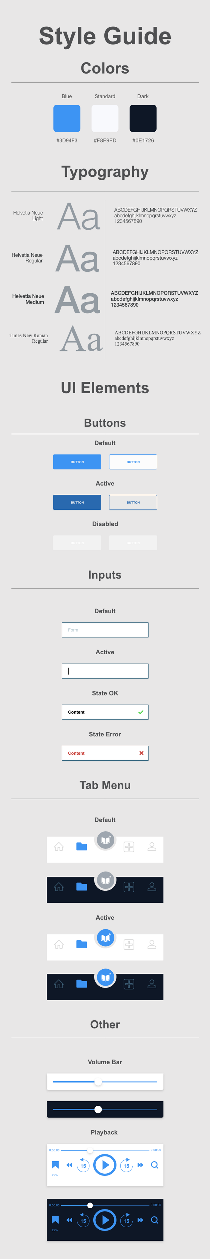
Style Guide
The style guide went through many iterations but this one seemed to work the most in terms of color:
Branding
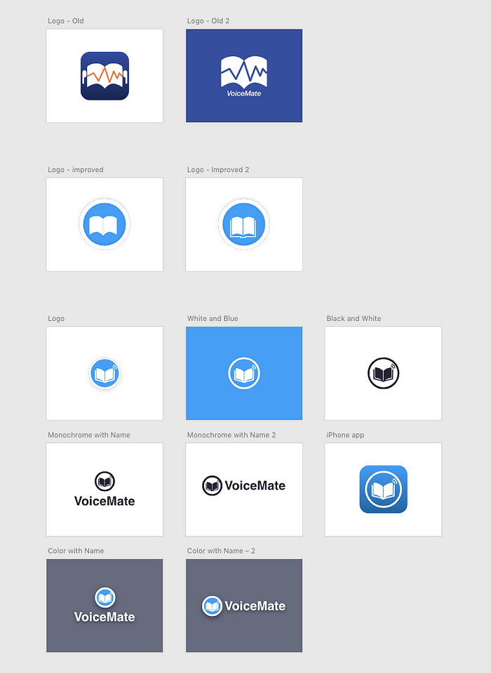
The process of naming and creating a logo and name for the app was continuous. The name and design of the logo are always subject to change.
Onboarding Illustrations
The best way to present an app is to lead users towards an onboarding process. It is estimated that onboarding increases user engagement and helps users understand what the app does and how to use it.

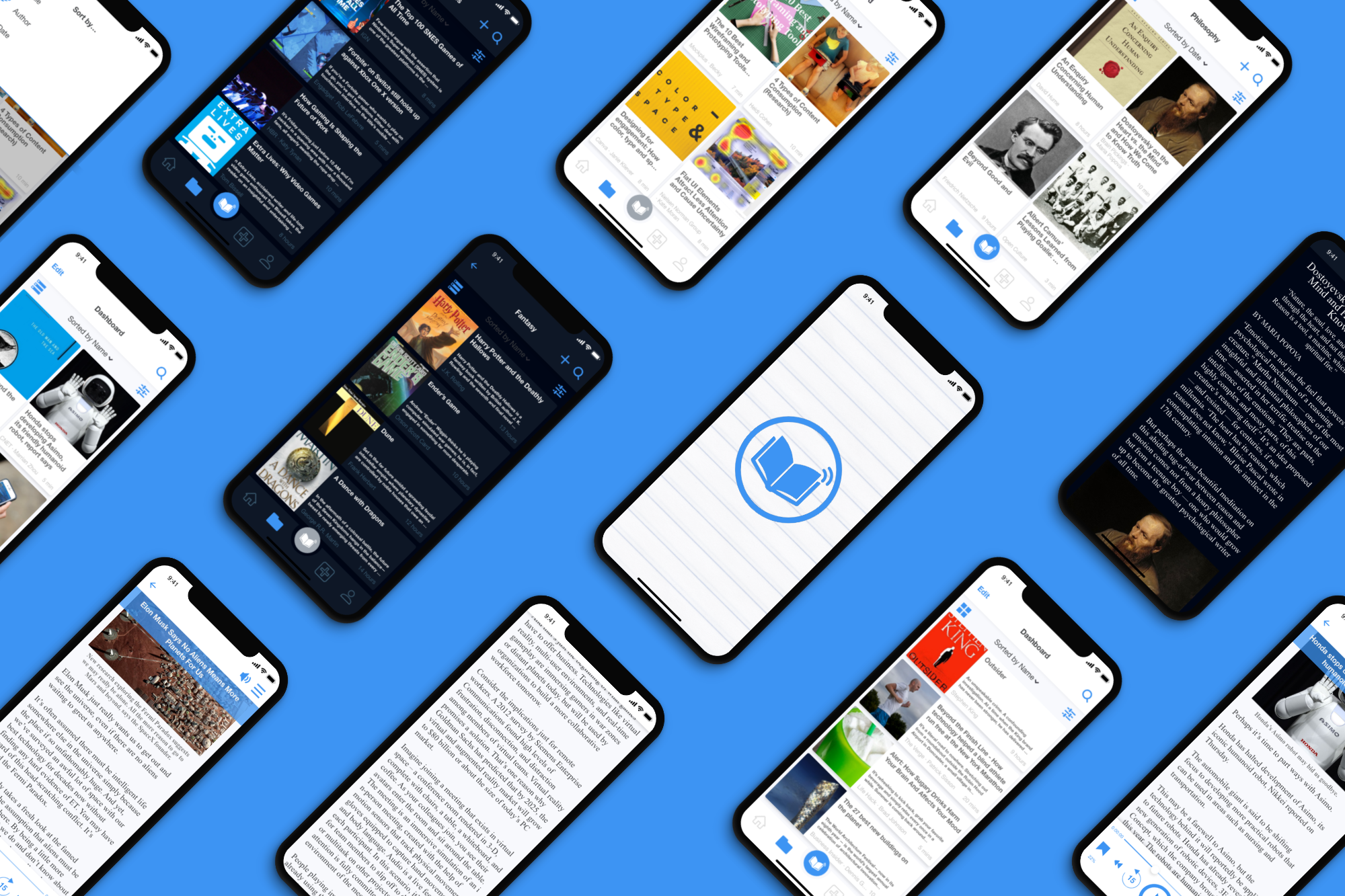
Final Iteration
After constant, careful consideration, the final version is made:

Conclusions
Working on this project has been a great experience and I have learned about the user-centered design process in great detail. Understanding the UX process through a user-centered lens has given me a great amount of information needed to design apps with the user in mind by understanding the motivations and desires of each user. gaining a deeper understanding of human behavior and emotions is paramount to becoming a proficient UX designer.
One of the biggest motivators in learning UX was for me to understand visual design and UI further in order to create apps with more ease and engagement. But I have learned much more than expected about UX, which can become an invaluable tool. Experimenting with Adobe XD and Sketch has given me the opportunity to become viable in the industry. Other tools used were Photoshop, Illustrator, Google Docs, and Optimal Sort.
I would like to give a very special thank you and shout out to my mentor and industry expert, John Maier for the continuous support, guidance, and motivation!
Thank you for reading.