A UX Case Study About Our Attempt At Bridging The Climate Change Gap

Project Background
For this project, my group and I set out to explore the topic of climate change with the goal of understanding how users feel about the issue, how they learn about it and if there are any pain points in doing so. We also wanted to uncover whether or not users take any current measures to combat climate change in their daily lives.
We knew this was going to be a big undertaking as climate change is a sensitive and tricky subject, but with the severity of its impact on our society it was something we were all deeply curious about.
Conducting Our Research
Our first step was to define the type of users we wanted to interview and create a screener survey based on this criteria. Our survey was simple — we were looking for people who believe that climate change is an issue and sought out information on the topic. We sent the survey to our individual networks and as well as the wider General Assembly community and received 31 responses.
From here, we conducted interviews with 7 users who believed that climate change was an issue and read articles on the topic. During our interviews, we wanted to uncover how users learn about the issue, whether or not they take measures in their own lives to combat climate change and if they face any pain points while seeking out information.
We asked a number of questions to get to the bottom of some of these issues, such as:
- What comes to mind when you think of climate change?
- What pain points do you have when seeking out information?
- What topics are you most interested in? Why?
- Where do you get your information from?
- When was the last time climate change influenced a decision that you made?
Synthesizing Our Research
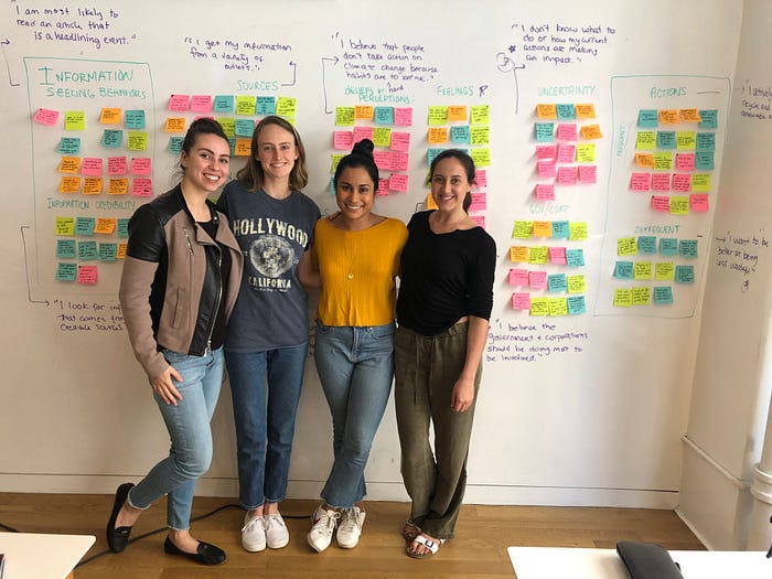
Once we completed our 7 interviews, our team came back together to synthesize all of our information.

Affinity Mapping, Round 1
After going through the affinity mapping process and attempting to create our ‘I’ statements, we realized we had a problem — we couldn’t find any behavioral trends among our users. A few were religious about recycling and reducing the amount of plastic they used, while others thought about it peripherally but didn’t consider it much in their day-to-day. Then there was the way they sought out information — some actively searched for climate change related articles while others would stumble upon them while scrolling through social media or reading about other issues.
We started to feel a sense of panic at the thought of having wasted countless hours on interviews and research synthesis. After staring at our data and speaking with our instructors, we realized that there was in fact one major trend that we were overlooking. The one thing that all of our users shared was a belief regarding the perils of climate change and the way it made them feel. Regardless of how much they did or didn’t do — all of our users had intense feelings about what climate change meant and how it made them feel.
Our second realization was an even bigger one — while all of our users shared this belief, there was a clear division among the people who decided to alter their behaviors to be more considerate of the environment and those who didn’t. How could it be that a group of people shared the same feelings about climate change yet some actively sought out information and ways they could adjust their behavior and others did not. This was the problem space we needed to investigate.
Affinity Mapping Round 2: UX-ing Our Research
With all of this in mind, we went back over the data from our interviews and created new affinity map groupings. This time, we sorted our data by those who actively sought out information and incorporated climate change related actions into their daily lives and those who weren’t proactive about either but had strong feelings about the topic.

Looking at our data differently this time taught us a few things. Overall, our interviewees felt concerned and a strong sense of urgency to act on climate change but when they read about it, they feel overwhelmed by the amount and variety of available information on the topic. As a result, they become uncertain about what to do and question their ability to make an impact. Our users do however have a desire to be less wasteful through their daily actions and also believe the government should be doing more to help and communicate about this issue.
Using our findings, we came up with the following statements to help define our target users, understand their mental models and start to uncover some key features that we knew our product had to include.
1) I am very concerned about climate change
2) I am overwhelmed by the amount of information and the number of sources
3) I don’t know what to do or how my current actions are making an impact
4) I want to better at being less wasteful
5) I believe the government & corporations should be doing more to be involved
Once we had this information in hand, we developed a persona that embodies the needs and behaviors of our product’s user.

Shay, our persona, wants to be more informed on climate change and the most effective course of action she can take. She currently gathers her information from a wide variety of sources, however, this makes it challenging for her to determine what information is credible. What she needs is one go-to source for the most reliable information on climate change that will inform her and guide her in making effective decisions in her combat efforts.
Looking at Shay and her behaviors, goals, pain points and needs, we came up with a problem statement which would serve as our guide and focus us throughout the design process:
People don’t know how to make an impact on climate change and get frustrated when looking for information.
Shay is overwhelmed by the amount and diversity of information regarding climate change. How might we organize the information for Shay to make it more digestible?
Our Solution
Our solution to this problem is GreenFeed — an iOS application that curates credible and comprehensible information surrounding climate change. Account creation & curation, which is a significant part of GreenFeed, led us to the decision of creating an iOS application versus a website. Additionally, a feature within our app integrates actionable items for our users that can be completed daily or when they choose. An application will better serve this functionality due to the accessibility. Our research also showed that our users are currently reading news on their iPhone mobile devices as they often do so on the go.
After identifying our problem statement and space, primary persona, and platform of choice, we knew we had to include the following features in our application:
- Curated articles from credible sources
- An urgency meter
- Daily tips
- Article recaps
- Save function
Our Partner
A key theme that we uncovered in our research was that all of our users felt strongly that the government and major corporations should be the ones leading the charge on climate change.
With this mind, we decided to explore a partnership with the United Nations. In helping the UN promote climate change initiatives, we’re bridging the gap between the government and our users, establishing a higher level of trust in those who have the platform and position to make significant policy changes. And through this partnership, GreenFeed will serve as the ultimate authority for climate change news, only providing information that has been vetted by the UN.
The Climate Action Summit, an initiative sponsored by the UN, was created to define action areas to reverse the impacts of climate change. GreenFeed will help the UN realize its goal of spurring climate action by translating those action areas into achievable tasks that help users engage and feel more confident in their efforts.
Design Studio
With our platform, partner and problem area in mind, we moved on to the design phase.
We came up with a comprehensive list of features for GreenFeed that are crucial in meeting our user’s needs and worked together on two rounds of Design Studio to sketch each screen. We knew we wanted our users to be able to curate information based on their own preferences so the first round involved sketching our onboarding screens so users could customize their information. We also wanted to incorporate a feature that would help users incorporate better climate change behaviors into their lives so we developed a Daily Tips feature that users could opt into to receive notifications about things they can be doing to help combat climate change. Through this process, we came up with the following screens:

For our next round of Design Studio, we focused on the screens the users would see once they created their account and selected their preferences. At this point, the user would go to GreenFeed’s home screen where they could view articles by topic as well as sort them by source and date. The home screen also includes a bottom navigation where users can navigate to their saved articles, the Daily Actions page so they can reference a master list of daily actions, and their profile.

Mid-Fidelity Wireframes & Usability Test Results
This led us to our mid-fidelity wireframes which we used to conduct one round of usability testing.


We tested 4 people and gave each of them two tasks. The first was to create an account and took the user through our onboarding process which allowed them to select their preferred interests and news outlets that they would like to receive articles from and set their notifications to receive our Daily Tips.
4/4 users successfully completed the task but more importantly, all 4 of them chose not to set up the notifications for the daily tips.
For the second task, we asked users to save an article that they could come back to at a later time, which they could do directly on the homepage or within a particular article, both using the bookmark icon. 4/4 users successfully completed the task and were able to identify the bookmark icon.
Hi-Fidelity Prototype
After testing our mid-fidelity wireframes, we designed and tested our hi-fidelity prototype.
Knowing that users did not want to receive notifications from the app, we discussed other ways of integrating the Daily Actions feature as we still wanted GreenFeed to have an action-oriented component. We changed Daily Actions to Take Action, which is a page on the app where the users can view a list of actionable things they can incorporate in their lives. We also changed this on the on boarding page and instead added the Take Action icon and a descriptor of what this page is and where users can find it when logged in.
We also found that users wanted an option to Skip certain parts of the onboarding process which we added in as well.
When designing our hi-fidelity prototype, we knew we wanted to use colors and typography that was calming and positive while still being authoritative. During our initial user interviews, we learned that users were turned off by the alarmist images and headlines that often go hand-in-hand with climate change news so we wanted to make sure we took this into account while designing our hi-fidelity application.


Usability Testing & Next Steps
Once we had our final screens, we conducted another round of usability testing with 5 users. During testing, we learned that 3/5 users were still unclear about the Take Action feature during onboarding.
We also learned that users did not understand what all of the icons on the footer navigation referred. As such, the next iteration of GreenFeed will include labels below the navigation icons and we will update the ‘Take Action’ screen to better communicate the feature, perhaps by using a short gif to show users where the screen is on their homepage and what they can expect to find there.
We would also like to explore new features that came out of testing such as a share function so users can share articles with their friends as well as a way for users to search for climate change initiatives in their local communities.
Our UX Design Team