Member-only story
A quest for the ideal Navbar Height
At the start of almost any web project (online product / marketing website) I start implementing bootstrap. In the design I take into account the bootstrap grid and the dimensions of the most used components. In this story I will specifically look for the most ideal height for a navbar for both desktop and mobile use.
Published in
3 min readDec 2, 2020
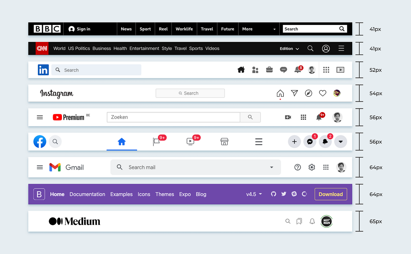
Contemporary examples on desktop
Contemporary examples on Mobile

- News websites tend to display as much content as possible (and by extension advertisements). It is striking that main navigation takes up very little space here. It also makes sense here because you are supposed to navigate through the main articles to the detail pages.
- Furthermore, it strikes me that almost no texts are used in the navigation bars of user-oriented platforms. It is assumed that the user recognizes the symbols used and can navigate with them.
- Some website / platforms integrate the search in navbar, others provide an extra bar for this (immediately below the navbar).
- In the case of gmail (see example images mobile, 3rd example) I find it bizarre that they give the page title priority to the search functionality. The search function can be found right below the navbar.
- When the search bar in the navbar is used, you will usually still find a sticky action bar at the bottom of the site.
- I am used to following “bootstrap” in all the graphical decisions I have to make, but I personally think the navbar of the mobile version of the documentation website takes up a lot of space. The logo gets a whole line and also the social media links are included in the main navigation. The social media links seem to be redundant here, and it should be enough to put these links in the footer.
- Personally I feel most comfortable using a navbar height of 64px. It is enough…

