A Guide to CSS Grids for Designers: Flexbox, CSS Grid, Floats & Clears
Designers and Developers — A Perfect Harmony
I am a strong advocate for designers knowing how to develop. How can someone design for the best user experience without an understanding of how that design will be built? Take for example a car designer. There would be no way of designing a vehicle without knowing what the required components are to make the vehicle work. Web design is no different.
Grids — The Building Blocks of Design
Grids are one of the starting points for any design project. Knowing what type of grid to use for what type of challenge can significantly enhance the user experience and create a better flow between the designer and the developer. The ability to design a layout while simultaneously being able to identify how that layout will adapt and change across multiple devices and environments is invaluable. This is all possible with a comprehensive understanding of how grids are programmed.
I remember a long time ago when I was first introduced to web design and development; I was in grade 8 and I was tasked with building my elementary school’s website. I had experience working with my Final Fantasy 7 GeoCities fan page so I was the obvious choice to take on the task. The web as we know it was in its infancy and everyone was using tables to build out dynamic layouts. The internet has come a long way since then.
Floats & Clears
When CSS layouts using floats and clears were introduced my mind was blown. I no longer needed to hack and slash tables to do things that they were never meant to do. I could make containers and stack them into unique forms. While this revolutionized the way that web design worked, it still came with several drawbacks — namely that it relied heavily on the HTML being structured in a very specific way.
Take for example a simple 3 column grid. If I wanted to create 3 equal columns with equal margins, the HTML would require additional classes to be added to the last column as well as a “clear” div after.

In addition, making this type of grid adaptive for mobile was very one-dimensional. You would basically have 2 options to make these types of grid respond. You could make the column widths retain their percentage (squishing the content inside) or you could force the columns to stack.
While the float and clear grid would be responsive for smaller screens, it would not be adaptive (catering the user experience based on device). I would not be able to successfully adapt a desktop layout for mobile ensuring to retain the best user experience (without doing a lot of “smoke and mirrors”).
Flexbox
Flexbox was a godsend. As a designer-first — creating fluid and dynamic layouts while still upholding design integrity with web design has always been a challenge. Take for instance inconsistent column heights.

When building websites with dynamic content areas (like a blog) it can be challenging to ensure that your original vision is upheld when you leave the content populating in your client’s hands. While you can provide guidelines for the title and copy lengths, there is no way to guarantee that such guides will be followed.
With flexbox you can you have the ability to create a more consistent grid, and vertically aligning content is a breeze (vertical alignment with floats and clears has forever been my Everest). In addition, you can re-order content without touching the HTML.
CSS Grid
Where does CSS Grid come into play? When I started to explore CSS Grid the first thing that came to mind was “editorial design”. The bridge between print and digital designers has always been a big one. It has always been difficult for print designers to understand that their designs need to be adaptive. The web is fluid and while things like “orphans” are a design faux pas in print — in web design, they’re sometimes unavoidable.
So how does CSS Grid solve this gap? Well, it doesn’t exactly but what it does do is allow for complex layouts to be made easily as well as allows the designer to have much more flexibility when it comes to how the layouts respond across multiple platforms.
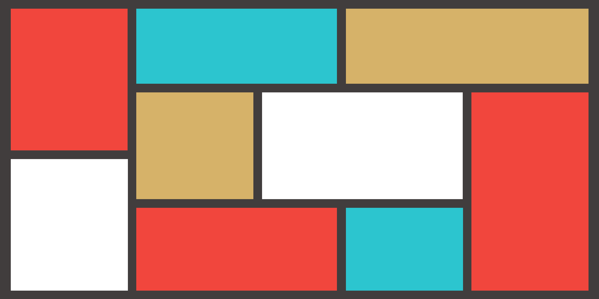
Whenever I want to learn new CSS properties I always design something first to ensure that the final product is possible. Final Fantasy 7 was one of my favourite games growing up, and with the release of the new remake, I thought it would be a perfect topic to use to explore CSS Grid.
The design is fully adaptive utilizing the CSS Grid property “grid-area”.

The above layout is based on the foundations of designing a grid. The unique placement of components would have been extremely tedious and HTML heavy. Luckily with the use of CSS Grid, this layout was painless. Not only was it easy to build, but making it adaptive for different devices was effortless. From a high-level perspective, the rebuilding of the grid was handled by 5 rows of code by simply adjusting the “grid-template-areas” property.
You can see the code in action on Codepen here:
https://codepen.io/lezus/pen/JjYeJOB

You can easily adjust component locations as well as adjust the space they take up in the grid. This is incredibly useful when designing adaptive layouts that cater to the user experience.

When to use CSS Grid
While CSS grid in incredibly useful and dynamic, I still feel it isn’t ideal for every situation. For websites or web-apps with heavy visuals and catered content lengths, CSS grid is the way to go. While the columns and rows can accommodate for varying copy lengths and content types, to ensure the best UX, CSS Grid should only be used when designers and copywriters can work together to ensure a brand guide can be followed.
In Conclusion
Ultimately it is up to the developer to decide what tool is best suited for what project. However, as a web designer, you should understand what is involved with programming layouts to eliminate the burden of solving unnecessarily complex programming problems. Your design should be based on real-life applications and should include designer notes suggesting ways to make your layouts work in an adaptive way to create the best user experience.
Mix n’ Match
Each grid option has its perks and you don’t have to be restricted to just one. In most cases, mixing and matching techniques will provide the best results. Knowing a variety of CSS techniques not only will help designers create concepts that use the latest technologies, but will also help develop a better relationship with developers to produce the best possible outcomes.


