A framework to create an accessible and harmonious color system for faster design-dev handoff
Enabling design & development teams to use colors deliberately for improved consistency across product
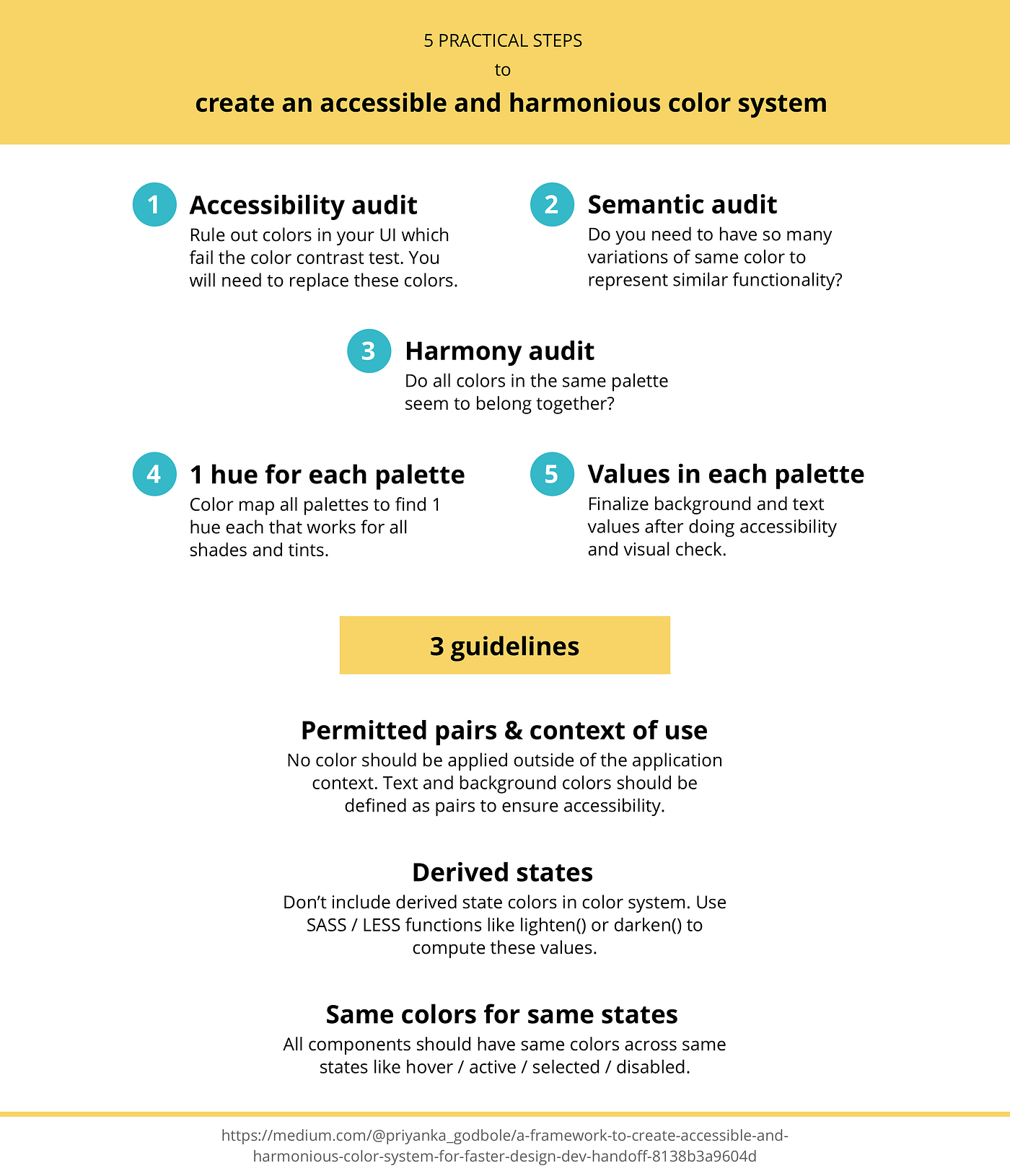
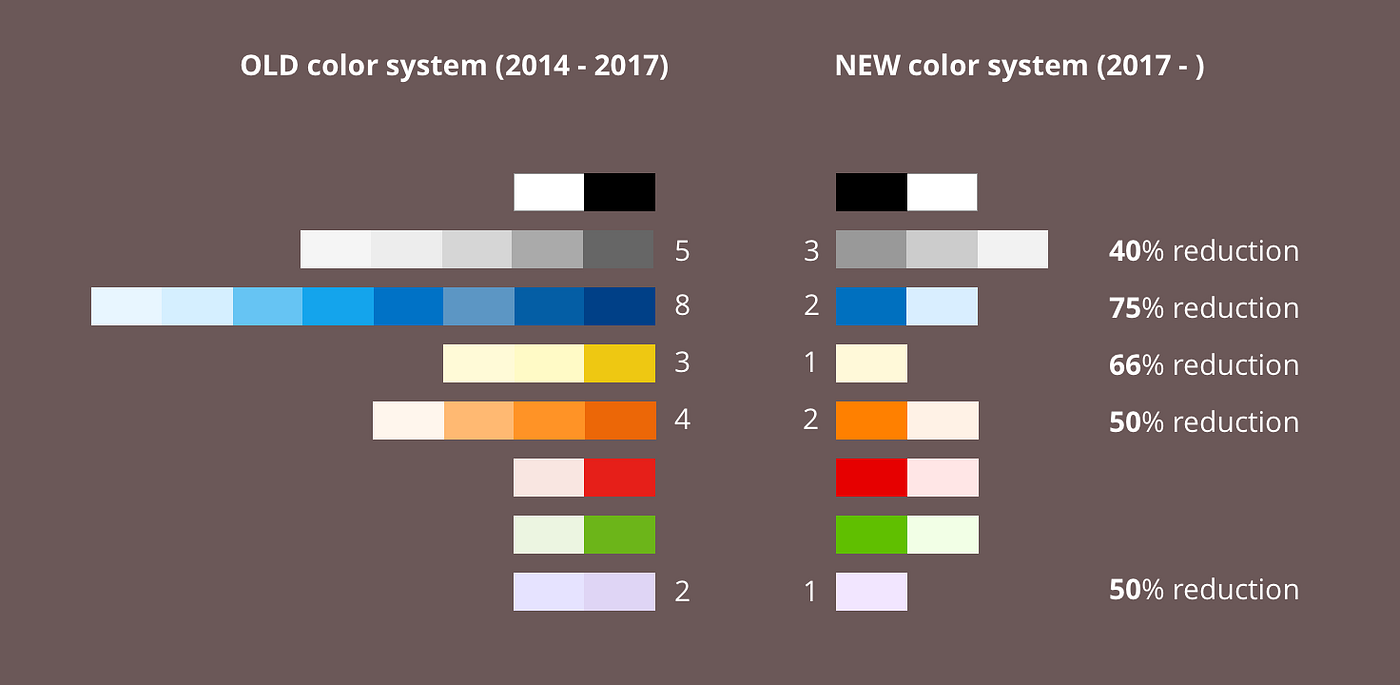
Here is a 5 step process which I used to redefine the color system of Practice Fusion’s EHR product. I reduced its color palettes by 40%–75% and simplified application rules to ensure consistency across the product. (This post is going to focus on the definition of UI colors only. Brand colors need a different approach and will not be discussed here.)
Step 1: Accessibility (contrast) audit of colors in your UI
Run the Chrome WAVE plugin and check for color contrast errors in your UI.

Take note of which color combinations are not accessible and cross them out from palette. It makes decision-making easier later on.

Step 2: Semantic audit of colors in your UI
Gestalt’s principle of similarity, states that things which share visual characteristics such as shape, size, color, texture, value or orientation will be seen as belonging together.
Components with same color properties (fill or border) will be assumed to have similar functionality. Too much variation in color causes unnecessary distraction and cognitive load as users need to process and interpret the meaning of each color variant.
Annotate the meaning for every color usage in couple of key representative screens. And while you do that, ask yourself just one question— “Do I really need these many variations of the same color to convey 1 meaning?” Examples:
- Links and buttons allow users to click and do some action. Do they really need to be in 4 different shades of blue? Can I have just 1 blue (or may be 2) to rule them all and be the only color/s that means click?
- Borders help to contain components, tables and sections. So, they really serve the same purpose of containing content. Do they really need to be in 3 different shades of grays?
How many colors in each palette?
- Based on semantics of color usage, I classified blue as the color of action. Our original blue color palette had 8 blues and I needed just 2 — 1 dark blue (shade) to imply “click” and 1 light blue (tint) to indicate “hover”. That is 75% reduction from existing blue palette.
- Grays are typically used for secondary text, input field borders and any secondary regions as background. That meant I really needed just 3 grays— 40% reduction from the original gray palette of 5 grays.
After doing semantic audit, you will know exactly how many colors you really need in each palette.
Step 3: Harmony audit of colors in all your palettes
Colors harmonize if they are variations in lightness and chroma within a single hue (monochromatic harmony)
Reference: https://www.handprint.com/HP/WCL/tech13.html
Use HSB model to evaluate if all existing palettes are harmonious. (HSB is the most logical humanly readable color model. No other color model gives us a full understanding of how the color outcome will change by adjusting its values.)
To have monochromatic color harmony within a palette, we need to have all colors from same hue. If the color palette has a very varied range of hues, the colors will not look like they belong together. A small delta in hue values may seem to be alright, as the difference is hard to perceive; but the question is there a good reason to have this small delta? I have found that picking just 1 hue helps with remembering colors for both designers and developers and in future, if you need to expand a palette, it provides a strong foundation for ensuring harmony in all colors.
Step 4: Pick 1 hue for each color palette in your UI
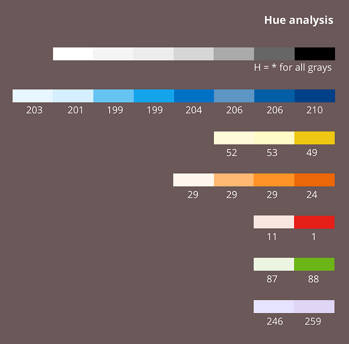
I will start with example of blue palette, which had a hue range of 199–210 in my case. I am going to pick 1 single hue from the same range, so that the overall appearance and brand feel is not impacted. I created color palettes for H: 195, 200, 205, 210 by keeping either S or B constant at 100%, and varying the other component by 5–15 points to give me shades and tints respectively. I rounded off hues to closest multiples of 5, as it makes it easier to remember the whole color system.
Color mapping for blue
I need to finally select just 2 colors out of all these blue palettes (as determined in Step 2), but both colors must be from the same hue. It is helpful to see full palettes of each shortlisted hue at once, as it gives a sense of the overall feel of each color palette and allows you to better compare with an existing palette. I observed that H:205 provided shades as well as tints that looked closest to our existing colors.

If you are tasked with creating a brand new color system, it will be helpful to take a look at all the hues available for the color and choose a hue that matches your brand emotion best. Example, for a fun consumer application, you may want to select a fun hue color like H:190.

Color mapping for all other palettes
Color mapping for all other color palettes was much simpler since there were limited colors in other palettes. Example: I started with red: adjusted hue to 0 and the new color set still looked more or less similar. I rounded of orange hue to 30. I started off with yellow hue adjusted to 50 and purple adjusted to 250 as those values seemed closest to existing values, but after testing in UI; I realized that hue 60 and hue 270 looked much better for our context of notifications. I ended up with hue values that had a pattern of being a multiple of 30 for most part (except the blue hue). This was a coincidence, but it did make remembering hues a lot easier.

Special case: Gray palette
Gray palette does not have a hue. So, I did not need to do any hue mapping for it.
Step 5: Determine values in each hue
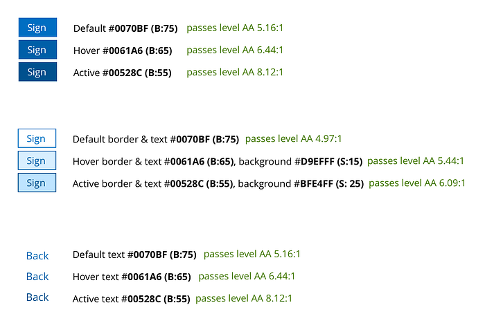
The actual process of deriving the background & text color values from the color palette was as follows. Shortlist colors which you can possibly use based on your background & text needs determined in step 2. Do visual check of how text appears on different background colors, to finalize background colors. Do accessibility check with WCAG Color contrast checker to finalize text colors which work best for the chosen background colors. I followed a similar method for other palettes.

Colors harmonize if they are the same lightness and chroma, regardless of hue (nuance harmony)
Wherever possible, I tried to use same S or B values across hues. I made exceptions only if the color was not accessible or was too off visually.


3 general guidelines while applying color
Guideline 1: Permitted text: background pairs & border colors
All the colors were derived only after first deciding on their application contexts (Step 2). No color should be applied outside of that application context. Example, a color picked for text should not be used for borders or a color picked for background should not be used as text.
As soon as you define your color system, define the permitted text : background and border colors. Color contrast is measured for text and background colors and so they should always be defined in pairs.

Guideline 2: Derived states (like hover & active)
Derived states often take colors which are slightly lighter or slightly darker than the original colors. By using CSS preprocessor (SASS or LESS) functions like lighten() or darken(), you can compute the derived states colors.
I have found that it is best to not include colors for derived states as part of the color system. The problem with introducing them as part of the color system is that it increases the number of visible options, and over time makes it difficult to limit its usage for other purposes.
“As the number of choices increase, it becomes exponentially difficult to make a decision.” — Hick’s law
Guideline 3: Apply same colors for same states across all UI components
Make sure all your UI components have similar color application across various states. I used the blue link color for borders for all components in hover state to imply that they are clickable. I used the same gray color for all component borders and also used it for all other types of borders like section borders, table borders, divider lines, etc

In conclusion
By following this process:
- You will come up with a color system with limited values and limited application rules (Hick’s law) — which are very easy and logical to remember (Gestalt’s principles of similarity).
- You will be using colors in your UI which adhere to accessibility color contrast guideline. This will allow people of different abilities to track and comprehend information more easily.
- Design-dev handoffs will become faster as the developers will also know all the rules of application of color system and be able to guess color in mocks delivered by designers.
- Designers may not need to redline all colors. Developers will not need to spend time in inspecting mocks in other tools like Zeplin.
This is a 3rd post in my series of design systems. Read my previous posts about creating accessible, harmonious and predictable typography and spacing system, if you liked this one.
You can follow me on https://twitter.com/priyankagodbole. Thank you for taking the time to read this far!
Useful articles for reference:
Though there are plenty of articles touching on color theory, I did not find a lot of resources explaining a systematic practical approach to coming up with a color system. If you know of any other articles besides the ones listed below, please share it in comments below.
https://medium.com/eightshapes-llc/light-dark-9f8ea42c9081
https://medium.com/eightshapes-llc/color-in-design-systems-a1c80f65fa3

