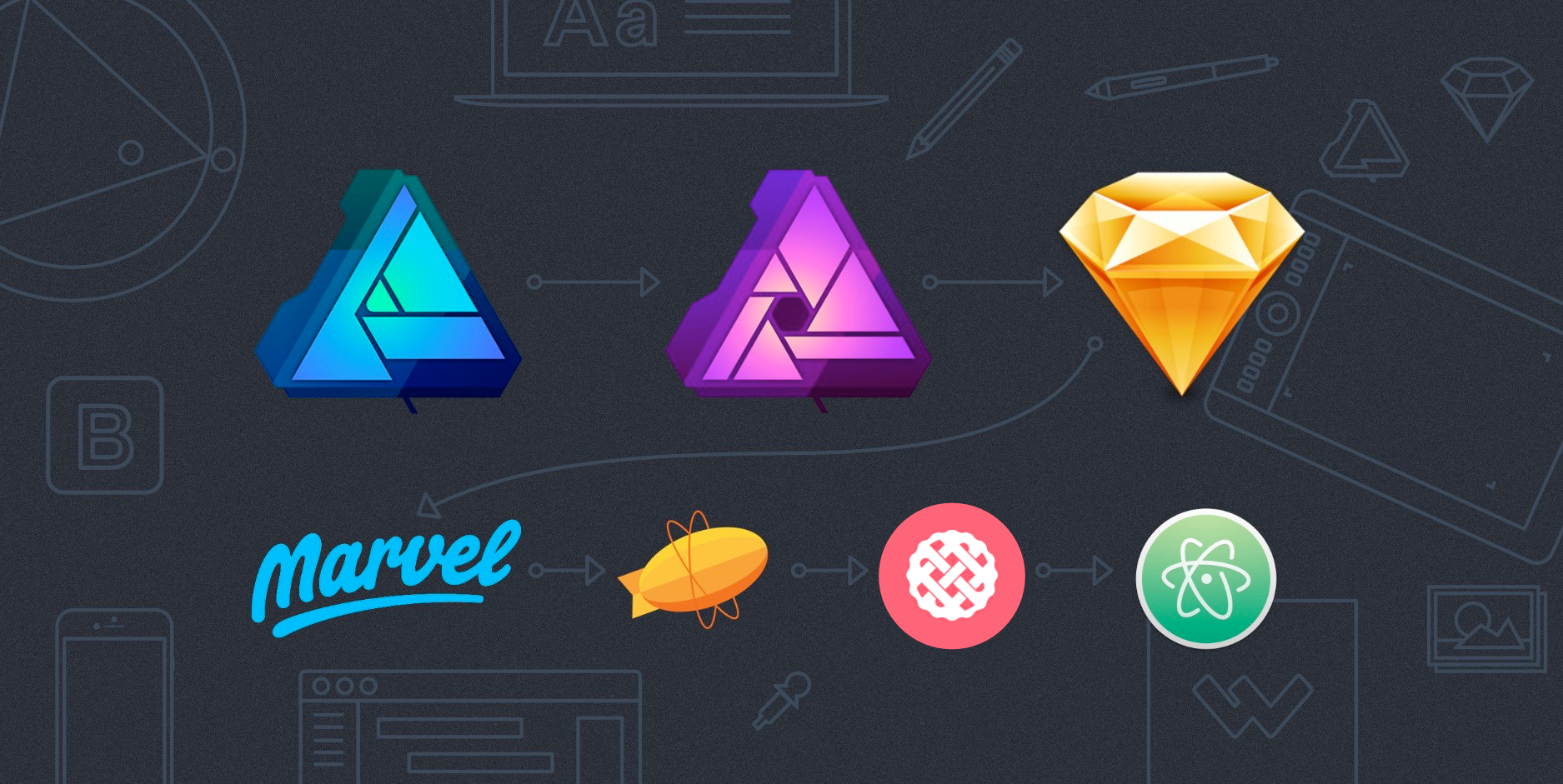
A Digital Design Workflow: Tools in Review
The world probably doesn’t need one more article about ever-changing design tools, but I’ve had a few people ask what I use in my work at Worthwhile and why, so here are a few thoughts on my current design tool chest and my process. It’s a great time to be doing graphic/web/ui design and prototyping because the competition is increasing, and the tooling options keep getting better and better. At the end of the day, our tools don’t matter nearly as much as the output—it’s the work that matters.
In digital design, making only static comps is usually not enough anymore, but I doubt we’ll completely move beyond the need for static design ideation. For me, on nearly every project I’ve been on, showing the client a high-fidelity concept of the final product went a long way in building trust and in opening up important UX discussions. But whether for client presentation or for internal developer conversations, you need tools to create and edit high-quality design assets, great tools for efficient layout work (the same tool may be the solution for both, maybe not), and solutions for prototyping—either lo-fi prototyping that explore user flow or hi-fi prototyping to explore details of interaction.

Almost two years ago, I decided it was time to try moving beyond Photoshop for my UI/web design work. I’d been working in Photoshop since 5.0 on my parent’s PC growing up, so it was like a treasured old friend. Is Photoshop immensely powerful? Sure. Best for web layout? Maybe for some, but usually not. A fully raster-based workflow to me is not in-line with modern digital design. Photoshop has improved over time, adding artboards and better support for exporting retina assets, so it’s an option, but has its issues. Our of the main issues I had was less simple and fluid than I would’ve liked, Working with shapes and vectors was a pain, and dev handoff was also painful—involving either manually annotating a ton of specs or letting my dev team poke around and measure in my PSDs themselves (they hated doing this—I learned better!).
Currently, Photoshop still gets some grief for its slower, legacy architecture, its image-editing focus, and its “feature bloat”. I say, as a professional, don’t demand that your tools be as beautiful and “free of bloat” as your own consumer-focused design solutions. Your tools should not slow you down, but they also should not be overly limiting. They should enable the creation of dynamic solutions while enabling you to ideate and polish with speed. As Jonas Downey noted, sometimes density and complexity is necessary and better than simplicity. Your grandfather’s tool shed wasn’t awesome because it only had one saw, one hammer, a ruler and a few nails.
Affinity Designer

I saw an article on Affinity Designer over a year ago when it was still in its earlier development, and my interest was piqued. A vector and raster tool in one app? At the cost of one month of an Adobe CC subscription, I gave it a shot. At first, I found it similar enough to Adobe products that the learning curve wasn’t too steep, but it was different enough that it still took a little getting used to. It opened PSDs and AI files. The workflow was fluid. The exporter was decent but was a step up (its gotten a lot better since then). It made exporting retina assets easy. It had awesome undo and was capable of saving infinite history. I made the jump and bought the team some licenses rather than pay for a full Adobe CC license for our devs (when all they did was open Photoshop anyway).
The Good
- Powerful, core features that just work. Serif set out to make their software more than an Adobe clone, and where things have been rethought and simplified, it just makes the app shine. Affinity Designer doesn’t have every advanced feature of Adobe Illustrator, but what it largely does away with all the extraneous tools you didn’t use anyway, and it focuses on making the core tools and experience work really, really well. It’s made my work faster and improved the quality of my output just by the nature of how the app works and responds. In a way, I feel like Affinity combines the best of Illustrator, Photoshop, and Sketch. Some people have said that it feels like it’s trying to do too much, but I disagree. I think it’s easier to pick up for a new user, but powerful enough to do a lot of things well.
- Intelligent Symbols. Affinity introduced symbols in a fashion similar to (but in my opinion, better than) how Sketch used to work. In-context editing, variable sizing, and detachable sub- portions of symbols. It’s pretty beautiful in action.
- Constraints. Affinity Designer actually introduced this in beta before Sketch 39 introduced the same idea in Smart Symbol Resizing, except Affinity gives you a bit more control by allowing you to not only establish a positioning relationship between a child and parent element, but by letting you set which specific edge[s] of the parent the child layer should relate to.
- Endless undo. If you don’t mind larger file sizes, you can also save a file with history and scrub back to the beginning when you return. Auto-save has also saved my bacon on a few occasions when I’ve dealt with crashes.
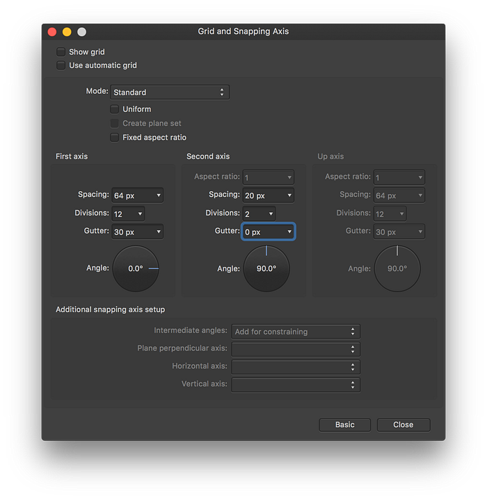
- Other core features: flexible artboards, powerful custom grids, extensive snapping options, color modes and color management, global colors, character and paragraph styles, and solid basic pixel editing tools (if you need more, you can pop over to Affinity Photo, the companion app, which is also definitely worth the modest price).
- Fairly solid Photoshop/Illustrator compatibility. Import and export aren’t always 100% perfect (Adobe’s justly made compatibility with their formats tricky), but PSD import for me is almost always seamless. So all of those old designs, mockup PSDs and UI kits are still accessible (just keep in mind the smart objects will be collapsed down and rasterized though).
- Mac/PC compatibility. Affinity Designer’s current 1.5 beta also now exists for Windows users as well as for Mac. While most designers are on a Mac, I think Serif stands to gain a lot of ground once they’re solidly on both platforms.
Minor Issues
- Current lack of scripting API for actions/plugins, and currently not a lot of support for third-party services.
- Lack of support for multiple fills and strokes per object not supported (yet).
- Color support (including Pantone!) is pretty solid, but currently you can only embed Pantone values via PDF (no EPS support yet).
For now, I’m using Affinity Designer in professional work for icons, illustrations, various digital assets, print collateral, and some web layout work.
Want to Learn Affinity Designer?
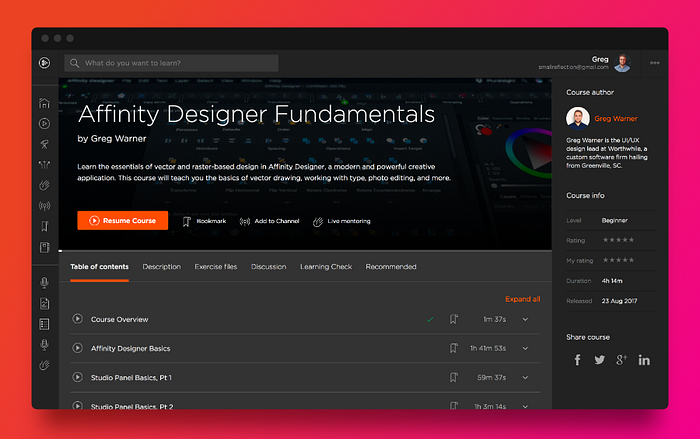
Shameless plug here. If you haven’t gotten deep into Affinity Designer yet and are interested in a comprehensive overview, take a look at my new Pluralsight course Affinity Designer Fundamentals. If you benefit from it, let others know. :)
Sketch
The Mac-only Sketch still seems to be the current king UI design. As Affinity was growing in my workflow, Sketch seemed to be taking the design world by storm. So I gave it a shot and kept reading tips and tricks for how other designers were using it, to see if I could add it to my tool chest and speed up my workflow. My impressions from the start are still pretty accurate.
Sketch was born as a vector drawing app. It grew to fame because it’s grown to be a great tool for general layout and wireframing. It shines in its simplicity, but as noted before, that’s also it’s limitation. You can pick it up in a day or two and start using it effectively, and by learning a few hacks you can indeed save a good bit of time with it. However if you need to do anything beyond the most simple of photo edits, you’ve got to go elsewhere. Ironically, if you’re drawing an icon or illustration of any complexity, it’s just painful and difficult. Trying to use the pen tool in Sketch sends me running back to Affinity Designer like my rabbit runs after fresh banana slices. So why use it? UPDATE 9.21.16: With the release of Sketch 40, Bohemian did introduce some very good improvements to ease and speed vector drawing, so that’s a huge plus! Give each tool a try and see what works best for you.
The Good
- First and foremost in my mind is not Sketch’s simplicity or its core features, but its power when paired with the explosion of plugins and add-ons that the growing community has produced. From InVision’s oft-noted Craft add-on (which is fantastic) to other plugins for Content Generation, dynamic batch-renaming of layers (one of my personal favorites) to layer sorting, Sketch can gain power with company.
- Noted integrations. Partly because of its growing popularity, Sketch plays very nice with other apps such as Principle, Framer, Marvel, and Zeplin. That’s one of the core reasons I’m using it now.
- It’s designed for layout. The Canvas/Layout feature is a favorite—a simple, ultrafast way to set up a column grid with the proper gutters. Add-ons like Auto Layout by the makers of Anima App also greatly improves control over layout, allowing you to achieve some near full-responsive designs (as elsewhere, the good here is counterbalanced by dependence on third-party plugins. But for what it is, it’s excellent).
- New Symbols and Smart Symbol Resizing. Sketch’s new, isolated Symbols functionality as of 3.7 actually caused quite a bit of controversy, and I’m still on the fence on it. Symbols in Sketch is now more flexible than it once was, allowing for variable sizing, nesting of symbols with dynamic positioning, and sidebar layer content overrides. So Sketch and Affinity are fairly similar in effect, but where Affinity allows for in-context editing, Sketch has chosen to isolate symbols to extract them from context. Regardless of your preference, it provides for powerful, atomic design.
- Shared Styles. I have a love-hate relationship with the way Sketch treats shared styles. Shared type styles are much more reminiscent of Keynote and Pages than Adobe, so editing styles is more natural and contextual (and, fortunately now, only change all instances via manual sync).
- Code. While Photoshop also has some support for this, Sketch thinks a bit more like a web layout tool. You can right-click any element and get some rough but helpful CSS code.
- Wonderfully simple, multiple-resolution export that just works (update: and as of Sketch 42, you can now define common export presets, which is sweet!). Similar to Affinity, you export either isolated layers/folders or draw manual slices conditional to the design view or the contents of a folder—however instead of a separate persona for export, it all happens in the main design view and in the core layer panel, so it’s very intuitive and fluid.
Issues
- Well, this space-eating problem happened to me on a 1 TB MacBook Pro awhile back—perhaps it’s been fixed by then, but just a note of what to do in case it’s not.
- Sometimes the same joys are also frustrations. What Sketch tries to keep simple, such as Layer Styles, lack flexibility—and in some cases, the basics of what I’d expect from such a popular design app. There’s an uppercase/lowercase command and shortcut, but still no actual text setting for it. A selecting and changing the color of a portion of text with a set style still changes the entire block’s color and style. Essentially, Sketch really needs the less-simple and more appropriate separation of paragraph and text styles that Adobe and Affinity employ. Sometimes, the fully contextual styling approach leads to issues. Fortunately, Bohemian has improved some painful problems, such as line-height issues when changing text styles.
- Symbols have gotten much better in recent updates, but non-contextual editing can still be a bit of a pain in certain instances.
- Another of the joys is a bit of a concern—some of the main reasons I use Sketch are features from plugins, and some of those plugins I discovered because I realized they weren’t native features when I felt they should’ve been. Plugins are fantastic, but I’d love to see Bohemian work some things in as natively supported features. Sometimes running a Sketch update can break plugins you depend on.
- Limitations: again, Sketch is powerful and fantastic for layout and its integrations, but you may prefer another app for drawing and creating design assets (Sketch 40 has improved this, however).
- Apparently no future for PC-compliance, and no future or desire for compliance with Adobe file formats. While I know the majority of designers are Mac-lovers, I think a single-platform approach may limit Sketch’s growth long-term. Maybe I’m wrong. The flipside to this is the growing number of Sketch adopters means you’ll still be in good company. Either way, there is no single king in the digital design space any more.
Zeplin
Zeplin has bought me some fans amongst our developers! Zeplin is one of those growing apps that integrates nicely with Sketch (also, now, with Photoshop), and makes dev handoff a breeze. With one shortcut, you can push Sketch artboards to a Zeplin project, and devs can simply mouse over the design in Zeplin to get accurate measurements, dimensions, fonts, colors, and more. You can automatically generate (and manually edit) a styleguide for developers to reference based on your established design styles, creating one home for type and colors. Developers can export their own PNGs and SVGs from anything set up as a slice in Sketch. Better, they can get rough CSS, LESS, and SASS styles from any selected element. Add that up over pages and projects, and it equates to a lot of saved time.
Marvel
Marvel, similar to InVision, is my choice for simple, quick and user-flow-focused prototyping. Prototyping is the big thing in design these days, and it feels like the Wild West, with a new tool or tool update seemingly vying for dominance every other day. Currently, no prototyping tool stands out as the king of many needs—usually one tool tends to do one type of prototyping really well, or well in one way. Currently, I prefer Marvel for its scaled-back simplicity and its dependable sharing and collaboration—keeping prototyping simple and high-level in the beginning of a project’s development supports the MVP approach we often recommend to clients, saving valuable time and money. Marvel makes sharing and discussing design details easy.
For some higher-fidelity fakery that pairs well with Marvel’s leaner strengths, I’ve sometimes stuck to animated GIFS: exporting static assets to put into Apple Motion, added animation, exported video then quickly converting to animated gif with the excellent GIF Brewery for Mac, and back into Marvel (which is a bit convoluted and not recommended for heavy use). The downside is that GIF support on iOS is near non-existent, and tends to make prototypes crash. In the browser on desktop it works like a charm. I’ve mentioned this to Marvel’s team and they said they’re investigating other ways of addressing animation.
The Prototyping War
Where Marvel, InVision, or Adobe XD’s basic in-app prototyping features do a great job of helping you to map out user flow and will get a solid initial idea in your hands, they don’t currently allow for more fine-tuned UI interactions and animations. I think some of the design community is too quick to employ gratuitous, overly animated approaches because it looks good on Dribbble and UI galleries. But with restraint and where budget allows, higher-fidelity prototyping focused on purposeful microinteractions is great. So then there’s Principle, Framer, Origami Studio, Protopie, Atomic, and many more. Depending on the project, I sometimes find prototyping bits of a system out in real code with HTML, CSS, and a little JS/JQuery on CodePen is a more practical use of time, but sometimes you need other solid tools to flesh out an idea first.
Principle has earned a good degree of adoption and praise with designers as easy to pick up and fast to prototype with, but with its export being only movie files and gifs, it seems a tad limiting to me and I haven’t invested a ton of time with it. It seems good for quickly iterating on microinteractions and fleshing out solutions in-house or if you need to deliver a higher-fidelity prototype to a client using only iOS.
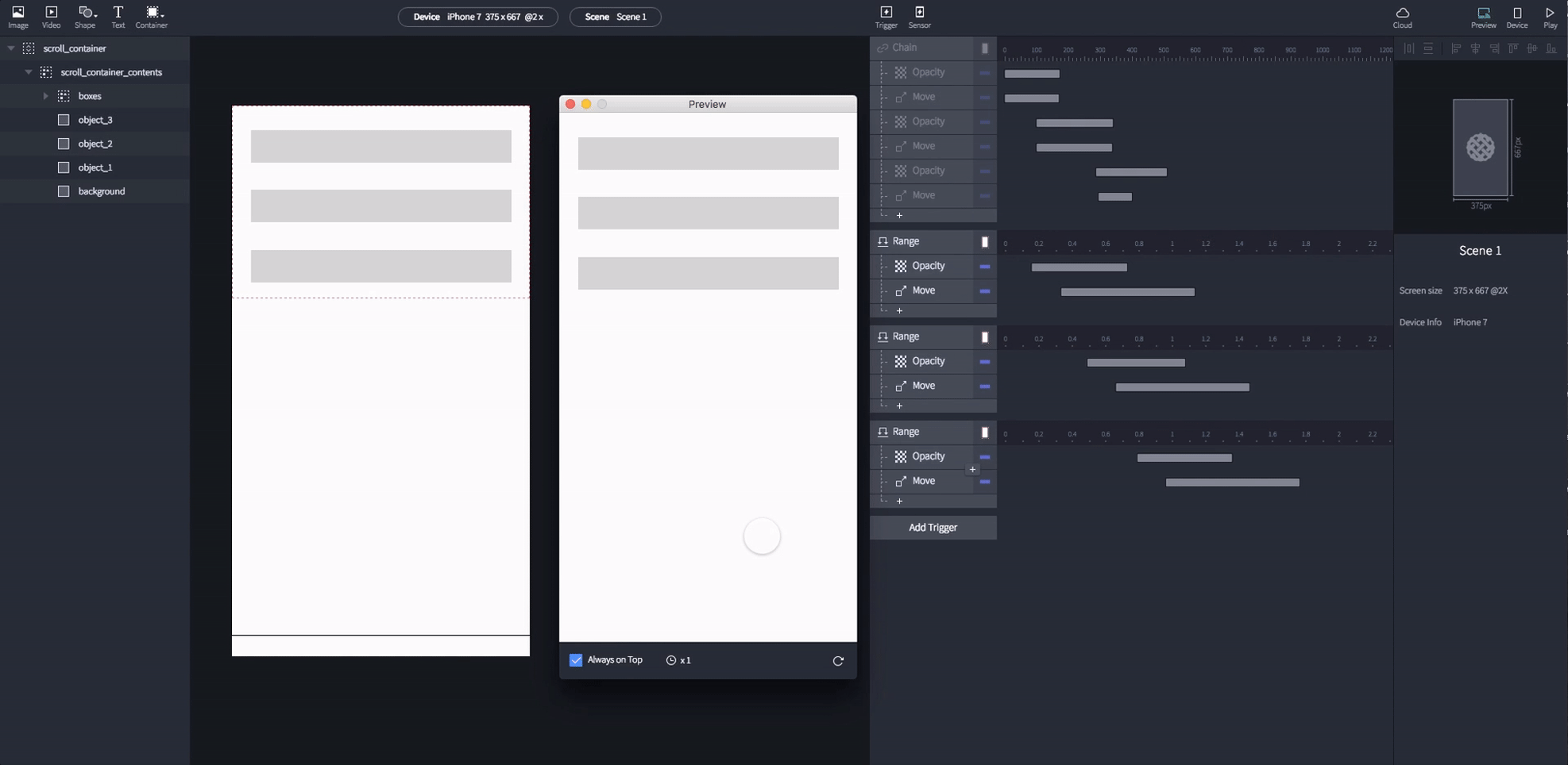
Framer ($15 a month) is the big kid on the block generating the most press these days it seems. At it’s core it’s a Coffeescript-based (soon to be ES6-based) app meant to open up the boundaries of what’s possible in prototyping. That means getting into some code. If you’re faster enough at that, it might be a fantastic choice for you—they’ve made good strides with a rapid release schedule to simplify the learning curve for new folks, but to get very far you’ve still got to invest some extra time and get some coding knowledge. Recently they’ve included nice adds like Framer Flows to quickly chain together app views, Auto-Code Animation to make refinements more accessible, a Design view to quickly put together the basis for new screens, and Patterns to speed up development (ready-to-go bits of code for common interactions). All of this means Framer knows their approach is a bit more time-consuming for new folks. It may get you to a better, more programmatically-thought-out end result, but for me the time investment on most projects is still slightly prohibitive.
For sharing, they’re among the best, having Framer Cloud to make sending to colleagues and clients easier at the moment than other high-end desktop tools.
Atomic is also doing some really great work. They’re one of the most robust browser-based tools—more advanced for microinteractions than Marvel/InVision and closer to the fidelity level of Principle and Framer. In my earlier tests, the required time investment to make a longer-form prototype still wasn’t always the perfect fit, but as they’ve improved things along the way it seems capable of robust results.
Origami Studio (free from Facebook) is another powerful option for higher fidelity results. It still has a higher learning curve (somewhere under Framer but above most other tools), but by employing an open, visual programming approach, it offers the possibility of more flexible exploration of interactions. Like Framer and Principle, a downside is it being Mac-only, but the bigger issue for me is difficulty in sharing—not being able to simply share prototypes with clients or teammates via URL is a shortcoming. But with the desktop app being free, and having dedicated apps for Android and iOS (and having the ability to export to video), it’s not too hard to share concepts with a team or clients if they don’t mind grabbing source files. In its current state it still feels like too much effort to build full-scale prototype in Origami (though I’ve seen it done well), but for exploring selective animations and interactions, it’s a great tool.

As an update, my new favorite tool for higher fidelity prototyping is lesser-known Protopie. It hits a lot of sweet-spots for me.
it’s a Mac AND PC desktop app without a cloud subscription, allows for native-level quality and access to smart-device sensors, has easy sharing via URL and apps for Android and iOS, and it’s relatively easy to pick up and get productive in quickly.
I grabbed a license and started kicking around, and I’ve found their “Object + Trigger + Response” model and supporting UI to be really intuitive. It’s easy to jump between lots of screens and prototype interactions per-screen in separate views without things getting overwhelming. I’ll be using it more in the future, and personally I think it deserves more attention.
And of course, then other new blended tools and things on the horizon—Adobe is working away on Experience Design in an attempt to catch up to Sketch (the interface shares a lot of similarities) and take on other simpler prototyping tools by combining design and lo-fi prototyping in one app. By current progress, this app seems to be making some good headway and is very quick and nimble, but it has a good ways to go before it can catch up to its smaller, nimbler competitors—so far most designers haven’t seen a good enough reason to ditch Sketch and jump back into the Adobe licensing model if they’ve moved on. InVision purchased up Silverflow, Macaw, and Easee, so it wouldn’t surprise me at all if they don’t attempt to bring some powerful new hybrid app of their own to the table before long.
What works well for you, and for what types of projects? I’d love to hear other perspectives.
The Rest: Code, Annotation, Management
For simple and fast internal feedback, I try to keep things simple and less reliant on needless additional platforms. I use Skitch from Evernote to point out quick visual notes and needed fixes, dropping PNGs in Slack or elsewhere for team review. I love Atom for the front-end prototyping I’ve been able to contribute. Used to use Linotype FontExplorer for font management but recently I’m giving free Mac/PC font manager Fontbase a go and liking its speed and simplicity. NameChanger is a great little app to clean up filenames after you’ve exported tons of slices out of Affinity or Sketch and realize you need to do a batch name replacement. I draw many a vector with a cheap Amazon basics mouse because Apple’s MagicMouse feels remarkably non-ergonomic (to me). A Wacom Intuos for all those fun drawing and painting opportunities.
For image compression, I use ImageOptim and/or TinyPNG.
Considering the current selection of tools out there, I tend to hear designers either arguing against complexity and in favor of simpler design apps, or complaining about needlessly siloed workflows requiring too many separate apps. We can’t quite have it both ways, it seems. One app needn’t do everything, but no single app should be overly simple for professional use either. A good designer should know what app is best for what purpose and build as they like with an eye toward the highest-quality end product.
So that’s my toolbox and general workflow, as refined over the last couple of years. How about you?

