A Bridge to Product Design (Case Study)
I work in tech because I want to design digital products that make the world a better place. In recent years, I’ve learned that the role of a “designer” is evolving into something much more than pushing pixels. Designers are starting to use their creative problem solving skills to become integral business strategists.

Going into 2018 as a designer, we have more opportunity than ever to shape the future of technology. We have faster, more sophisticated digital tools that can help us tackle bigger challenges, some of which we can’t even predict yet. But why not start with challenges we already face today?
One such challenge has become more prevalent especially in recent years: exposing the stigma and providing help for people who live with mental health conditions.
This was the central challenge that my cohort focused on during the Bridge School product design program I graduated from last week.

How might we improve access to mental health services in Canada?
Nearly half of all Canadians will experience some form of mental health related issue in their lifetime. Yet, a large percentage of those individuals — nearly one third — will not receive adequate treatment. Identifying the symptoms is only the first step. Finding accessible, affordable treatment is an ongoing challenge for millions of Canadians.

Client: The Stowe Research Institute
Our client for this project is The Stowe Research Institute — a (fictitious) Canadian research organization whose mission is to provide innovative solutions to challenges faced in healthcare. They believe through inventive application of design and technology, they can shape the future of the healthcare industry and provide world-class patient care.
Three of our instructors took on the personas of client stakeholders to challenge us as we started our discovery sessions for the project.

CEO: Emily “Cici” Stowe
The daughter of the wealthy Stowe family. She recently became CEO and is keen to revive the facility to become the leader in world-class mental health services in Canada.
CIO: Katrina Rampel
Kat’s main concern is about security and privacy for patients, while ensuring the product is built with cutting-edge tech.
CMO: Fatima Remtullah
Fatima needs our app to go viral. She wants to get a buzz going and mitigate the stigma around mental health.
The Stowe Research Institute wants to lead the way in making mental health services more accessible for Canadians. They hired us because they want to use design thinking to better understand their patients in order to create the best possible product.

The main discovery process we used throughout the program was called The Clarity Canvas, developed by Rangle. It’s a lean framework that lets us quickly get to the why of what our clients are looking for.

The first step was to explore and refine stakeholders’ desired project outcomes. Based on those outcomes, we then defined the problems that the product should solve, and for whom, with all the key stakeholders in the room.

First, we posed a question to frame our discussion about the project:
What goals and concerns do we need to address?

We facilitated an open conversation with stakeholders about their individual goals for the project, while writing their thoughts down for everyone to see.

For the next activity with our stakeholders, we posed a new question:
What outcomes do you want to achieve, as a result of completing this project successfully?
This time, we gave them time to write down their project goals on sticky notes. When they were done, the stakeholders put their sticky notes up on the whiteboard and started grouping similar ones.
From there, we worked with them to define each of the groupings with either a single word, phrase or sentence.

The Five Whys
In order to gain more insight into some of the goals proposed, it was our responsibility as facilitators to continue to drill-down and ask them why they came up with a certain goal. By using the “5 whys” technique by Sakichi Toyoda, we usually didn’t have to ask why more than 5 times to get down to the root of the problem.
Top 3 Goals
Once we felt as though we captured all the main groupings for the project goals, we asked for our stakeholders to vote on the goals they thought were most important. Ultimately our top three goals were:
- Engagement
- Exposure (Lowering Stigma)
- Leadership
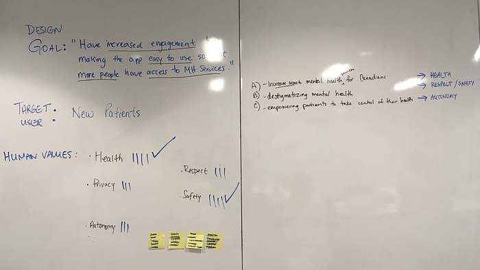
Define the Design Goal
We expanded on the most important one, “Engagement”, and came up with a central design goal that all our stakeholders agreed with:
Have increased engagement by making the product easy to use so that more people have access to mental health services.

Risks and Assumptions
And while we were going through each of these discovery exercises, we would keep track of any risks and assumptions that came up in our discussions, or any topics that would require more time for exploration — which we put in a category we called the “parking lot”.

The last question we ask the stakeholders is:
Whose goals and concerns do we need to address to make this project successful?
This activity was fairly quick for us because the discussion during the previous exercise made it much clearer for us to identify target users. We asked the stakeholders to write down their thoughts about target users on stickies and group similar ones together. Then, they “dot voted” as a quick way to determine what user group they thought was most important to target.

At the end of the session, after tallying the dot votes and quickly discussing with our stakeholders, we determined that we needed to prioritize “New Patients” in order to make the project successful.
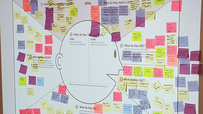
The Empathy Map
With our target user in mind, we conducted an insightful exercise to help our team empathize more deeply with them: The Empathy Map. This was especially powerful for us given the subject matter for our design challenge. To conduct the exercise, we needed to put ourselves in the mindset of someone who is living with a mental health condition.
“[The empathy map as a] tool helps teams develop deep, shared understanding and empathy for other people. People use it to help them improve customer experience, to navigate organizational politics, to design better work environments, and a host of other things.” — Dave Gray
Ethical Design Thinking
Taking it another step further, our team also used a new methodology that allows designers and product teams to focus on human values throughout the design process. By facilitating an Ethical Design Thinking workshop, we were able to reframe our original design goal to be more reflective of human values.
We started with our original design goal:
Have increased engagement by making the product easy to use so that more people have access to mental health services.
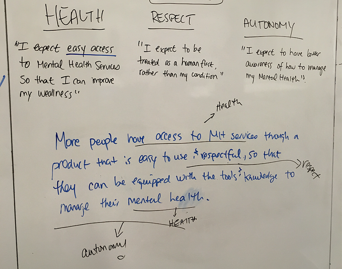
And by the end of the exercise, we had written a new human-centered design goal to reframe our project:
More people have access to mental health services through a welcoming product that is easy to use, so that they are equipped with the tools and knowledge to manage their mental health.

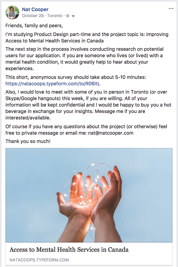
Once the discovery phase concluded, we prepped for the research phase of the project. We needed to validate our assumptions by surveying and meeting with real humans who could ultimately be users for our product.
The timeline for the user research phase was very short — we had less than a week to find people and survey or interview them. In my case, I decided to make an online survey and post about it to my facebook and instagram accounts. I also asked on my facebook page if anyone would be willing to interview in-person in exchange for coffee or lunch.
User Research Questions
Writing the research questions themselves was a delicate process. I needed to use respectful language to talk about mental health conditions and focus on questions that highlight what users Feel, Think and Do.

It was also very important that my questions were not biased or phrased in a way that would lead them to my own assumptions. For example, instead of:
“Was it difficult for you to get a diagnosis?”
I asked:
“What was your experience like getting diagnosed?”
Online Survey
I decided to use TypeForm for my Online Survey and posted it on my facebook and instagram pages.
My facebook page is private and has an audience of people who are typically closer to me (friends, family, acquaintances from school and past work colleagues), so I thought that perhaps I would get people who were more comfortable chatting with me in person.
In just under 24 hours, I had eight responses to the online survey, and for the most part they were fairly detailed and provided me with some decent insights.
Three people reached out to meet up in-person, as well.
In-Person Interviews
I met with 3 women in-person and asked them questions along the same lines as the ones I posed in the online survey. The results were much broader and deeper and I was able to ask questions as the result of other questions that organically came up during the interview.
Each interview took about an hour or so and I scribbled pages of notes in my journal that I would later re-read a few times to gather insights.
Synthesizing User Research Data
In total, I was able to get interview results from eleven people: 8 online survey responses and 3 in-person. I gathered the interview/survey responses and with a sharpie in one hand and a sticky pad in the other, I started reading them one by one and writing down the pain points that came up.
Sometimes I wrote duplicate stickies and that was okay. I kept reading through each entry and eventually my whiteboard was a cloud of stickies.I grouped the similar ones, started to label them and the major pain points became clear.

User Journey Map
Once I identified the major pain points from my research, I started to consider them in the form of the user journey map. This exercise was useful to gather the insights and put them into the form of a narrative, where I could express clearly what users were thinking, feeling and doing in each phase of the journey.

Competitor Research
Before moving into ideation and coming up with potential features for our app, we wanted to take a look at what other products exist in this space.

Talkspace.com ($$$)
- Online therapy
- 24/7 access to therapists
Tess ($$)
- Sophisticated AI chatbot, on-demand when and where the mental health professional isn’t
- 24/7 access to chatbot
Opencare.com
- For dentists and patients
- Platform to simplify interactions between patients and providers
- Get matched with dentists, view their ratings and reviews
Summary of Research Insights
One of the common themes I gathered from my research was that the emergence of mental health conditions typically happens during youth or young adult years, when everything in your life tends to be in transition. Also, there were common frustrations around finding the right specialist or treatment plan — it was never a straight, easy path and often took people years to find something that worked for them.
For those reasons, I chose to focus on the middle part of the user journey: the “Decision/Diagnosis” phase.

I decided that I wanted to focus on making an app that was custom to the Stowe Institute and would help their current patients find specialists, easily communicate with the main practitioner and keep clear medical records and history. This would also be a huge selling feature that would be marketable to attract new patients — who are our target user after all.

Now that we had a good understanding of our user journey and an idea of the area we wanted to focus in on, we started individually ideating on some ideas for features we could include.
North Star Exercise
This exercise was really useful to start thinking about potential features. We started by outlining the stages of the user journey on a whiteboard, and under each category we brainstormed ideas for features.

After we brainstormed ideas and features, as a group we started to vote on the ones we thought would be most effective, with our human design goal and business priorities in mind.
Here are the top three feature ideas that I voted on:
- List of specialists with ratings, reviews and video introductions
- A “panic button” — where patients can find immediate help/support
- Personal profile and record keeping system to communicate between specialists and health practitioners
Mini Google Design Sprint
Next, we did some exercises inspired by the Google Design Sprint Kit and modified them for our purposes. We discussed features that are explored in competitor apps, and then we individually took time to come up with some feature ideas that we wanted to explore. When we were finished, we refined our list into 8 ideas.
Crazy 8s
This was simultaneously a fun and nerve-wracking exercise that challenged us to sketch 8 ideas in 8 minutes. Not 8 variations of one idea or 8 steps of one idea, but 8 distinct ideas. The goal was to push beyond your first idea, which is frequently not the most innovative, and generate a wide variety of solutions to your challenge.
Here’s what I came up with:

It might be hard to tell from the above sketch, but here are my ideas in order:
- Panic button
- List of MH specialists with cost and rating
- Individual specialist profile with video intro, bio, testimonials
- Personal mental health record system / journal / tracking
- A behaviour tracking opt-in feature
- Tinder swipe left/right mentors that have similar conditions
- Live chat onboarding experience
- Map view listing with open services, clinics/support centres closest to you
Solution Sketch
We did a very quick solution sketch, where we spent more time articulating the one idea we were most interested in exploring. For me, that was the idea of a “panic button” for immediate support.
Then we shared our sketches as a group and gave each other feedback which was very valuable. In my case, I learned that perhaps the steps I included in the “panic button” flow were too complex for someone who might be experiencing a mental health episode. I needed to consider a simpler flow that got them help faster.

When I got to the design phase of the app, I wanted to explore the idea of using calm pastel colours and imagery featuring plants. More than one user I interviewed mentioned they hated the sterile environments they encountered when seeking treatment. Some people also mentioned that taking care of a plant helped them improve their mental health.

I continued to explore the plant motif in the logo design. The name for the product itself is a work in progress, but I tried my best to use language that humanizes the experience of managing and searching for mental health services. After research, I know that managing your mental health is more than just therapy, hospitals, and medication — it’s involves improving and maintaining your overall well-being on a daily basis.
With that in mind, I settled on “Personal Wellness” as language to incorporate into the logo.

In my prototype, I decided to explore these three main features:
Find a specialist
A simple way to search and filter for specialists and mental health services, while also educating and leading the user to explore their options. A key part of this feature includes individual specialist profiles with a video intro, rating, bio, education, testimonials and the ability to book appointments.

A personal mental health record system
All your mental health records in one place — a way to keep track of each specialist appointment and include an image of any written records in your file. Also a central location to document your complete medical history and keep your health and insurance cards accessible.

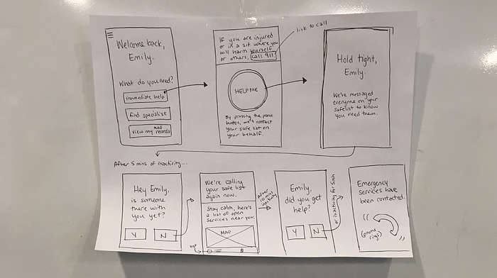
Panic button and open services near you
This feature was simplified from my original wireframe — this was built into the prototype with the assumption that there is a 24hr support line at the Stowe Institute for mental health emergencies.
If someone is in a panic attack situation and they are about to hurt themselves or others, they will get a call immediately. If not, local police services will be notified of their location and will be en route immediately.

These features would need to be explored and expanded upon in the final product. Also kindly keep in mind that some icons are still placeholders in this example.
Click through the full prototype here:

The processes I learned in the Bridge for Design program were thorough and eye-opening. I thought the Target User exercises such as The Empathy Map and Ethical Design Thinking processes were quite valuable to really identify with our users as humans first.
A note on user research and testing: because this was such an intense 7-week program, I didn’t have the chance to do adequate user research and testing on this project. The research phase was quick and as such the pool of people I had to choose from were biased/limited. Should I take this project further this will be done with more due diligence, along with proper testing.
I have so many ideas that could take this product further:
- Conversational-style on-boarding experience (a friendly ai/chatbot)
- Easier way to rate and compare specialists (side-by-side)
- Mentor community support system (forum or chat network)
- Opt-in behaviour and mood tracking/wearable device
If you are interested in chatting with me about this project, the program I went through, or if you just want to chat about product design and technology stuff, I invite you to email me: nat@natcooper.com or tweet me @natacoops

Thank you to my talented instructors and classmates for your time and energy in this program. It was an invaluable learning experience that gave me a hands-on opportunity to learn about product design strategy and process. I can’t wait to take it even further from here and keep designing and building products that change the world.
Thank you for reading!

