
9 Major UI mistakes that will kill your Apps!
Unfortunately, there is no one introduced a formula for creating a great design. But, if we can aware about some major UI mistakes that will deliver a great design.
Mistakes can be made across all levels of experienced designers. Please do not think that’s a shame. Definitely, we can learn by doing mistakes. A good design will born by eventual problem-solving. Many aspects depend on it.
The clients, who are not satisfied with their current product and they want to improve(redesign) its experience and appearance based on the latest survey and trend of mobile app designs. That’s why I’m covering some major points gathered.
Mistake 1: Poor Information Architecture
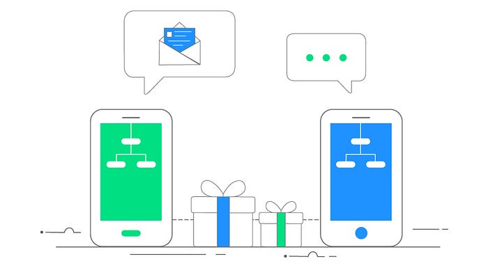
When you design something if it is a business card or a website or a mobile app — there will be a user interaction that happens with its own way. So, you have to plan and design according to the significance of the information that you’re presenting, that should be based on the way someone who interact with it. You should sit and think about the most important aspect you want to convey.
Once you understand the hierarchy, you can distinguish significant things with the help of fonts, colors, typography, elements, placements, etc. You need to think about what end users do with your product deal with it and design it accordingly.
Mistake 2: Consistency Issue

When I’m researched over some designs(apps, website, business card, etc), they have overlooked the elements to make the design inconsistent. For instance, different font with different styles, multi use of colors, layout, etc are a few of them.
If you use one element for specific action, then stick with it. Users are learning bingoing actions. So do not make them confused. If through unexpected experience to the user that will route to drain their experience.
Keep consistent layout. Use of colors and layout to create a repeat pattern across the design. Also, follow style guide standards while you design. The use of style guide standards allows keeping the pattern on the right track.
The consistent layout will help the user to understand the experience. Whenever you break the pattern then you must need to make up a whole. So, be consistent across your design and its experience; Even if a business card design or a website or an app.
Mistake 3: Contempt Use of Fonts
Try to use system fonts. For example, San Francisco is the default system font of iOS(Helvetica was the older one) and Roboto for the Android.
Are system fonts are good to use?
Yes, definitely. It’s is safe and easy to render the app screens in fast. But Samsung phones have the ability to change the system fonts. It will easily kill the look and feel of the apps.
You can also introduce additional fonts to beautify your apps. But remember to follow some guidelines of fonts:
About the license: A font is a software and is licensed. Before you committed a font you have to read the license and terms of the fonts. If you don’t know the license then don’t use it.
Less makes more: There are plenty of fonts are available over the internet library. And, every font has a story. So, you have to be more selective and it should add to the experience. Too many flashy fonts may complicate things. Remember, if you go with custom fonts you have to keep it simple and suitable.
Mistake 4: Congested Use of Elements
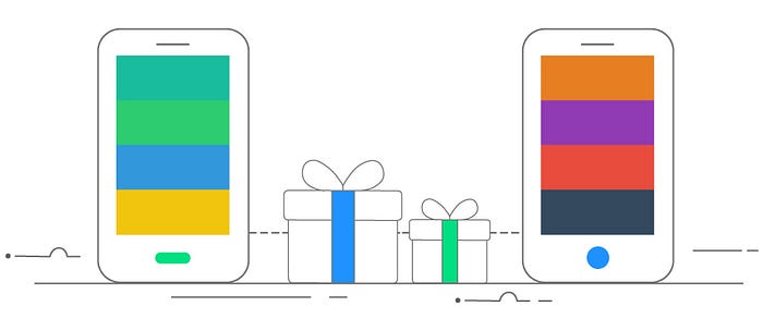
Users can’t possible to concentrate the content if you arrange the elements without a proper plan and also use of flashy objects may cause to loss of users.
Arrange the elements with proper spacing and alignment should enable the user to focus on content. For example, labels should come on the left side of and the selection box, on/off switch, etc should come on the right side of the device.
Remember, do not congest the visual elements. Arrange the patterns in an intuitive way.
Mistake 5: Overloaded Data
With the advent of supersized devices, the designers can consider too many stuff into the screen. But, they are facing issues to create necessary elements into smaller dimensions to supersized. For example, the iPhone 4 had 640x960 resolution and 2:3 ratio.
The converging era is inventing new trend and sizes. Supersized doesn’t mean more. So, we have been selective. Attract the user attention and allow them to easily navigate to respective screens.
The user will wonder how to use or where to click on the application. This prompt the user to get out from the app. So, we will lose the user if there is too much on the screen.
We have to allow the user to give more focus and access to the important content with an intuitive style.
Mistake 6: Design Transformation

By the arrival of Holo design in android it is possible to transfer the design easily from iOS to Android in 1:1 ratio by keeping same structure, guideline and even navigation.
Why not transfer the design from iOS to Android or vice versa? does it save time and money?
It might. But, remember about your goal, To create an ultimate user experience, right? People use their phone at all the time in a day, so they have the expectation of experience with respective platforms.
Remember both iOS and Android users have their own preferences. Even they know how a specific function will works. If your application behaves in different than it may prompt to lose the user.
Both iOS and Android have its own interaction pattern. Users might not pleased with you, if you come up with a different pattern to learn that from scratch. You have to follow the design guidelines while transfer iOS to Android, or vice versa.
Try to create consistent visual design elements to make the apps similar for both iOS and Android. For instance, buttons, colors, iconography, etc.
Mistake 7: Misleading Navigation Pattern

Actually, both iOS and Android have it’s on navigation components. For example, Drawer navigation which is available on Android devices. The Android users are familiar with it. Which is also available by swiping from left to right. The drawer navigation is available on iOS too. But swiping action is not a pattern on iOS. You have to click the button action to see the drawer navigation.
Bottom Navigation: Now, bottom navigation became more popular by the invention of supersized devices. Because it is easy to navigate and thumb friendly to move on respective screens.
Hamburger navigation: Reduce the use of hamburger navigation in which is necessary. For example, if you are working on a complex application you might need multiple navigation patterns. For that hamburger menu will be helpful. But remember hamburger menu is not a good paradigm because it is hiding navigation items.
Mistake 8: Use of Colors

Google and Apple were introduced Material design and Flat design patterns. Both emerge with elegant colors schemes without the use of gradient.
Due to the lack of color consistency or the use of multi color implies to get rid the user from the app immediately. Which is due to the distraction on the focus.
Mistake 9: Abuse of Components and Interaction

Why shouldn’t use iOS components to Android or, vice versa?
Well, That’s not a good way of representation. Because iOS and Android have its own guidelines and interaction patterns. The respective users have the understanding about the platforms and know how the respective functions work. So if we coined something new then we have to teach them how it will interact.
So, keep the interactions as it is in the respective platforms. So that the users can easily understand how it performs.
The Bottom Line
“The design is an art form. There is no specific formula for success.”
If you can avoid these 9 major mistakes, definitely the users will come and fall in love with the app. We can’t possible to expect every people’s mind and how they think. We have to observe our user and their behavior continuously by analyzing it using many tools like Hotjar, Crazy Egg, Mouse Flow, etc are a few of them.
Never rest yourself.
Learn, Analyze, and Implement.
Then only you can always introduce with something better than what you designed. Make it intuitive.

