8 Rules for Perfect Form Design
The Ultimate Guide to Better Forms

Before starting with a design we should keep in mind that the main goal with every form is completion.
This post covers the most common mistakes designers make and how to fix them, also some trick&tips on delivering a good looking UI and a better UX.
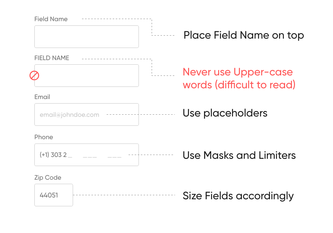
1.Build Perfect Input Field
Input Fields are part of every form UI, here are some tips and tricks to deliver better Input fields.
2.Improve Input Field UX
The user frequently leaves sites because of badly designed forms, here are some super quick tips to avoid this:

3.Single Column Design
When using a single column design, the user’s eyes move naturally from the top to the bottom. Use a single column on small forms, or group them on other cases.

4. Avoid Dropdown Menus
Dropdown menus keep the options hidden from the user, making it hard to see the choices.Avoid when you have small amount of choices to provide.

5. Avoid writing when possible
We complete forms because we want to achieve the goal but a finger swipe or a mouse movement is way faster and less stressful.

6.Fewer fields as possible
Let me explain this with fewer words as possible: First Name, Last Name = Full Name.

7.Differentiate primary and secondary actions
Use design to differentiate primary and secondary actions, making the primary call to action more visible than the secondary one to reduce errors.

8.Group related elements
Use white space to create groups or separate elements visually. If the form is long, break it down to steps.

“Writing articles for people who are in a rush, I value your time, and probably like me, you like reading on the go. Keeping it short so you don’t have to skip any paragraph.”
❓Do you have any questions? Let me know:
Instagram — Linkedin — Behance — Dribbble