8 Rules for Perfect Button Design

Buttons are an element that you will probably find on every interface, they allow users to take actions, and make choices.
As simple as they might look there are certain rules you need to follow in order to deliver a well-designed button.
On this article, I will be explaining some basic rules you need to follow for well-designed buttons.
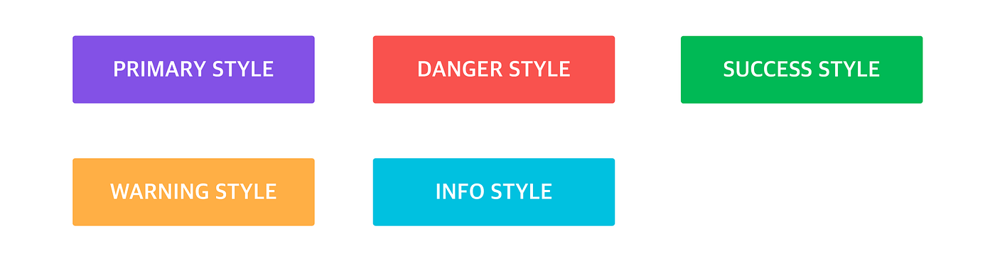
1. Buttons Types
Usually, all interfaces contain more than one button type for better user experience. Button Types help the user make the difference between what's important and what's not, different button types can grab less or more attention.

2. Buttons Anatomy
Before you start designing a button you need to understand its anatomy. Even though the anatomy is good to follow the structure depending on the user's language, English is written left to right so icon should come first then text.

3. Button size
The idea here is to make buttons finger-friendly for mobile users, and clickable on PC. There is always this case when we want to press a button and we press the button near it, here we are facing a badly designed button.
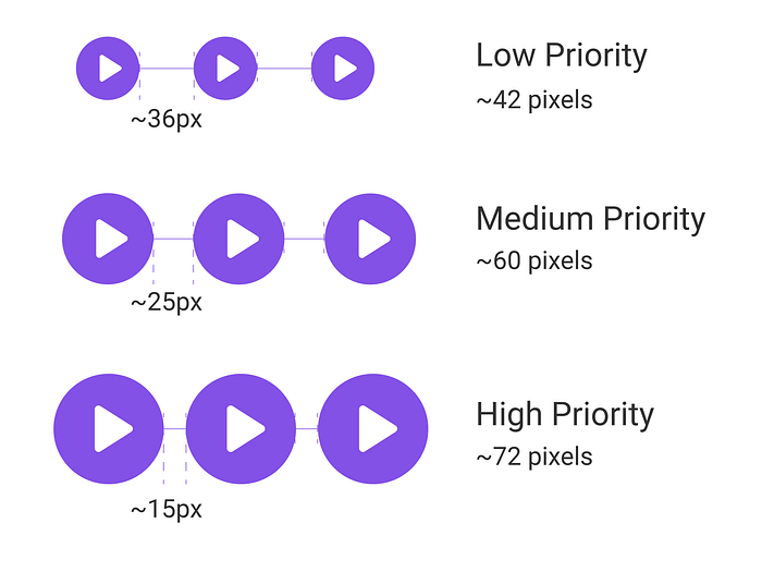
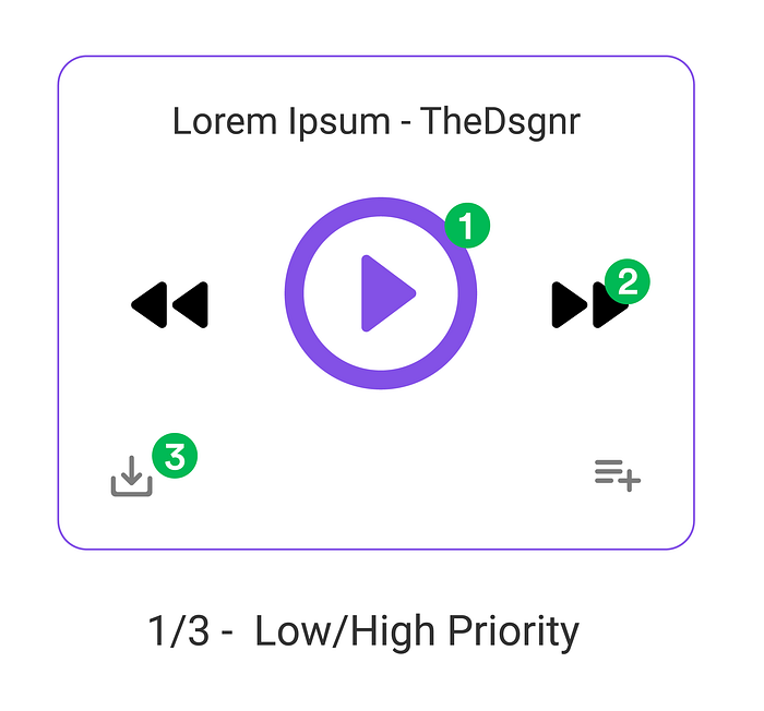
Also, the bigger the button the more priority it has.

4. Color & Contrast
Buttons with different colors came from bootstrap, usually nowadays we use primary and secondary buttons and there is no need to use different colors, but on interfaces like dashboards or interfaces where the button's message is more important than the interface using color is fine.
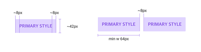
5. Width and Padding
There is no rule or the perfect number for this, but by viewing this example you can get an idea on the proportions.
6. Button spacing
Button spacing is really important, especially on mobile. According to this study: Touch Screen User Interfaces for Older Adults: Button Size and Spacing When the buttons were too far apart, users moved to the touch target much slower. And when the buttons were too close together, users had the lowest touch accuracy.
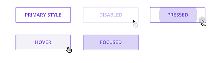
7. Button States
States are used to communicate the status of a component. A well-designed button should change state when a user interacts with it. Badly designed buttons can mislead to the wrong action or even be mistaken for another action if a button is designed like a field for example.
8. Placement & Order
Usually, buttons are placed in order of importance.
Besides, the example in this article a good example is login forms, the login button grabs the most attention, then after that, we have a Text button, typically used for less important actions.
“Writing articles for people who are in a rush, I value your time, and probably like me, you like reading on the go. Keeping it short so you don’t have to skip any paragraph.”
❓Do you have any questions? Let me know:
Instagram — Linkedin — Behance — Dribbble

