This quickie article is going to shine the spotlight on five sites that I believe showcase great use of typography! I’m a beginner UI student, so I have quite a lot to learn about the vast world of type. I’ve been given the assignment to comb the interwebs for some examples of awesome typography. Even though I’m no expert, I’ve found 5 sites where it’s easy to see that the use of typography rises above the norm.
- One Shared House (http://onesharedhouse.com)
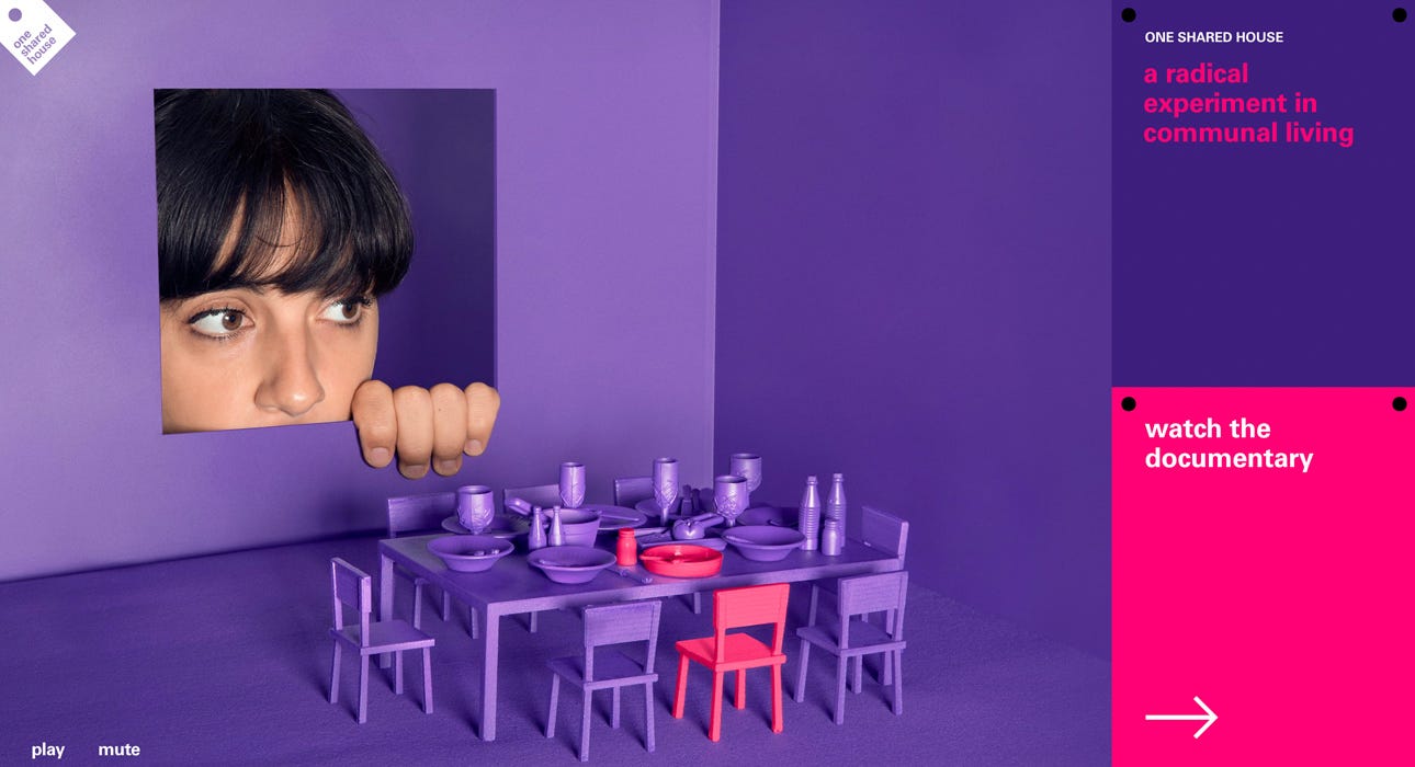
When we first land on this website, the gaze of the lovely lady in the purple box leads our direction to the right. The words used are minimal, leading to an uncluttered page. The contrasting colour of the text and the highly legible sans serif font choice make it clear what our call to actions are and where our attention should be going.
2. We Ain’t Plastic (http://weaintplastic.com)

Sometimes simplicity is key. The large graphic in the centre is highly contrasting from the background and will catch the viewers eye first. It points upwards, at the text which states the name of the website. Though the font is rather small in size, the increased kerning adds a stylistic effect which gives it a unique flavour. The “Hire me” button is small and almost tucked away. It is hard to miss, however, due to the clever use of empty space.
3. Taste Rewind (https://www.spotify.com/ca-en/)
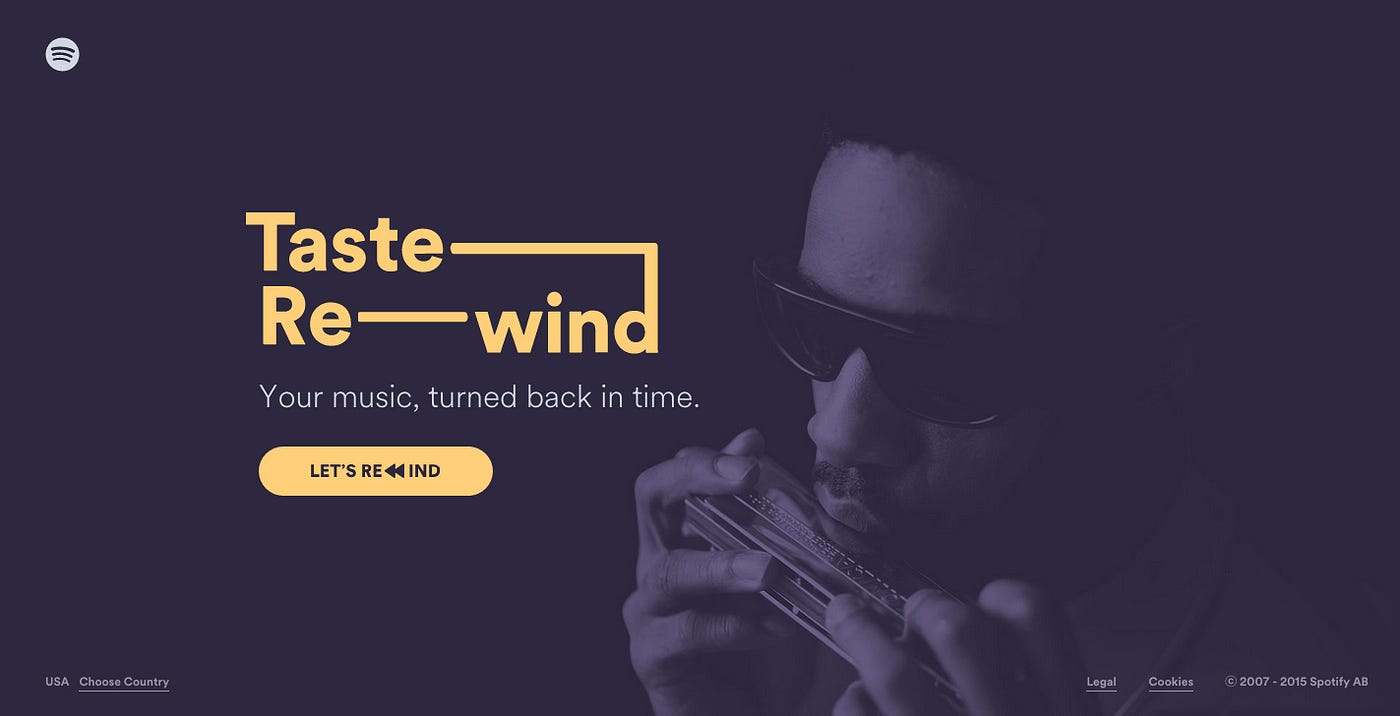
A dark muted background creates the perfect environment for your text to steal the show. The bright, contrasting yellow colour commands attention. The clever use of the “-” and the extended ascender on the “d” add flare and creates an aesthetic symmetry. Reminiscent of a tape cassette, the text aligns with the theme of vintage music. The replacement of the “w” in rewind with the << symbol is a nice touch as well!
4. Andre Do Amaral (http://doamaral.com)

The swimmer’s bright suit quickly sets her apart from the dull background. Her arm extends out behind the text, almost acting as a highlight. Thick, clear, bolded black text adds drama to this overall minimalistic website.
5. Top Hat (https://builtbytophat.com)
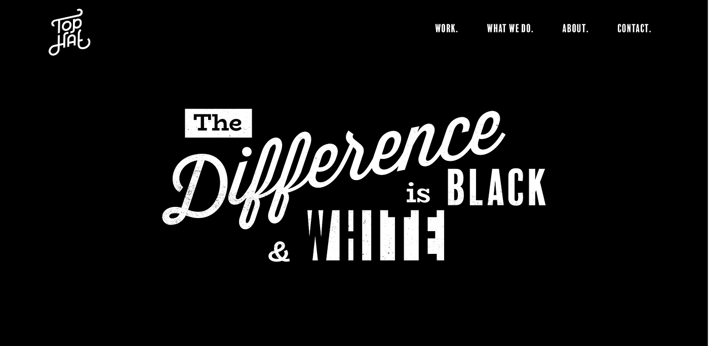
A great use of negative space and typesetting makes this website one of my picks. I’m a fan of literal imagery, and the use of black and white is definitely literal here. The overall minimalistic nature of this page really highlights the central text and makes their motto the focus. The navigation bar is also highly legible and easy to understand.
Well, that’s it for today! Thanks for making it to the end of my list and hopefully your eyes have been rejuvenated after feasting on some beautiful design!

