3 Tips to Get Started with Responsive Design
Quick Starting Kit for New Designers

Responsive design is not a new thing, bu for new designers, it is not easy to start with. If you are not familiar with the concept, please get a refreshment here.
Responsive Web Design makes your web page look good on all devices (desktops, tablets, and phones).
Responsive Web Design is about using HTML and CSS to resize, hide, shrink, enlarge, or move the content to make it look good on any screen:
The reason why responsive matters is not only to make webpage look good on all devices(mobile users increasing dramatically), but also make sure users will have comfortable visual experience when accessing your website with a not-full-width browser.
We never know how our website will look like on users’ computer: maybe they prefer to resize the browser to half the screen while working on the other half.
1. Breakpoints = Screens Needed
When I first got started with responsive web design, it was intimidating. I was thinking: In order to make it look good on all the devices, that means I will have to design so many versions!Well if we want, we can do that. But it will not only cost much more resources and time, but make the website hard to maintain or revise for future improvements.
So here comes the concept of breakpoints.
Breakpoints are the point a which your sites content will respond to provide the user with the best possible layout to consume the information.
For designers, that is the point when we need a screen. For new designers, I recommend using the default setting in Sketch.
320, 768, 1024, 1440

But if you have a specific device your want to target, or if your development team is using a specific framework like Bootstrap, things will be different. Communicate with the team before deciding.
2. Transition Between Breakpoints
Tricky thing happens here.
Designing five version of the website doesn’t mean the work is done. As a designer, we also need to think of how the website will look like when the size is between two breakpoints. As mentioned before, we can control the size of a certain mobile product, but we cannot do the same for the browser. There are a few points that we need to pay attention to, and more importantly, always communicate with development team, you will receive some unexpected but fabulous insights.
1/Position
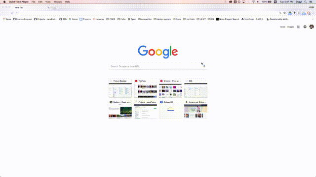
Think of how the elements will position while resizing. For example, what Google does is to always centre the search bar and thumbnail, also fix the width of each thumbnail.

But for Amazon, the side bar remain at the right, relative the same position.
Just a side note here, Amazon’s website seems not responsive in the small size but actually they disabled this on computers. If you visit their site on mobile devices, you will see a mobile optimized version for it.
2/Size

When resizing Dribbble’s website, the thumbnails remain the same size, it reduces the number of the thumbnail on each row in order to fit smaller size.

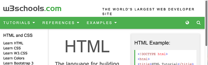
But for w3school, you can see they resize the width of the element instead. Whichever way you prefer, for the dribbble stye, it requires a well-working grid system, while for the other, it just allow the content to flow accordingly, normally used in content-based website.
3/Interaction
The way of interacting with the website should be carefully considered in different sizes. For example, the navigation bar:
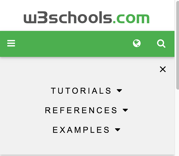
Hamburger menu is pretty popular now for smaller screens, but I’m still not confident with it as people tend to interact with the visible.


Stripe uses a tab menu in the larger screen but a drop down in smaller screen in order to save space.
One important thing, hover is not available on touch screens, so always have an alternative for touch screen, don’t rely solely on hover!
4/Image & Text
These two doesn’t need a lot of tweaks for gradually transition as themselves are naturally flow to fit the screen, however, we need to think of showing different images in different screens, and offer different text sizes for readability.


Take Stripe for an example again, for large screens, it shows the first one, medium screen the second, small screen not images. This can maintain the visual experience while not taking up too much space with the same image. Resizing the same image also works, but be careful if it becomes too small to convey the message.

In Shopify’s style guide, it clearly states the different recommended font sizes in different screens to maintain readability. A large 56px slogan make senses in a big screen, but it will become a giant in a mobile phone screen.
3. Which to Start First? — Mobile First
When we start doing the design, should we start with the smallest one or the biggest one? Mobile first is highly recommended because it can make website load faster on small devices.
To explain this, we need to understand how developers make the website responsive: the use Media Query in CSS to do that. CSS loads from top to bottom, which means if we put the CSS for mobile first, mobile phone will load the corresponding CSS at the first place while computers often has a more stable Internet access, and they can go all the way to the end to find the CSS for larger screens.
Final Note
I hope this 3 tips can help you get started with responsive web design right on the go.
As a beginner for front-end development, I strongly recommend you learn a bit HTML/CSS, at least understand how it works. It will help you make wiser design decisions, and reduce the development cost. Believe me, your developer folks will thank me for that 😋!
And while trying to write a website, it really helps you understand how responsive web actually work.
Above is my second experiment with responsive web development. As you can see, it is really simple, just a content-based one, I centered the content in larger screen, and let it flow to 100% width in smaller screen while placing the sidebar at the right top. It is not a perfect user experience but it is simple and easy to develop (coded by a designer with limited front-end experience-me). For a design style guide for internal use, it is enough.
Some More Resources
The following two might be a little advanced for beginners, but absolutely good read.
Jingyi is a product designer and a beginner of front-end development. Welcome to connect me via Dribbble, Linkedin, and Twitter.

