21 Best Practices for E-Commerce Configurator(s)
Configurators have been around for so long without any formalized documentation of best practices. Many of us UX-ers mimic typical patterns we see in other experiences in order to provide users with what they expect. While gathering information for a project I’ve been working on, I noticed these trends.
1. Design for Mobile First
Taking a mobile-first approach to your configurator can help guarantee success. Oftentimes UXers begin with desktop design as there is more canvas space to work with The issue is that the mobile version of a configuration usually comes much later, by which time you’ve received buy-in from different parties on features, layout, etc. This is the point where we end having to cram all of the features into small mobile-version, leading to cluttered and an unpleasurable experience for the user.
Due to the much tighter space, you’re able to identify the core elements needed. After the necessary features have been identified, this can be carried over to the desktop version and expanded. It’s much easier to expand your feature list to desktop and explore additional patterns and features than to try to stuff everything into a small screen.

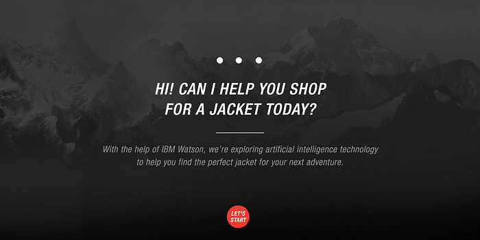
2. Ease Users into the Configurator
Configurators can be an overwhelming digital experience for some users depending on the complexity of your product or service. Easing them into the configurator with simple questions or tasks — such as selecting a color or model — can help set the tone for the configuration experience. Presenting the user with difficult questions up front may lead to users exiting before they’ve begun.
3. Customize the User Journey Based on Entry Points
It’s important to remember that users will come to your configurator from different entry points — such as the websites, social platforms, or offline — with a different purpose. For example, a user might see a shoe in store that they like and want to customize it based on their style. Imagine if your configurator allowed them to look up and customize that product with any pre-selected variables the shoe might have: perhaps through a unique link, or simply scanning the product with their phone. This user’s experience would likely look different then someone coming from a social platform ad. This user would likely need to begin the process by viewing many different types of shoes, selecting one, trying different options to see what they like, and so on.
Each entry point should provide the user with a different experience that’s unique and accommodating to them.
4. Allow the User to Start Configuring on Platforms that Meet Their Lifestyle
Through user research, you can discover where users expect to be able to access your configurator. For example, users want the ability to configure your product on Facebook or Instagram rather than downloading (another) app. It’s important to understand the “where” and the “why” for your users. Don’t make the user work to use your product, bring the product to them.
Create and integrate your configurator into the lifestyle of your user in an un-intrusive way. For example, Volvo allows you to begin configuring your car on Facebook before it turns you over to their website. No app download required.
Volvo Facebook Configurator (Only available on the Facebook Mobile App)
5. Provide Users Autonomy to Skip Steps in the Process
Gone are the days where a user needs to be hand-held through a configurator. Providing users with the autonomy to move through each stage — at their leisure — can help provide the feeling of a more customized experience. Users should not have to skip through the steps provided to them to reach their end goal.
6. Always Provide A Clear Next Step
Whether it’s during, or upon completion of the configuration process, it should be clear what next steps are available to the user: whether it be to add to cart, summary, contact a customer service rep, or another lead generator.
Users should not have to dig for what to do next or guess their next course of action should be.
7. Customize the Experience Based on User Lifestyle
As UXers, we need to understand that configurators can become overwhelming quickly with too many options for users to play with. It’s our responsibility to help mitigate information overload by only showing users what is relevant to them. A way to do this is to ask users simple lifestyle-focused questions that act as an initial filter to limit the number of options shown to the user — ensuring that options being presented to the user fall within their own constraints, leading to a better more curated experience.
8. Allow Users to Edit Directly From the Summary Page
Allow users to edit and update their configuration directly on the summary page — it’s that simple! There is nothing worse than having to retrace steps to make a small change on a final configured product.
9. Provide a Reset Option
Providing users with only one escape route — exiting the page — is a poor experience. Users should be able to simply click a button to reset their configuration, rather than having to unclick each and every feature they’ve selected.
10. Provide User Feedback Using Micro-Interactions
Configurators should be responsive in every sense of the word. Micro-interactions help the user feel engaged with the experience.
Seamless and timely interactions should be included that feel natural and provide the user with the assurance the configurator is working.
For example, a colour selection should not only update the colour of your product, but have a clear indication when the user is interacting with their selection, ie.via inactive state, hover state and clicked state.
11. Keep Users Within the Configurator
It’s important to remember that a configurator is a shopping, learning and fun tool. Be sure to provide everything the user might need during the process at their fingertips within the confines of the configurator; a user should not have to exit the configurator to compare products or purchase. By keeping the user on the task at hand and providing them with the necessary tools, you can provide a pleasurable experience that users will use again and again.
12. Easy and Transparent Running Price
A sometimes-overlooked element of the configurator is transparent pricing. It’s important to ensure users know what they can expect once they’ve reached the summary page for the final tallied price. You can make this happen by indicating which items or features cost extra — and how much extra — and by keeping an ongoing and updated final price in view at all times.
13. Useful, not Flashy Interactions
Overdone interactions can become overstimulating and disorienting for the user. Don’t go crazy with interactions within the configurator. It’s important that a user always knows where they are within the experience. Overlapping modal on modal with elements pulling out from drawers in different directions makes for a confusing time.
A good example is Unreal Engine’s Car Configurator: https://www.youtube.com/watch?v=ij2teUpbs8M
14. Seamless 360° View
Remember that a configurator should mimic a real-life situation. In a shop, a customer could pick up a product, turn it around and look inside. Your online experience should reflect the same experience. Don’t let the user wonder what the inside of a shoe looks like, or what it might look like from a different angle. Provide them with the autonomy to find and discover for themselves.
15. Provide Multiple Ways to Select Elements to Configure
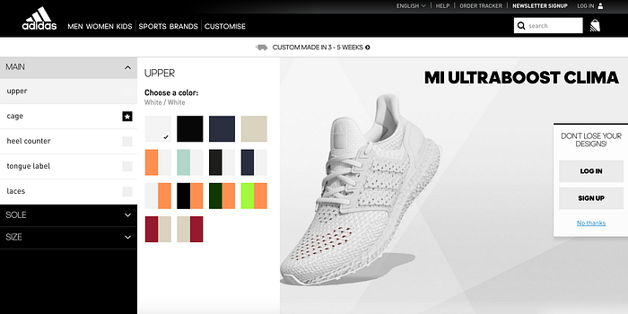
Not every user will be familiar with the naming conventions or jargon of different products. For example, did you know that the part of your shoe that keeps your shoelaces in place is called a cage? I certainly didn’t. By allowing users to click on the picture of the shoe to configure it, you’re providing them with the autonomy to learn, while simultaneously aiding them in the configuration process. This can also help speed up the configuration process, mitigating cognitive fatigue.

16. Minimal, But Not Too Minimal
A configurator should hone the attention of the user on the product being configured. Because of this, it’s important to keep the environment of your configurator minimal, while simultaneously not hiding elements or features that the user needs to interact with. (Nike ID)
17. Don’t Start the User with an Empty State
Starting from nothing can be intimidating for the user. It’s important to start them with a basic starting point — product-wise — for which they can start configuring.
18. Harness Video Game Principles (Gamification)
Video games have mastered the art of configurators. If you’ve ever played Skyrim or Fortnite, you’ll be familiar with this. They do a great job of providing constant feedback and intrigue for players. It’s likely that whichever product you’re designing a configurator for has already been done within a video game. I encourage every UX-er: before tackling a configurator to try out a video game configurator — you’ll quickly realize how much autonomy the player has.
19. Provide Non-Disruptive Learning
Learning and education is a major element of the configuration process. The user should not have to do additional research outside the configurator in order to feel confident their selection is indeed what they want. By including simple, non-jargon information, videos and photos in a non-disruptive way, you can aid the user in their journey.
20. Provide Access to the Configurator in the Global Navigation
Including your configurator within the global navigation will ensure that users always have access to this shopping tool.
21. Allow Users to Pick Up Where They Left Off
Provide users the autonomy to come back to their configuration at any time. This can be done through deep-linking (a unique link to their configuration), saving it to their account, or using cookies to remember their preferences. The majority of users will need to look at a product 3 times before purchasing. By creating a non-abrasive method for users to pick up where they left off, you’re not only creating a better experience but likely an experience that will convert into sales.

